Project Lens
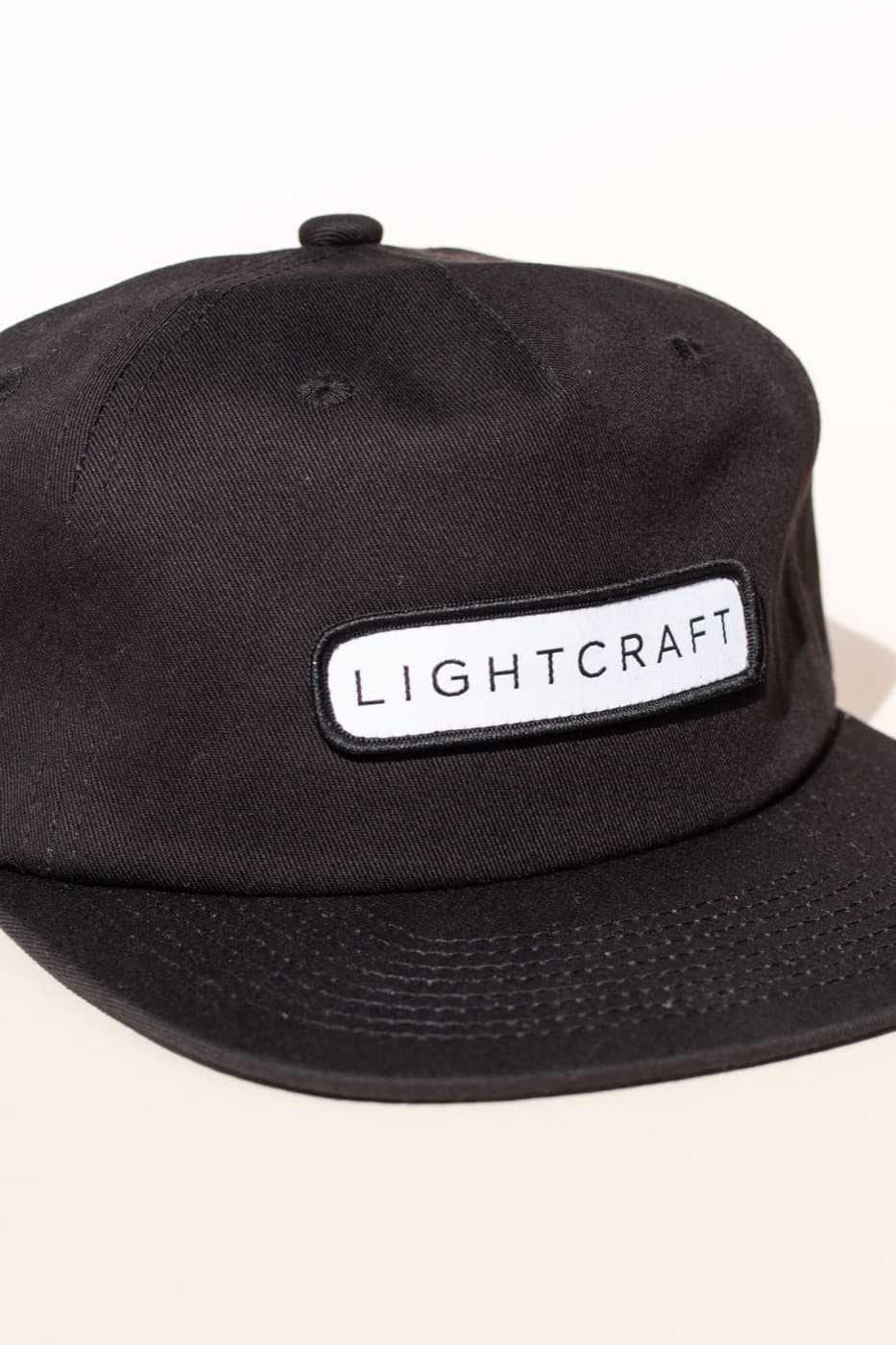
A black cap made more finished through the label.
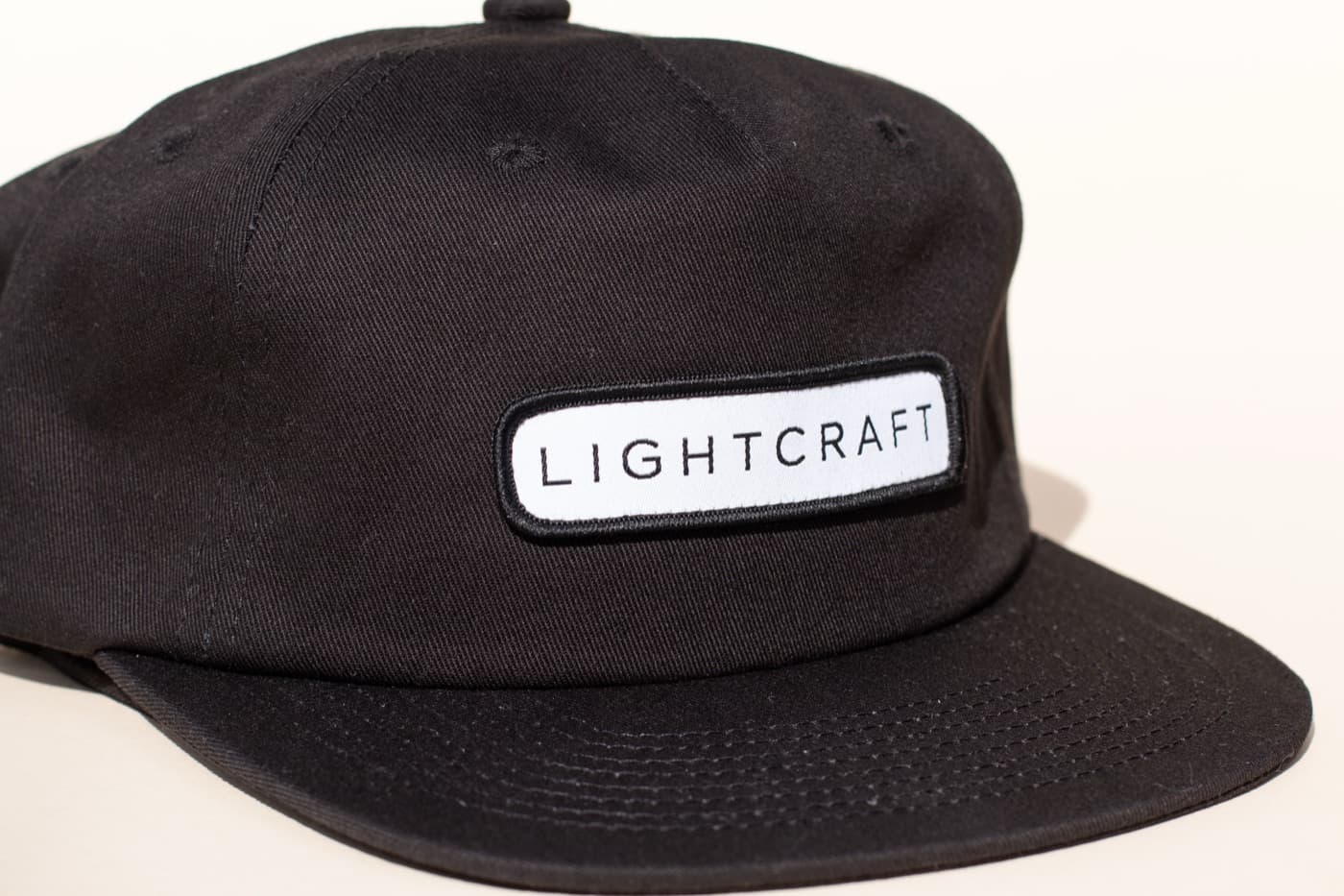
The label is the product decision. It adds dimension, a clean white contrast field, and a stitched edge that makes the cap feel more finished than a basic flat logo treatment.
Guaranteed Fresh
Woven-label headwear
Lightcraft's cap shows how a woven label can turn a simple black blank into something with more material presence and retail polish.

Project Lens
The label is the product decision. It adds dimension, a clean white contrast field, and a stitched edge that makes the cap feel more finished than a basic flat logo treatment.
Build Note
The woven label gives the mark structure and a more tactile finish than a simple direct decoration would.
Build Note
Black and white keeps the cap sharp while letting the label carry all of the brand read.
Build Note
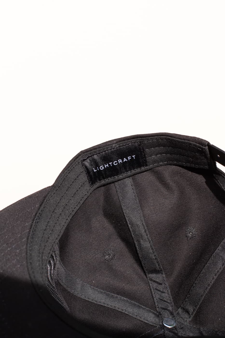
Interior and angle photos show the cap as a finished product, not just a front-facing logo crop.
Project Proof
A tighter photo set for the finished pieces, details, and product logic behind this case study.

Front detail

Black blank

Finished construction
Next Case Study
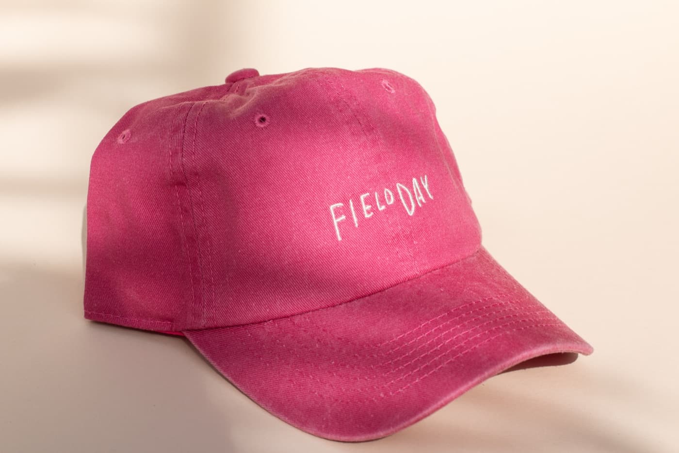
Fillday's dad hat is a useful reminder that the blank color can do the heavy lifting when the brand mark is meant to stay quiet.
View Next Study
Build With Orange Goods
Send the product idea, quantity, timeline, and references. We will help narrow the path and turn it into goods with a real point of view.