
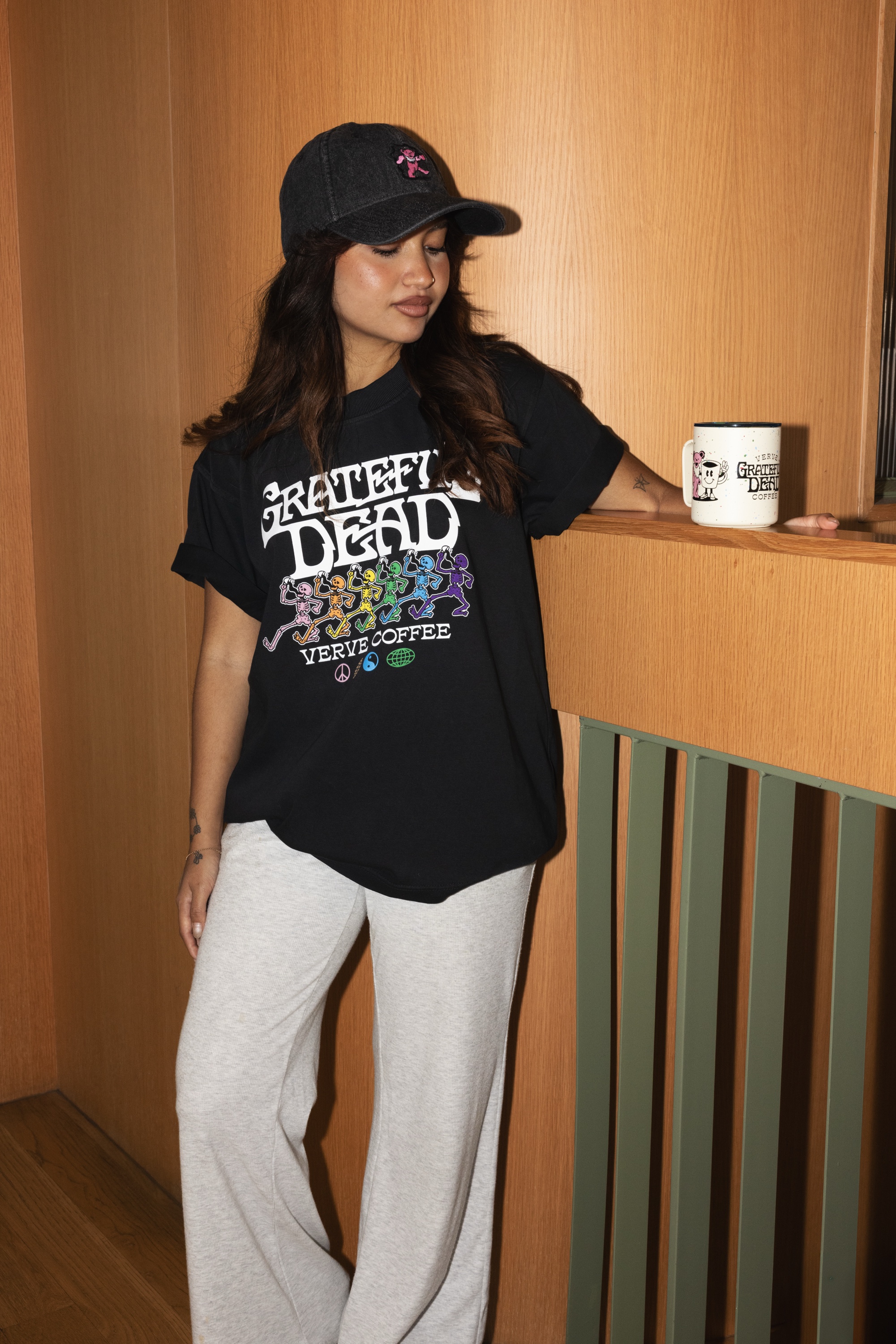
Apparel
Heavy tees, simple art
A heavier blank makes even a one-color print feel more like a retail piece.
Premium basicsRetail feel
Explore pick →Guaranteed Fresh
Monthly Edit
A tighter monthly edit of product ideas, graphics, and goods that feel current, useful, and worth making.
August 2026 issue
A heavier blank makes even a one-color print feel more like a retail piece.
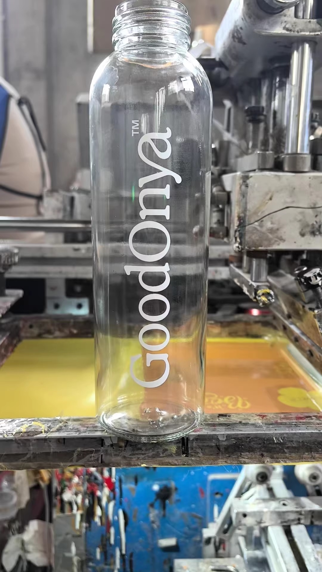
One useful product, one wearable piece, and one small detail usually beats a box full of filler.
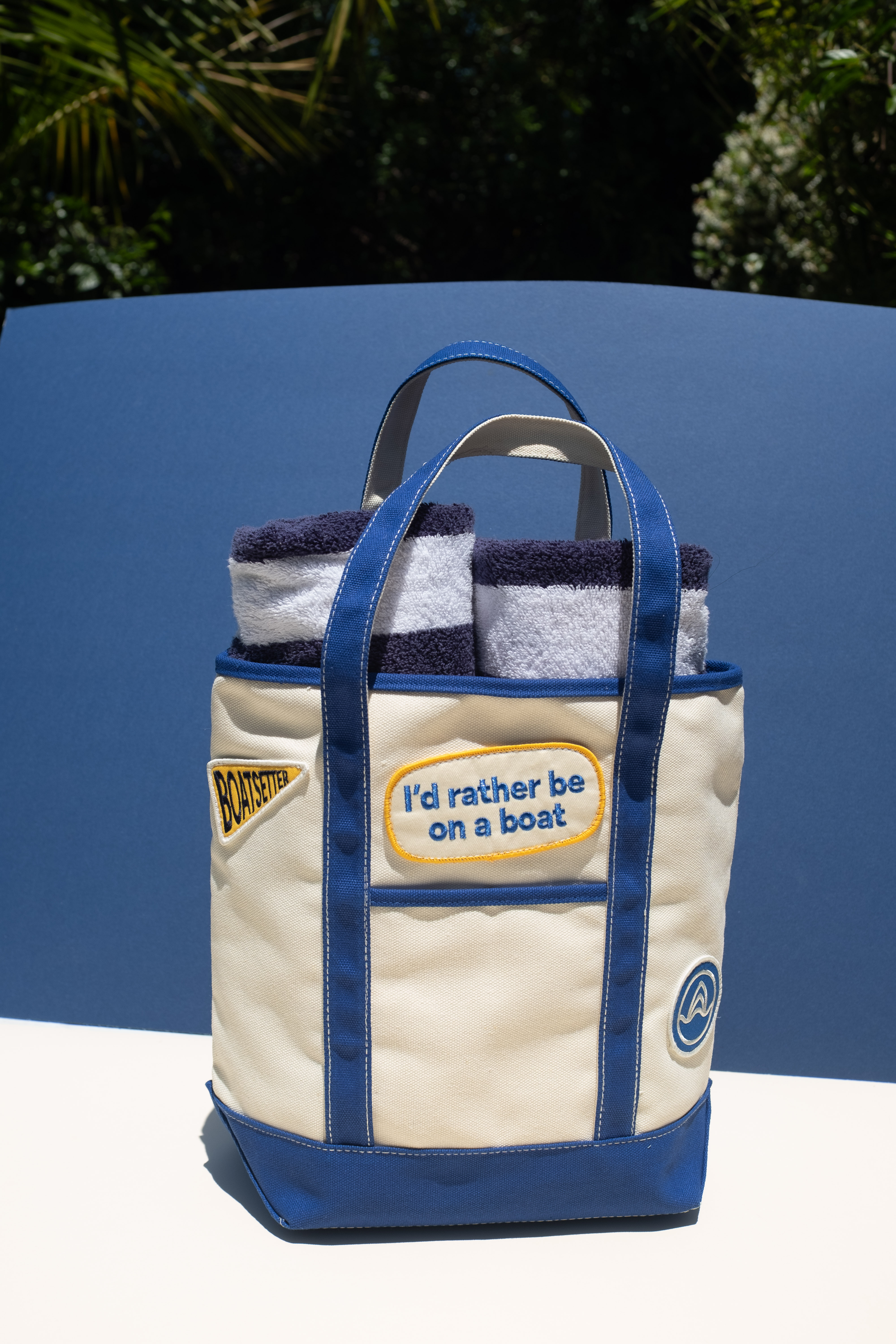
A tote is only boring when the blank, print size, and use case are boring.
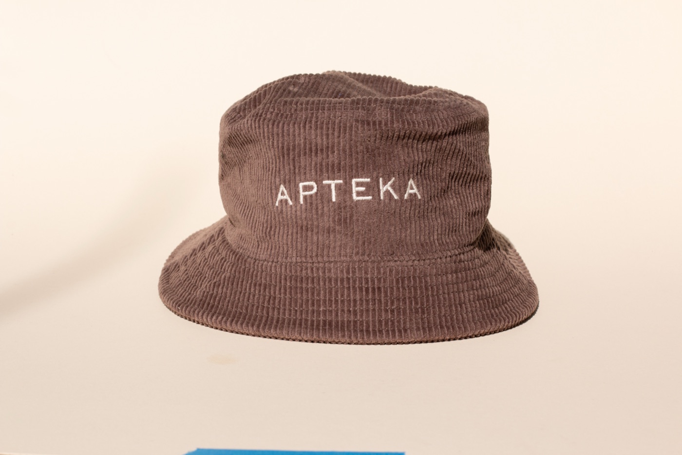
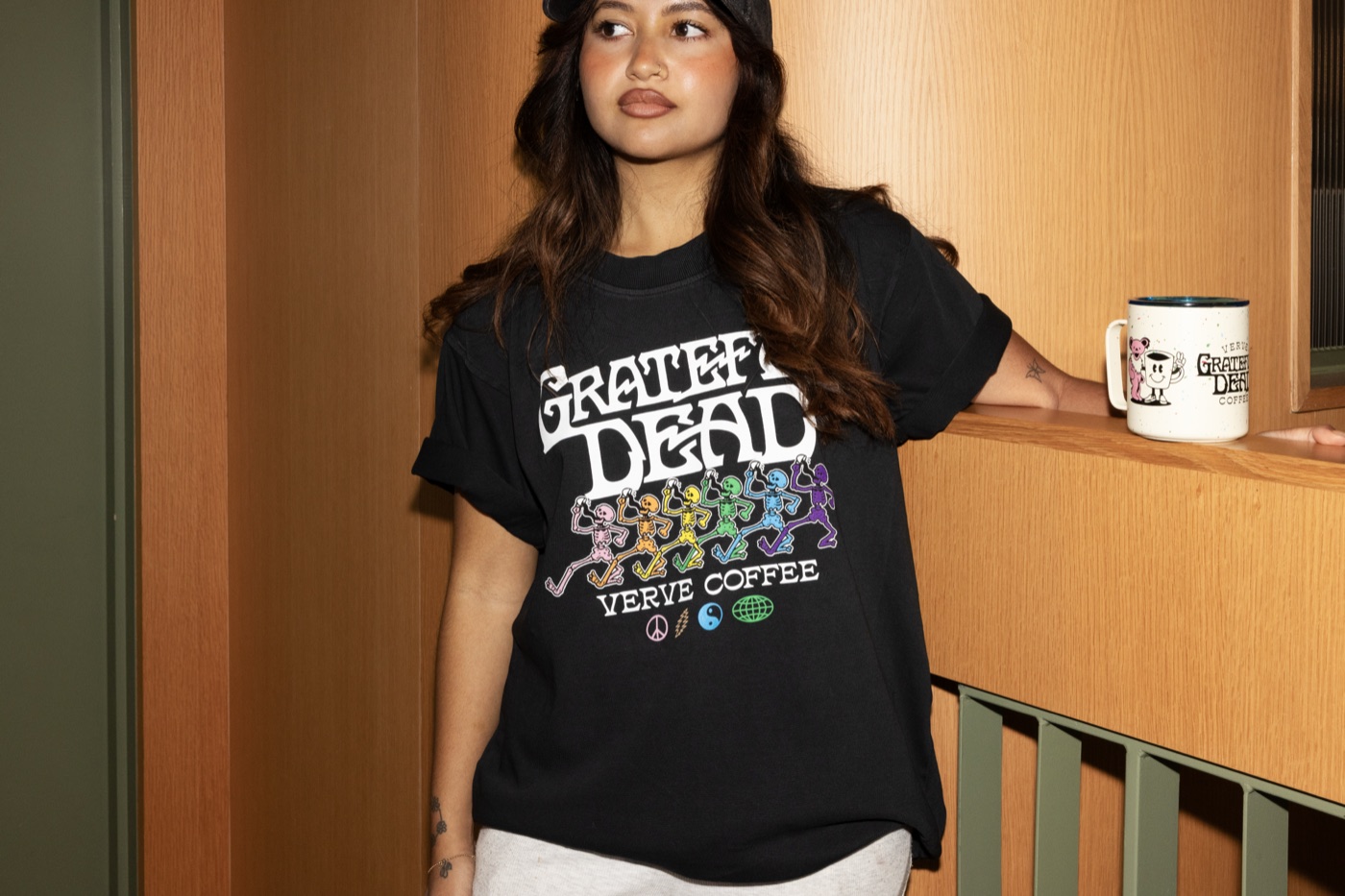
The best staff apparel feels like something the team would wear off shift too.
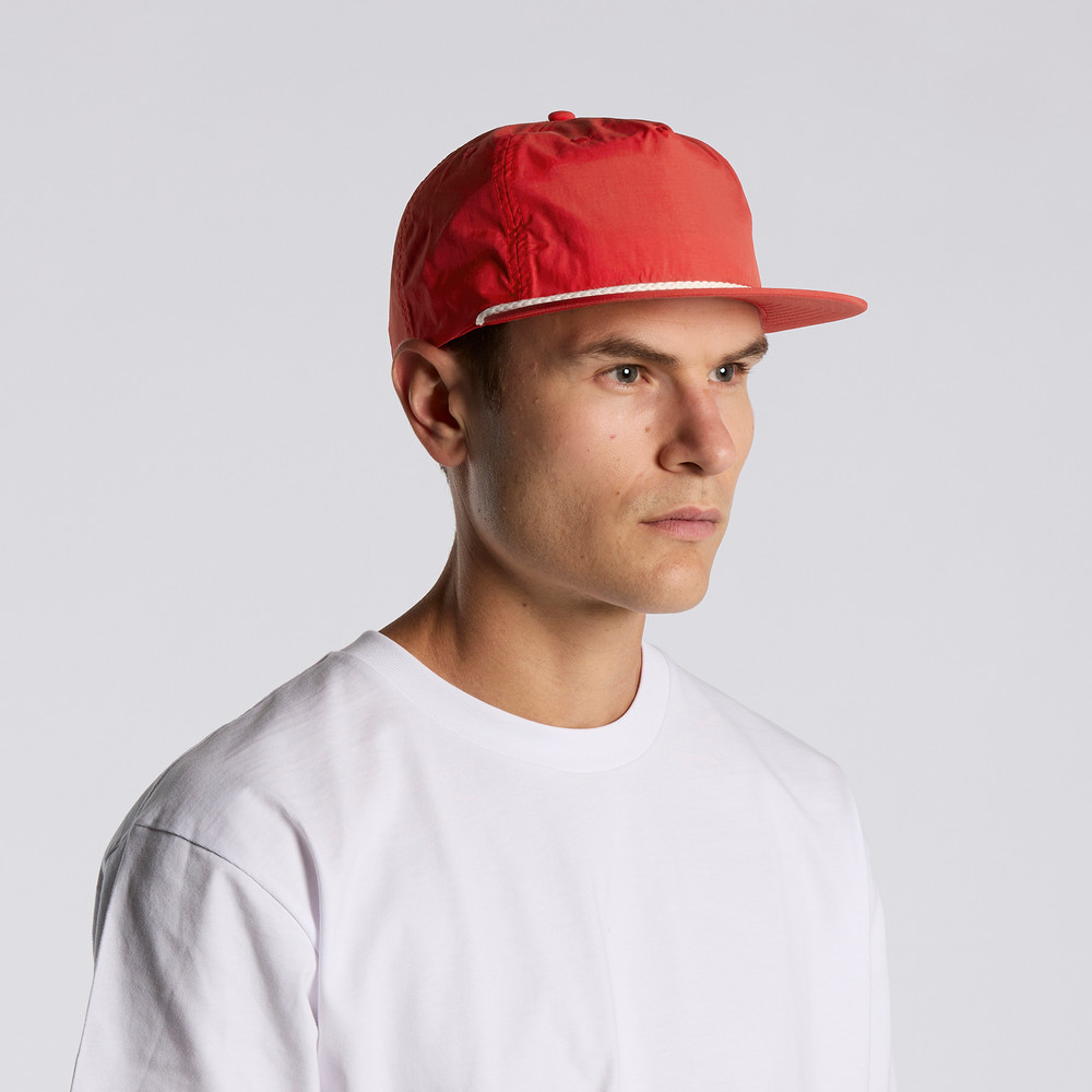
A rope detail gives a cap a little more personality without making the whole hat loud.
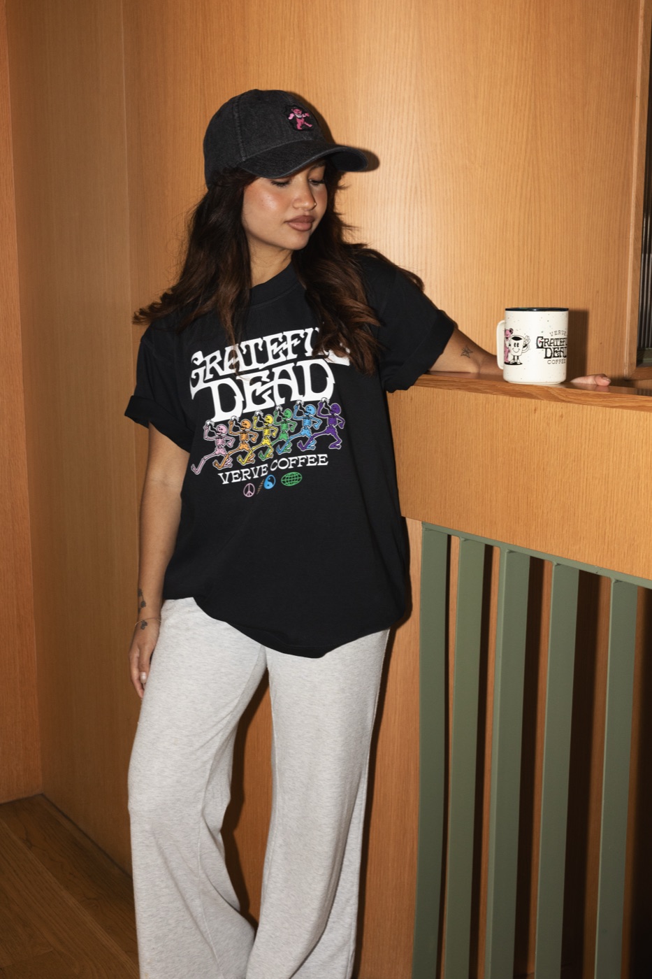
Sometimes the product is simple because the graphic is doing the heavy lifting.
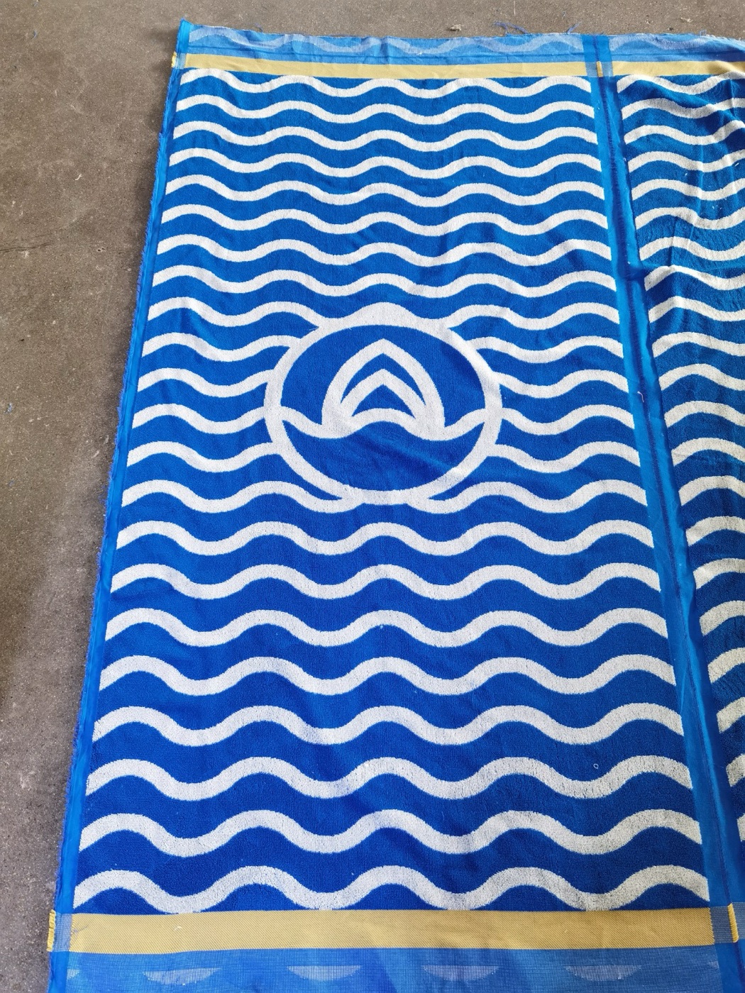
A towel gives a brand more surface area, better photos, and a reason to leave the house.
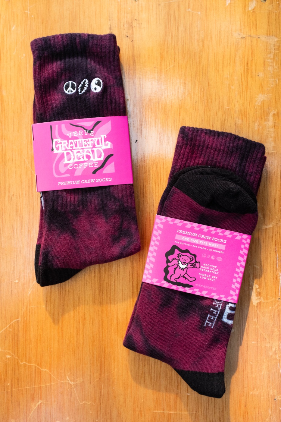
Socks are a good add-on when you need something easy to size and easy to mail.
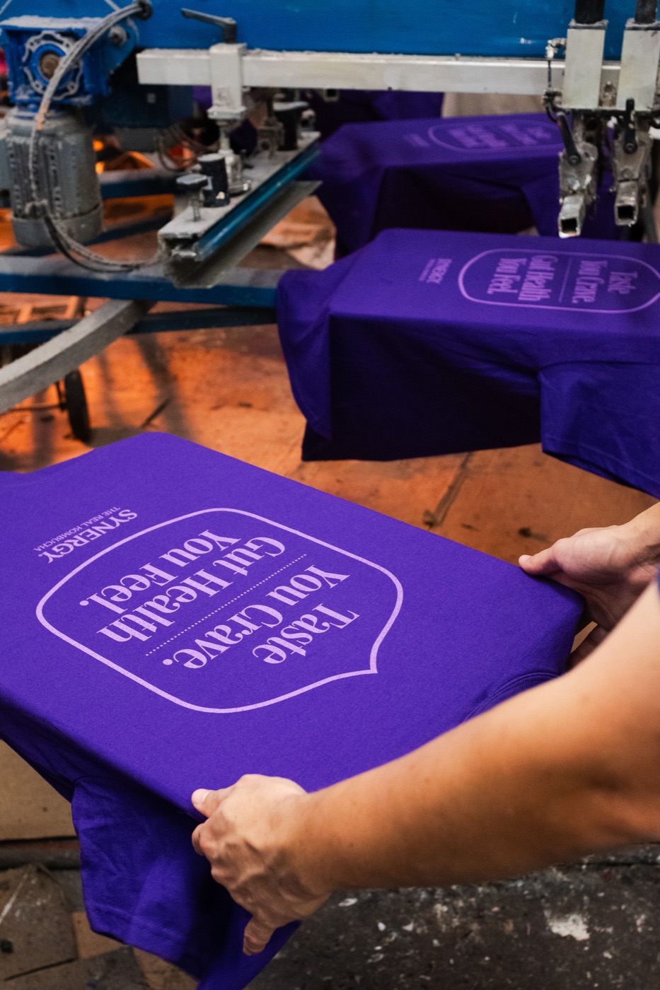
The order works harder when the piece still makes sense after the event ends.
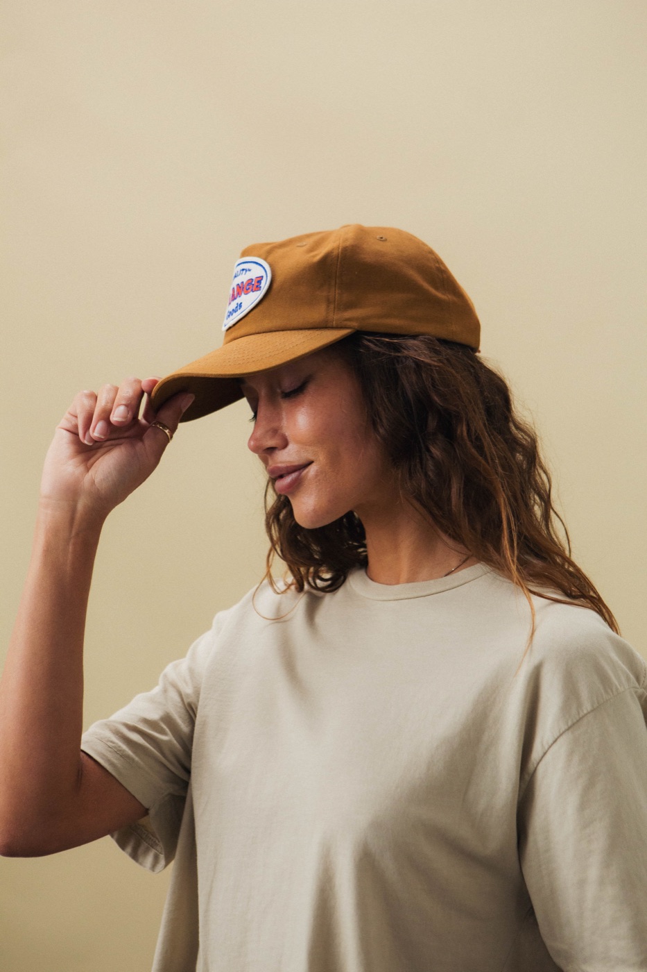
A patch can make a simple cap feel more designed, especially when the colors are dialed in.
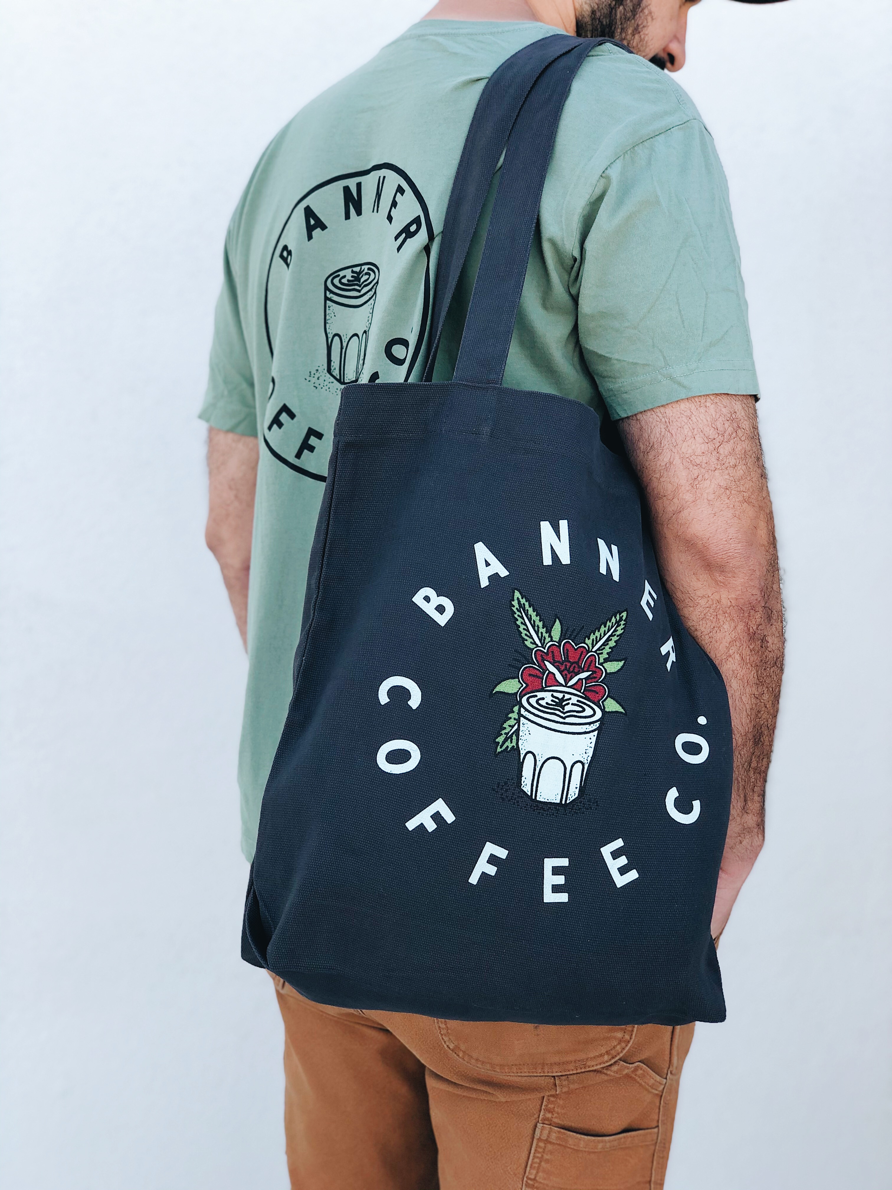
Restaurant merch works better when the piece actually belongs in service, not just on a shelf.
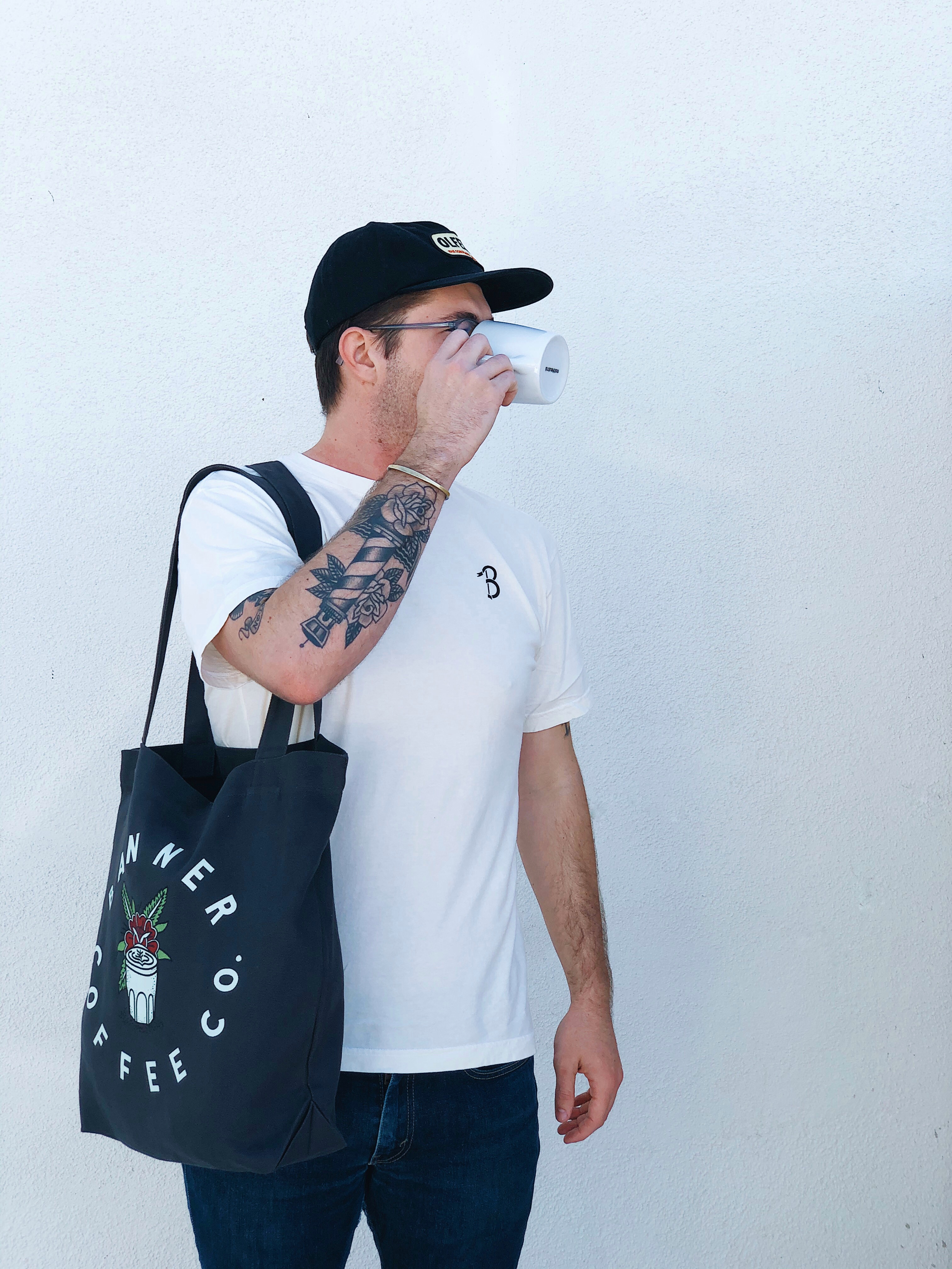
A simple tote can pull retail, gifting, and everyday use together when the art and blank are right.
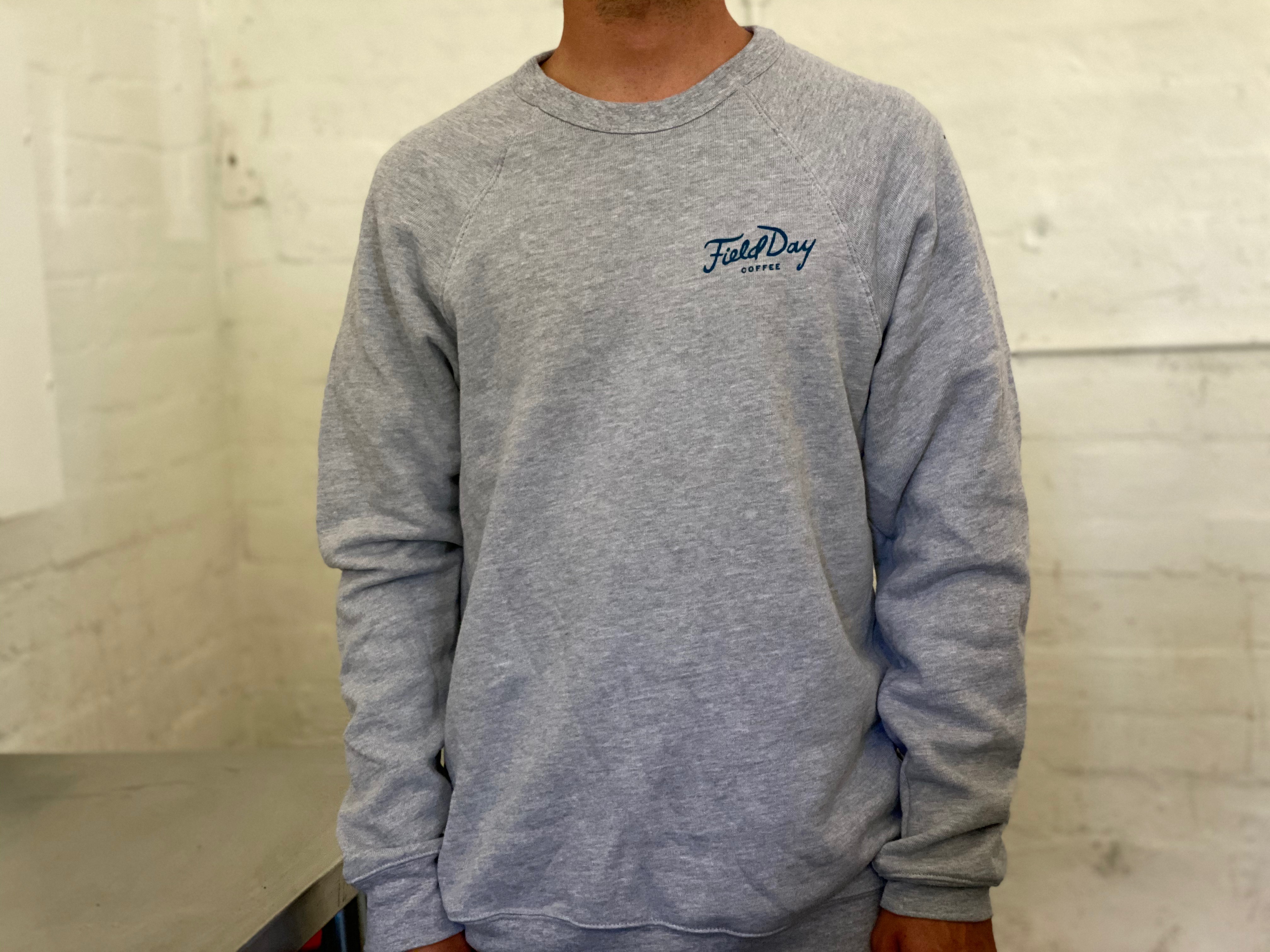
A clean crewneck can carry a coffee brand or event team farther than another throwaway tee.
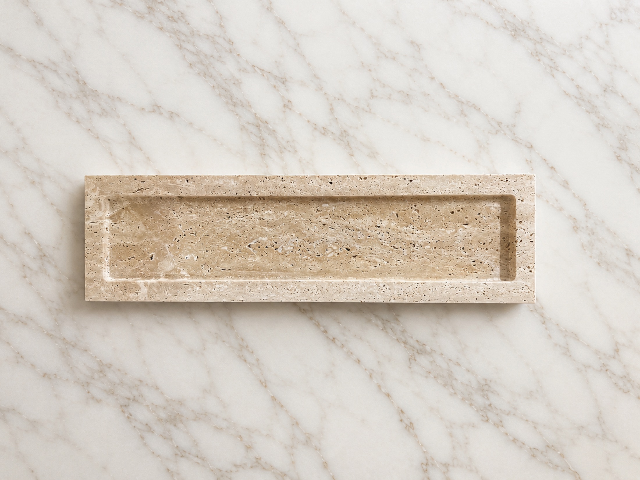
A tray, candle, or object piece can make a gifting program feel far more elevated than standard promo picks.
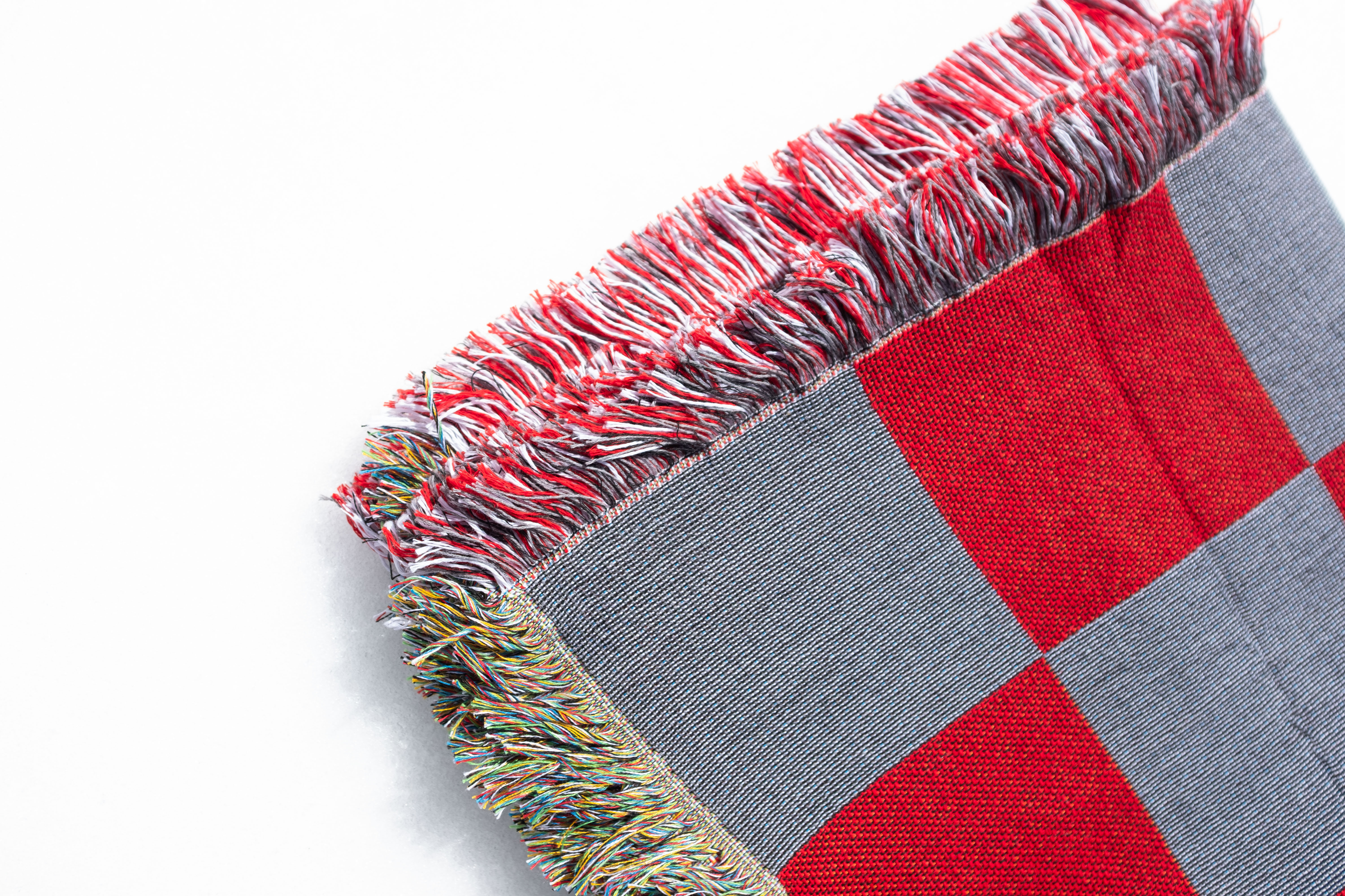
For hospitality, retail, and welcome kits, a blanket gives the whole project more presence right away.
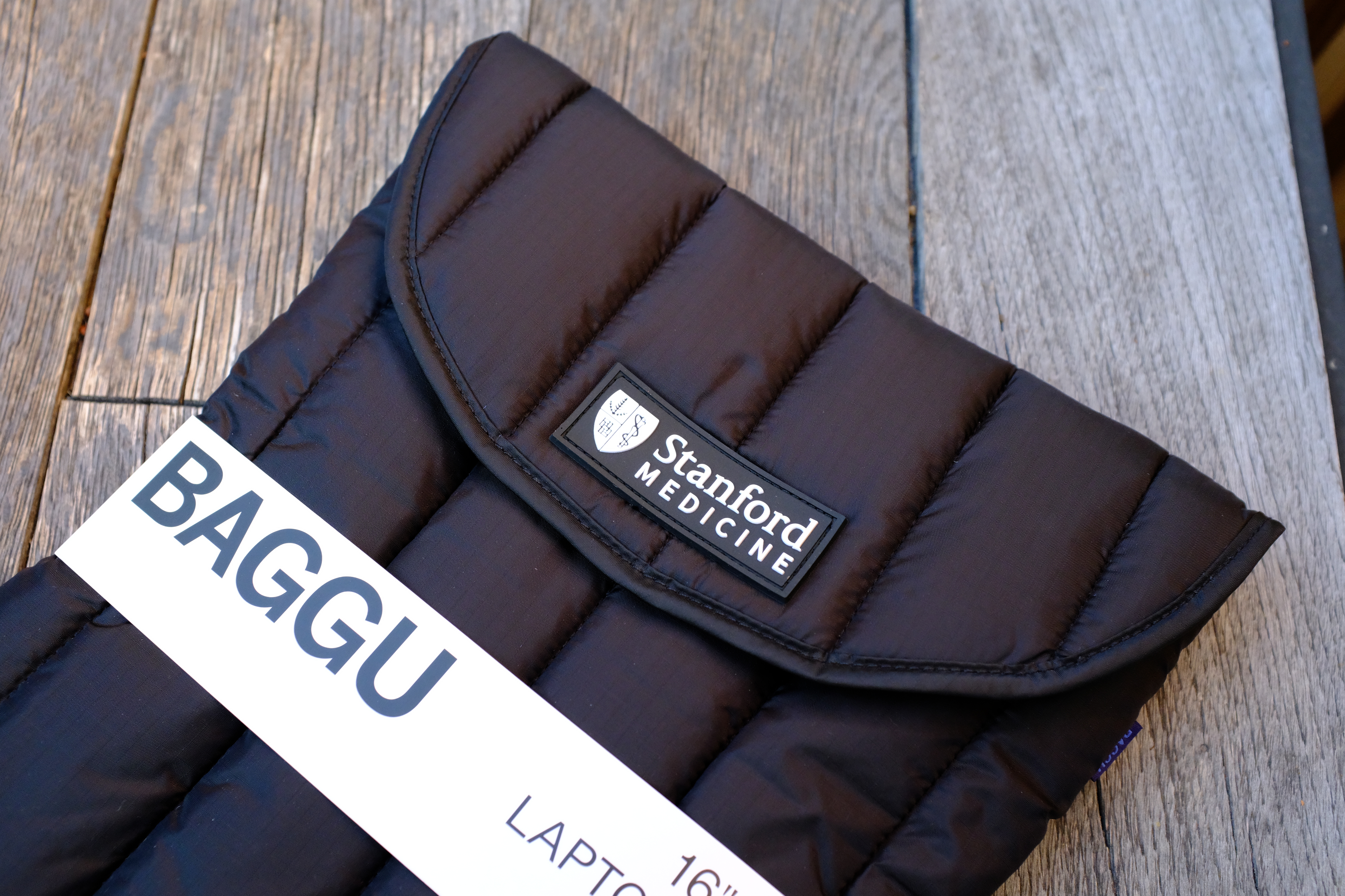
Useful tech pieces make branded kits feel more intentional and less like filler.
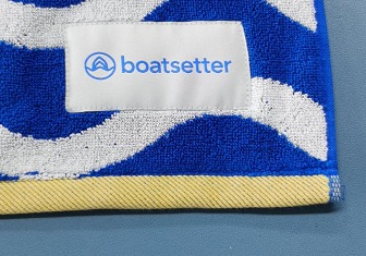
A strong woven label and color story can make a towel feel like a real seasonal product, not a freebie.
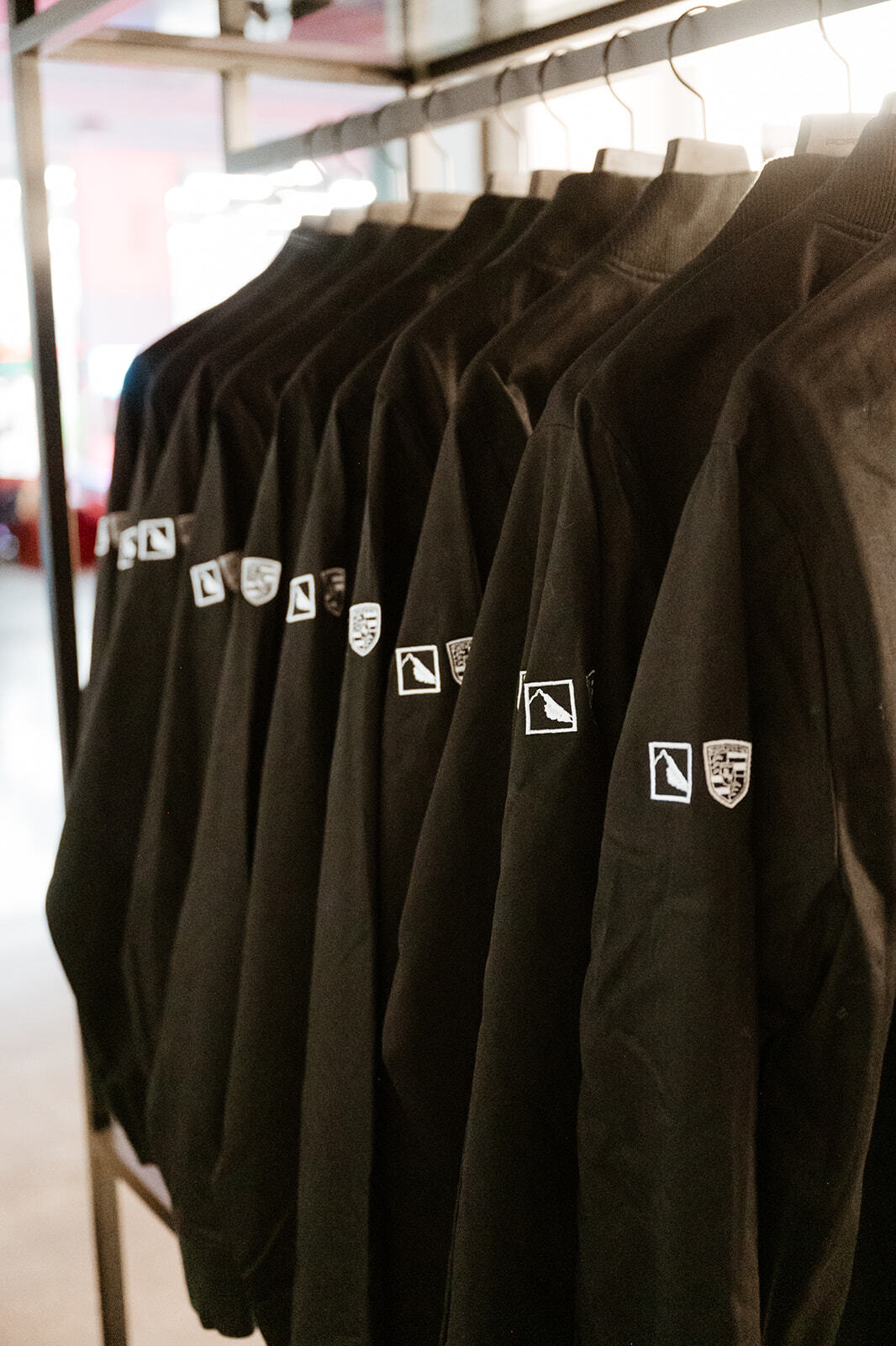
Brand activation gear lands better when the apparel, display, and gifting pieces all feel considered together.
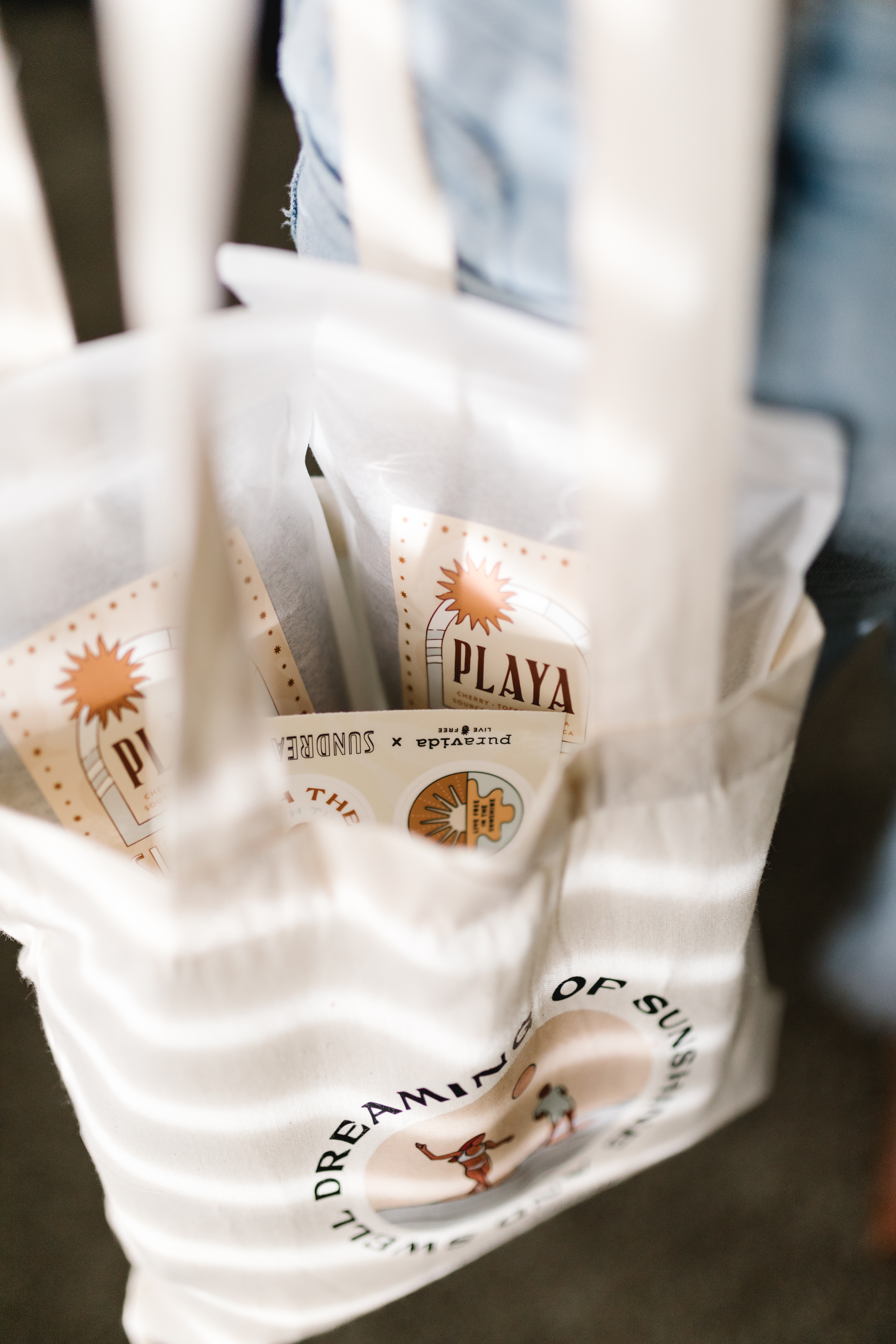
Small soft goods can stretch a gifting or retail assortment without blowing up the whole budget.
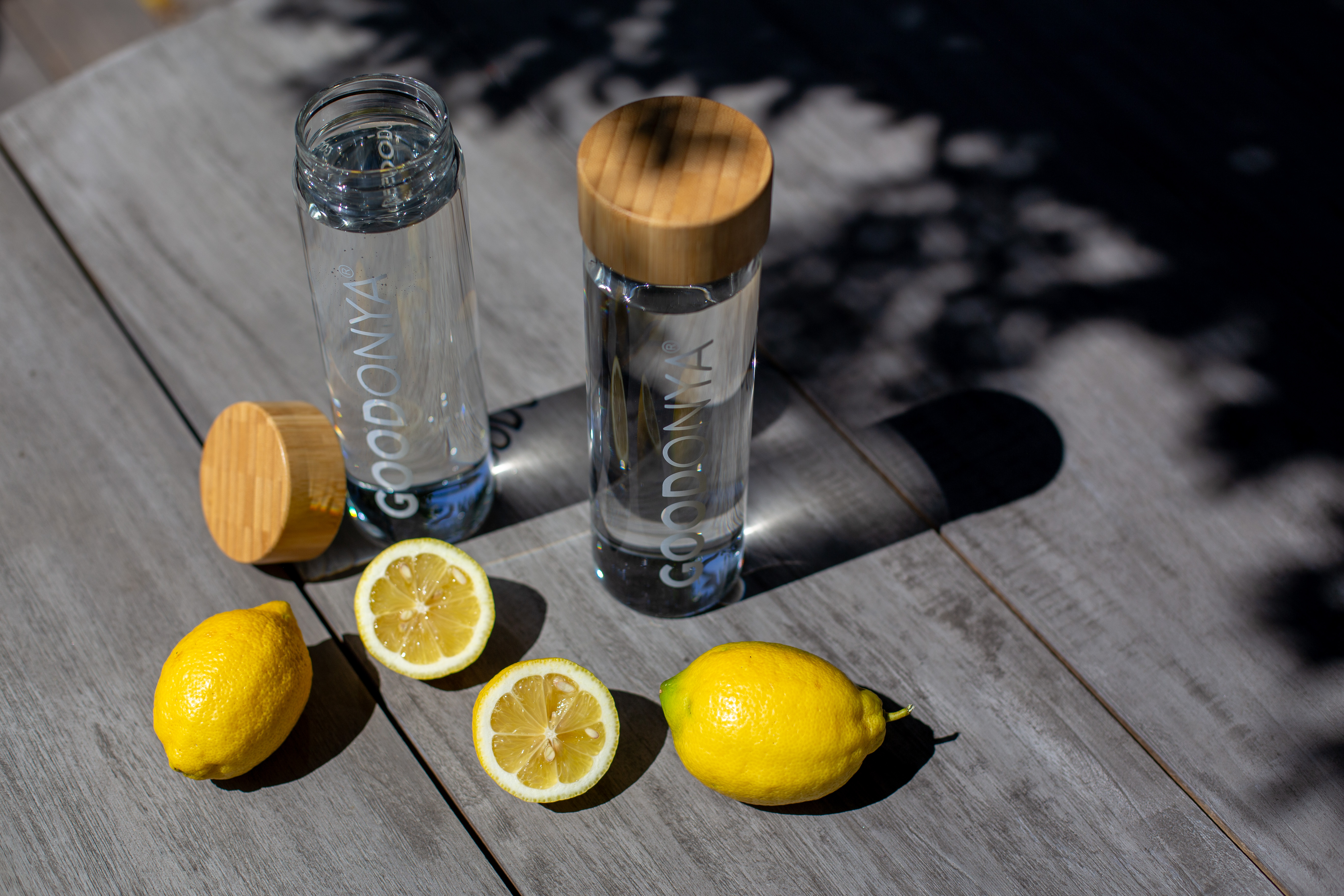
Drinkware usually sells the idea faster when it is shown as a lifestyle piece instead of a plain product shot.
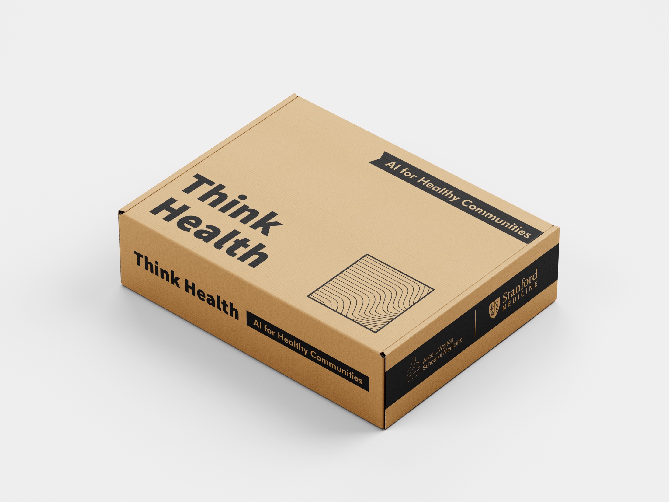
A good kit lands differently when the packaging is part of the concept instead of an afterthought.
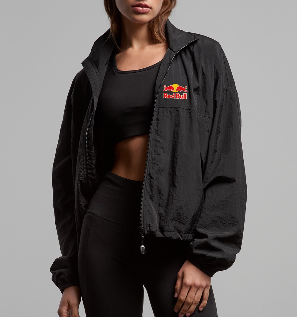
Jackets make sense when the team will actually wear them outside the office, not just for one group photo.
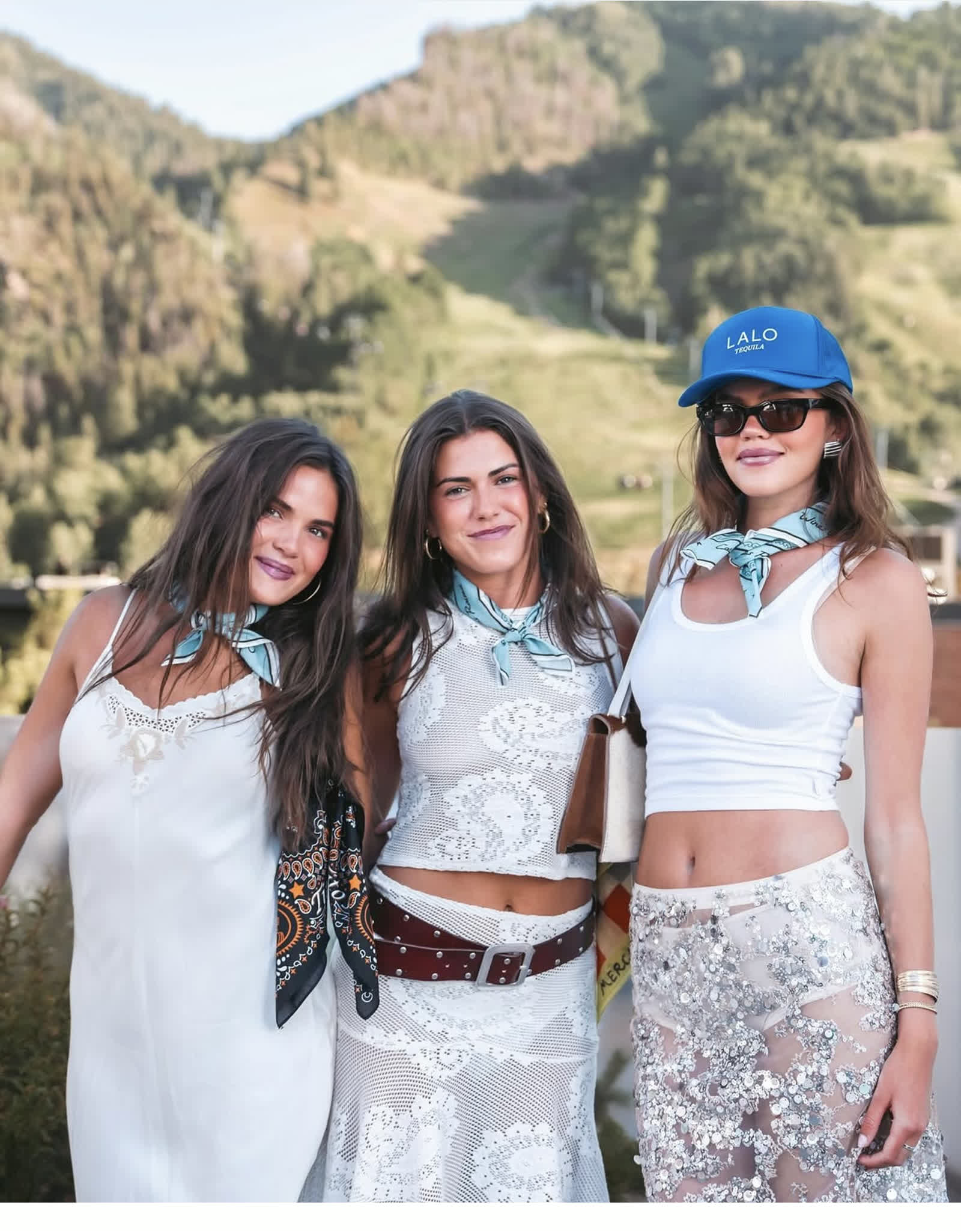
They work best when the artwork is doing something specific and the piece feels tied to the brand world.
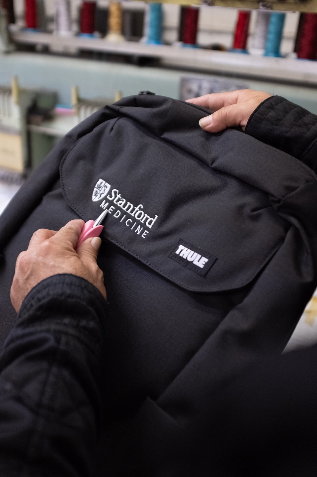
A backpack can quietly carry a logo while making the full kit feel more useful and more valuable.
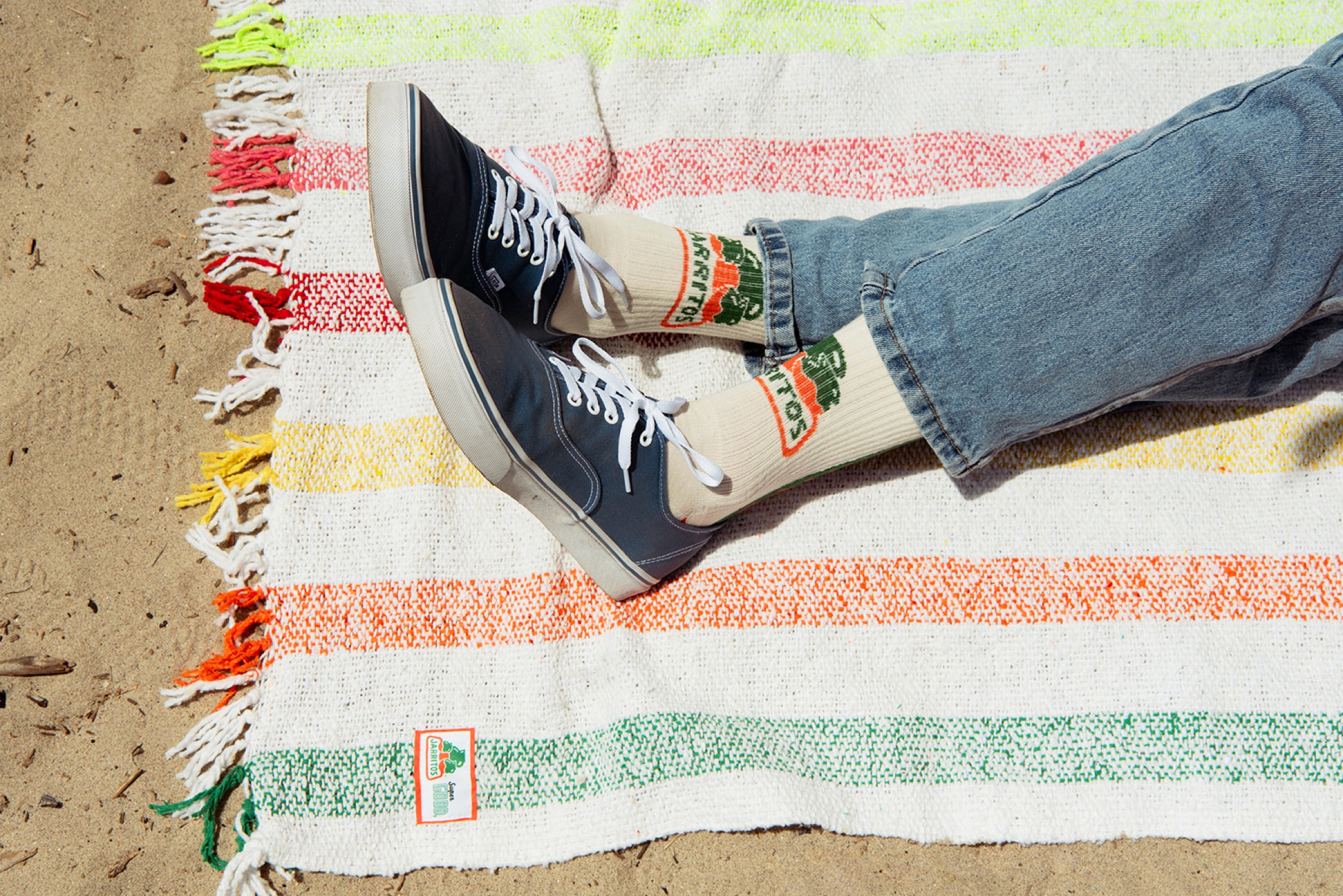
A good blanket can feel generous, retail-ready, and more memorable than another standard box insert.
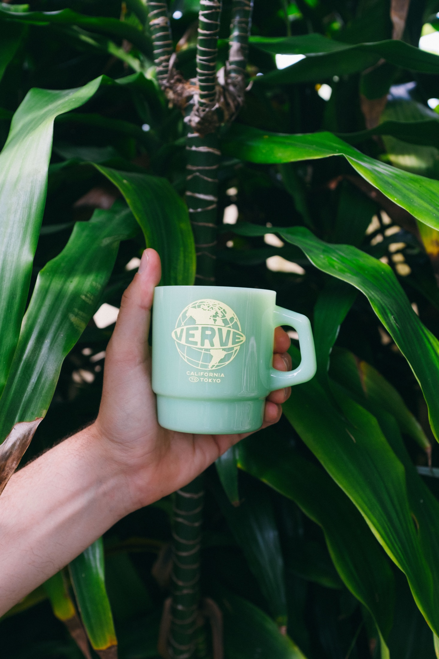
For coffee, hospitality, and retail counters, a milk glass mug still feels softer and more collected than a generic tumbler.
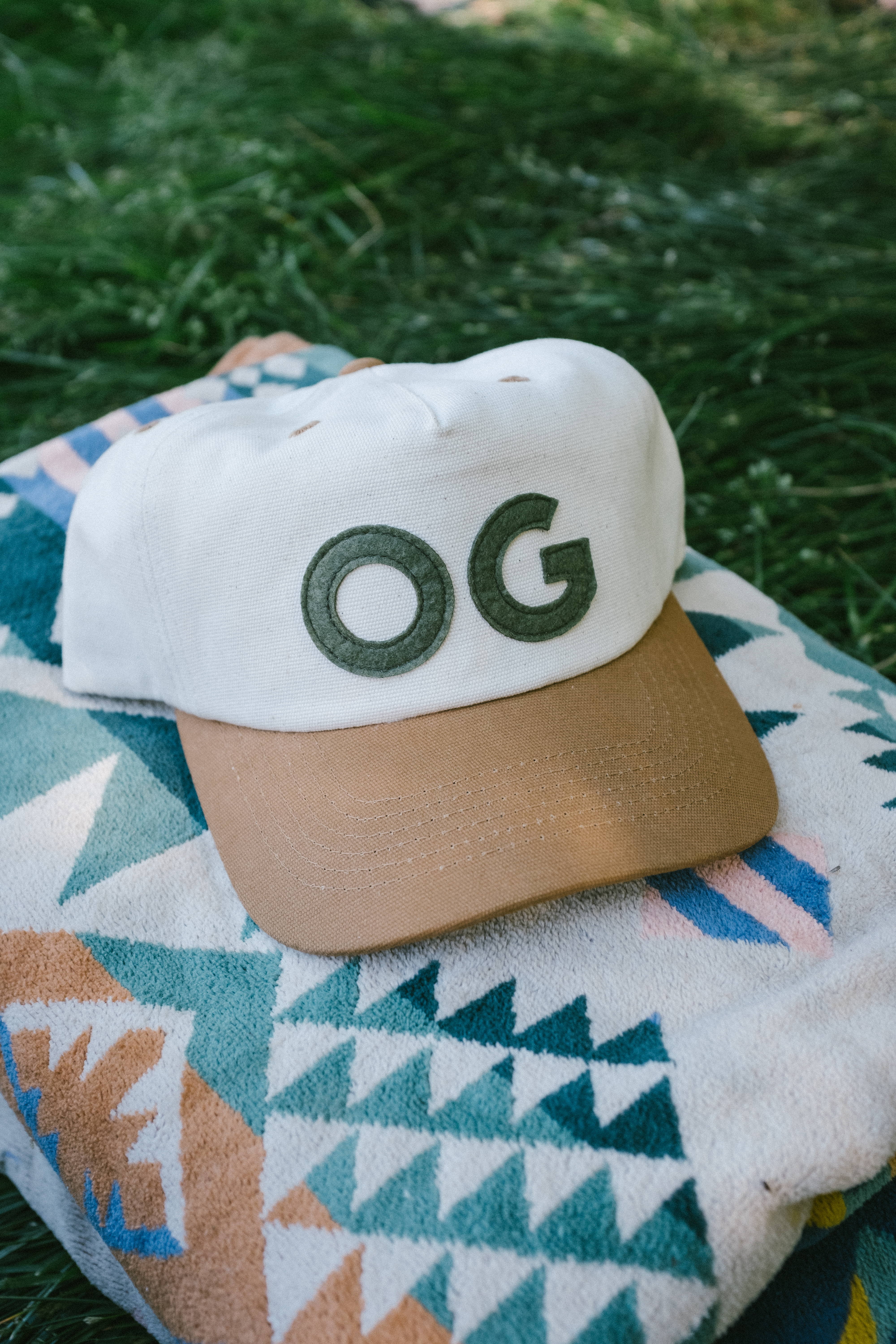
A felt patch can make a hat feel more tactile and more like a real piece of product than a flat logo hit.
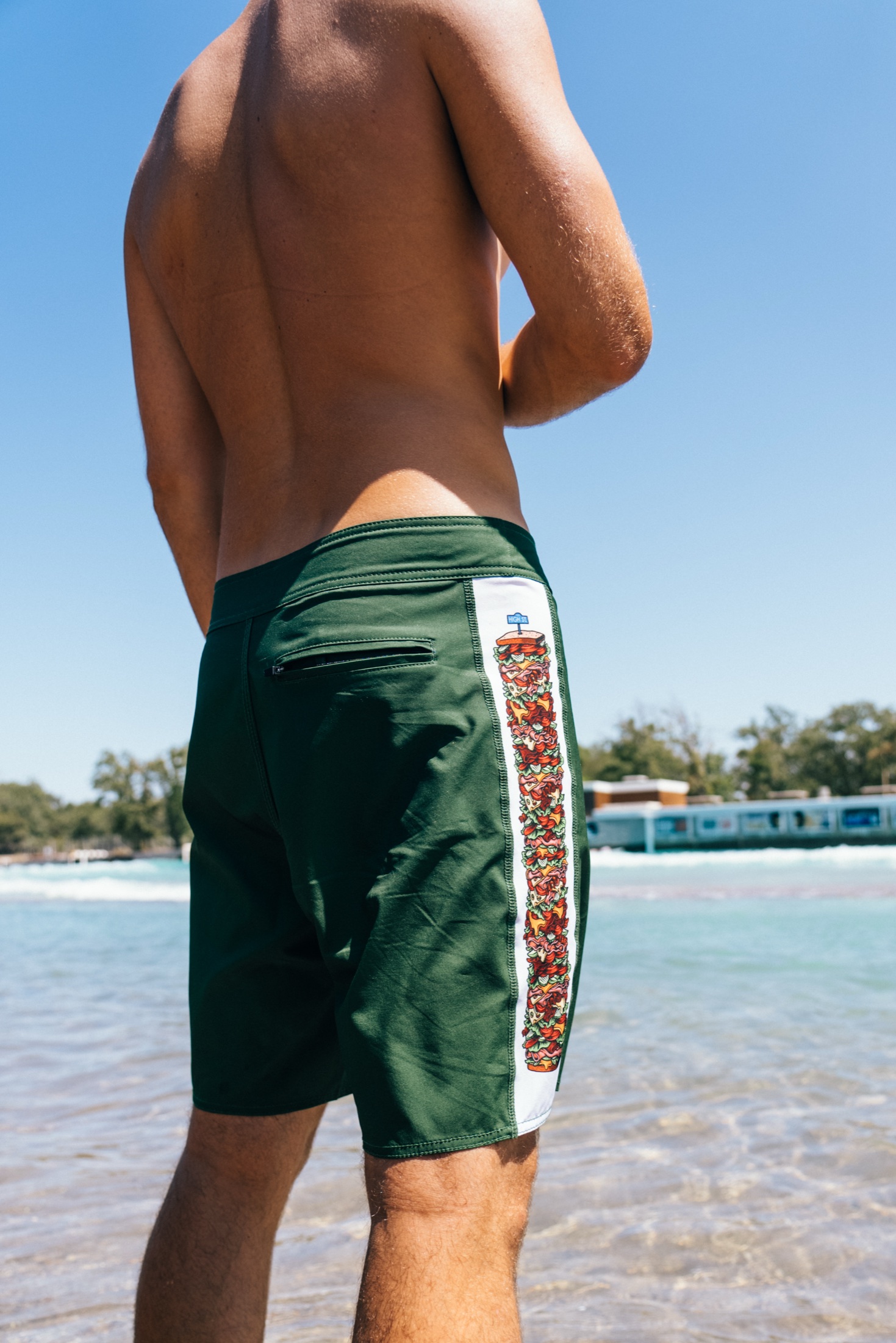
They only make sense for the right brand moment, but when they fit, they can carry a whole seasonal story.
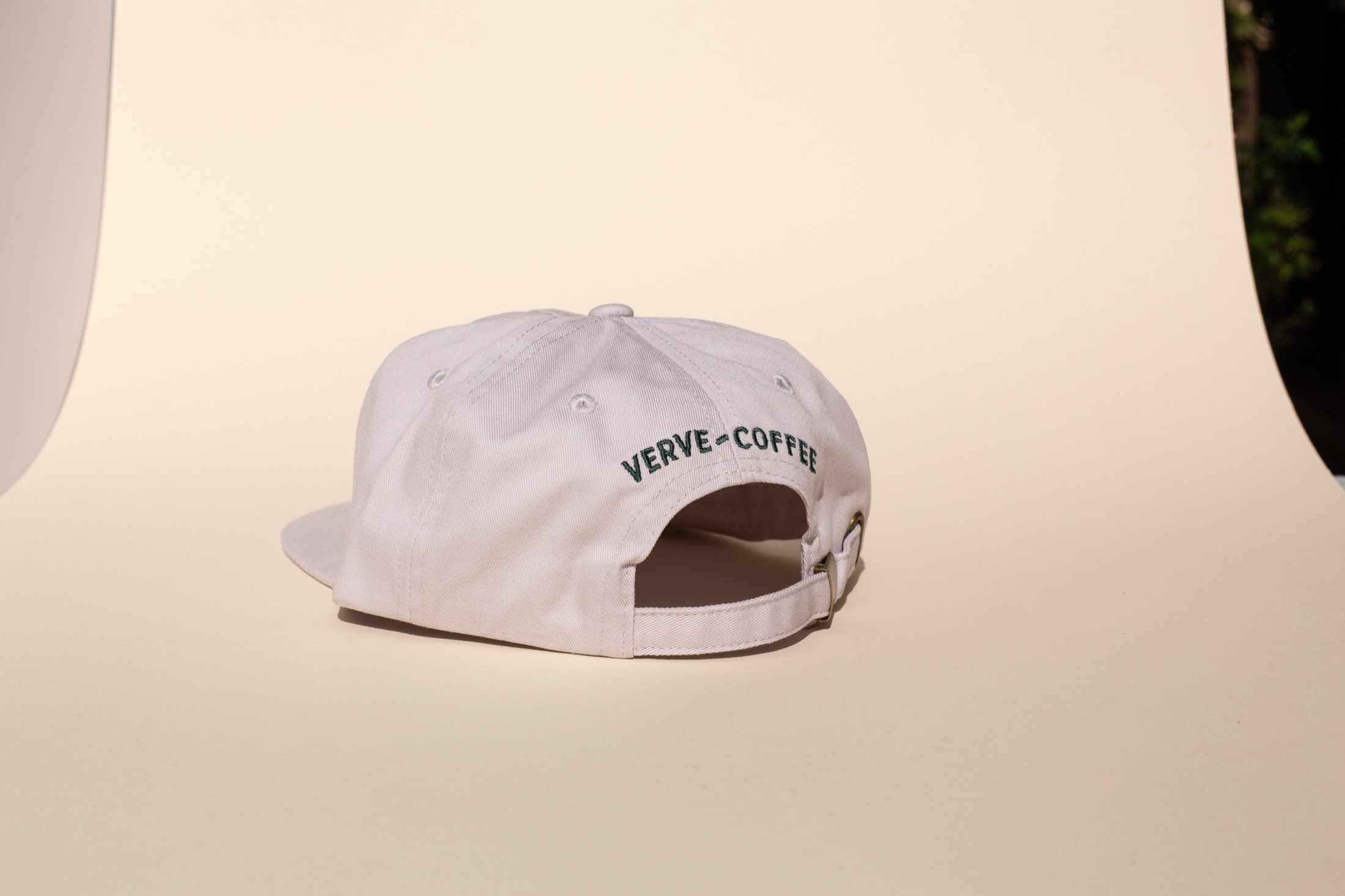
A small front logo with a stronger back hit can make branded fleece feel way more considered.
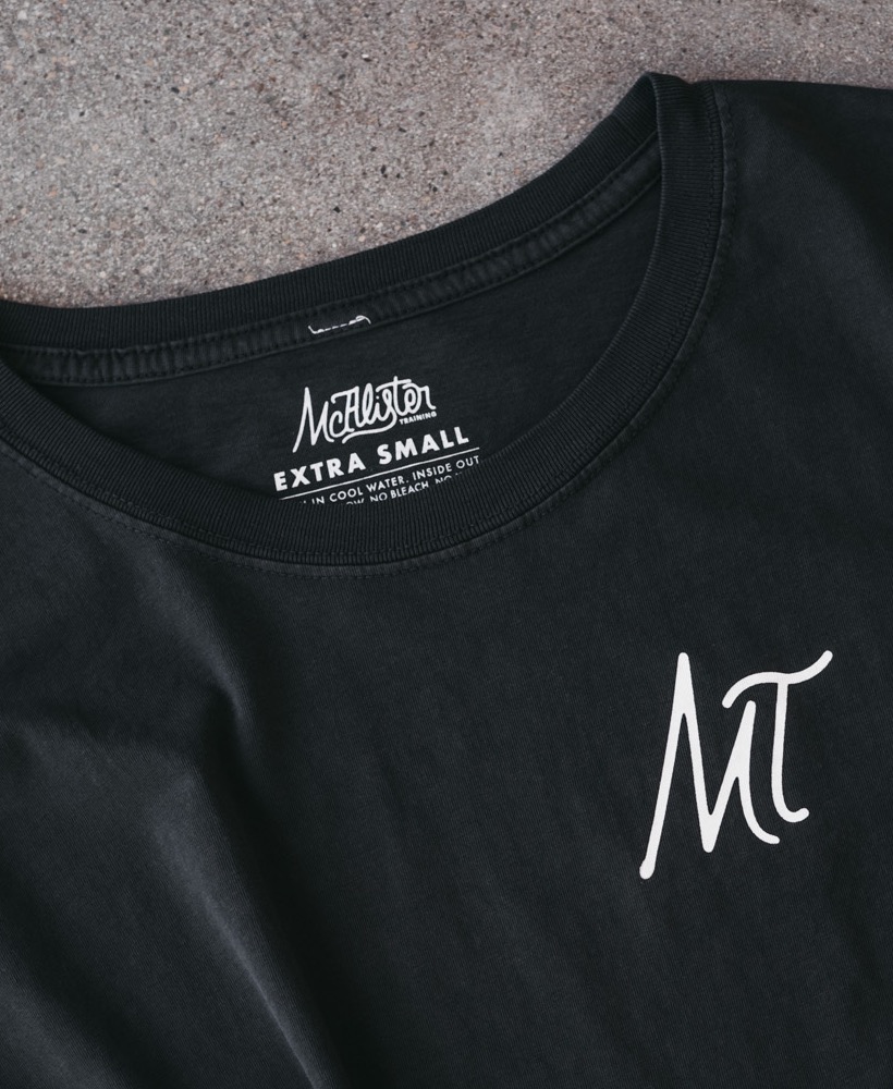
A neck print is a small detail, but it changes how the whole garment feels when someone picks it up.
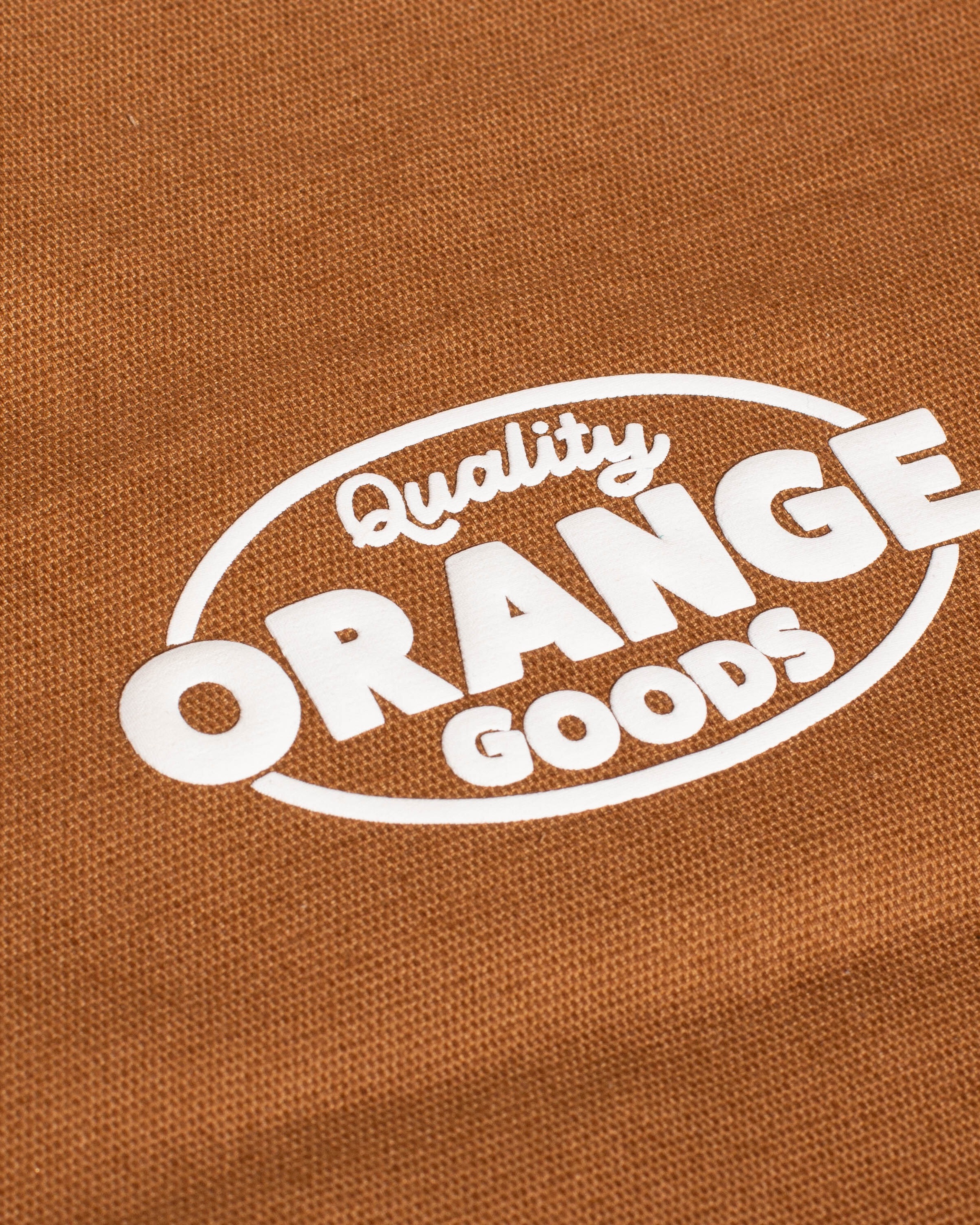
Used in one smart spot, puff can add dimension without making the whole piece feel novelty-driven.
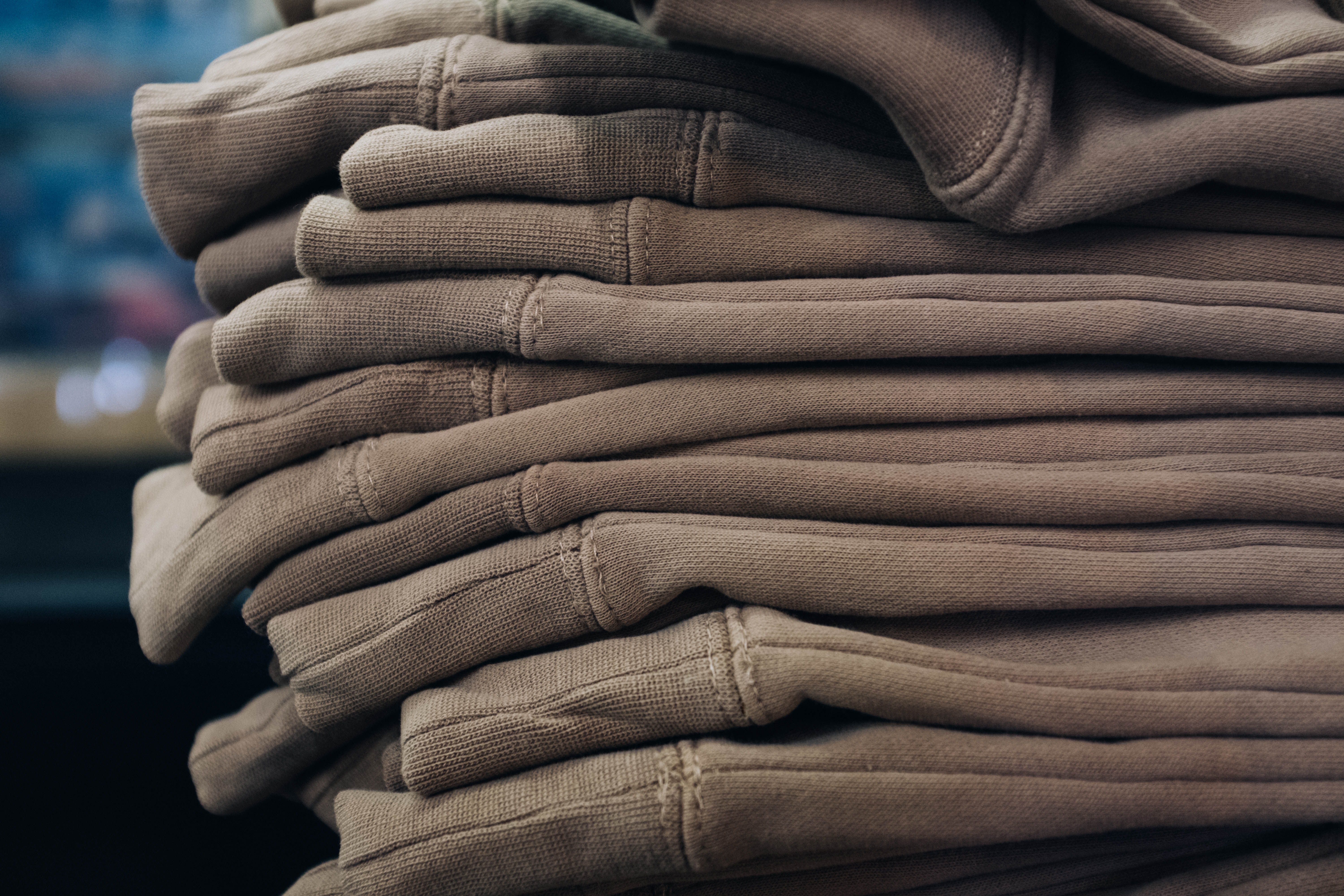
Sometimes the best design move is picking the blank with the right weight, wash, and shape before adding anything else.
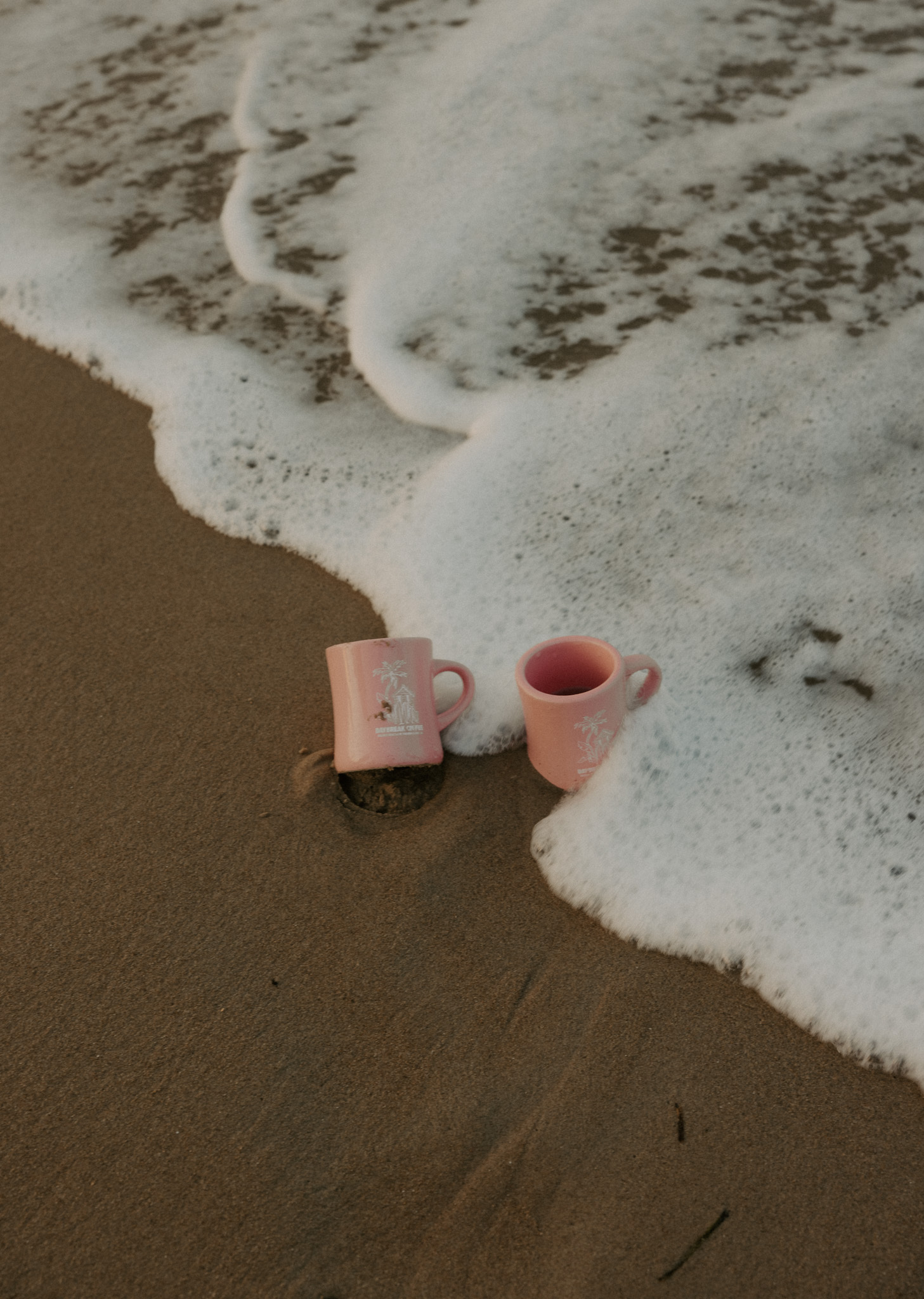
For cafes, desks, and gifting, a ceramic piece can feel more permanent than a sports-bottle default.
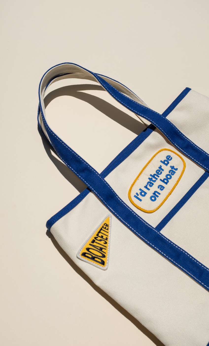
A tote gets stronger when the artwork uses scale, placement, and color instead of treating the bag like a flat handout.
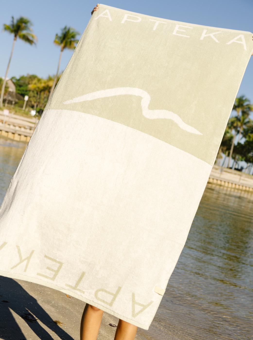
The best towel programs feel designed edge to edge, not like a logo dropped onto a rectangle.
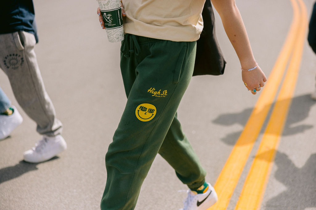
A branded set lands harder when the pant feels just as considered as the hoodie or crewneck above it.
If the audience will actually commute or travel with it, a backpack can carry a lot more long-term value.