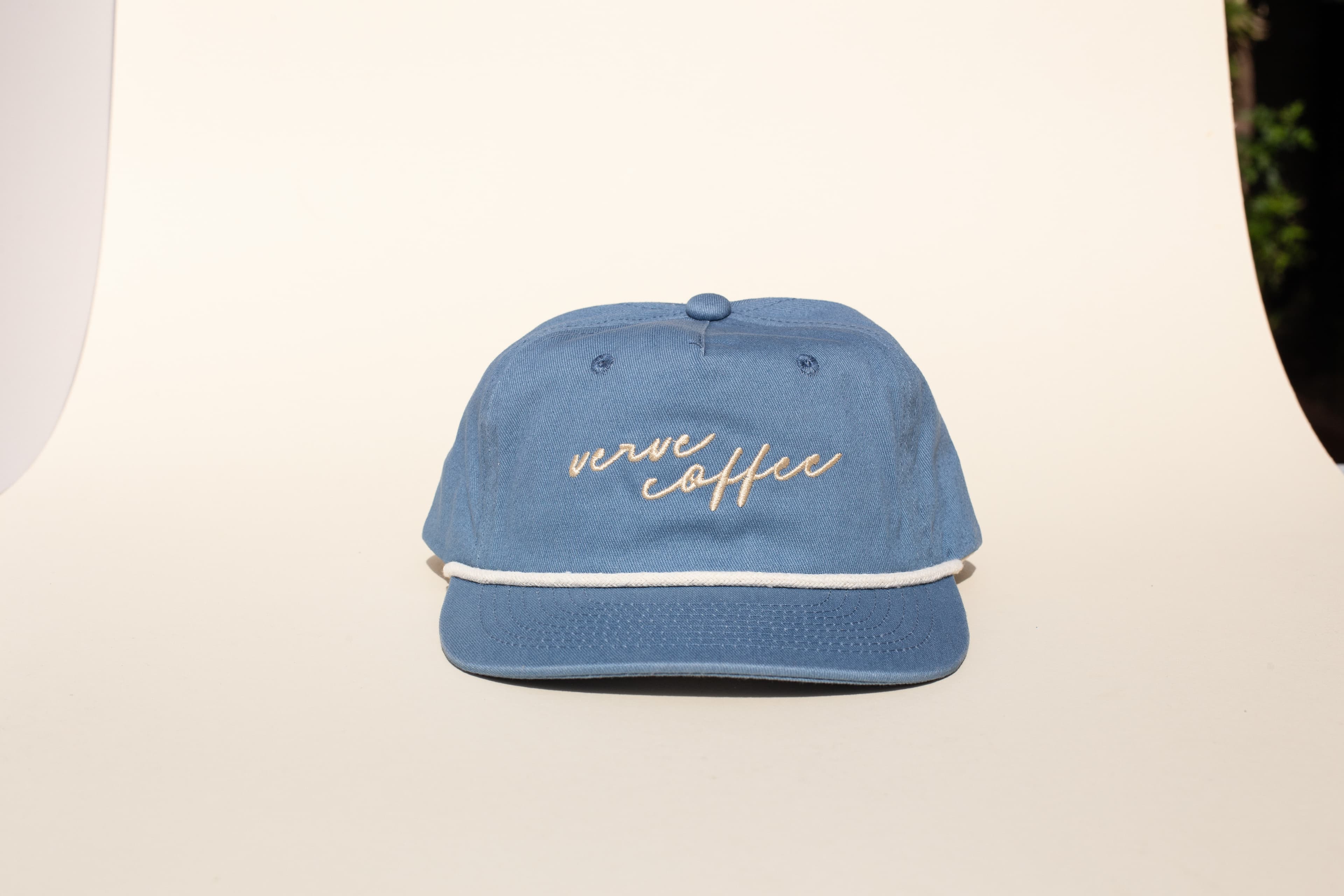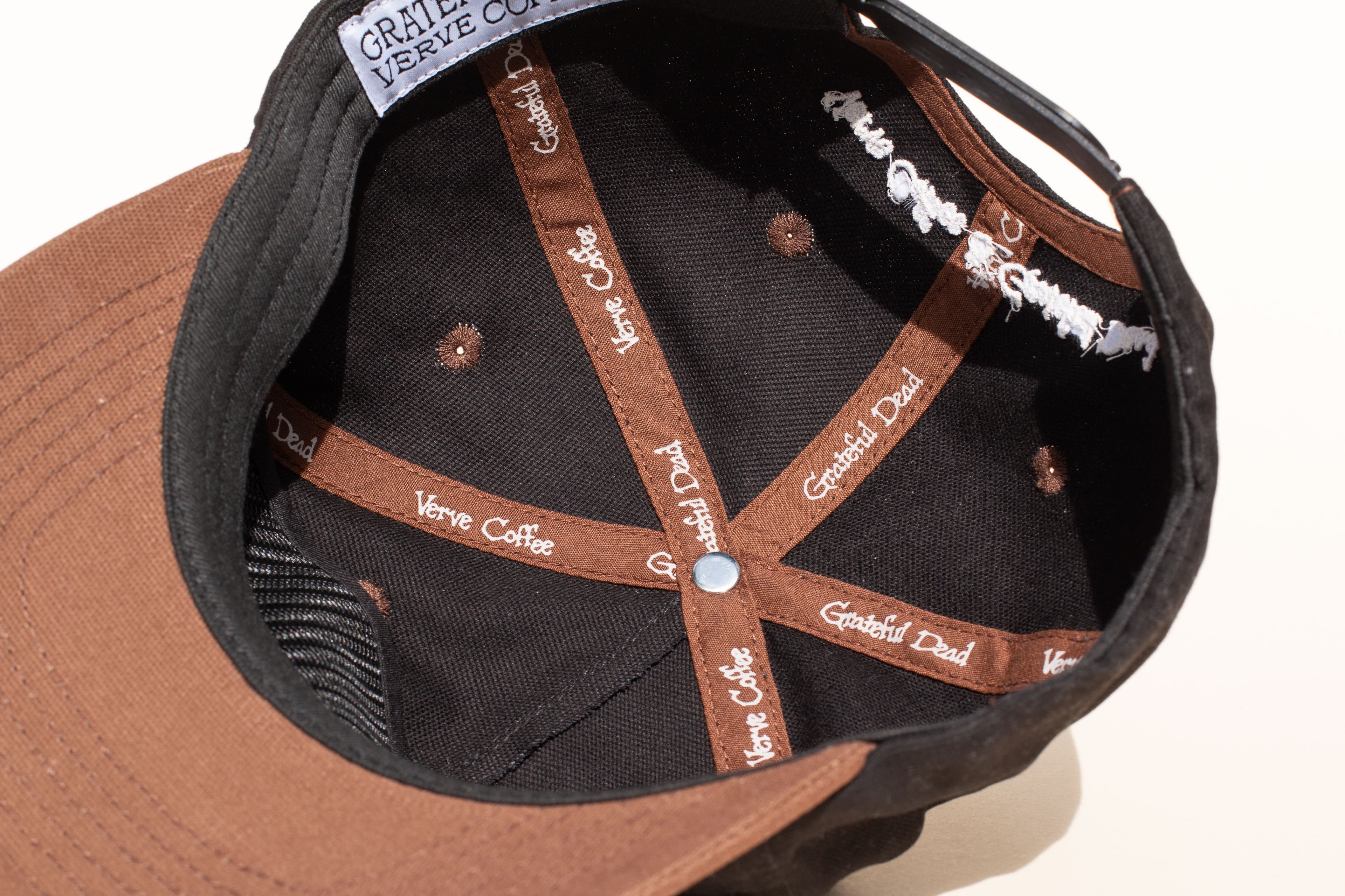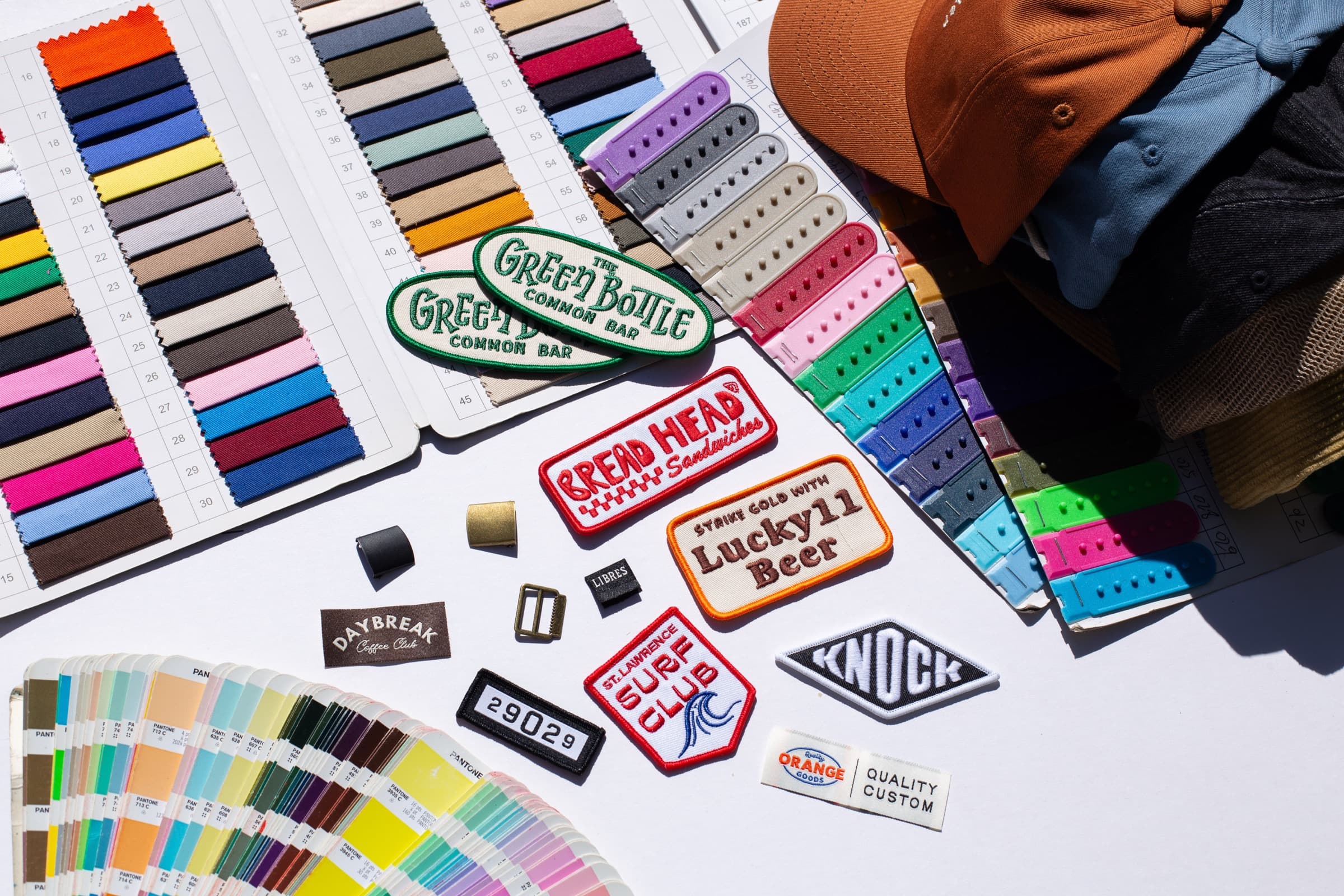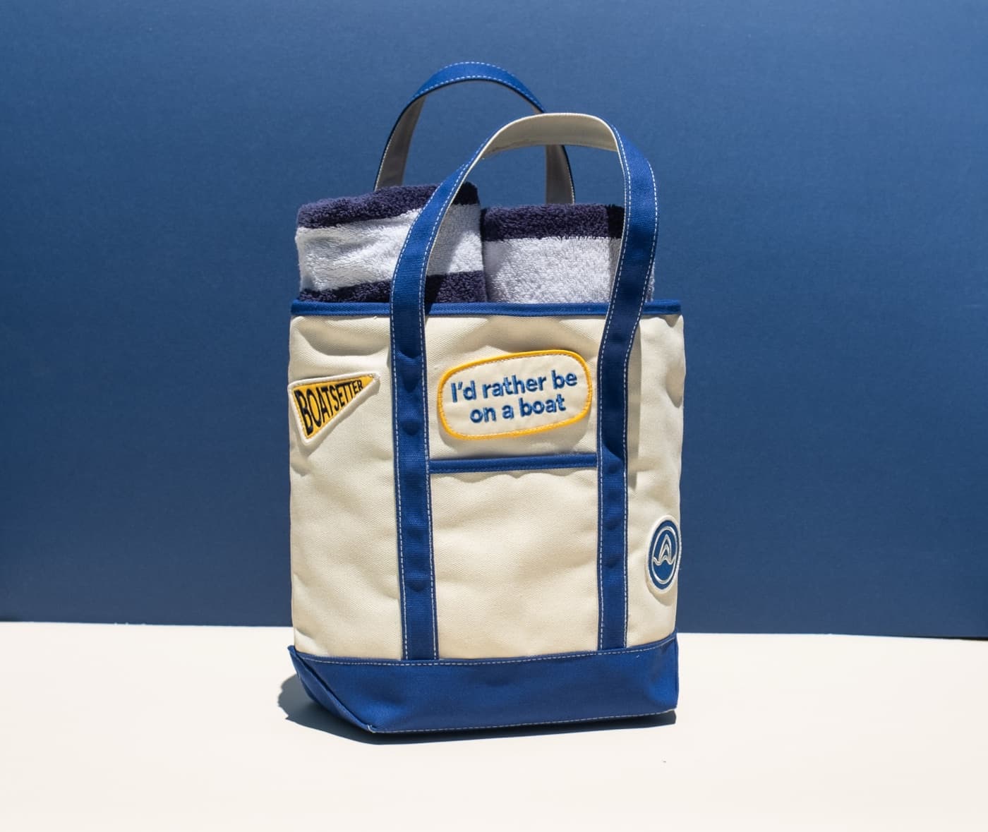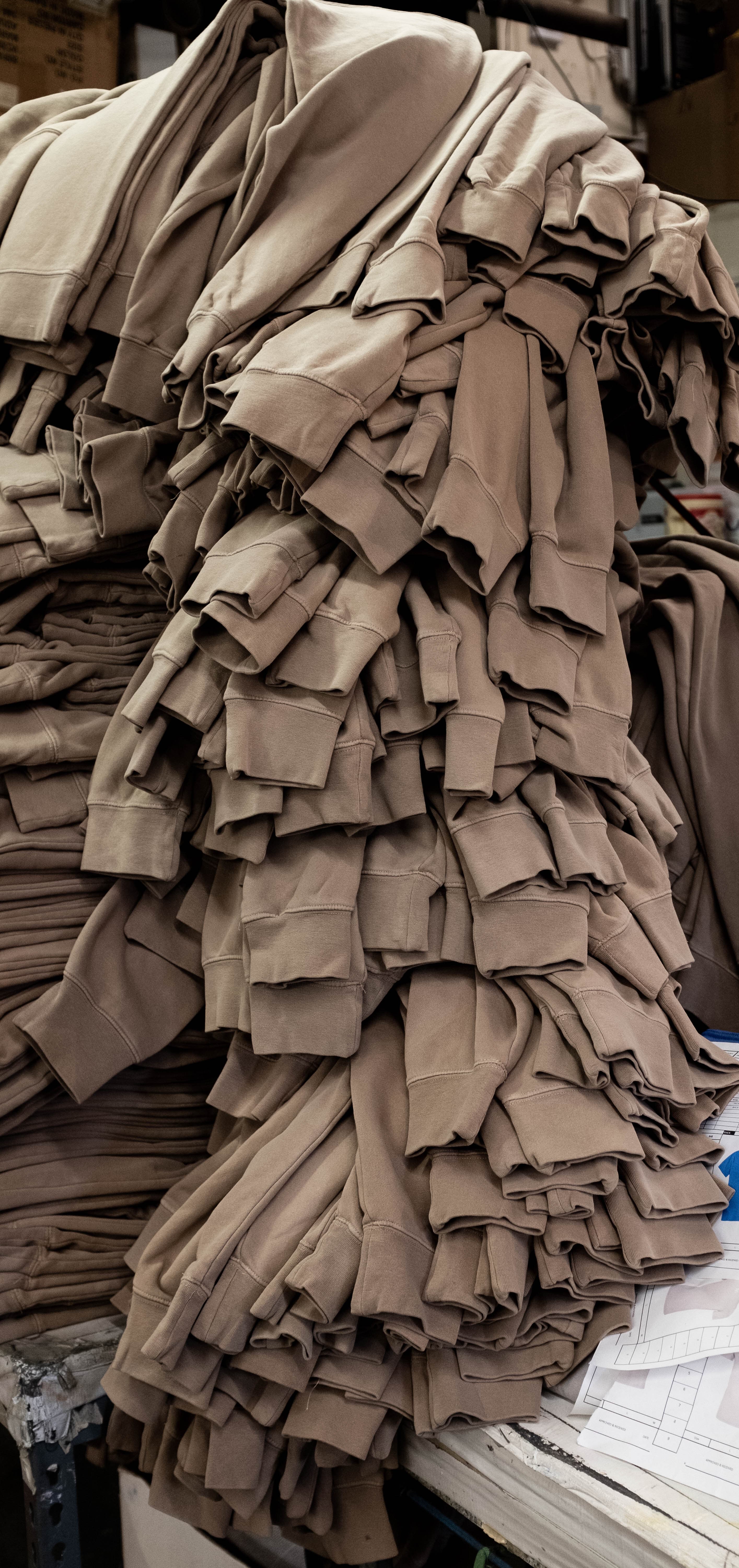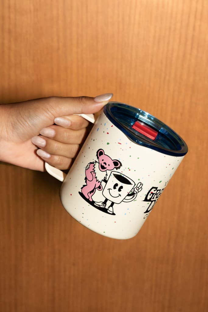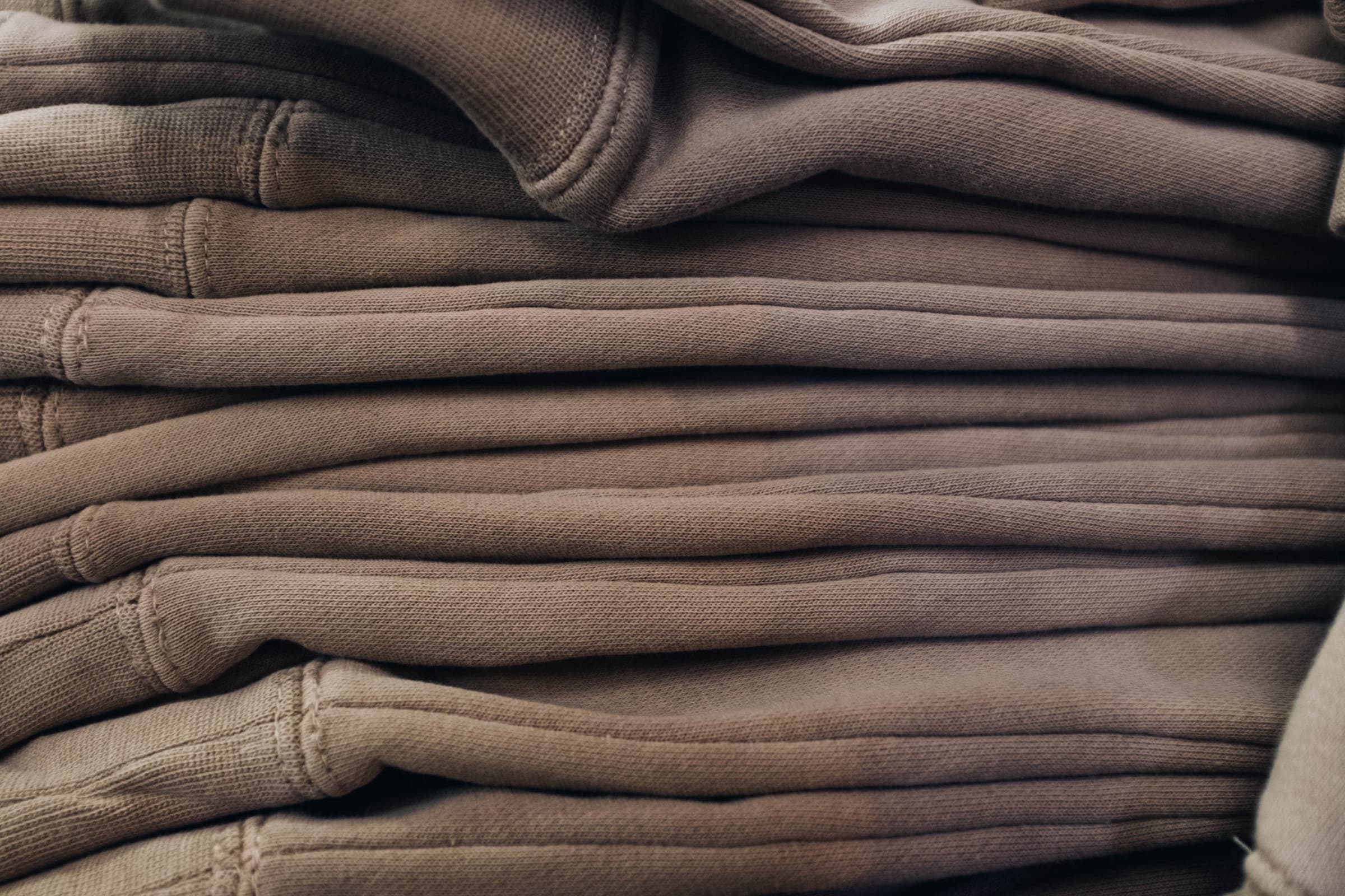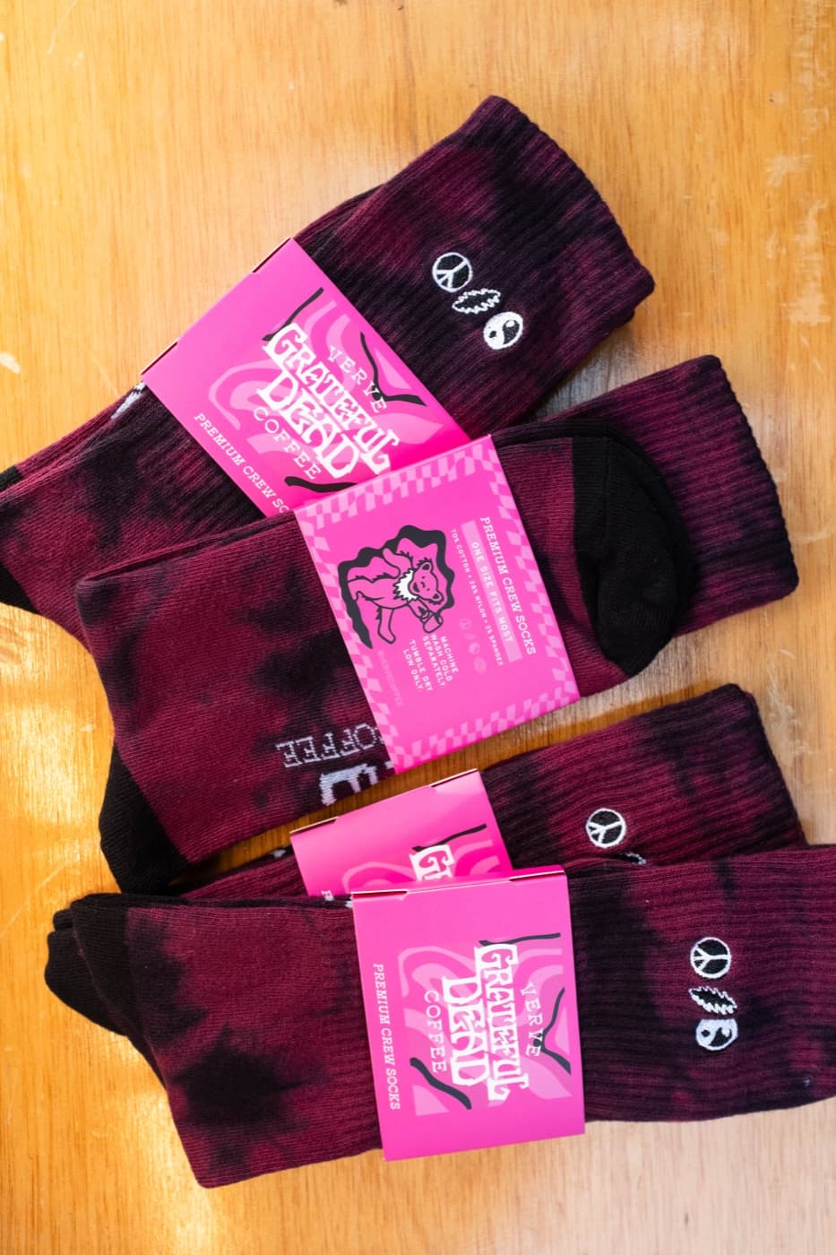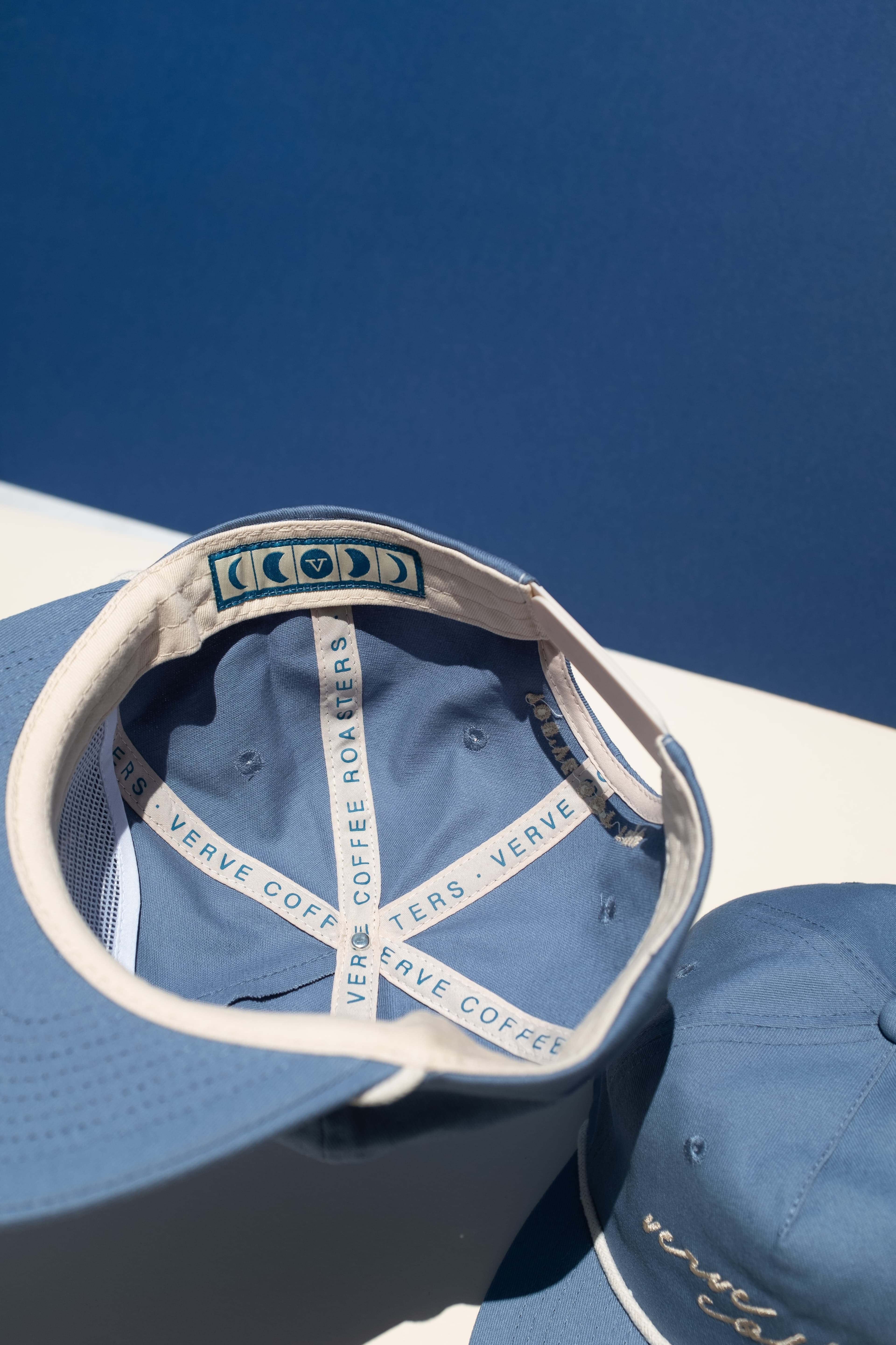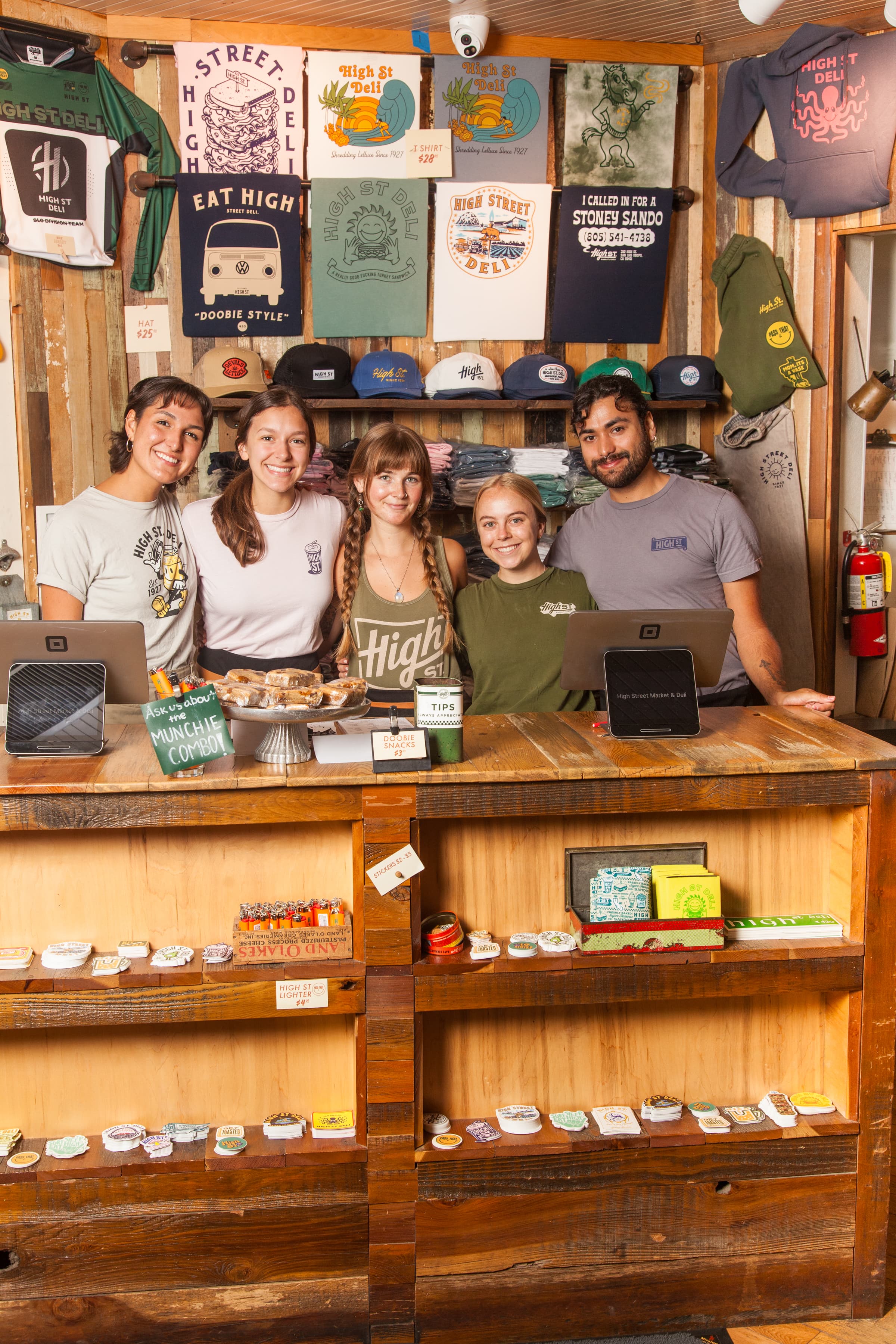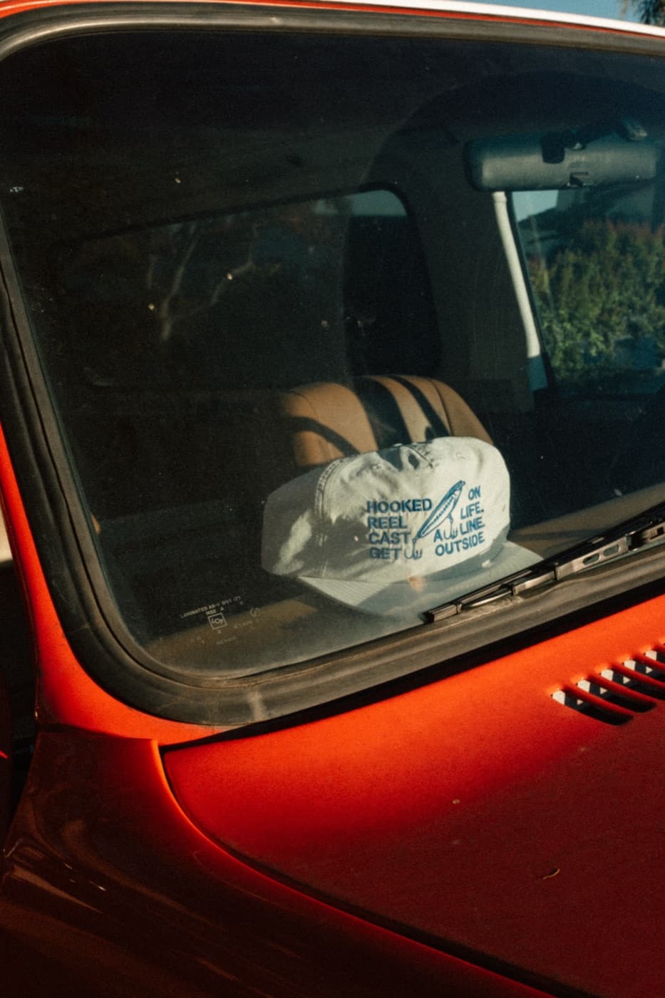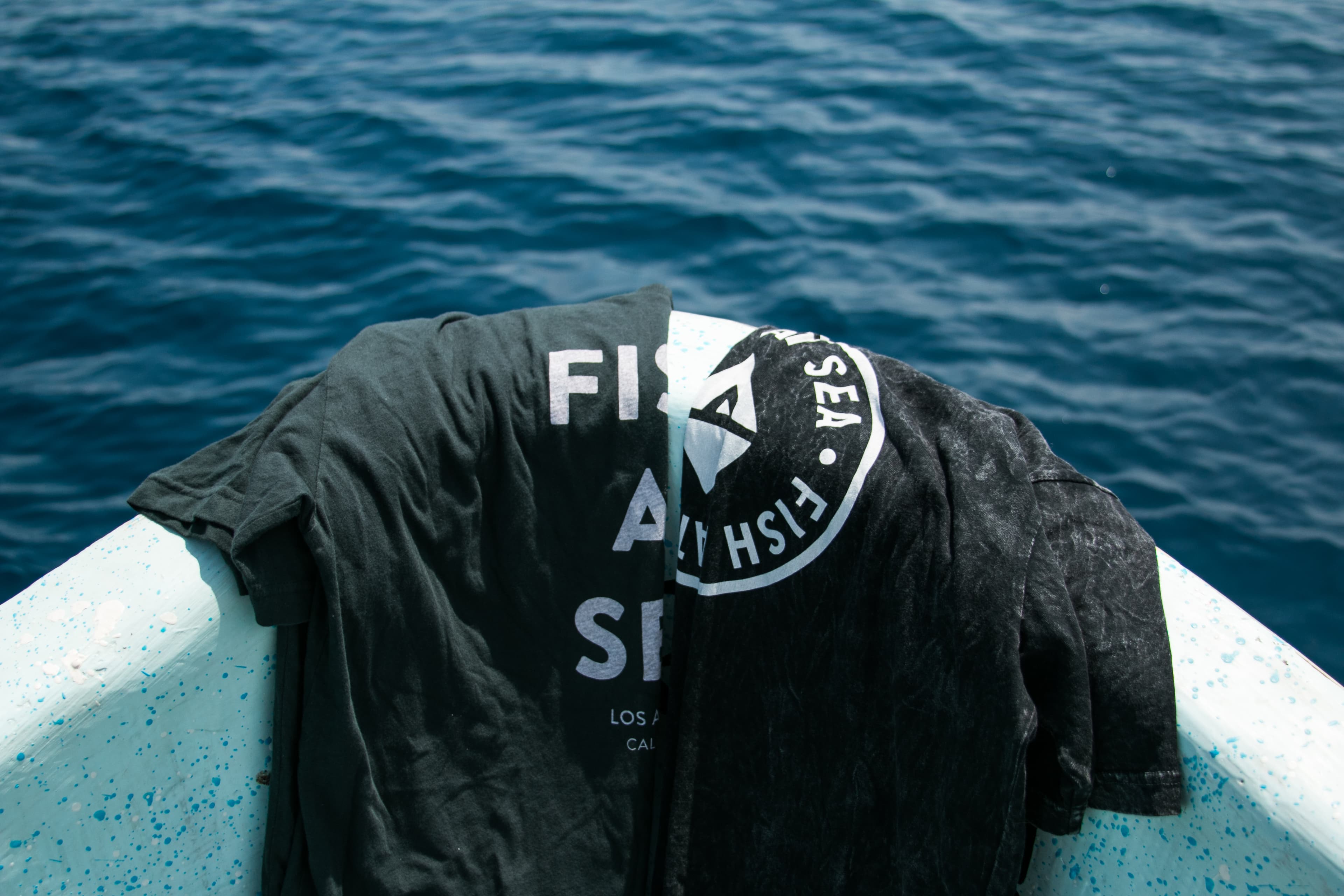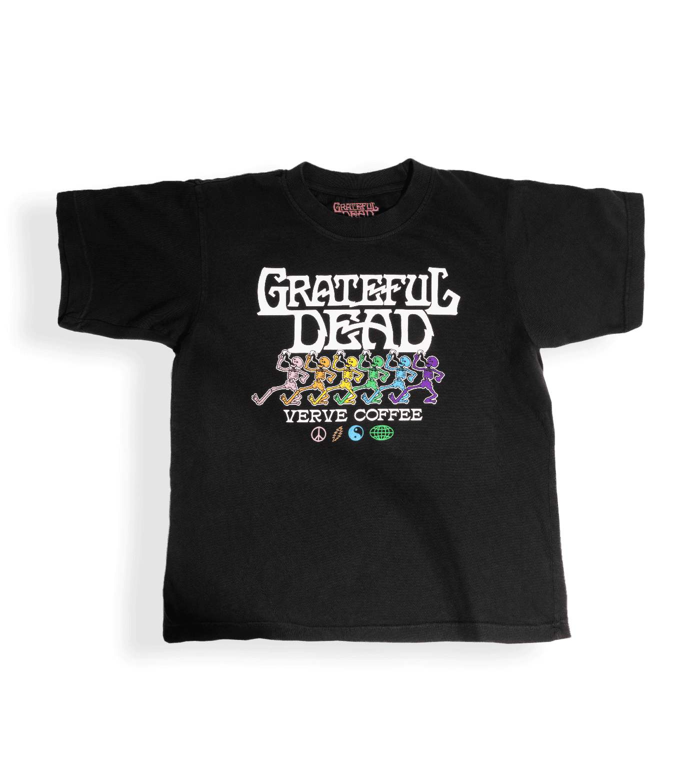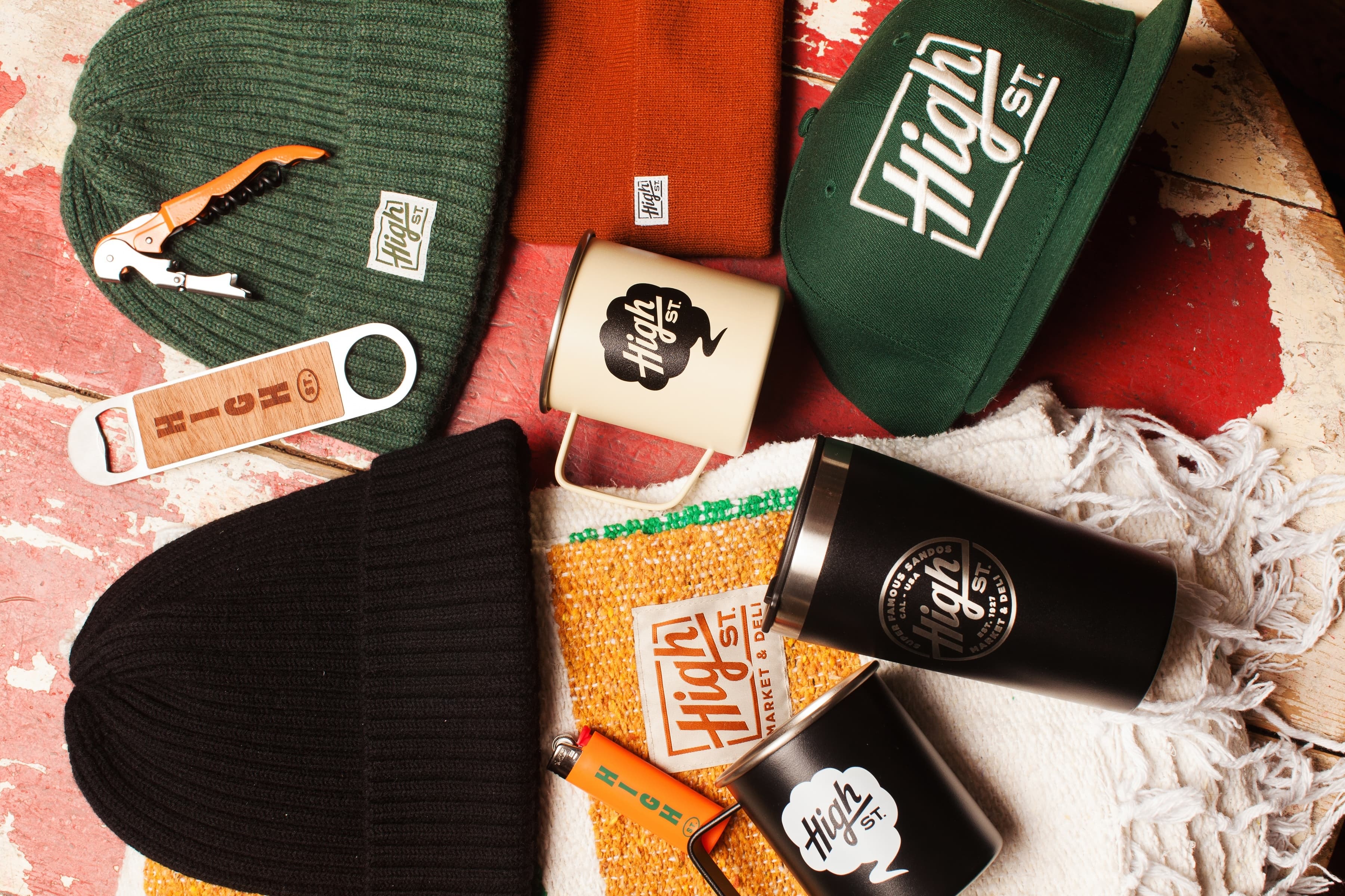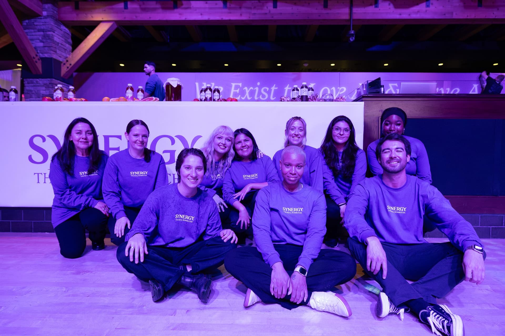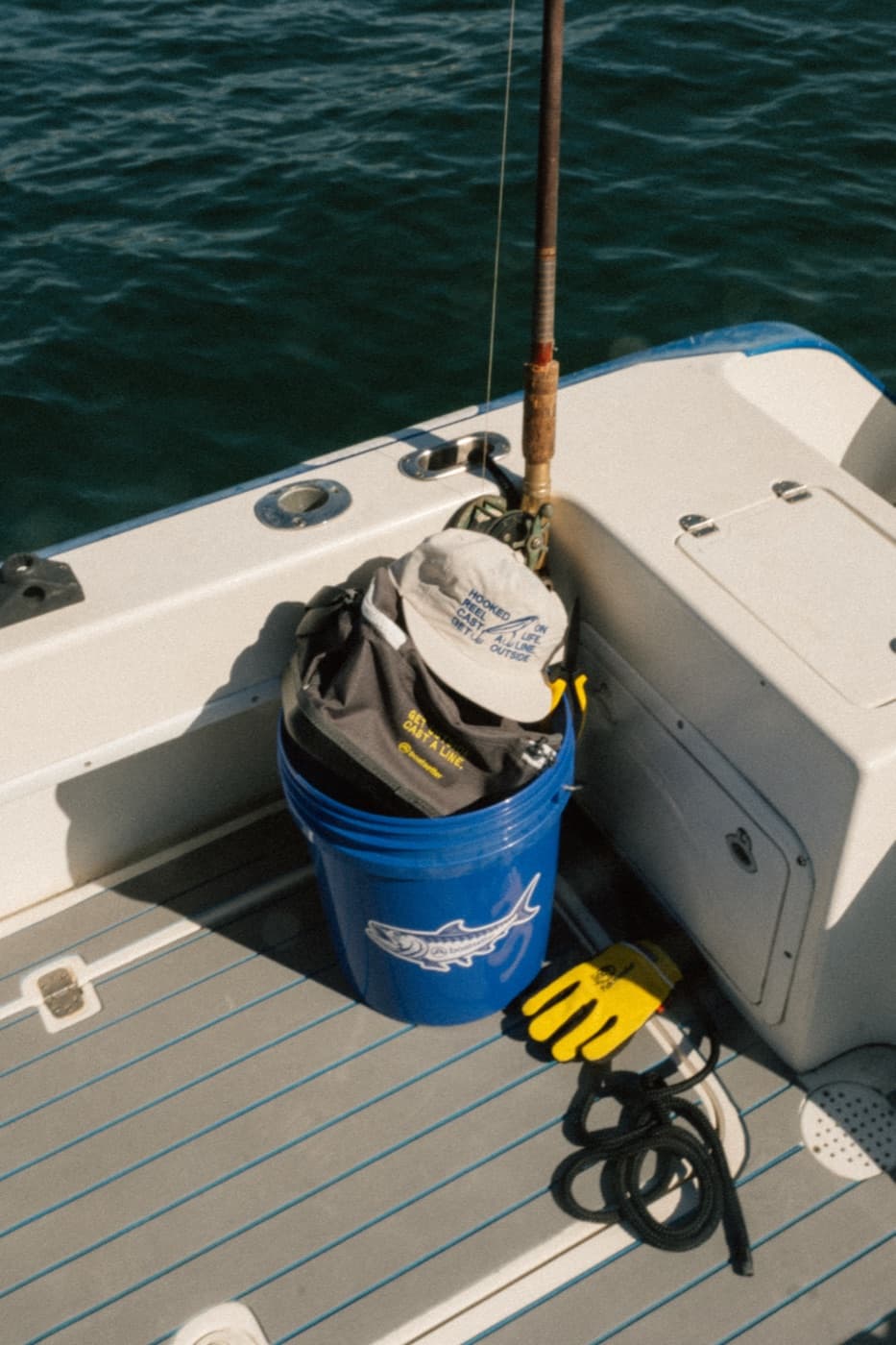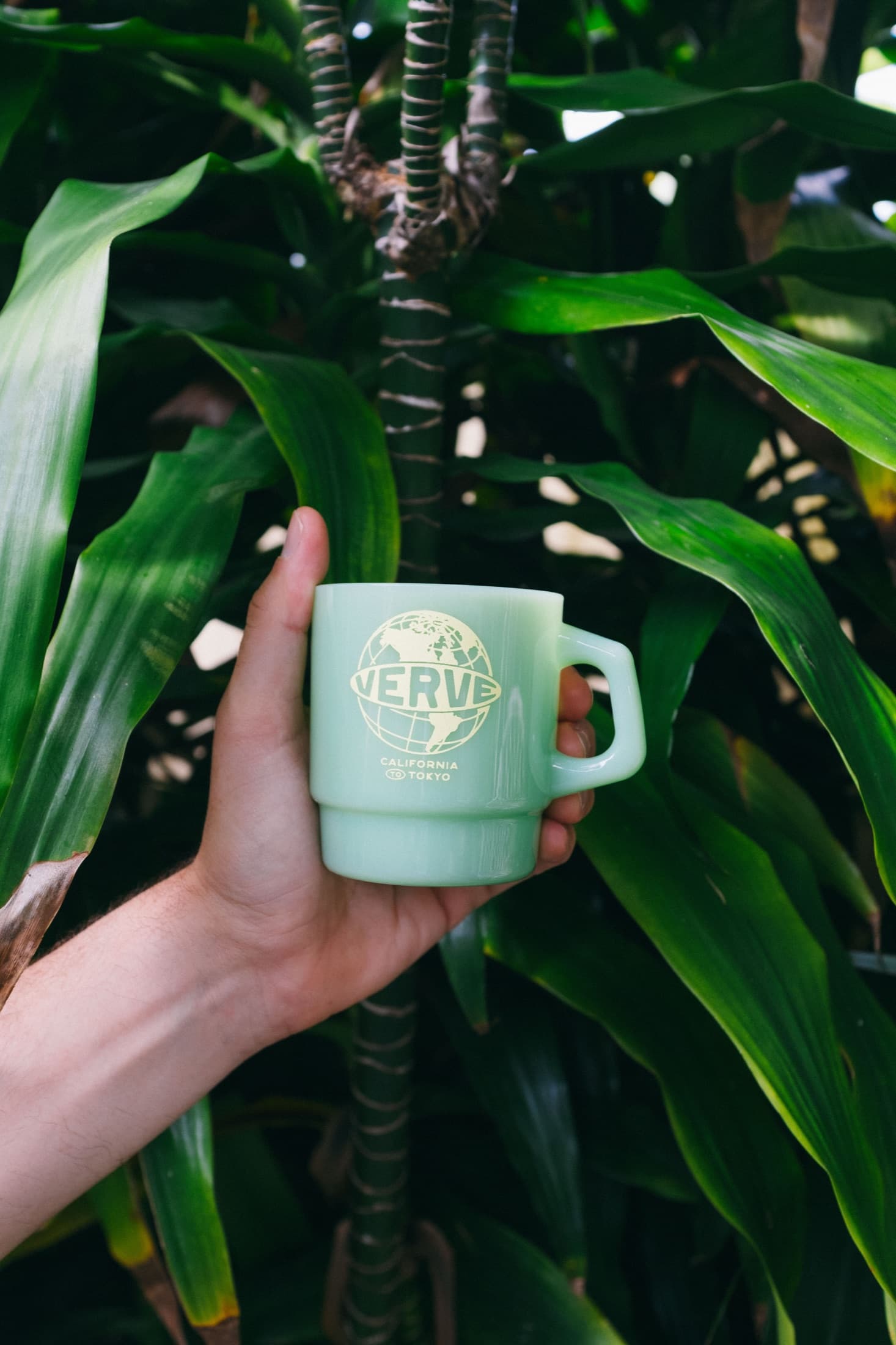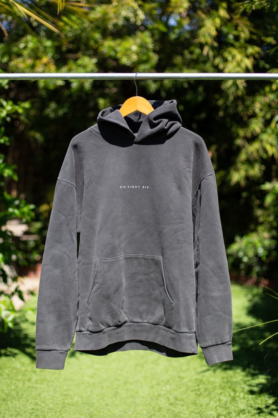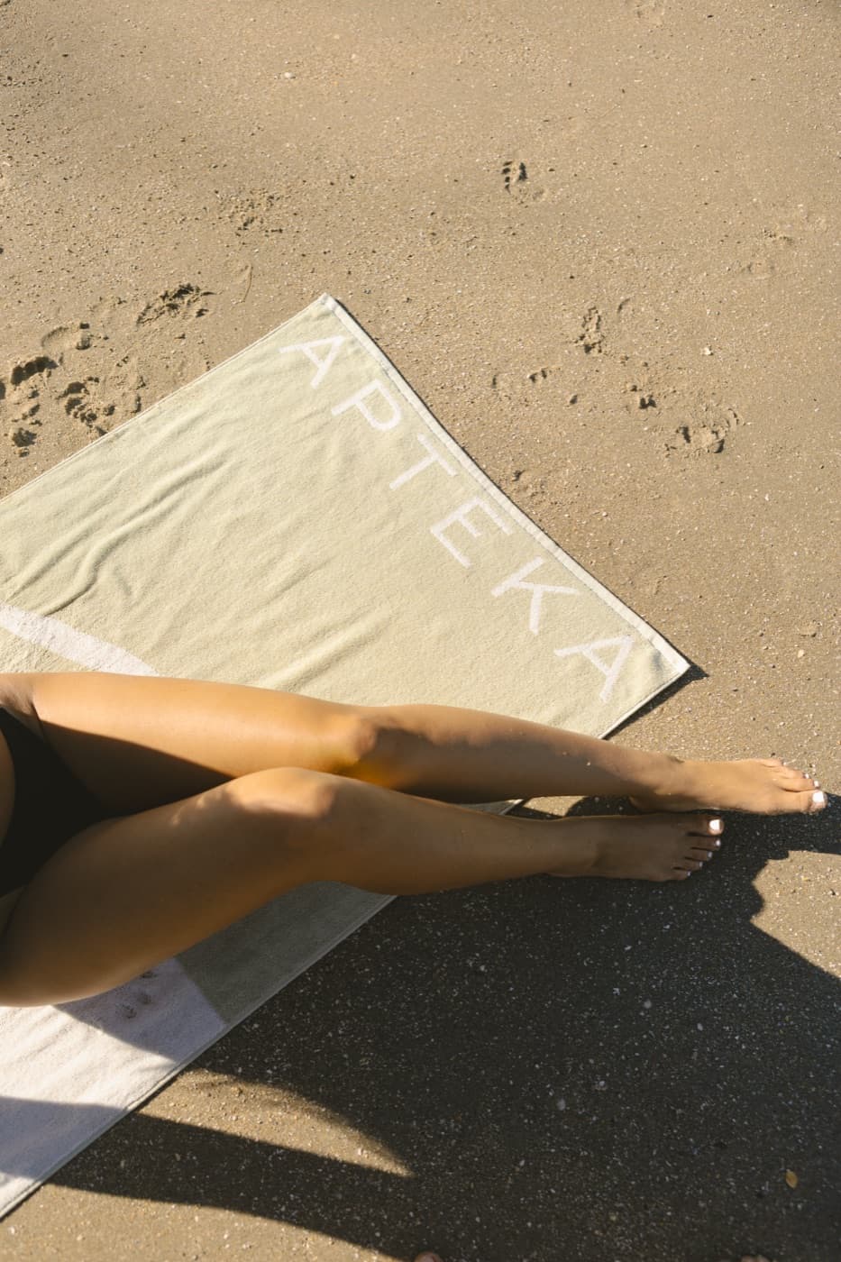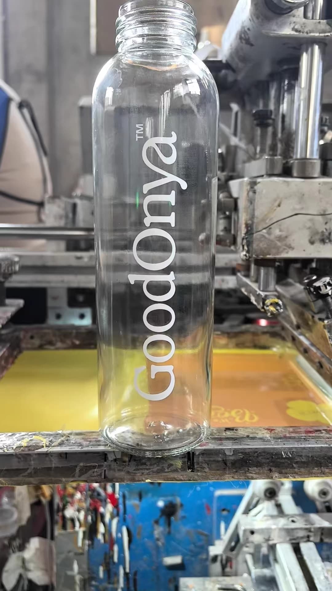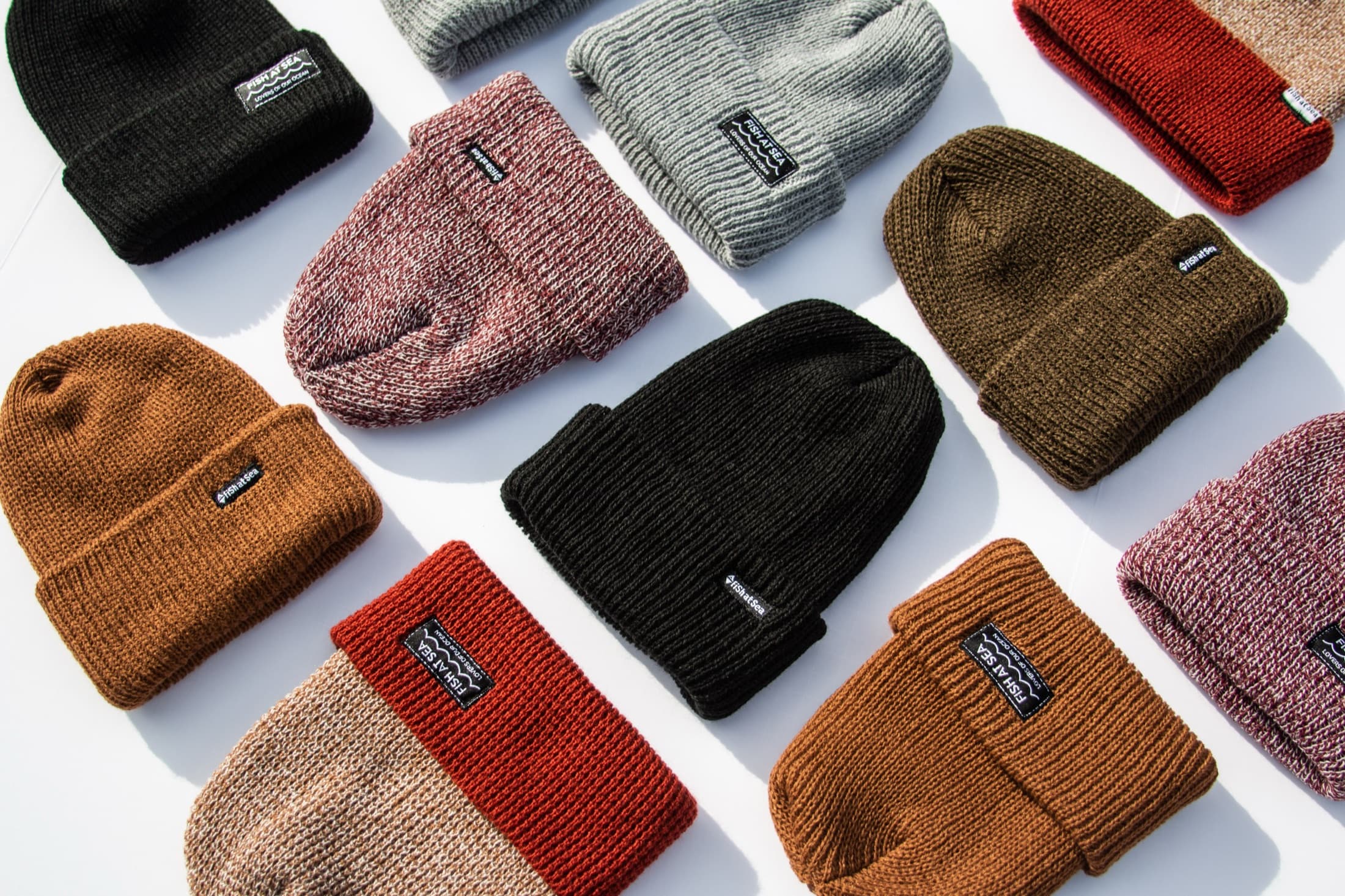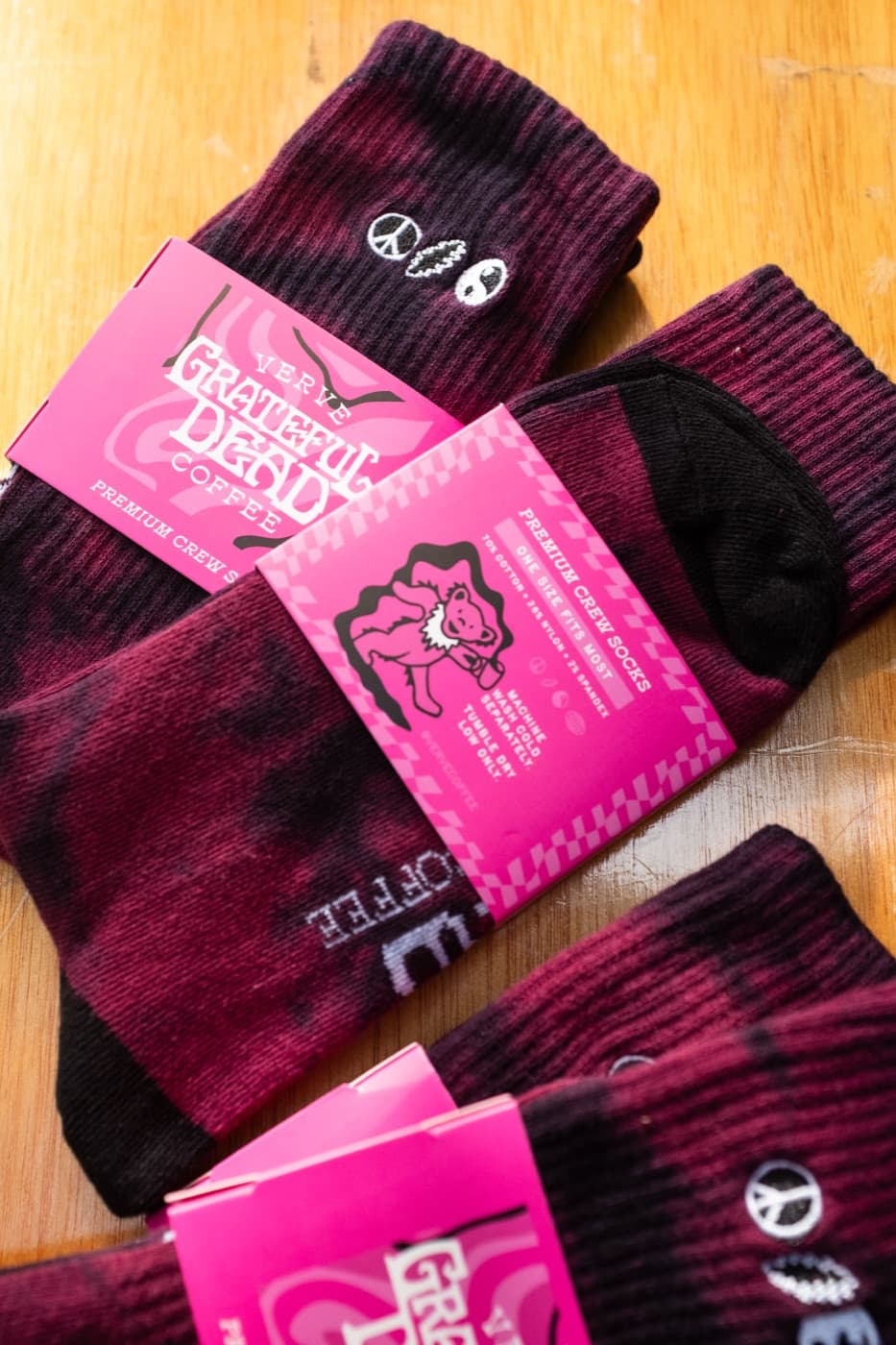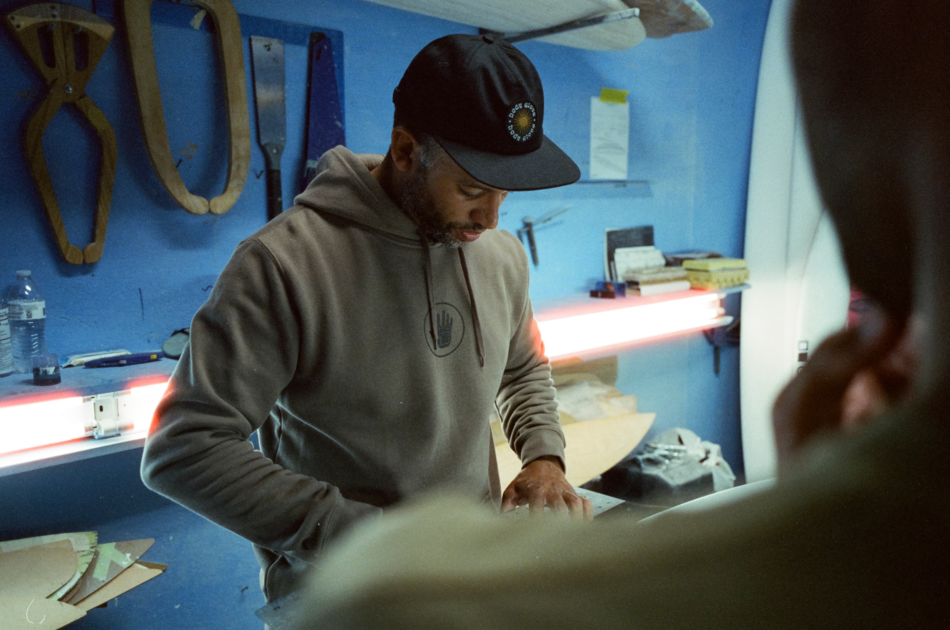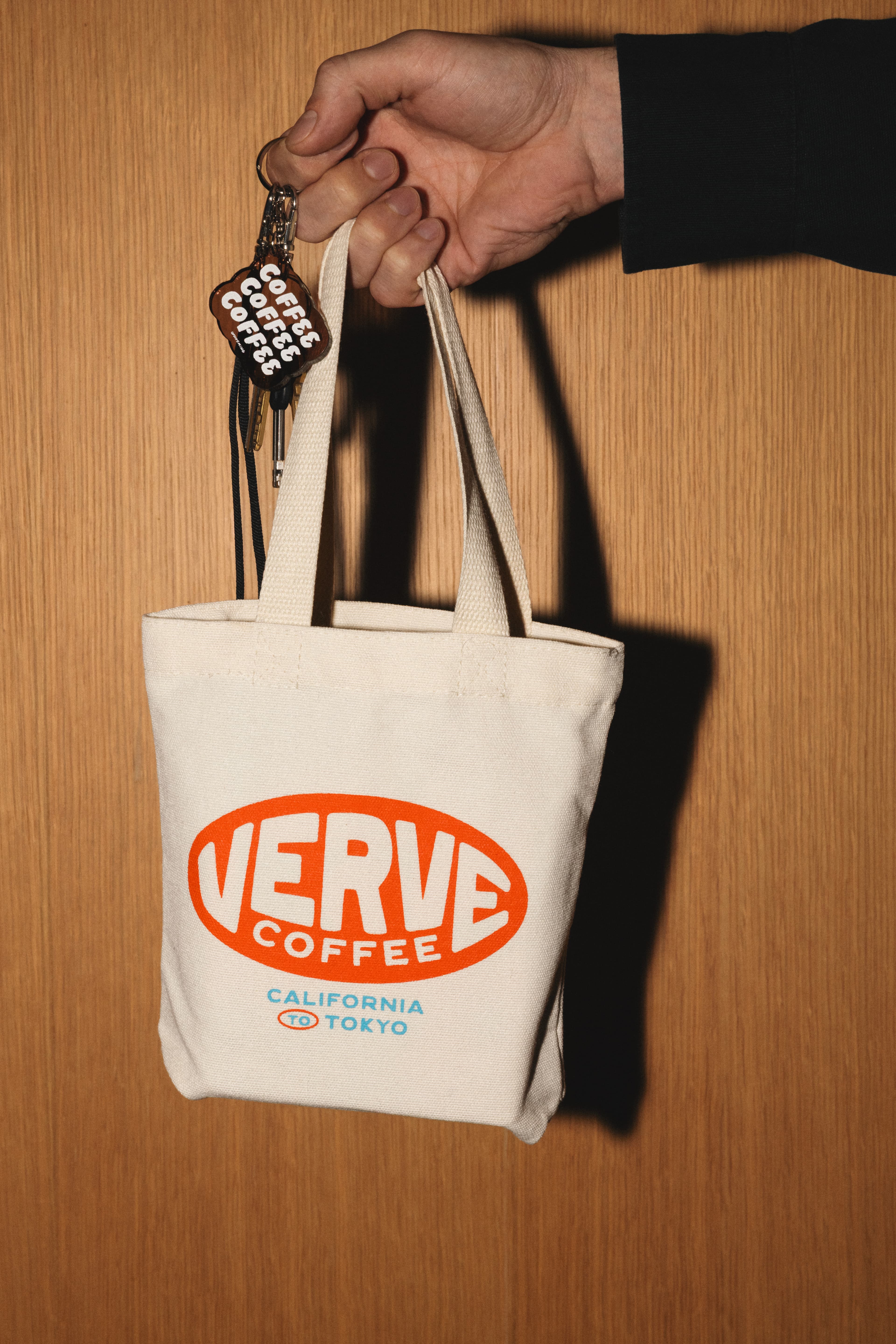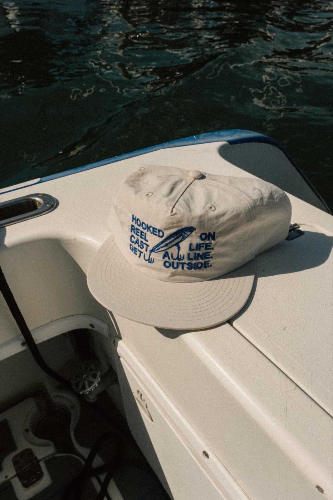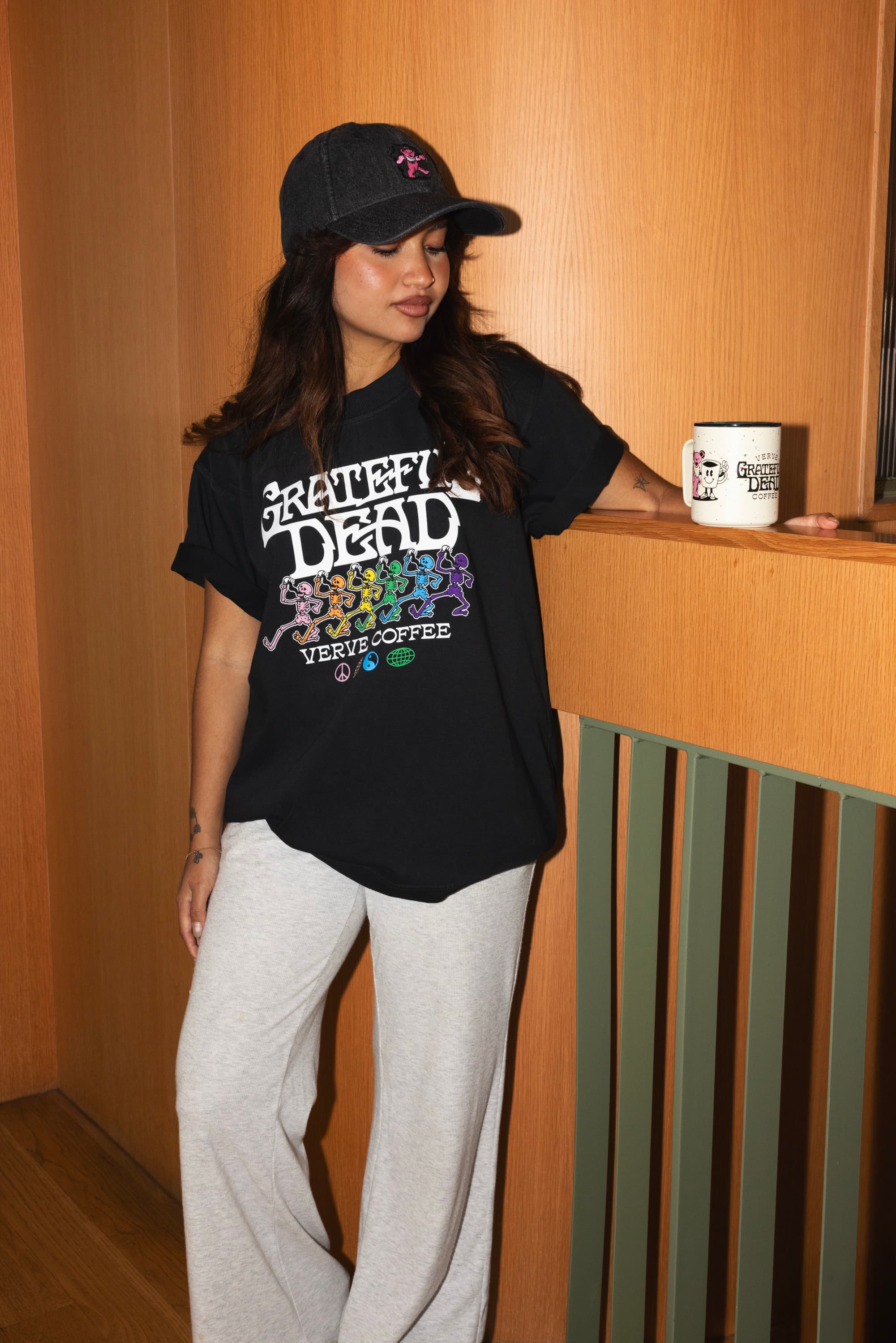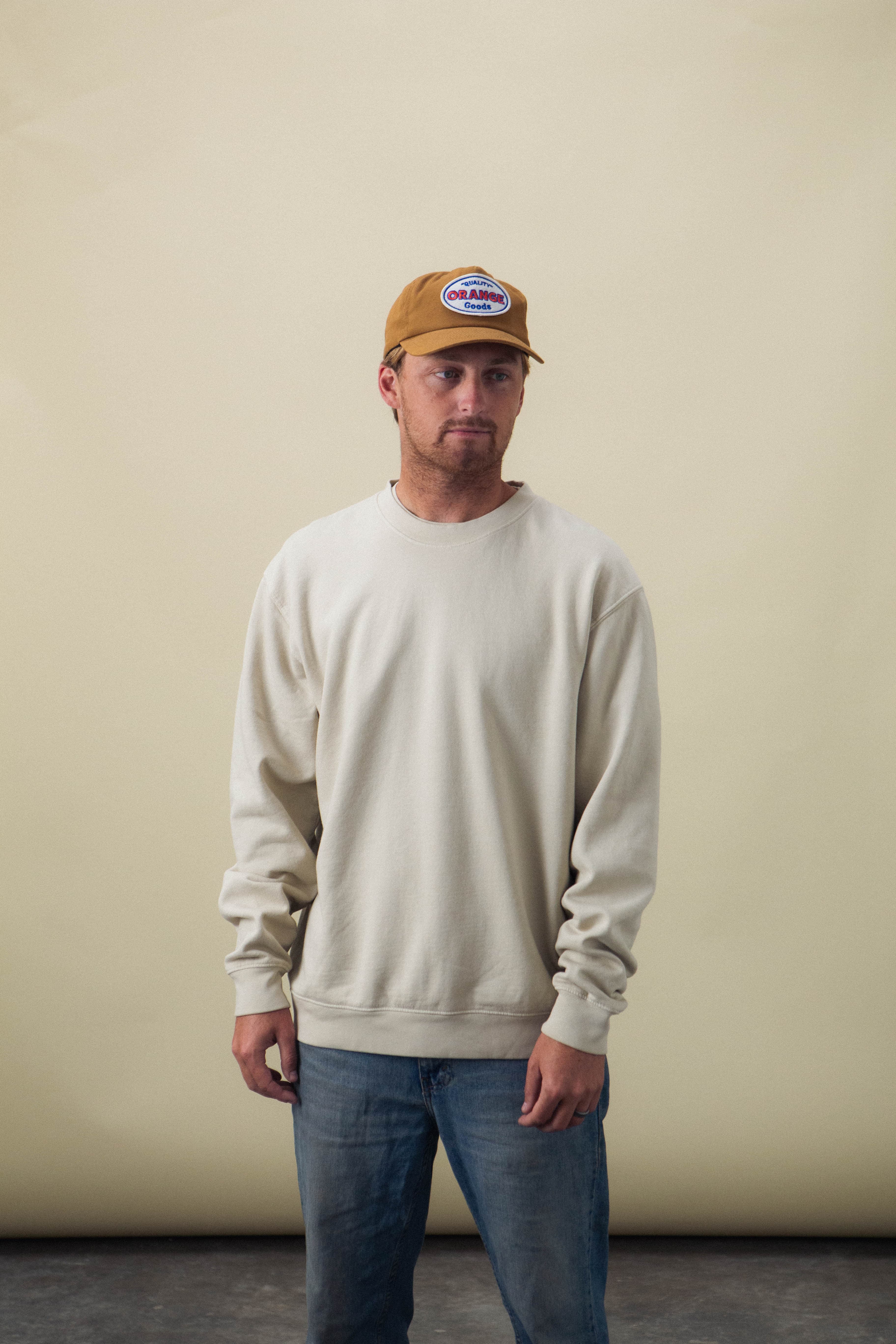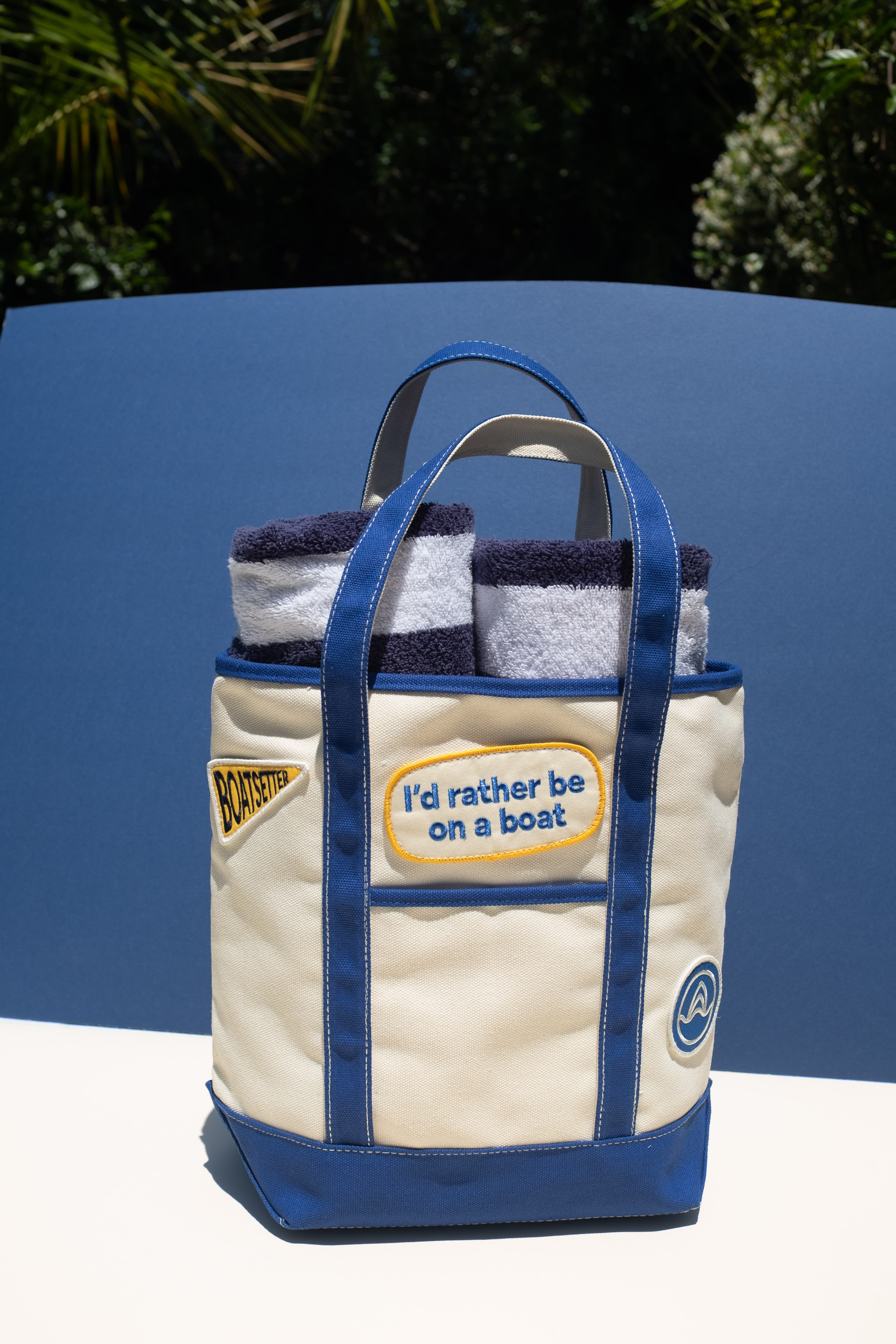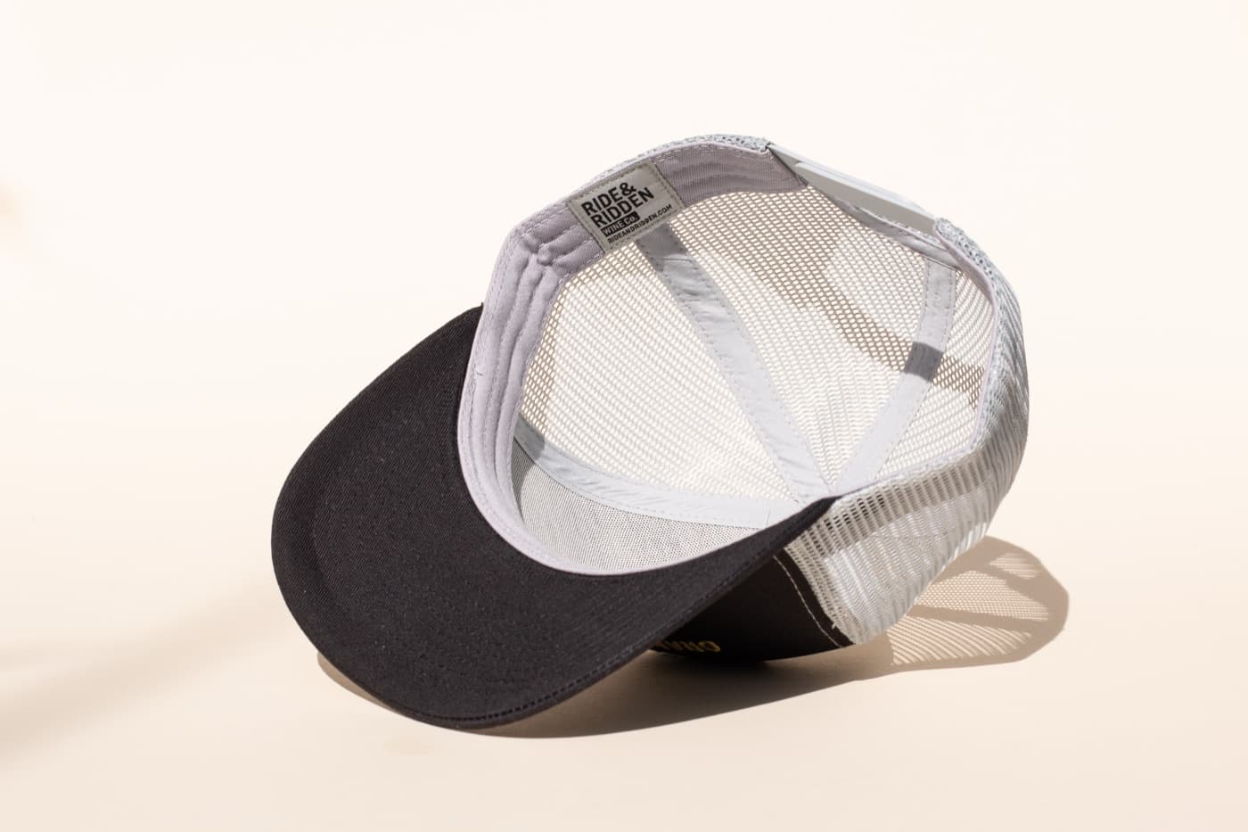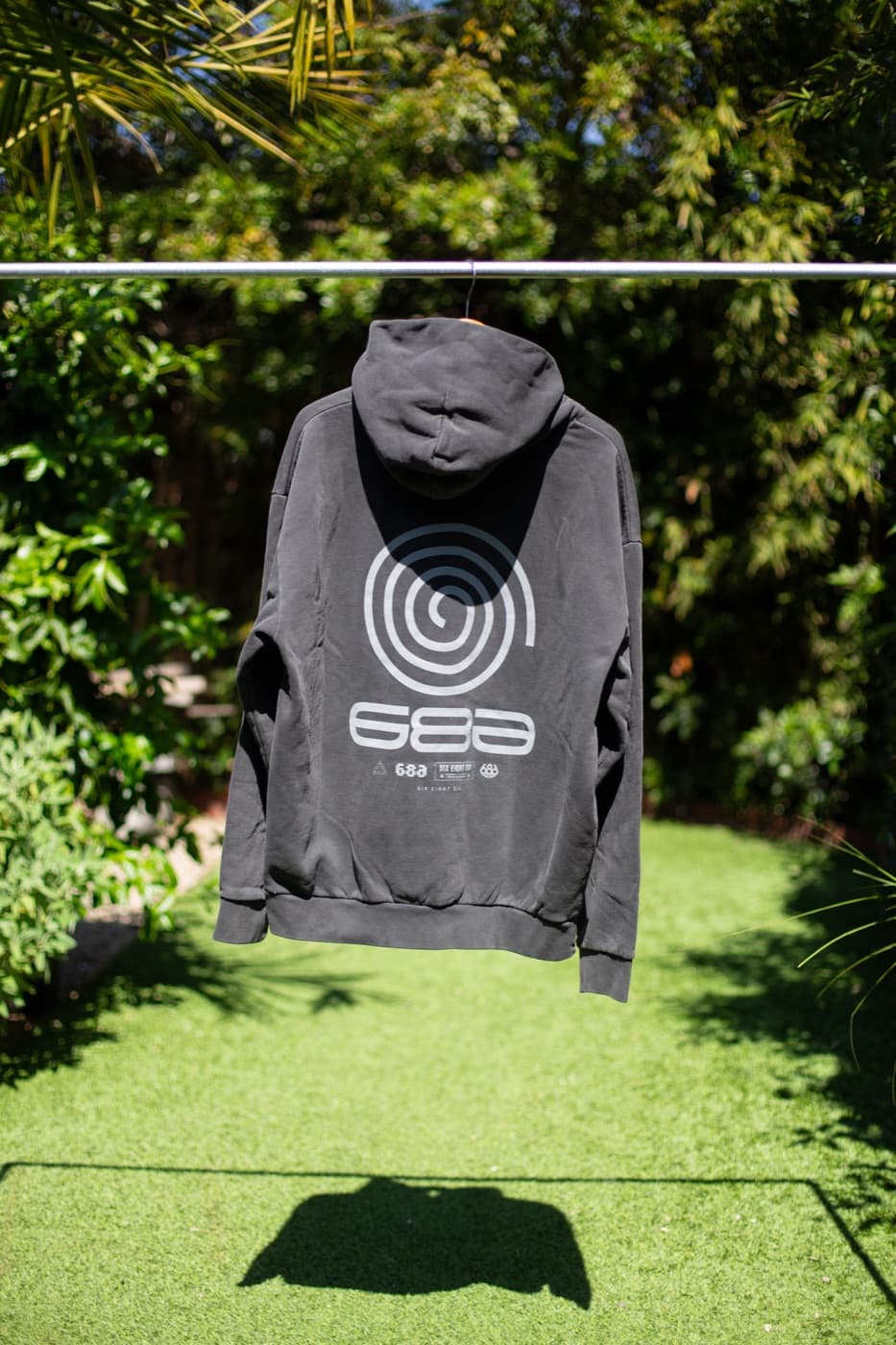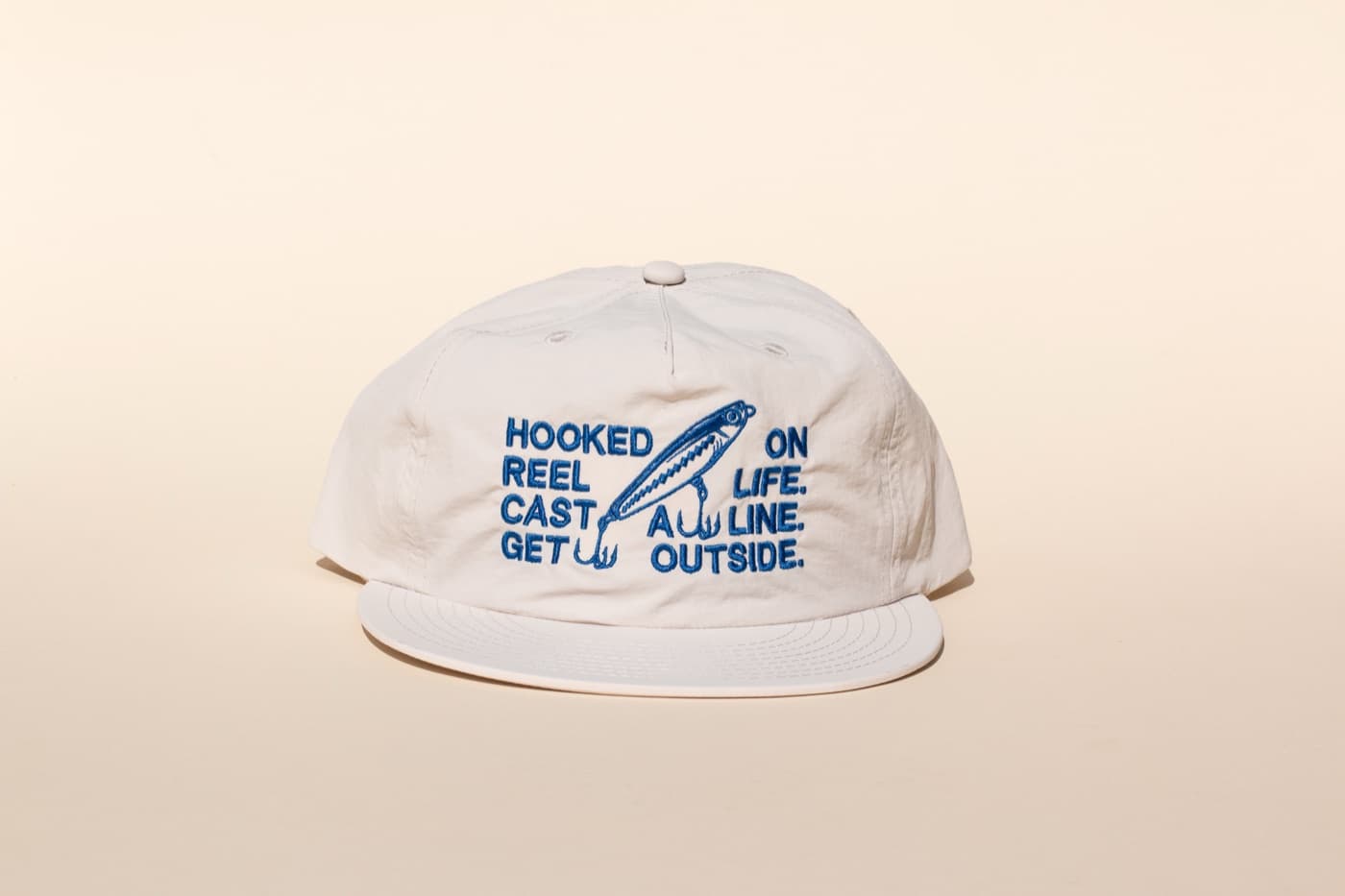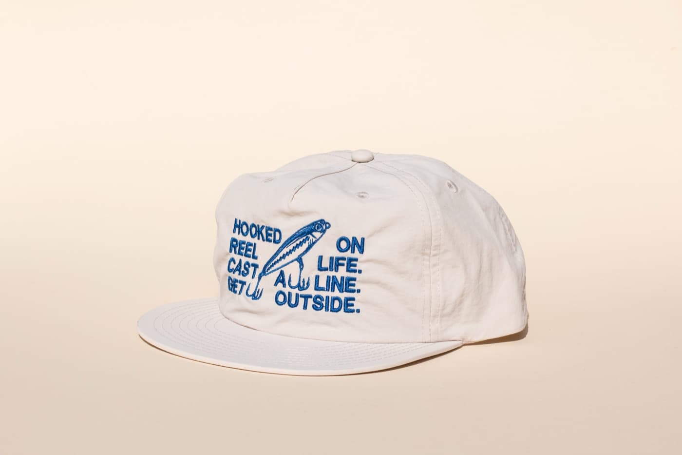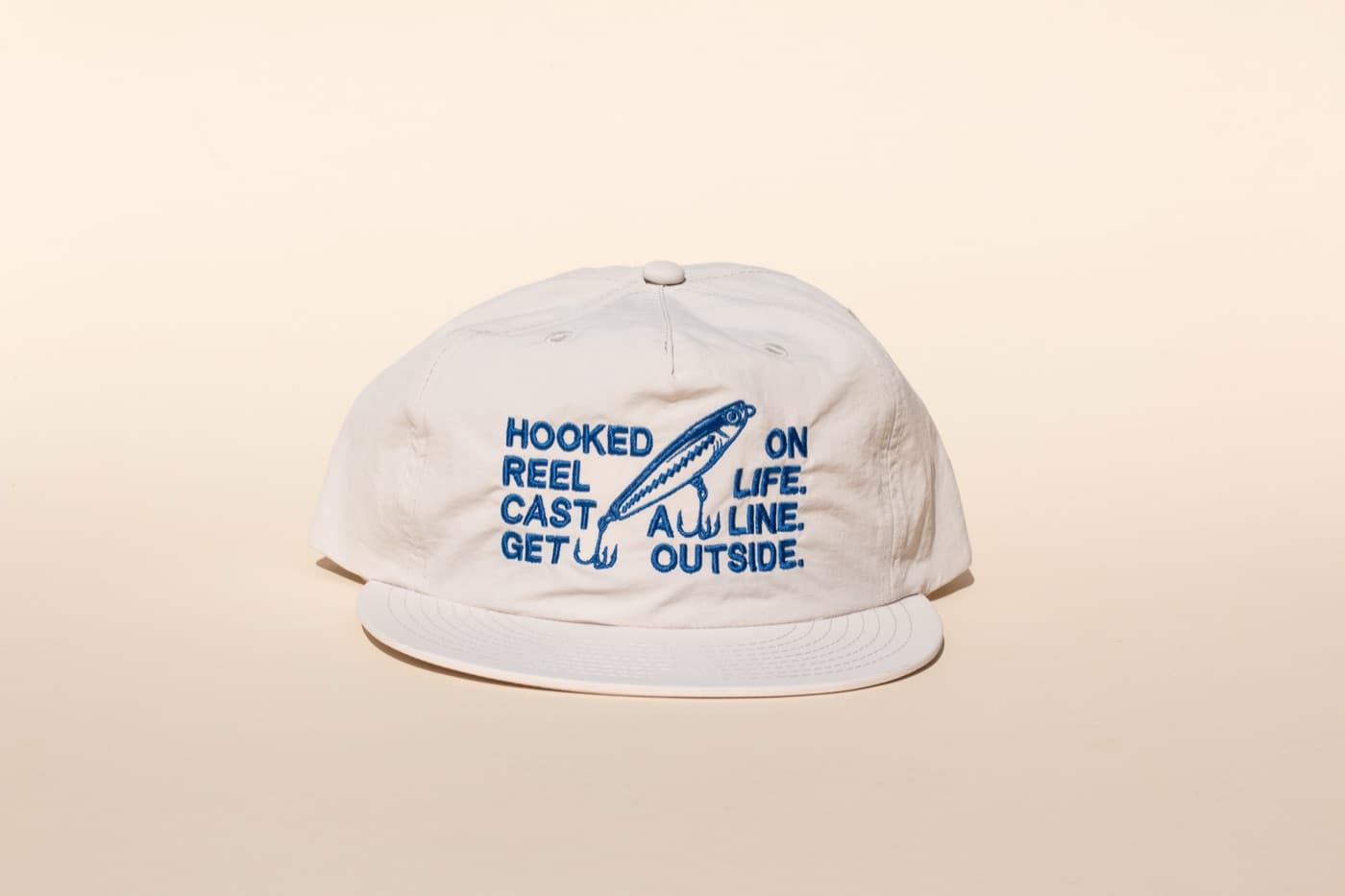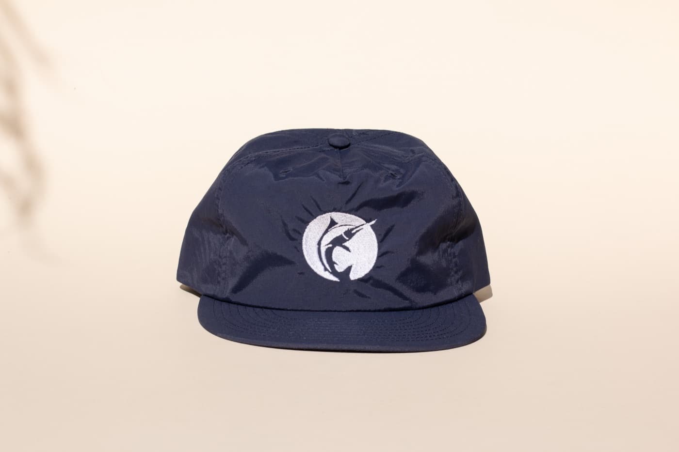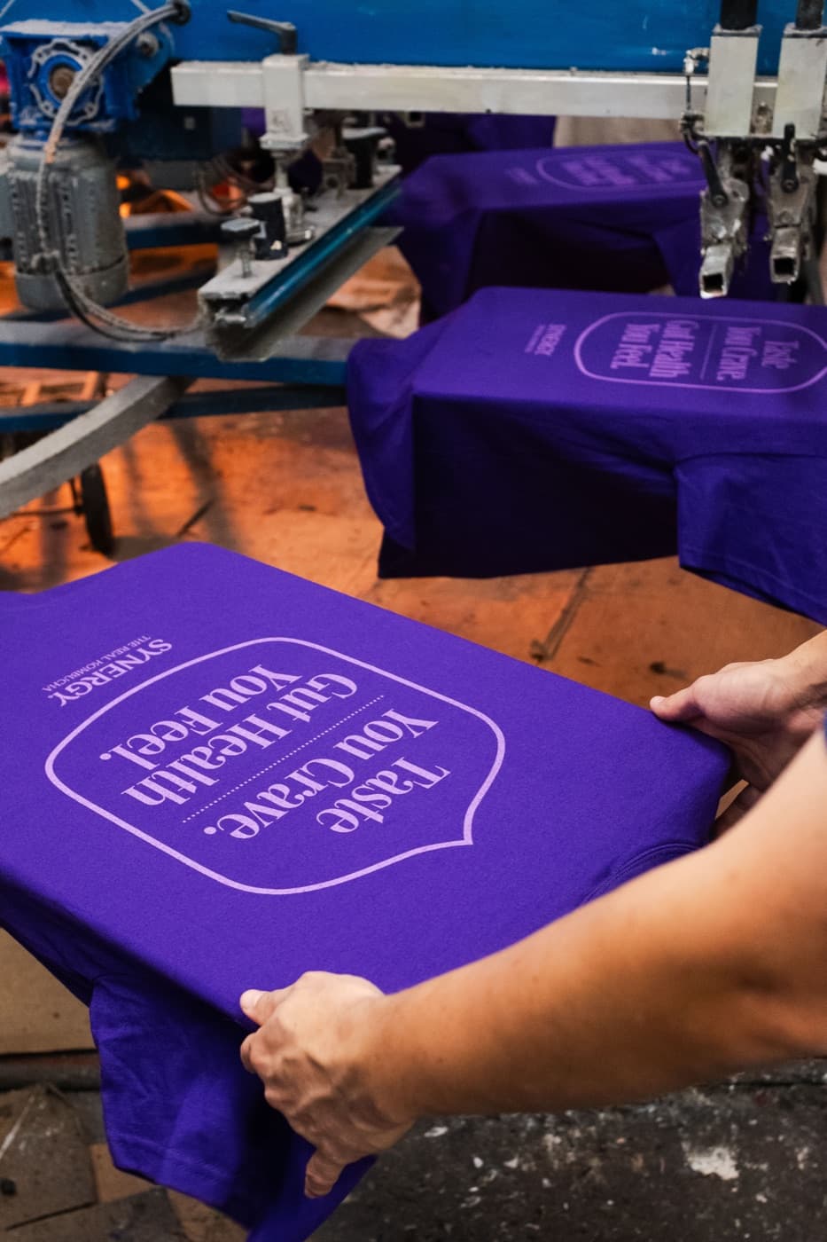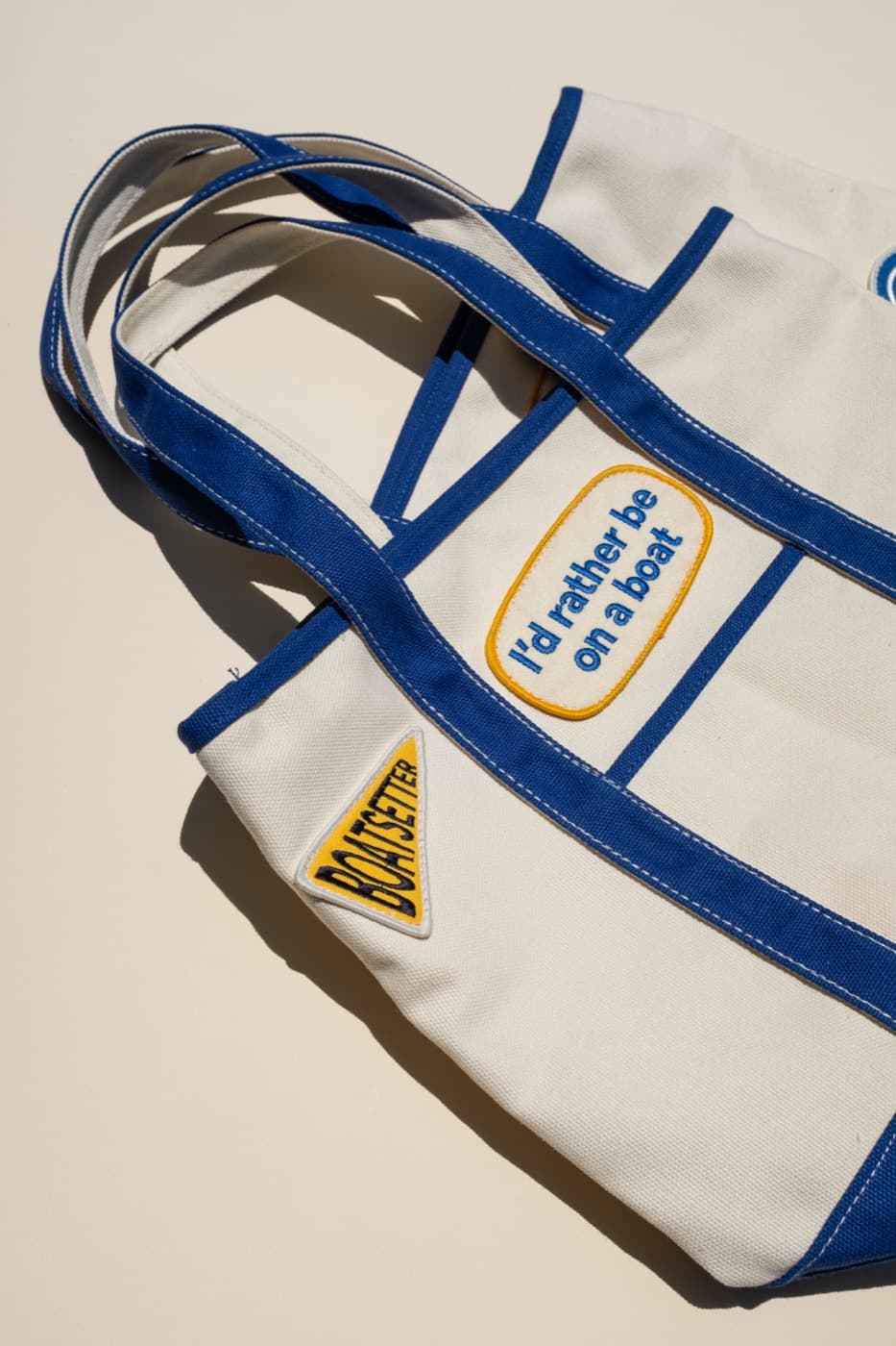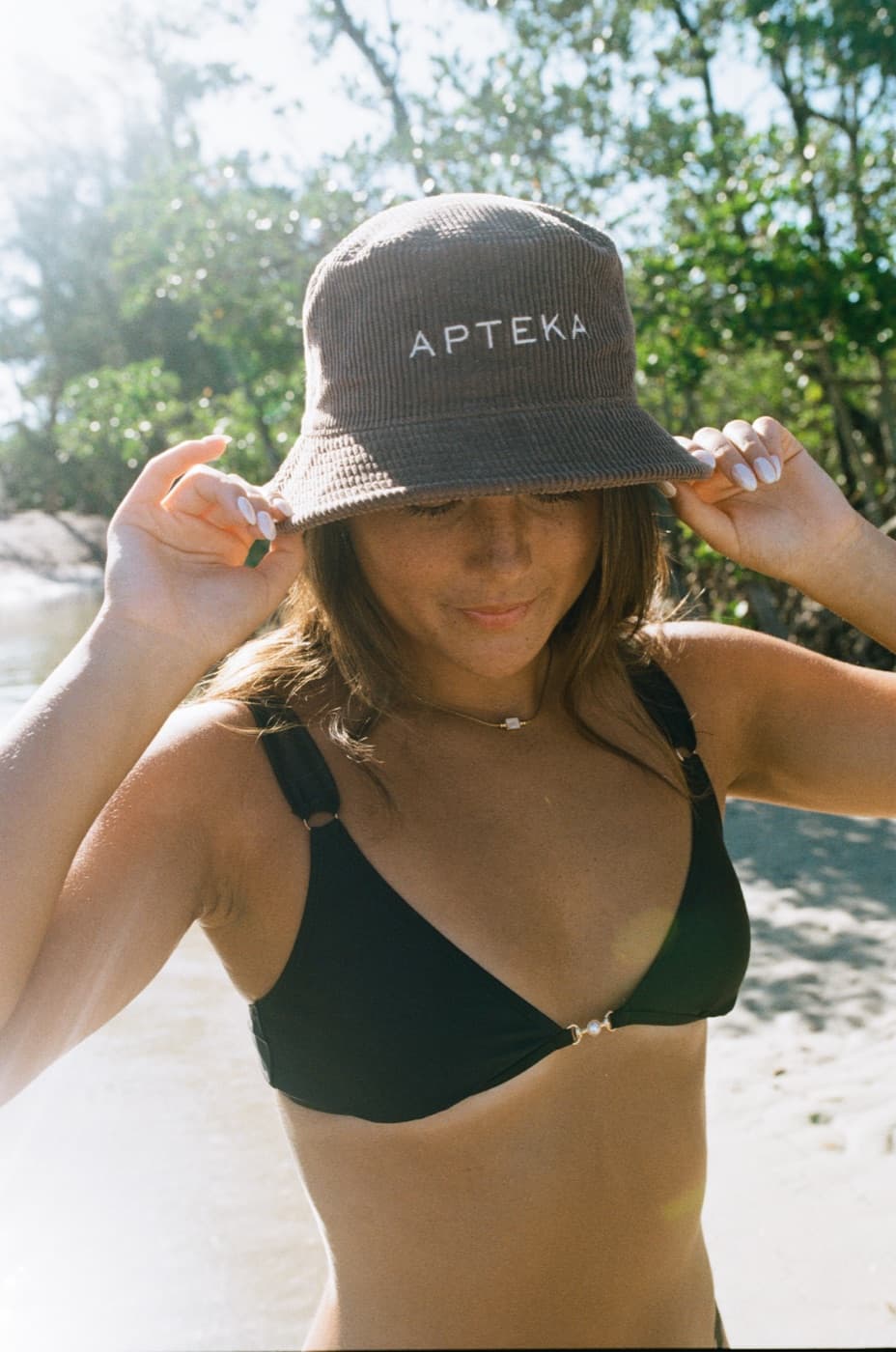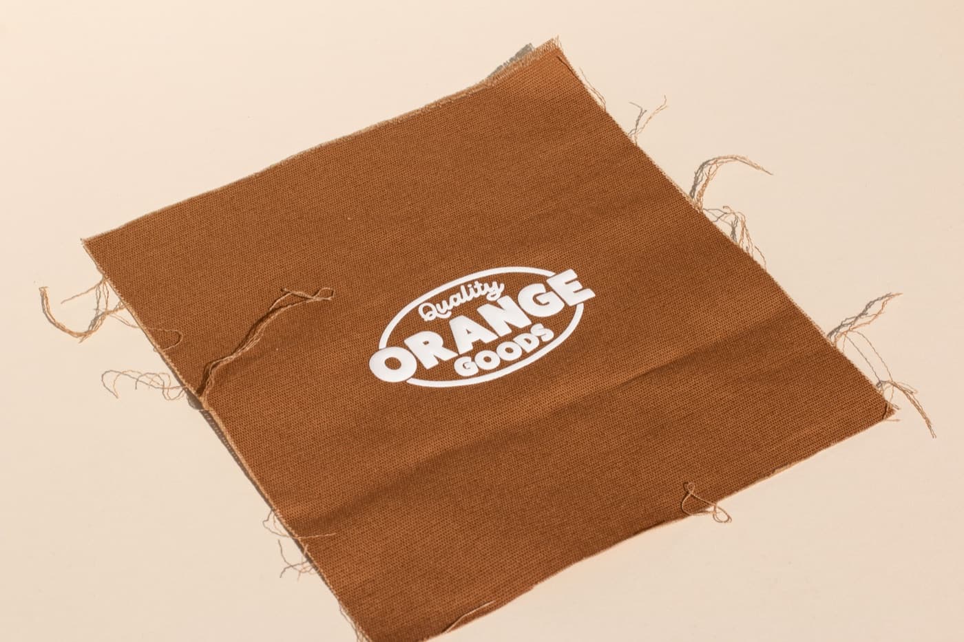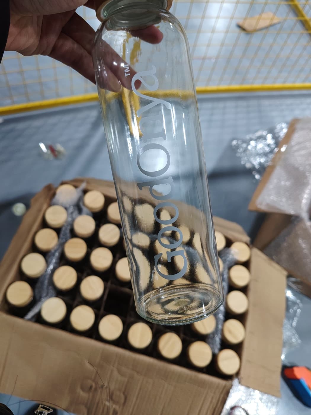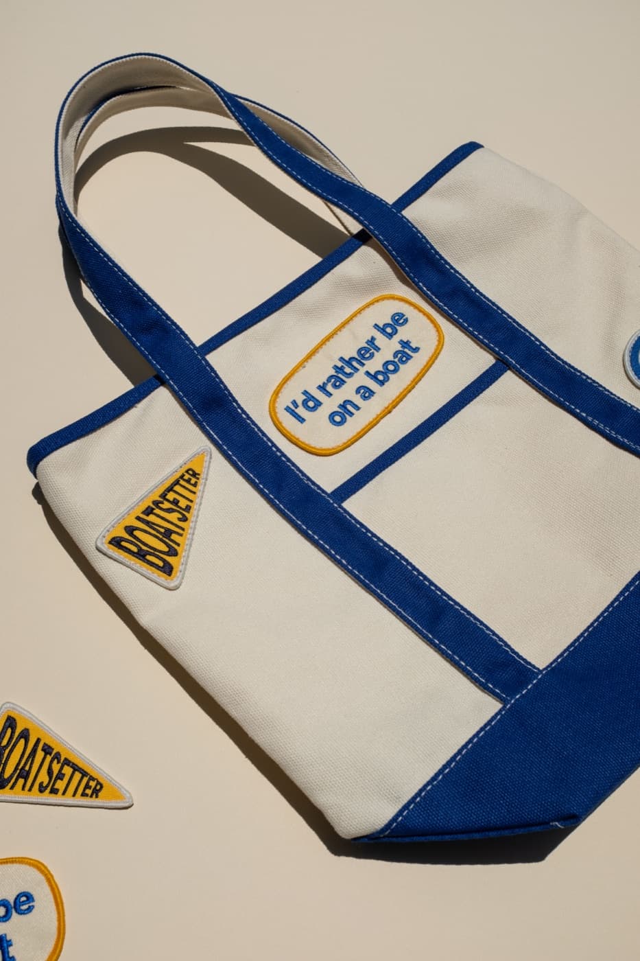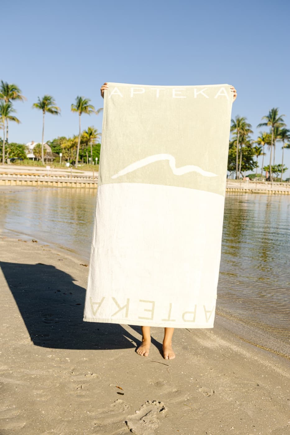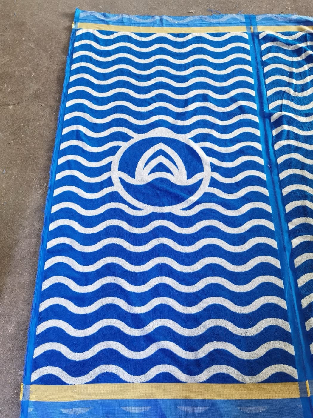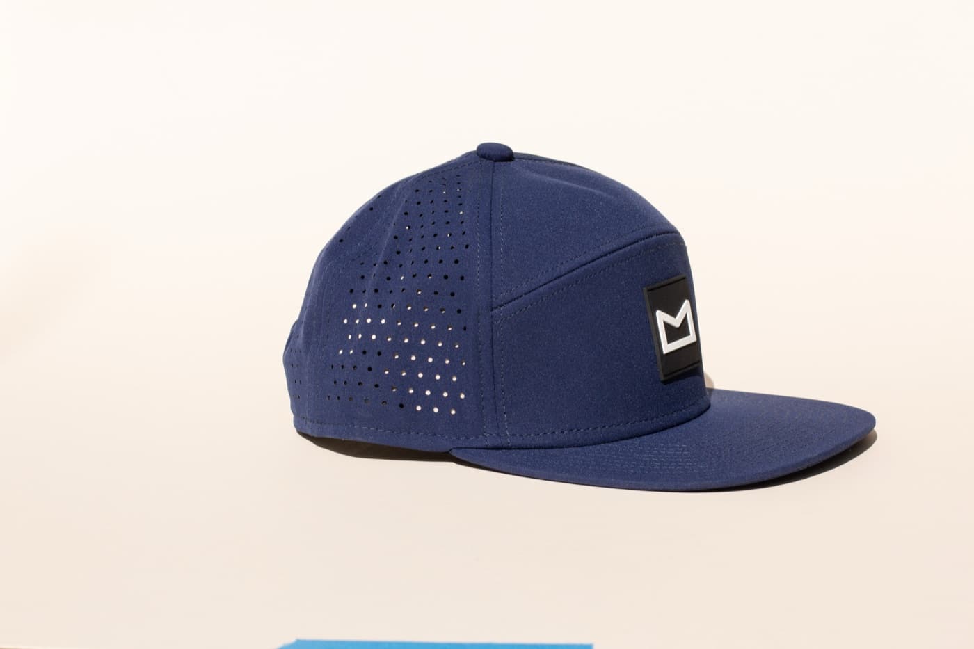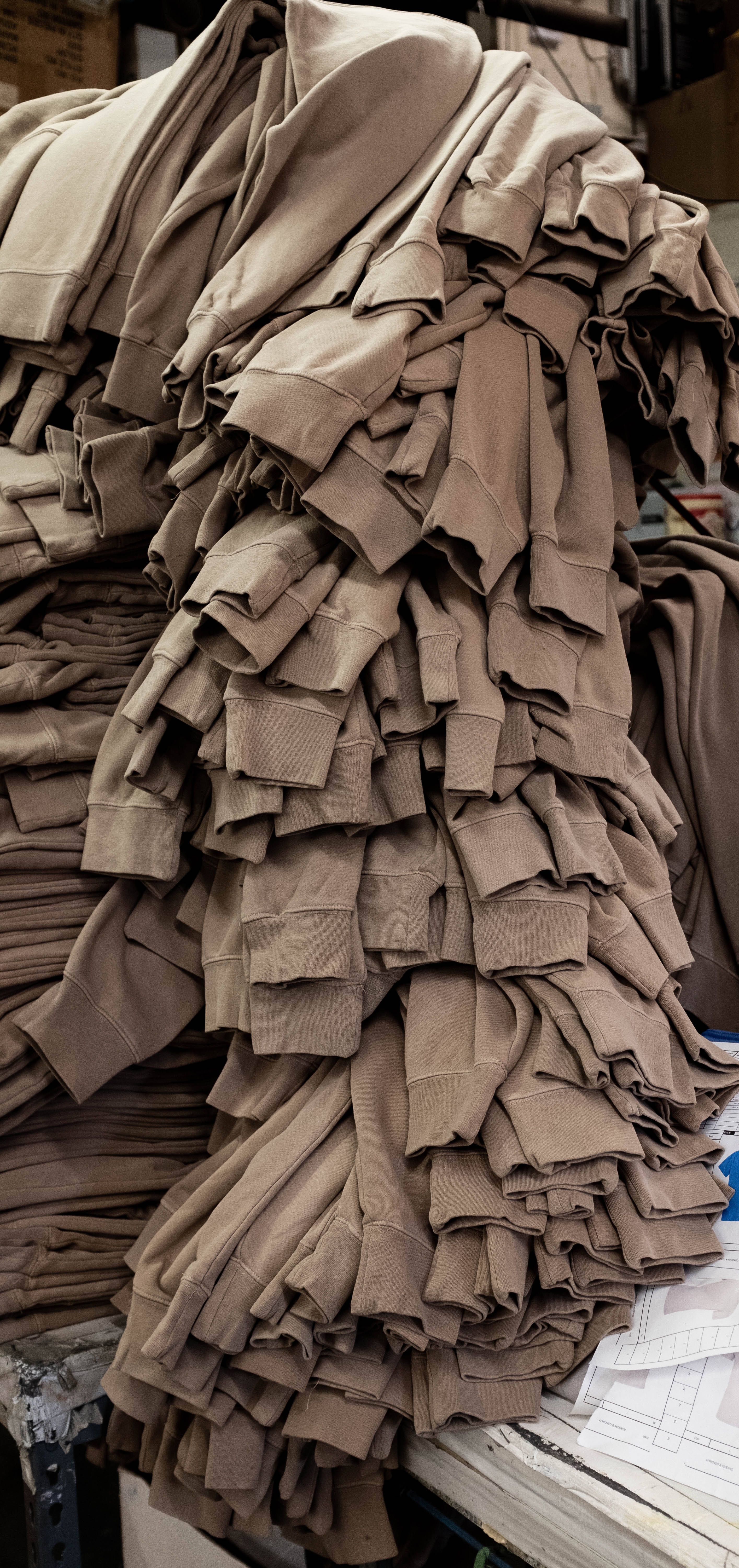
The artwork gets the attention, but the blank often decides whether custom apparel gets worn. If the tee feels stiff, the hoodie fits poorly, or the color feels off-brand, the print has to fight uphill. Retail-feeling merch starts with apparel people would choose even before decoration.
That does not always mean the most expensive blank. It means the right fit, fabric, weight, color, and decoration compatibility for the audience.
Fit is part of the brand
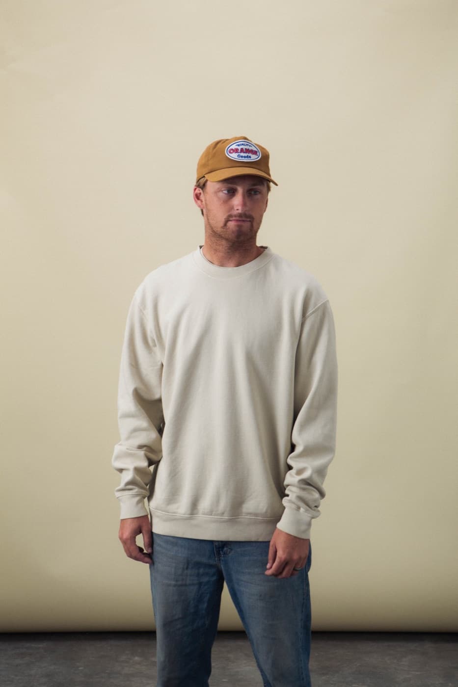
A boxy tee, relaxed fleece, classic crewneck, cropped shape, heavyweight blank, or athletic fit all send different signals. The right choice depends on the audience and how the piece will be used. Staff uniforms, retail drops, influencer mailers, and employee gifts may need different apparel bodies.
Color changes the whole piece
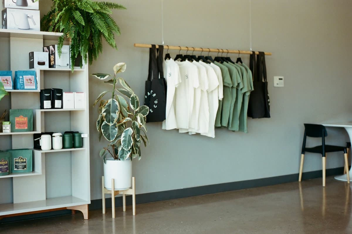
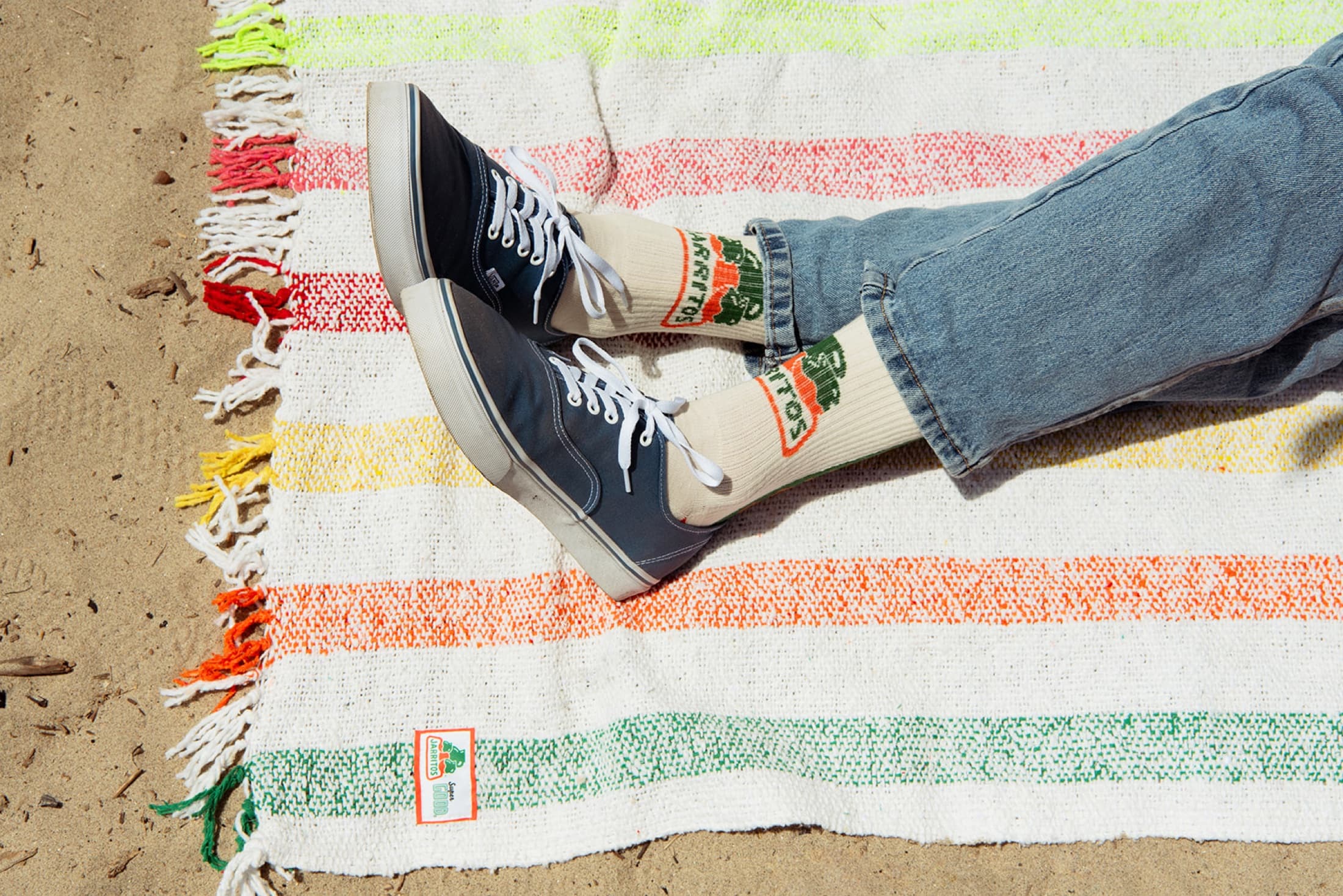
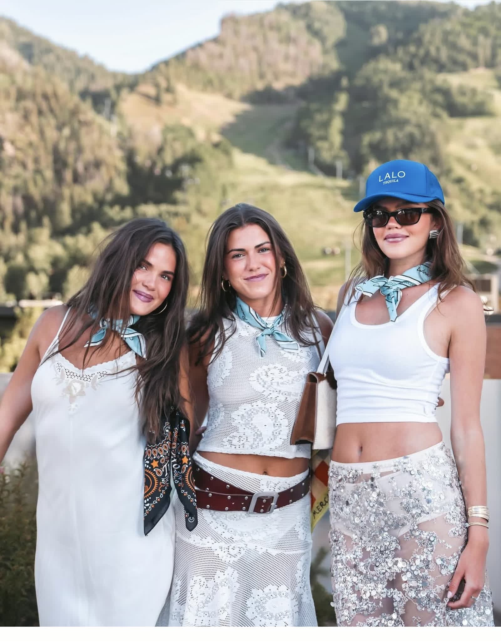
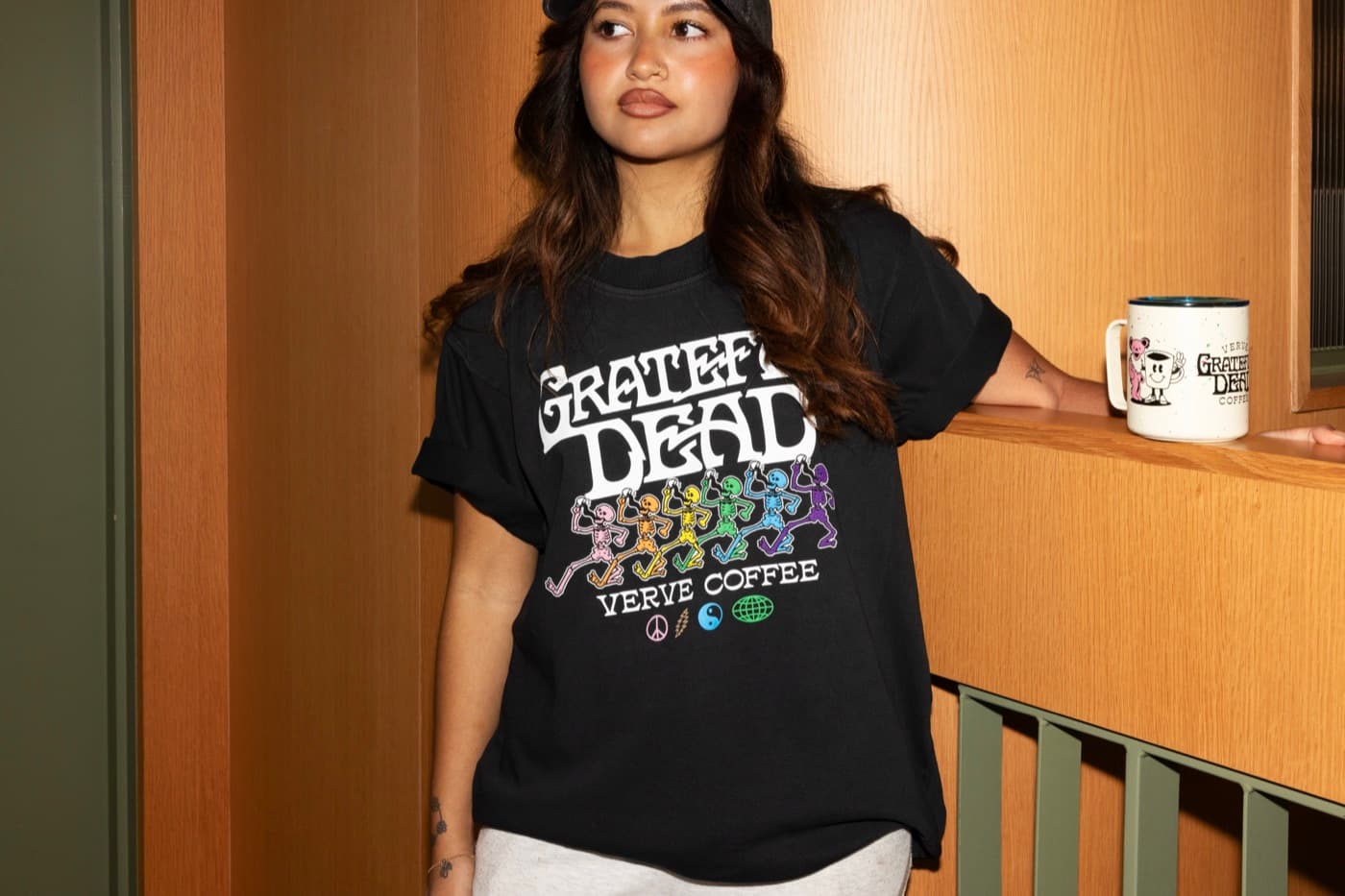
Apparel color can make a simple graphic feel more designed. Washed black, cream, forest, navy, clay, heather, or bright seasonal color all change the read. The best color is not just the closest brand color. It is the garment color that makes the finished piece wearable.
Choose decoration around the blank
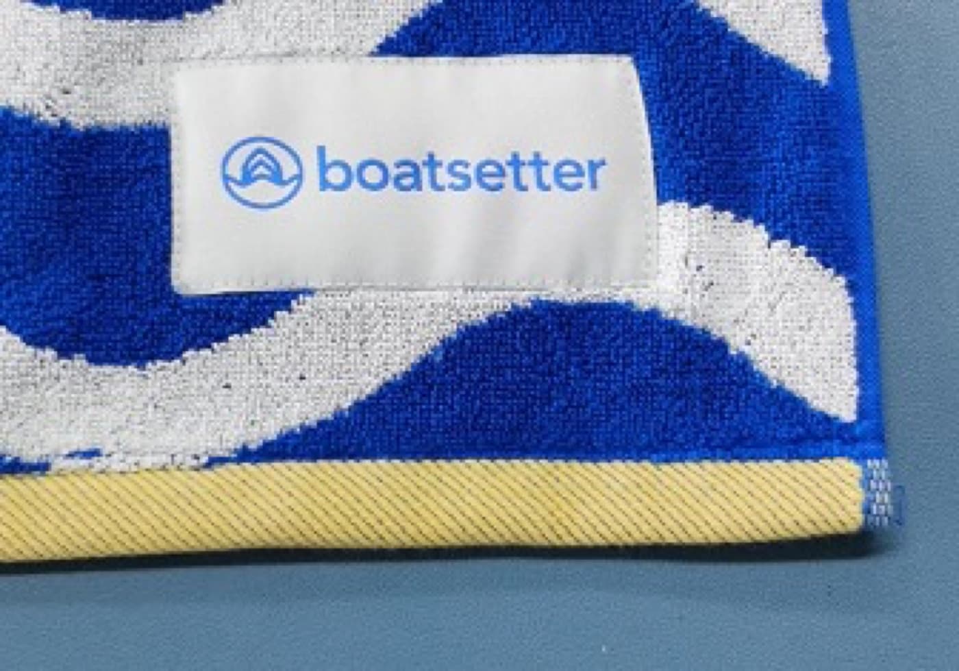
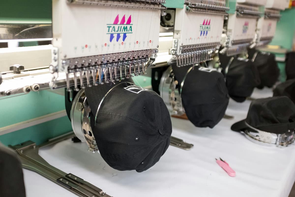
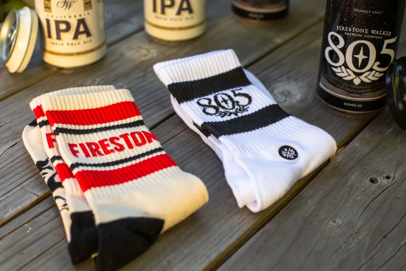
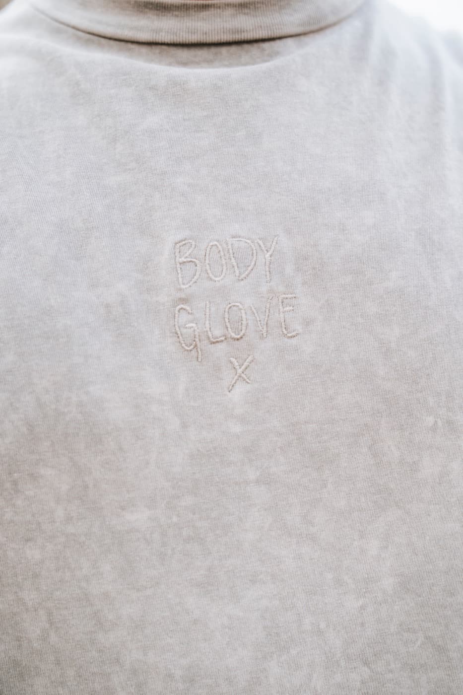
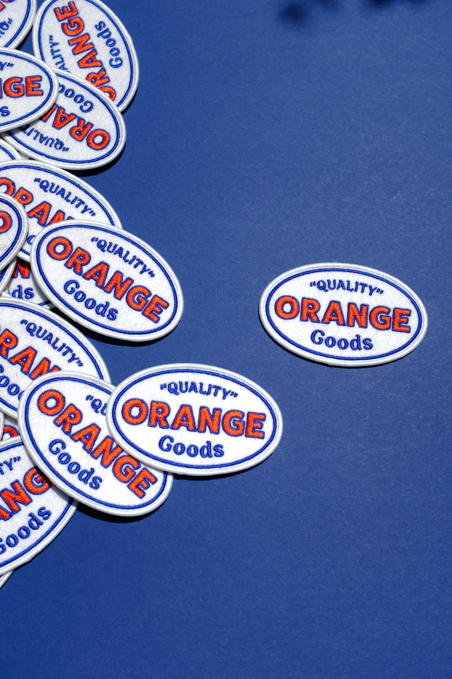
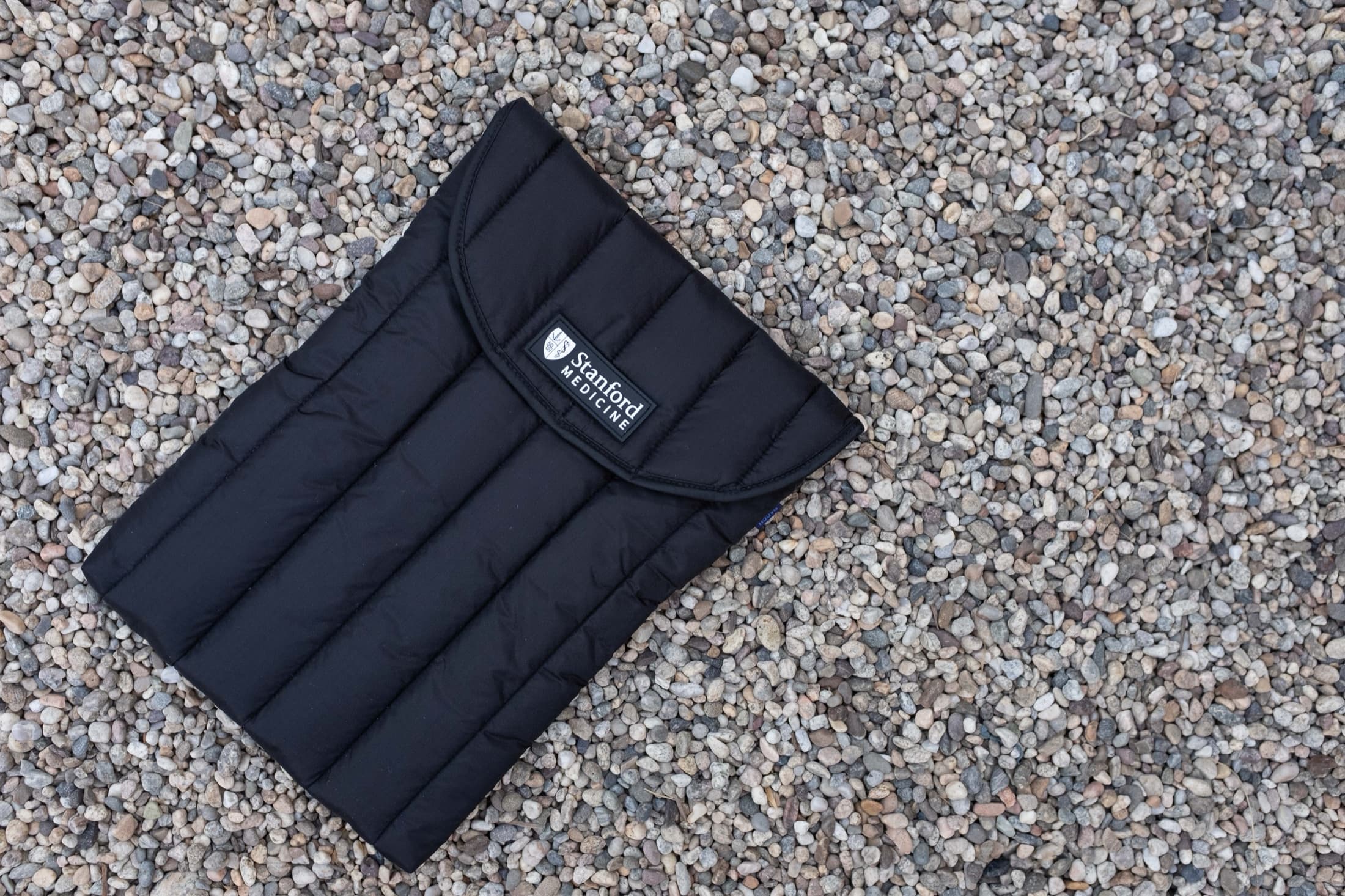
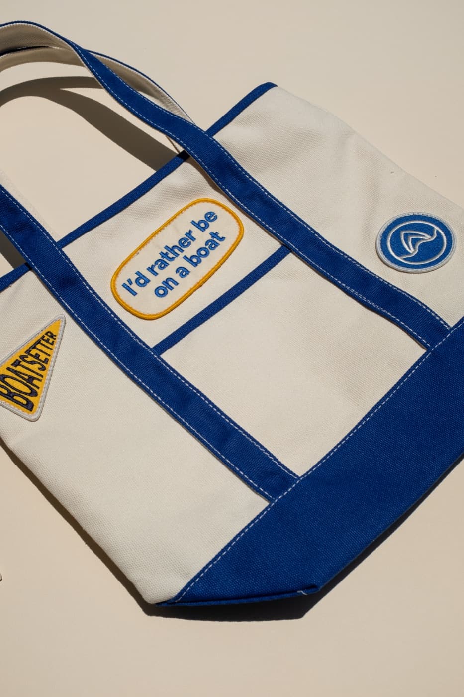
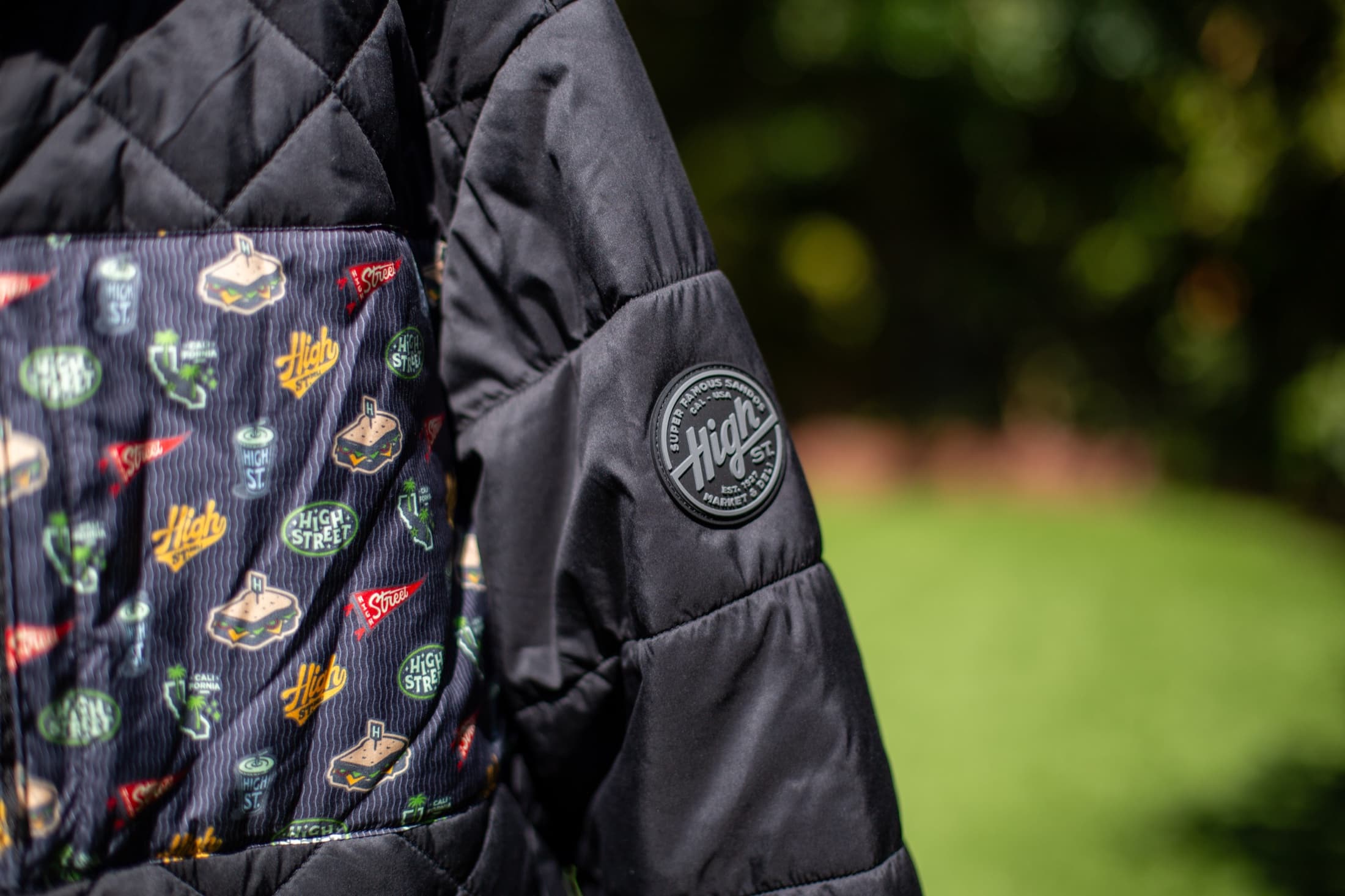
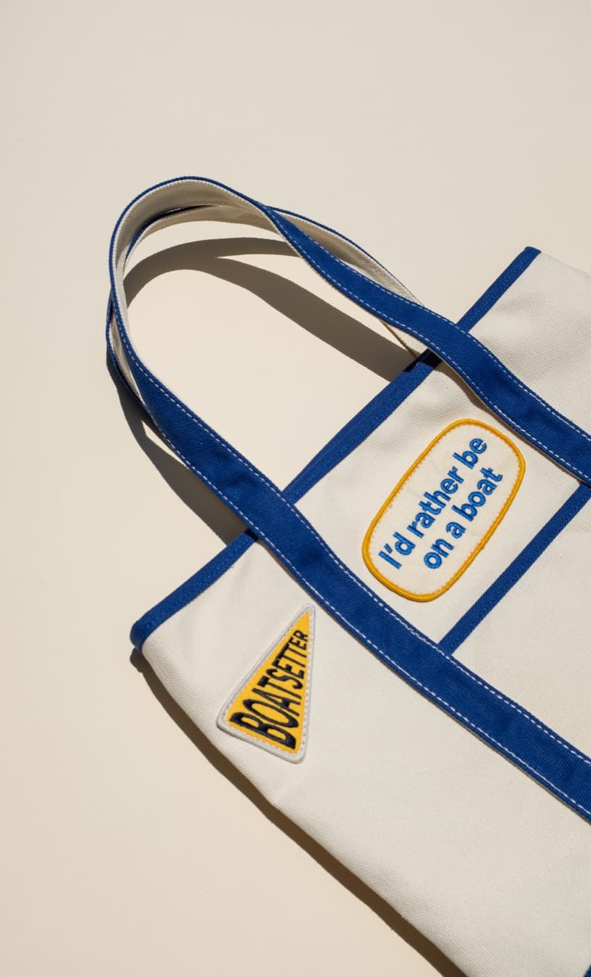
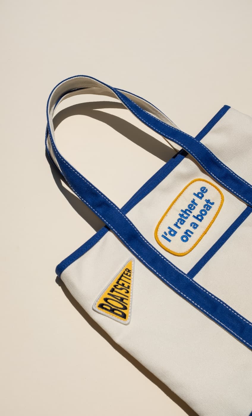
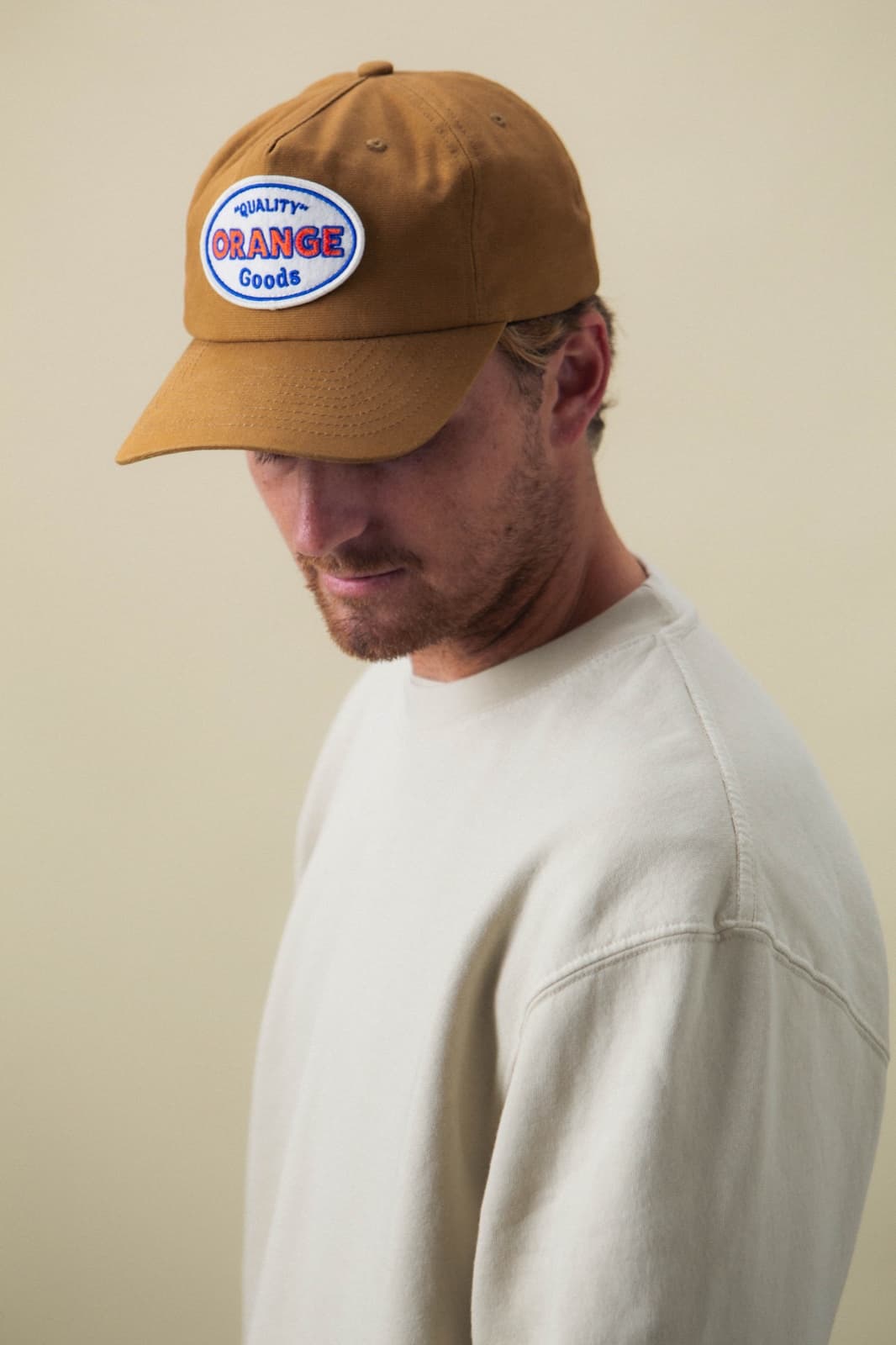
Screen print, embroidery, puff ink, tonal print, woven labels, patches, and specialty finishes each behave differently on different garments. Heavy fleece, ribbed texture, pocket placement, seams, and fabric stretch can all affect the final result.
The takeaway
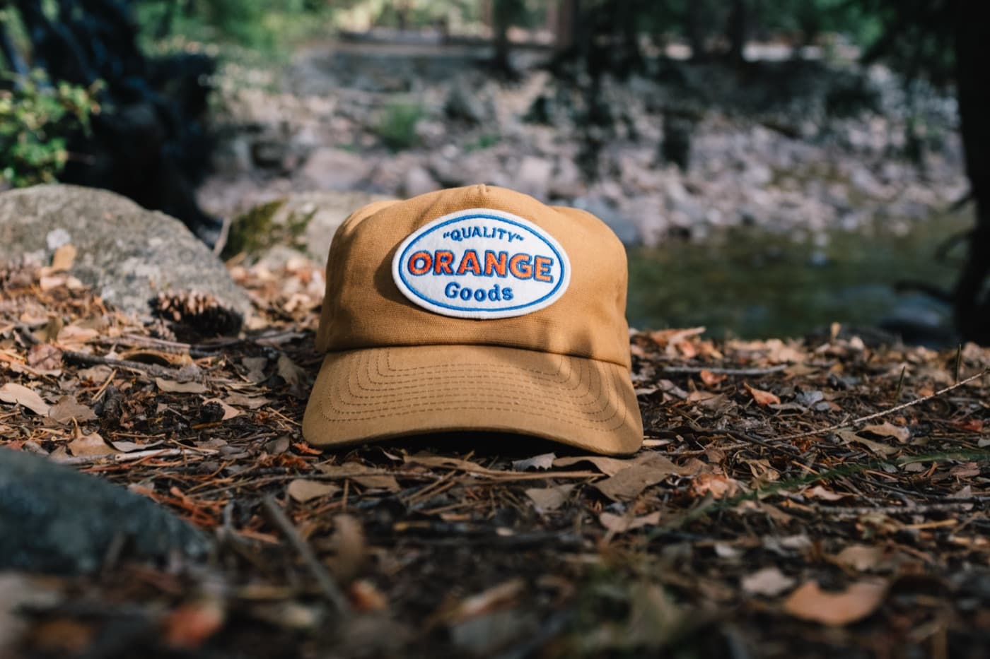
Retail-feeling apparel starts before the artwork is placed. Orange Goods helps brands choose blanks that fit the audience, support the decoration, and make the finished merch more likely to stay in rotation.