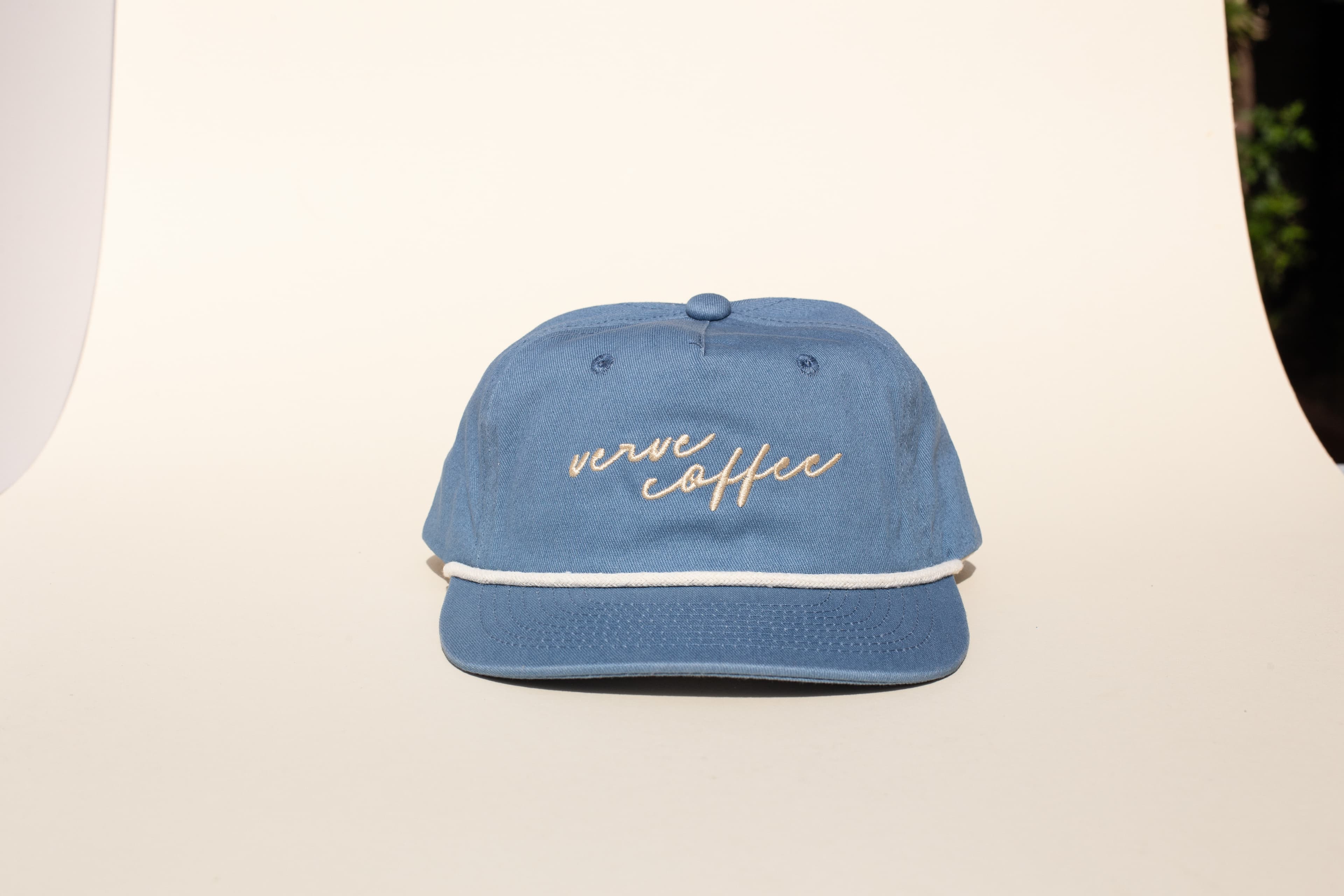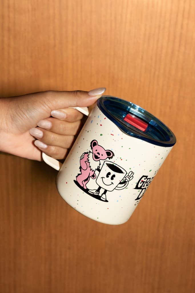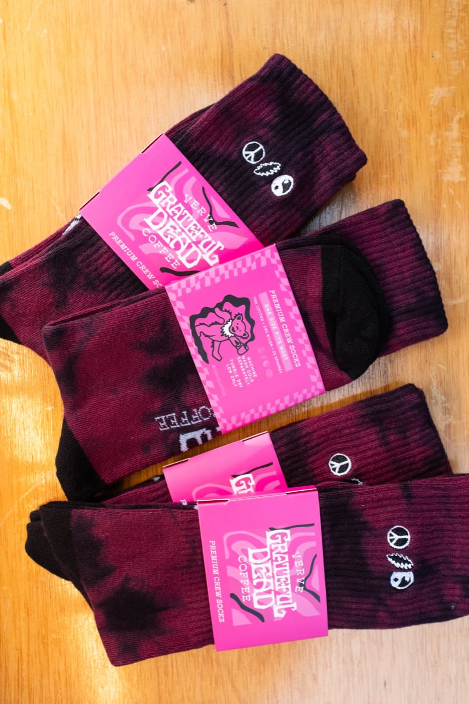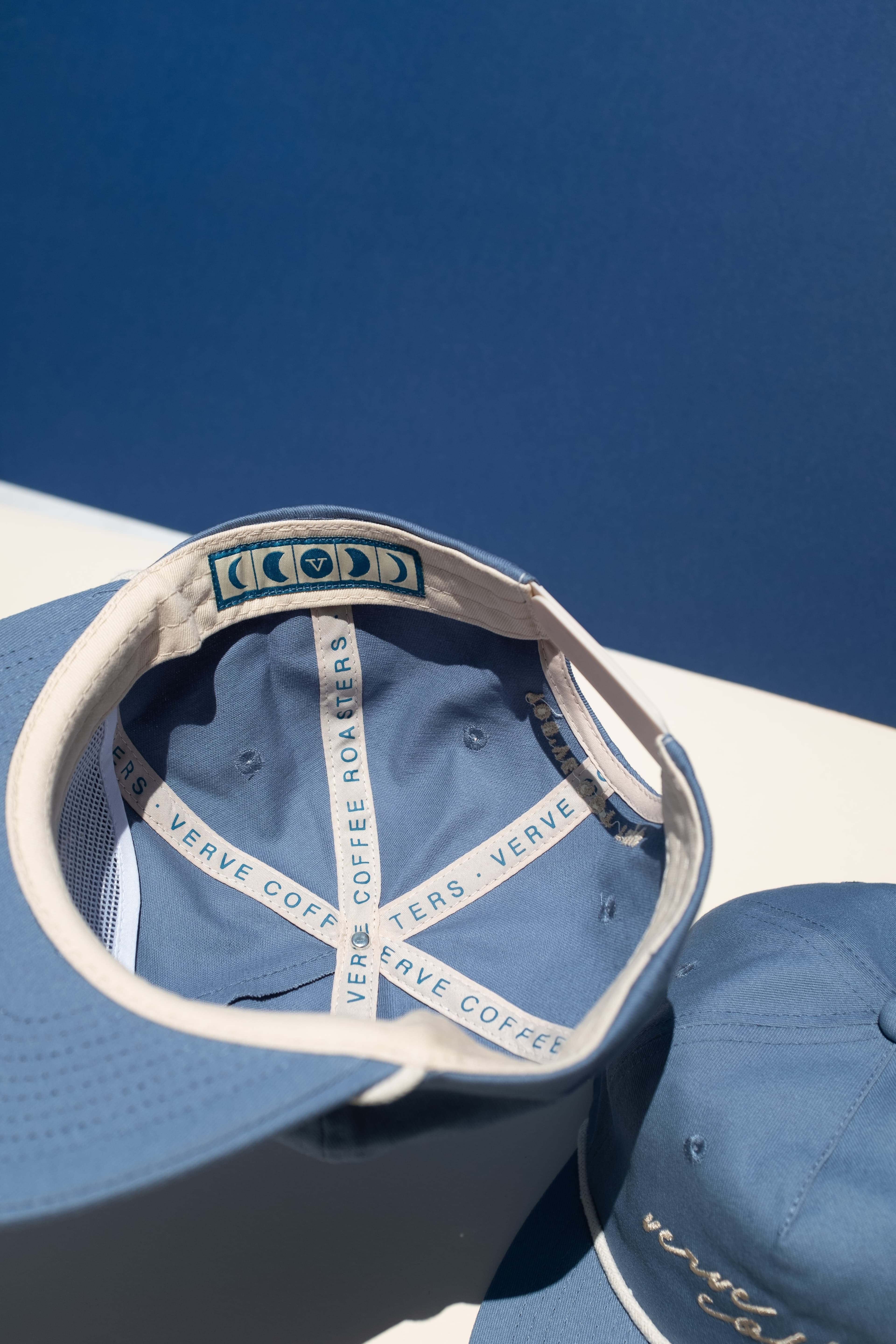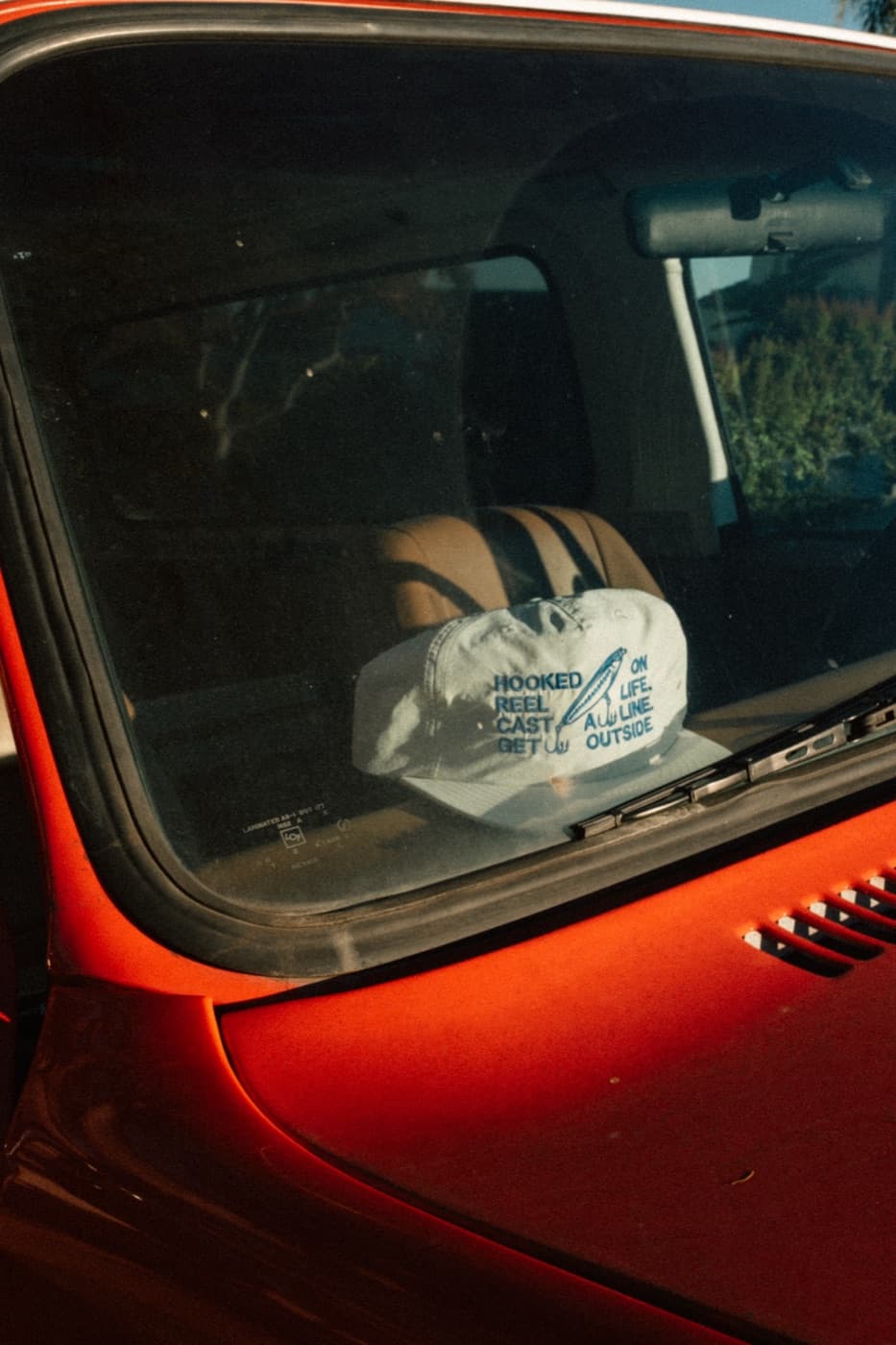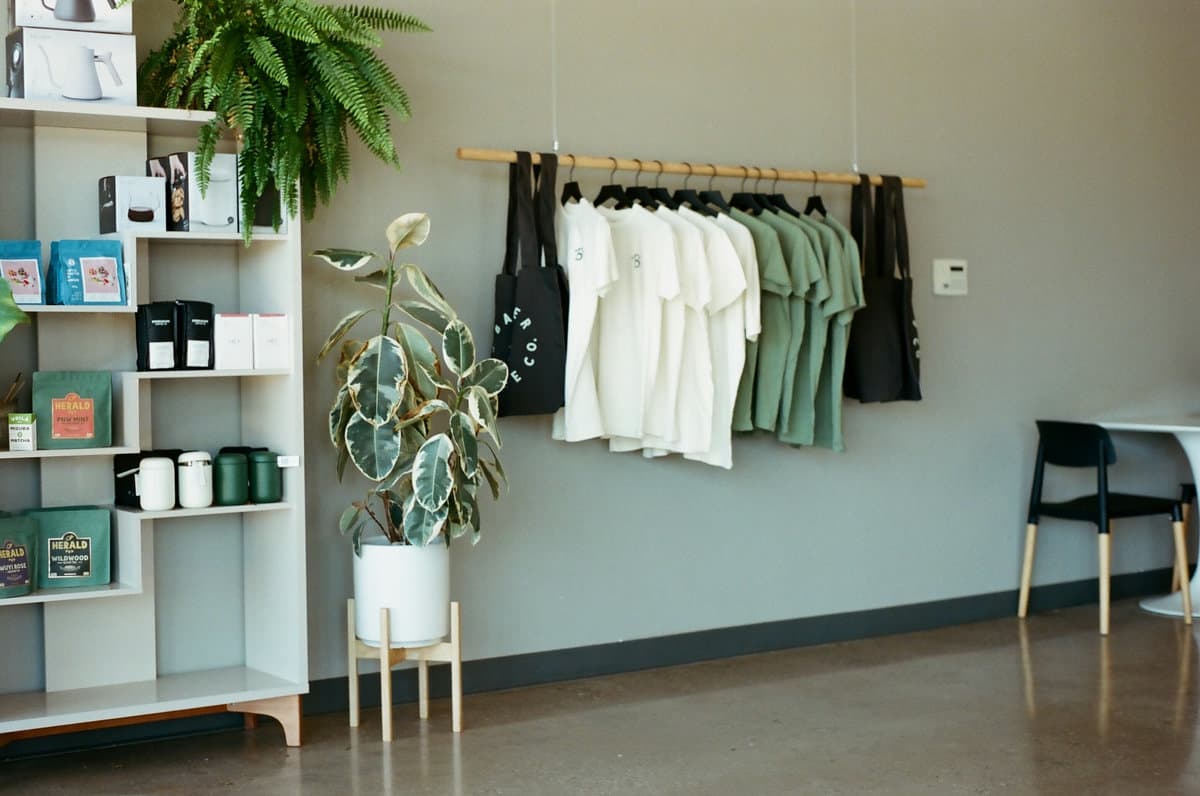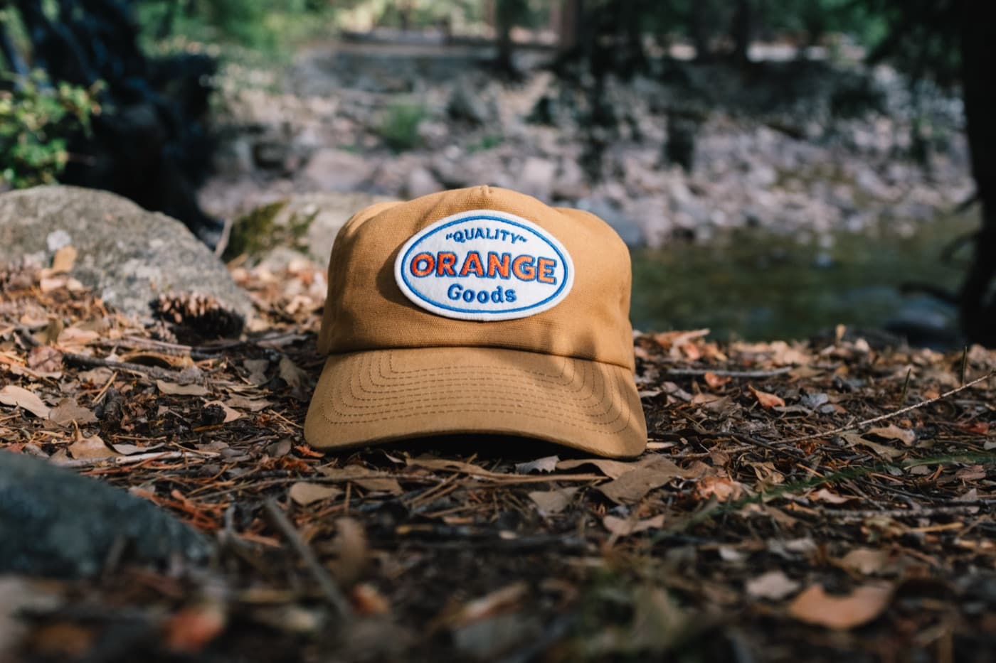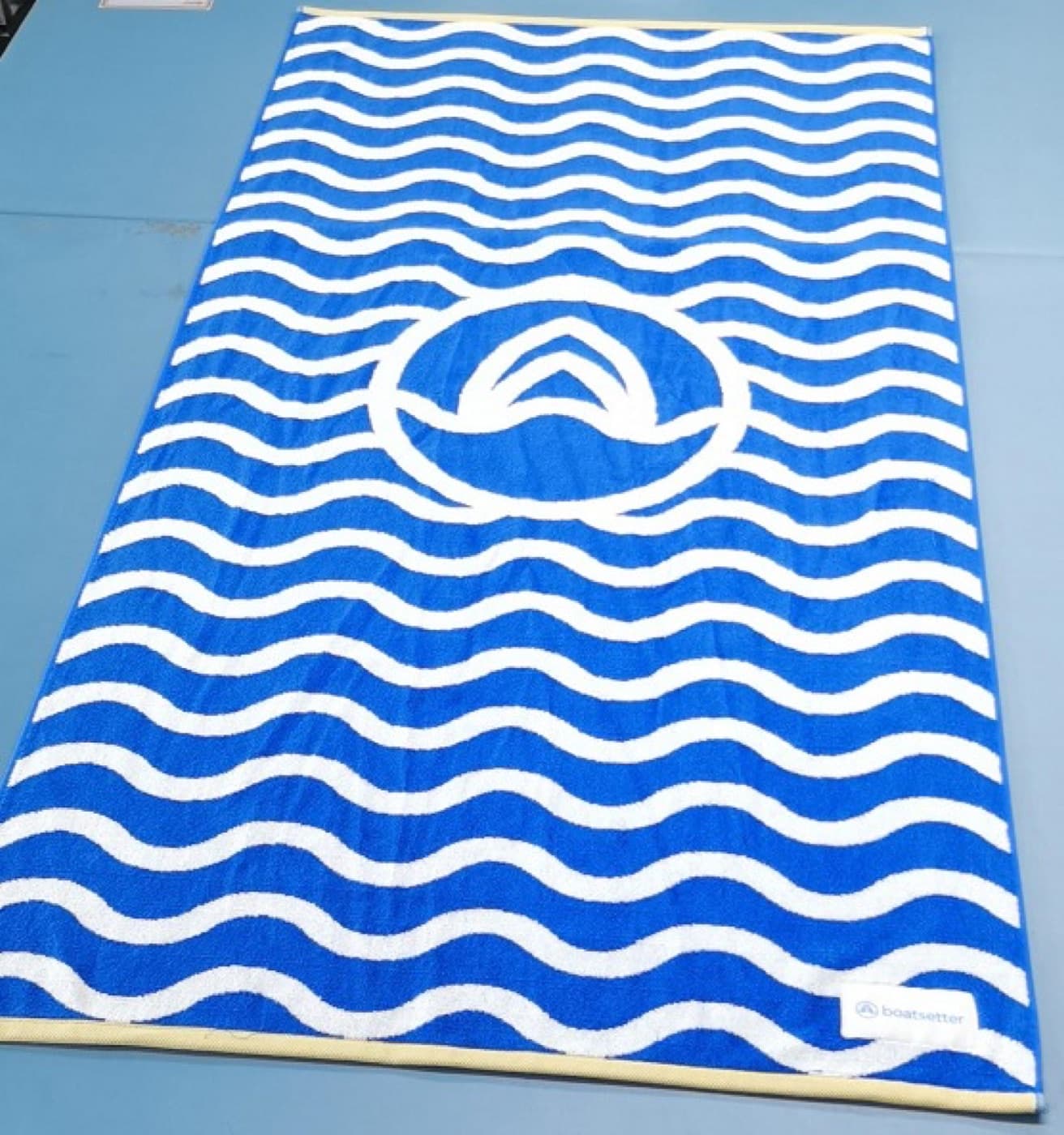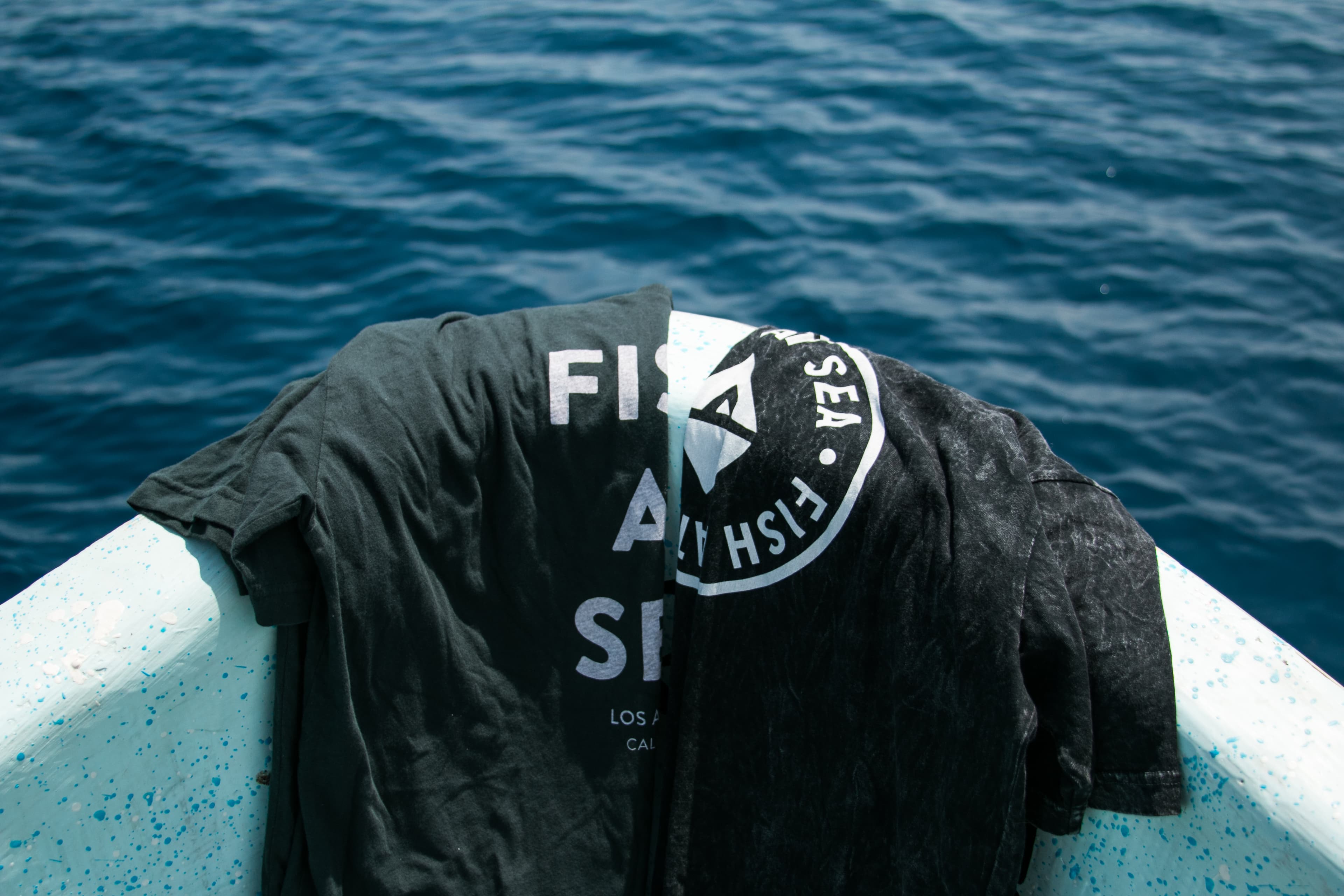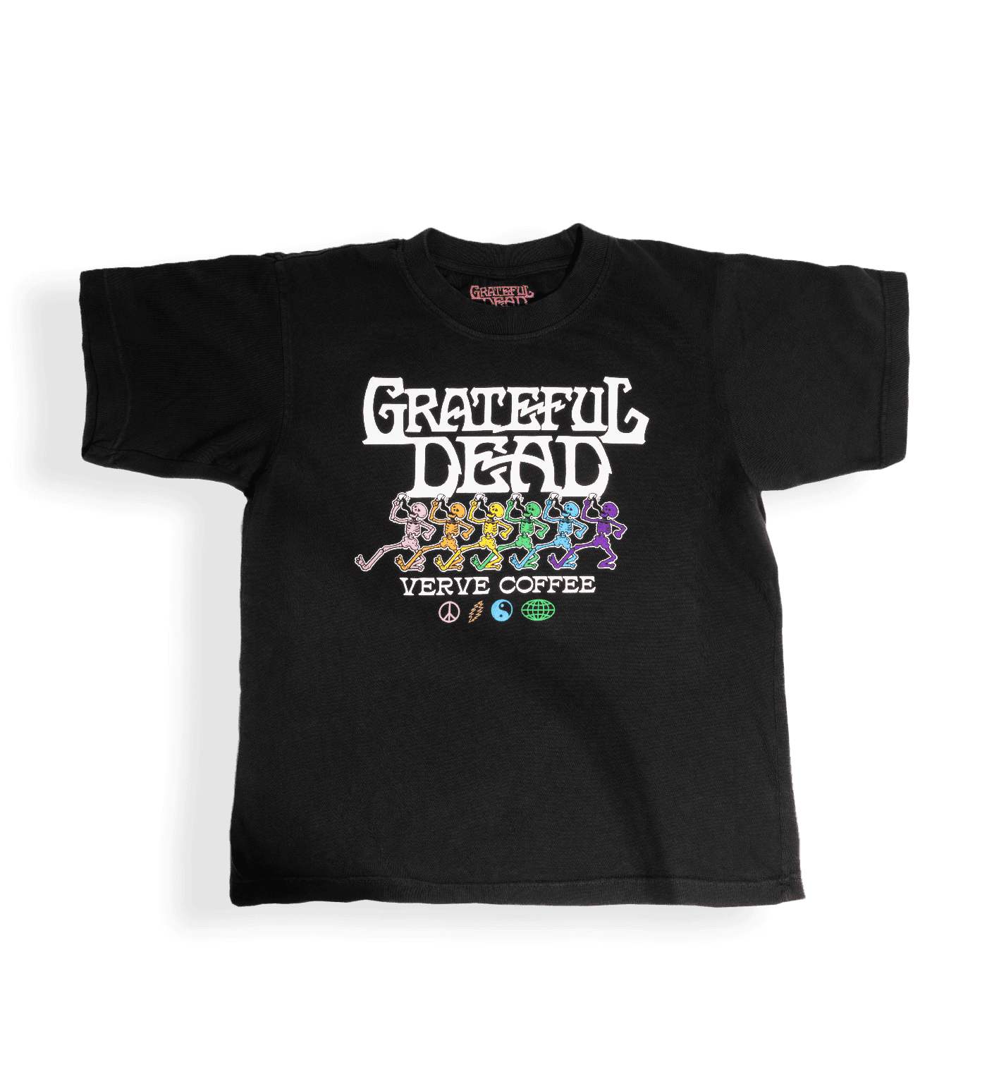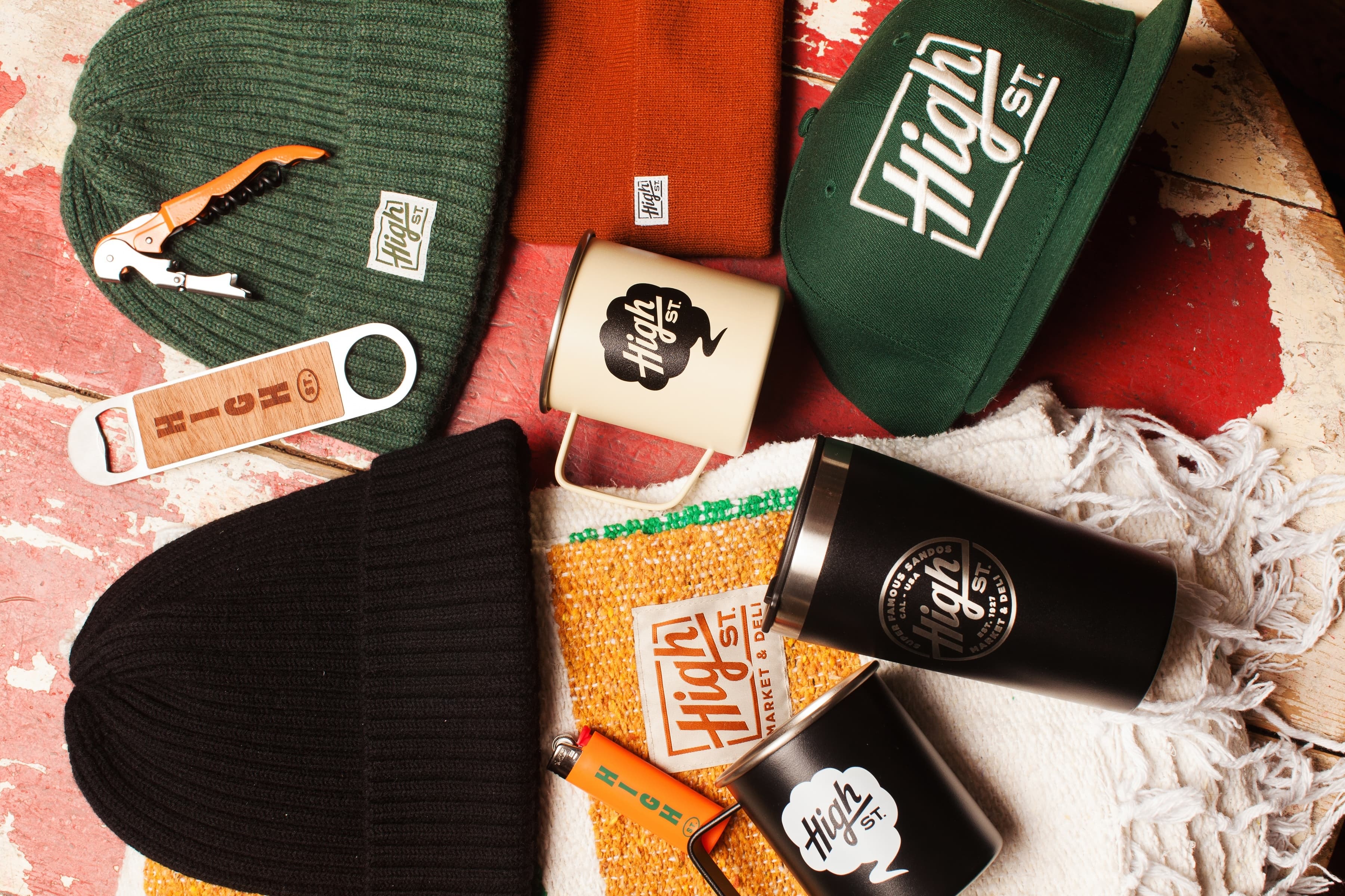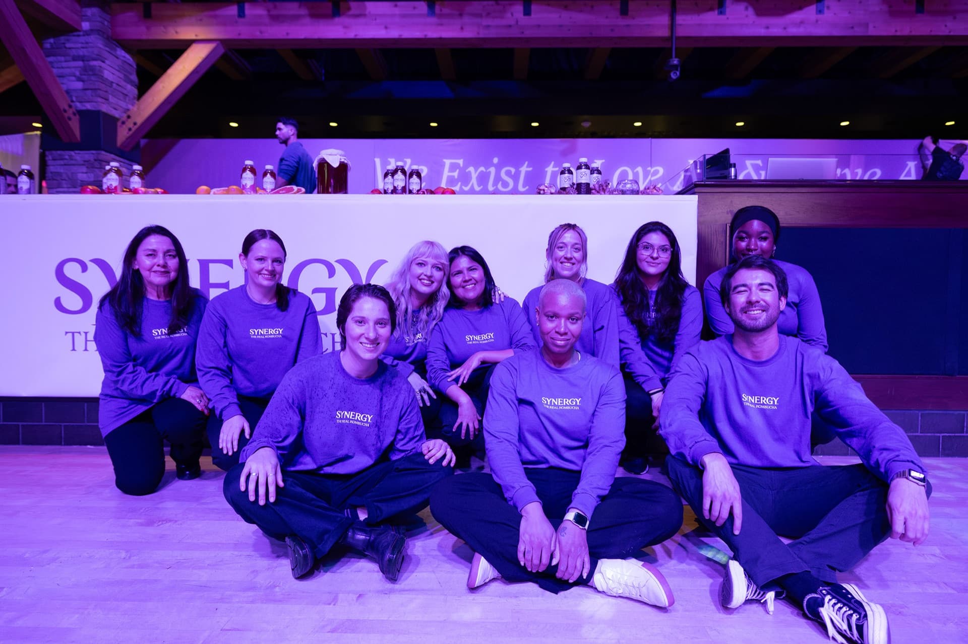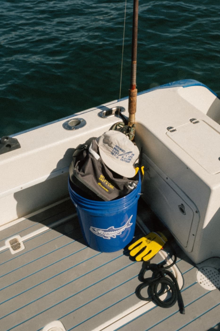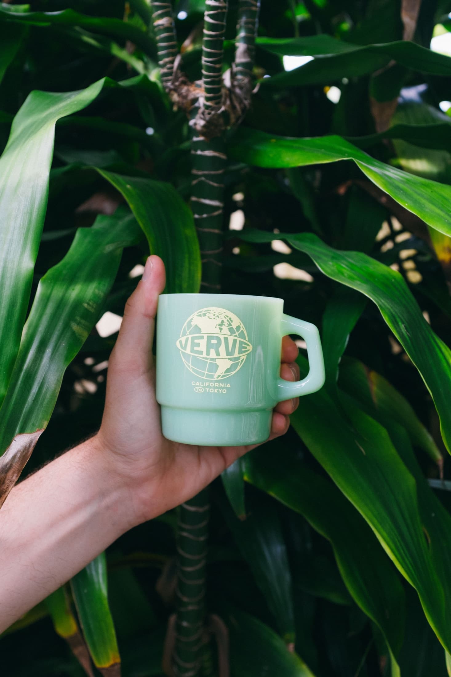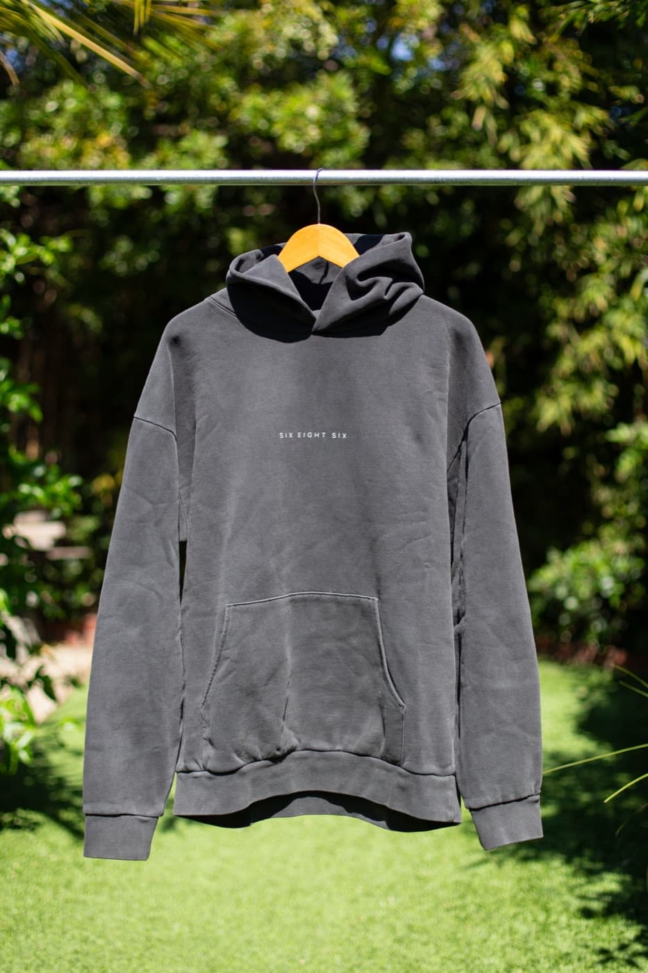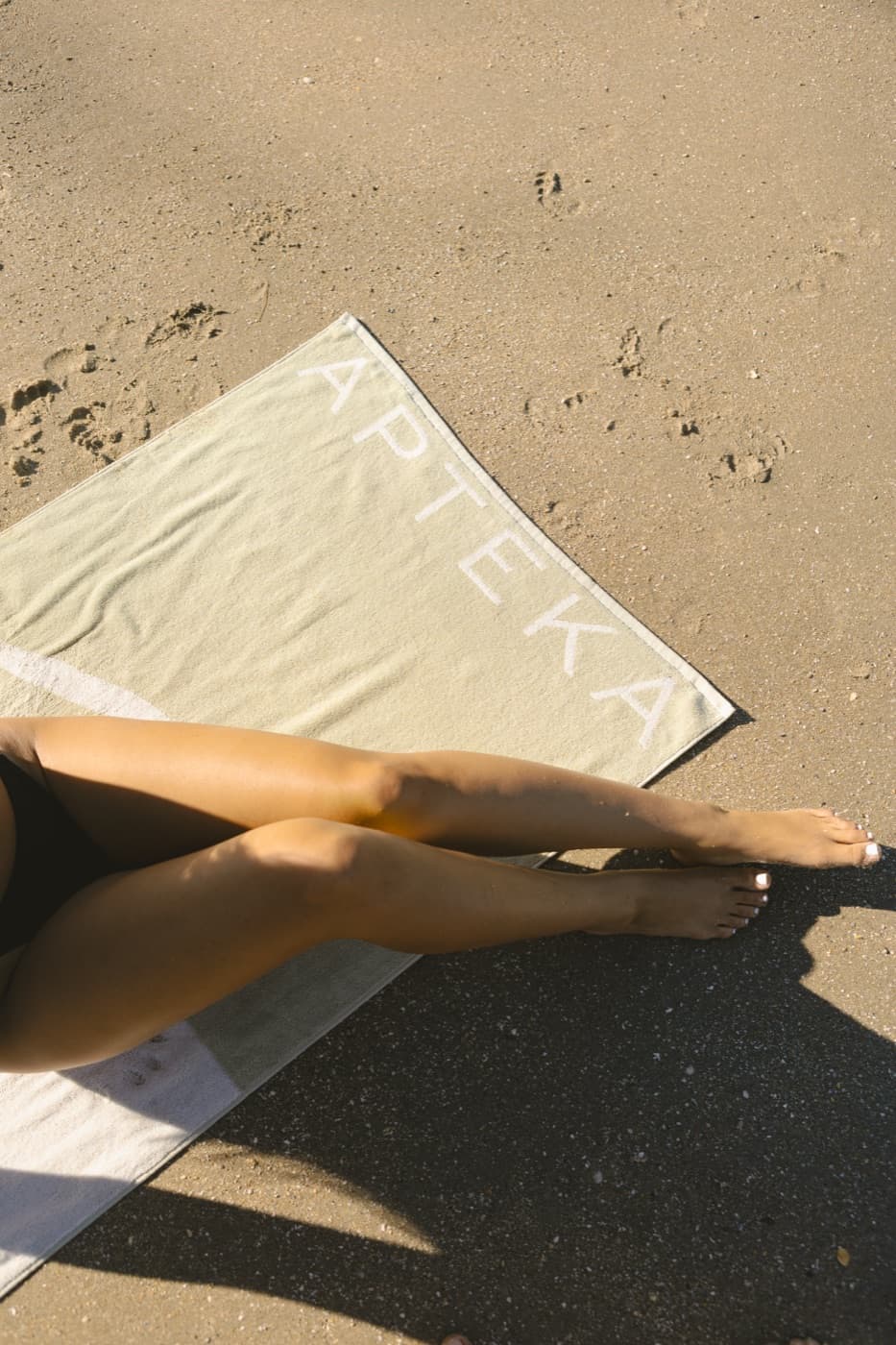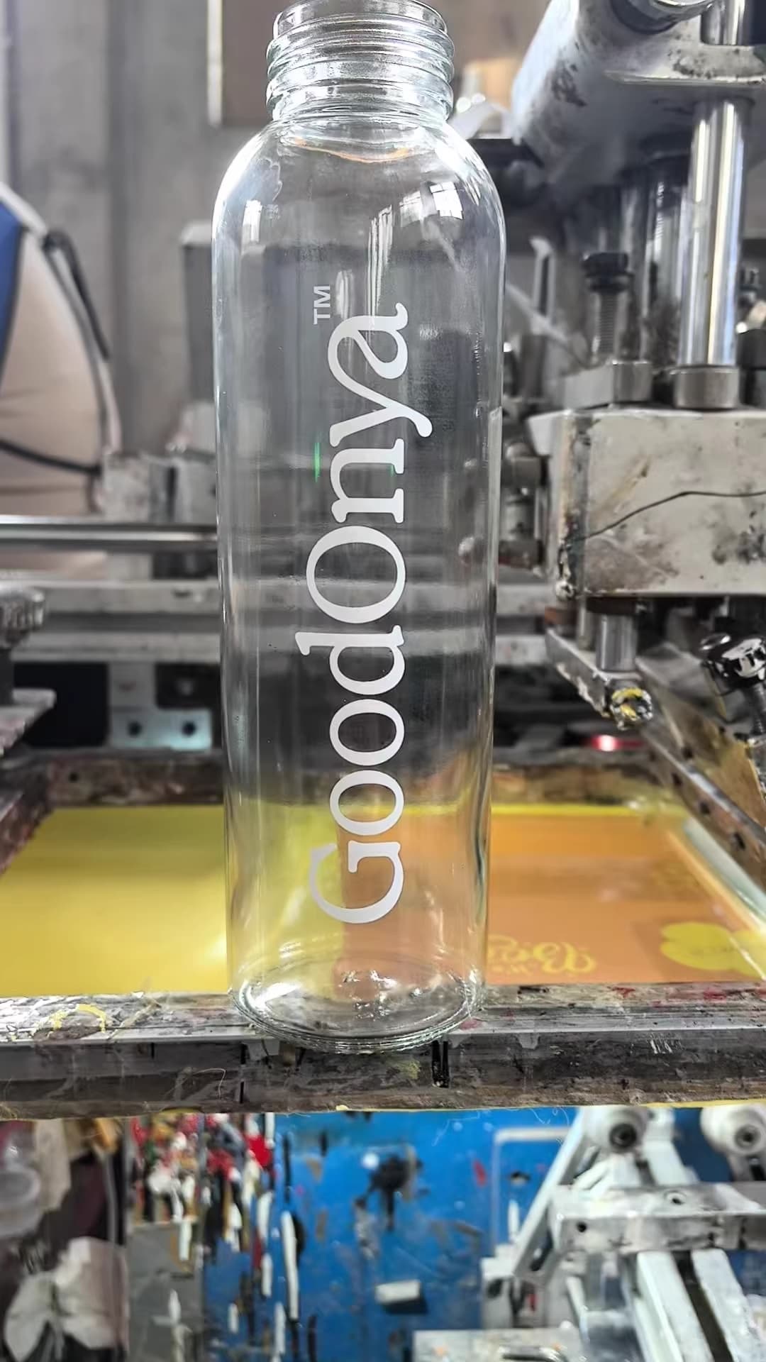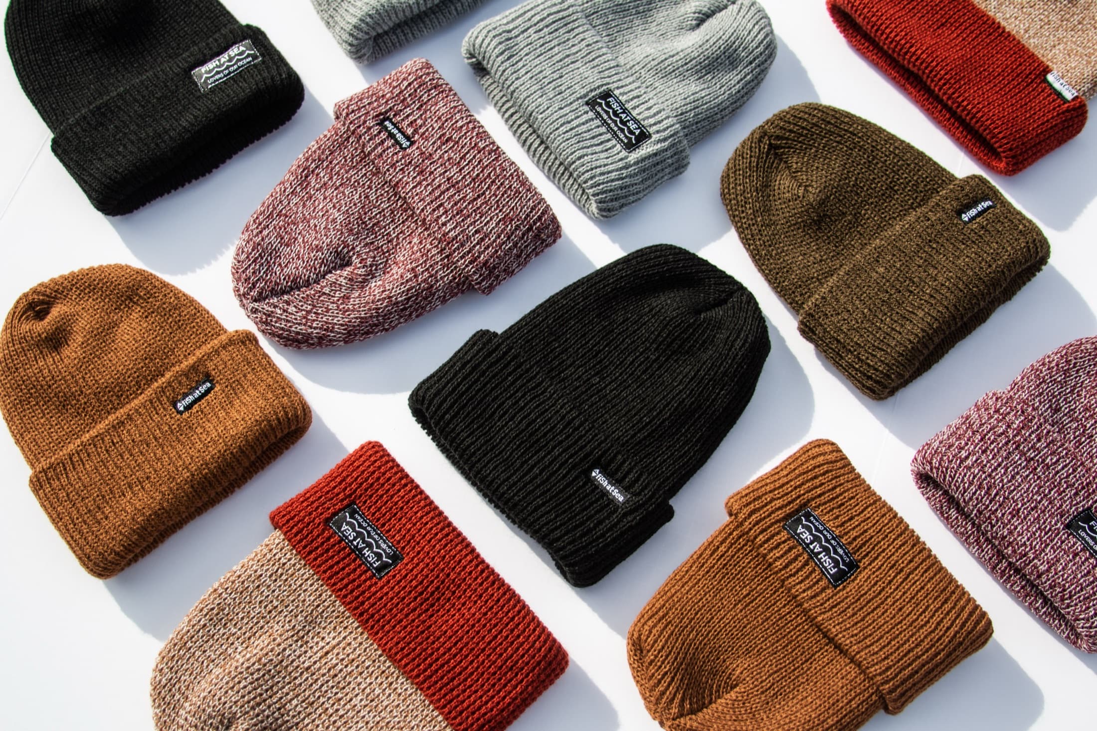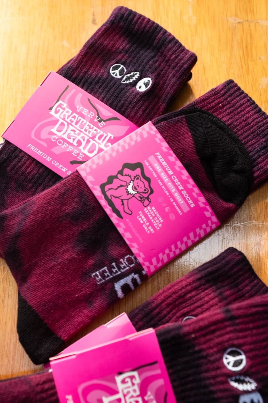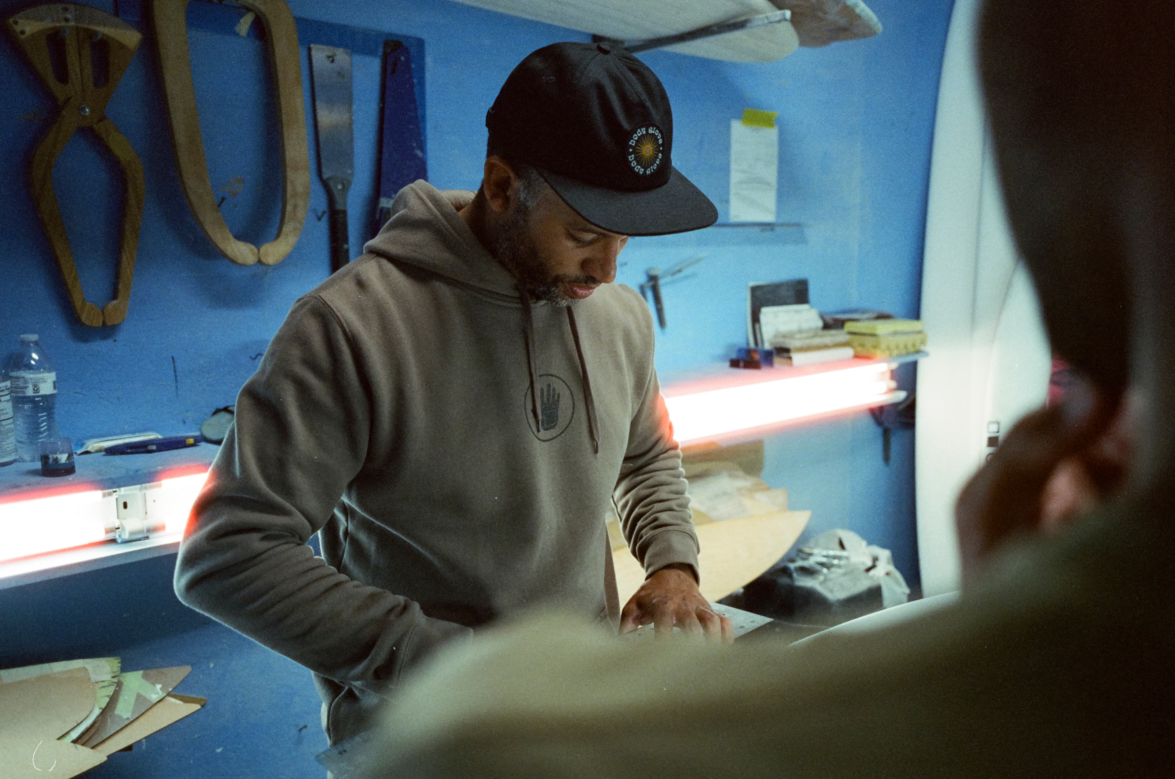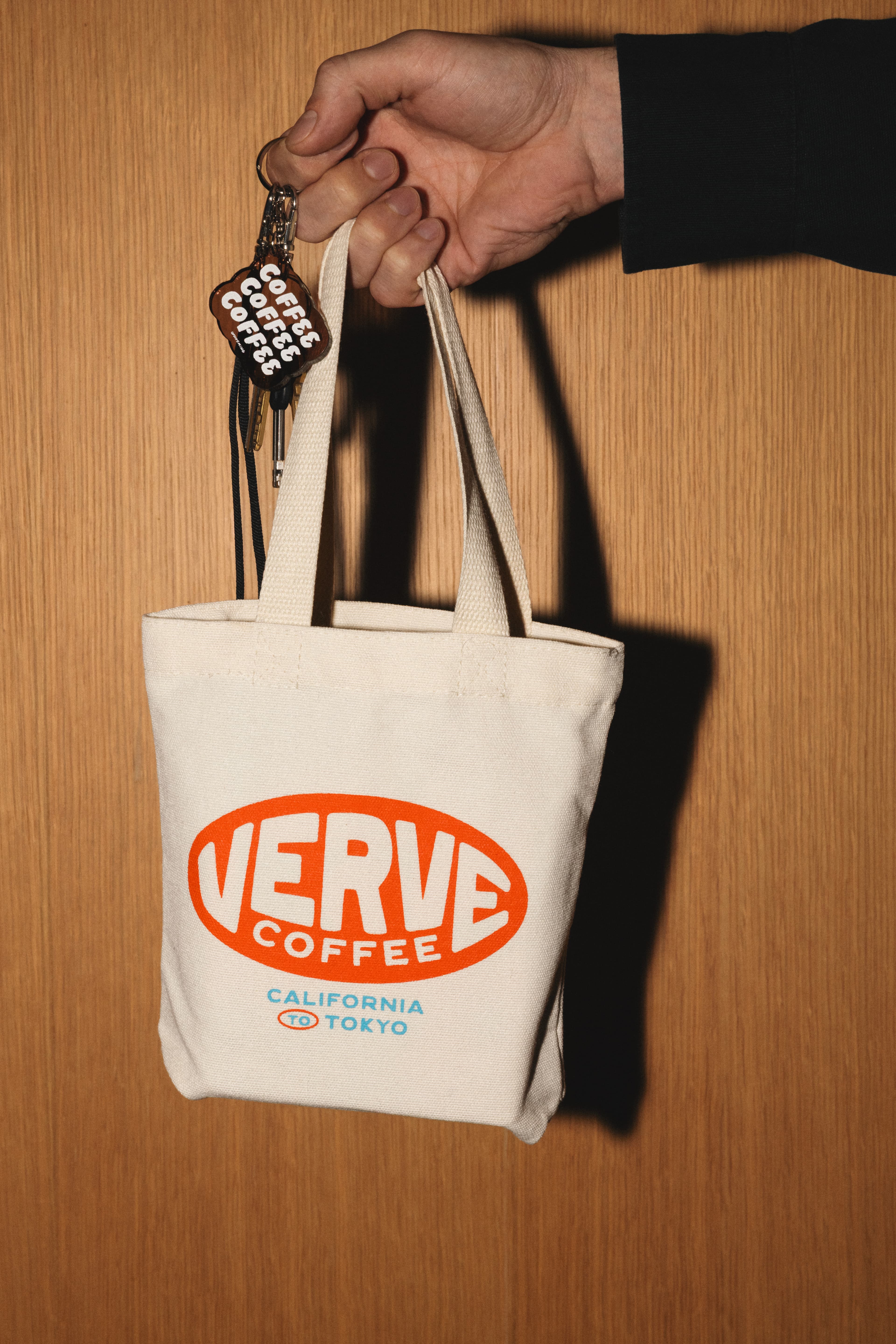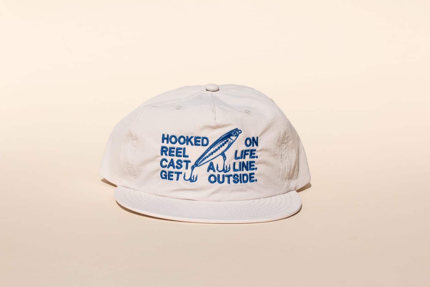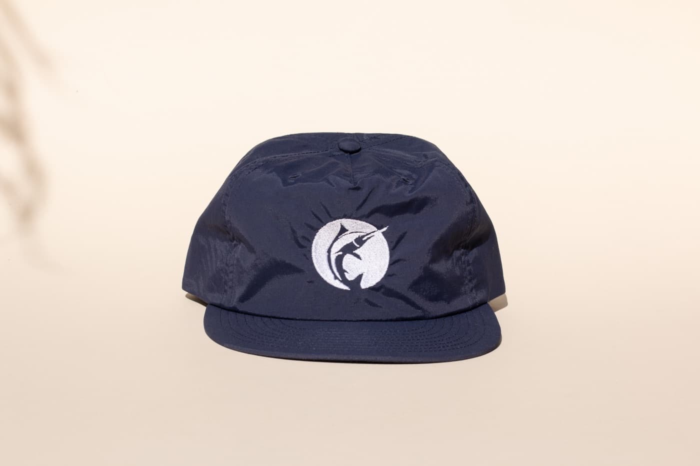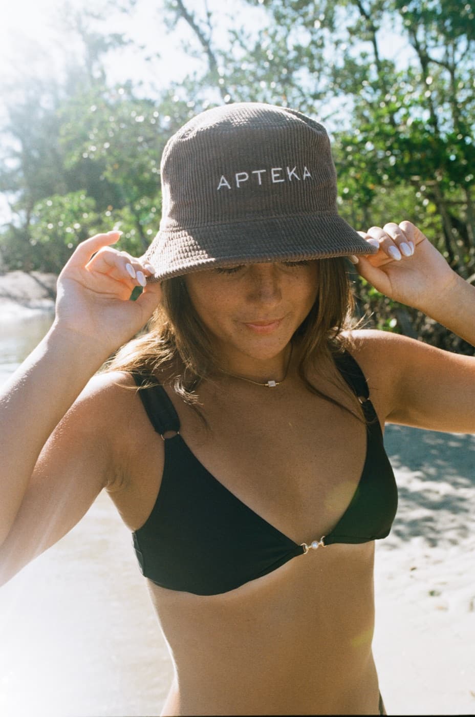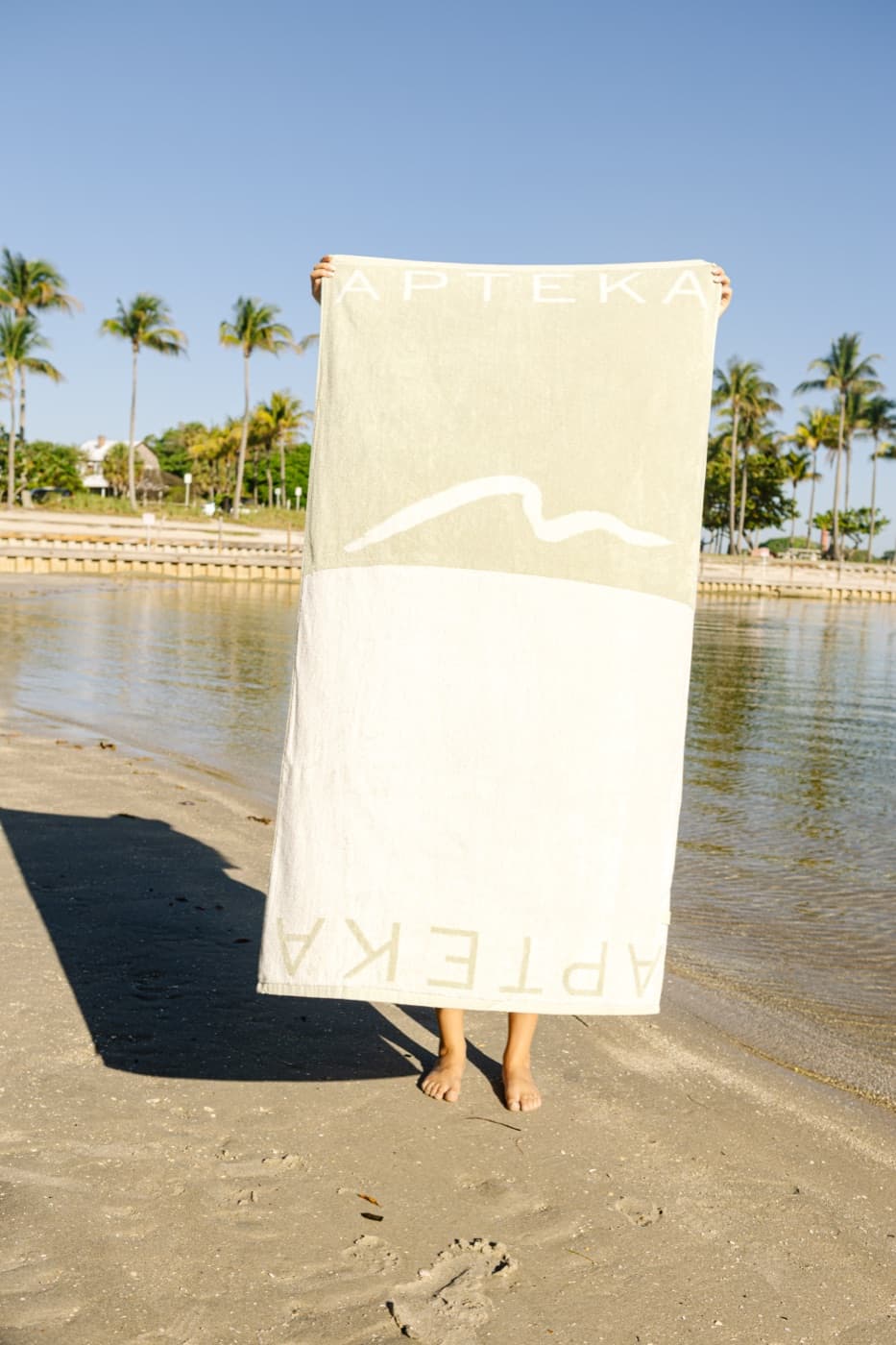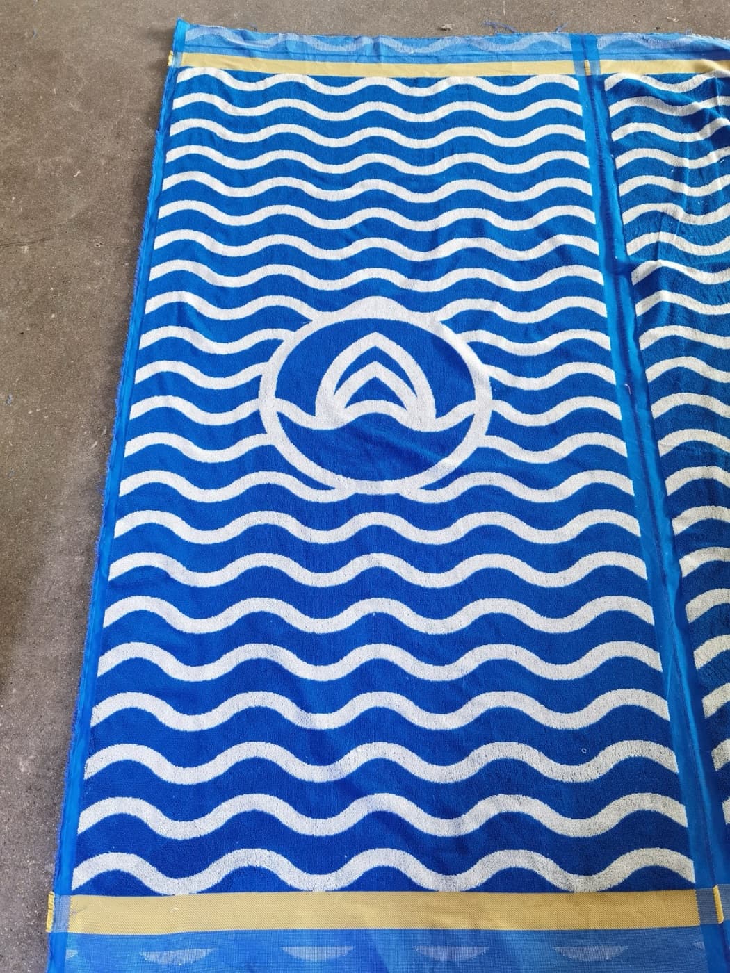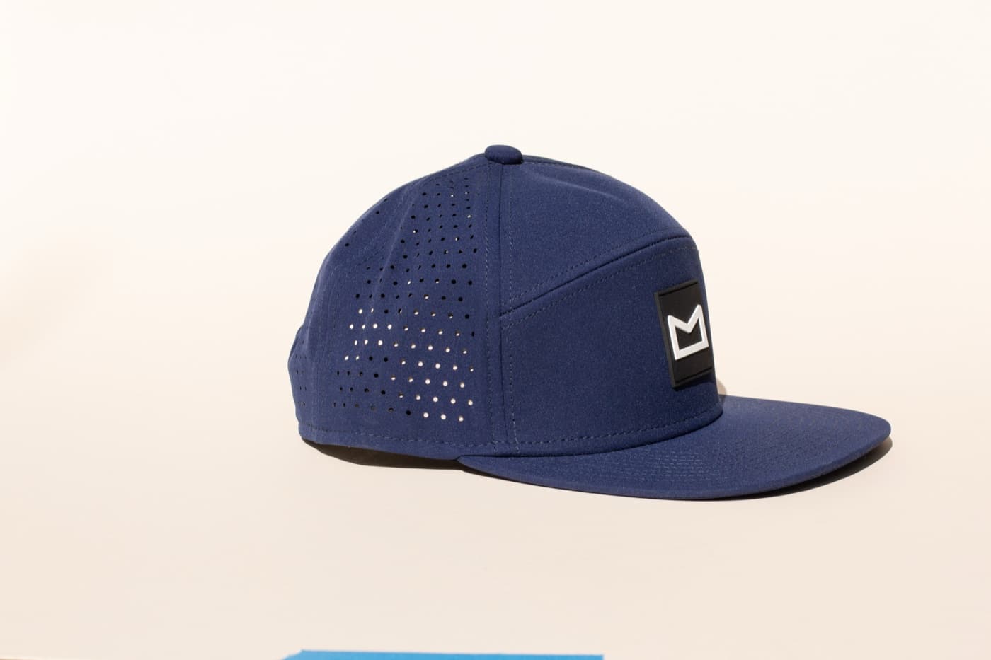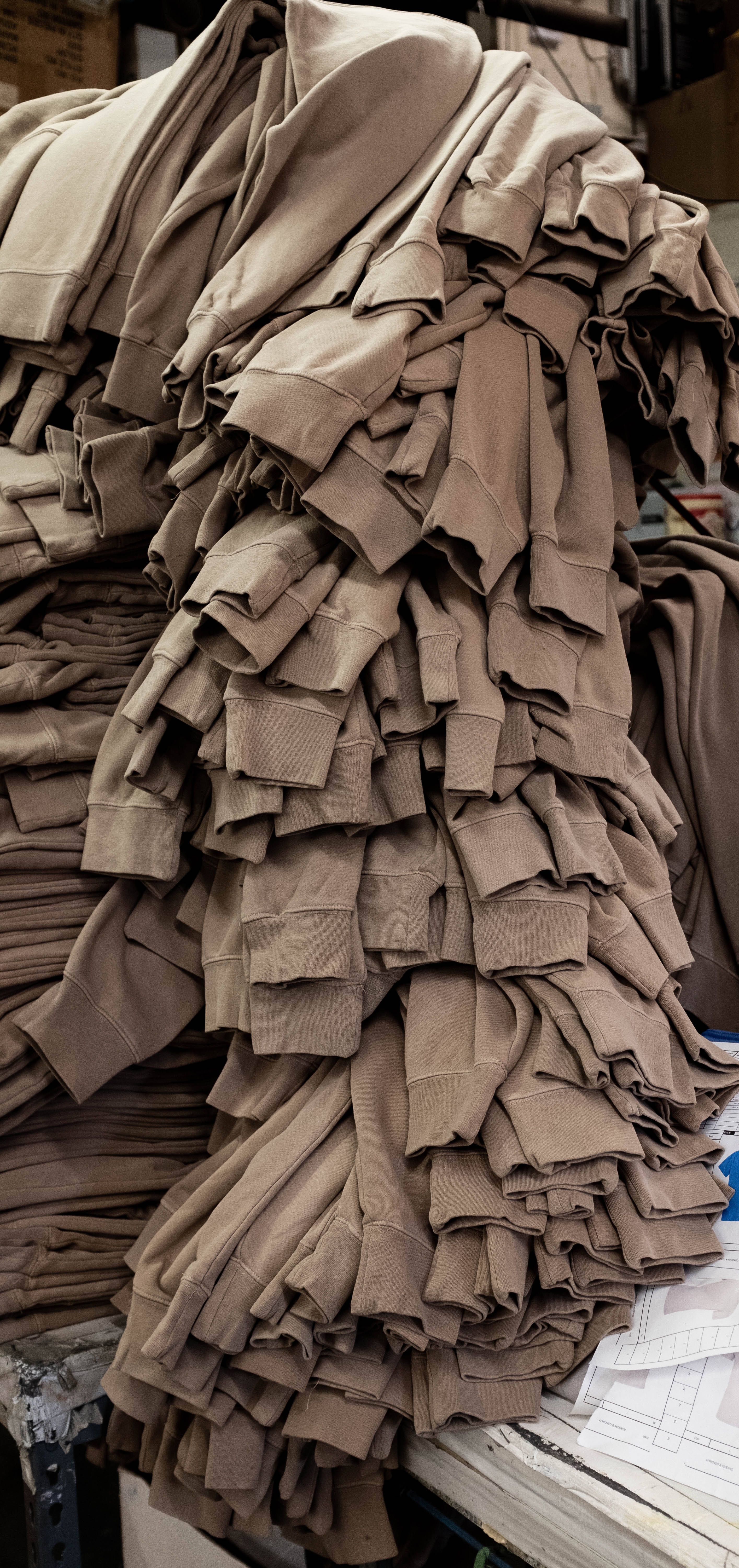
Custom apparel often fails before the artwork is added. If the blank feels cheap, fits poorly, or uses a color nobody wants to wear, the decoration has to work too hard. A strong tee, hoodie, crewneck, jacket, or fleece should feel like something the audience would buy without the logo.
The blank is not a background decision. It is the product.
Start with fit and audience
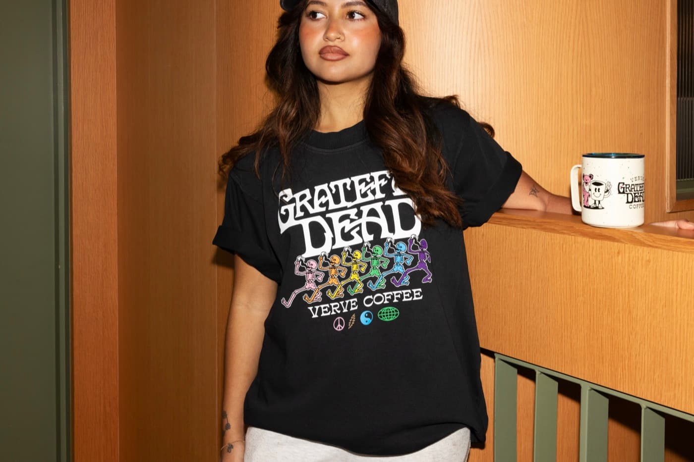
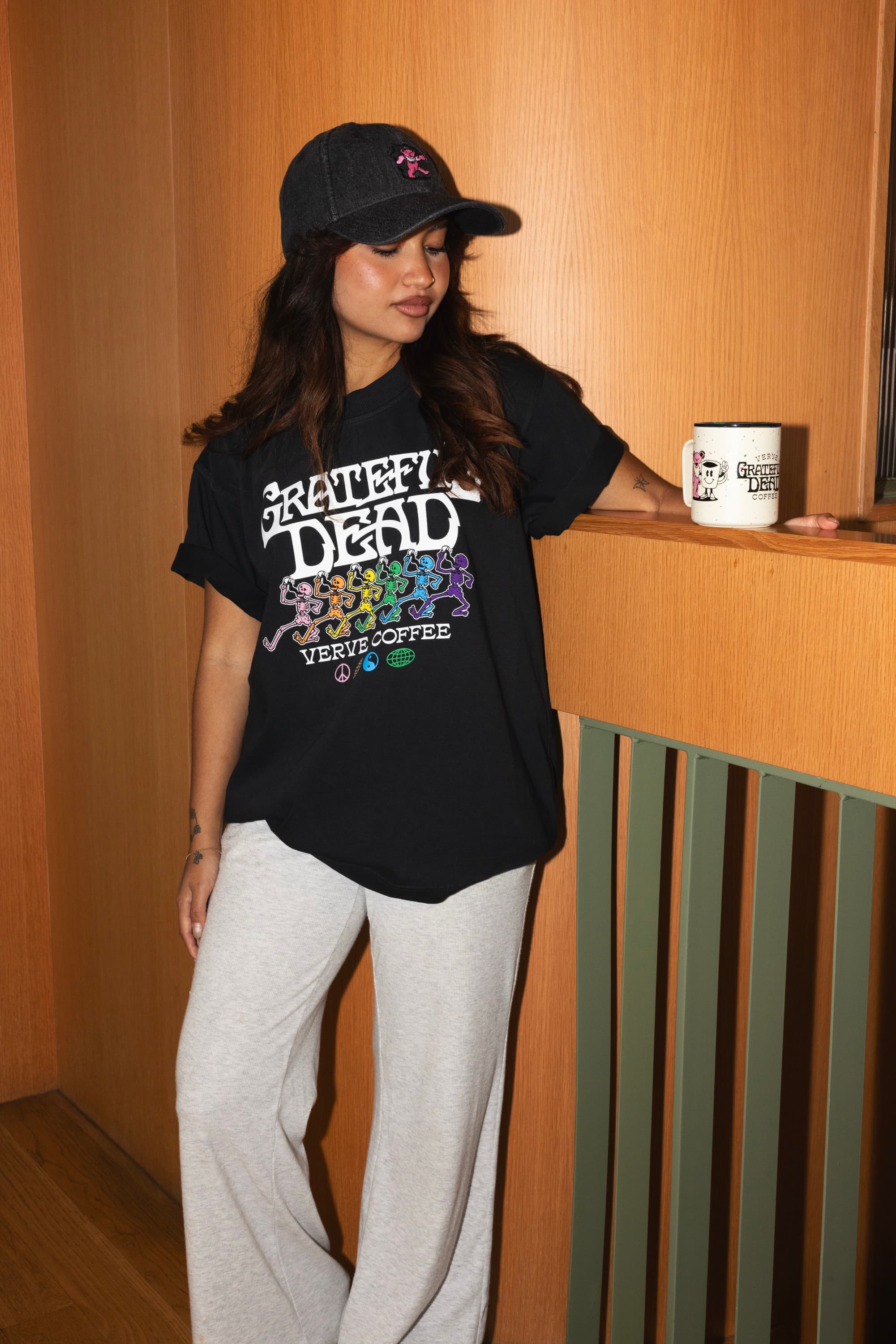
A boxy retail tee, heavyweight hoodie, cropped fleece, relaxed crewneck, performance layer, and standard promo tee all say different things. The right blank depends on who will wear it and where. Employee uniforms, retail drops, event giveaways, and VIP gifts should not all use the same body by default.
Use color to make the piece wearable
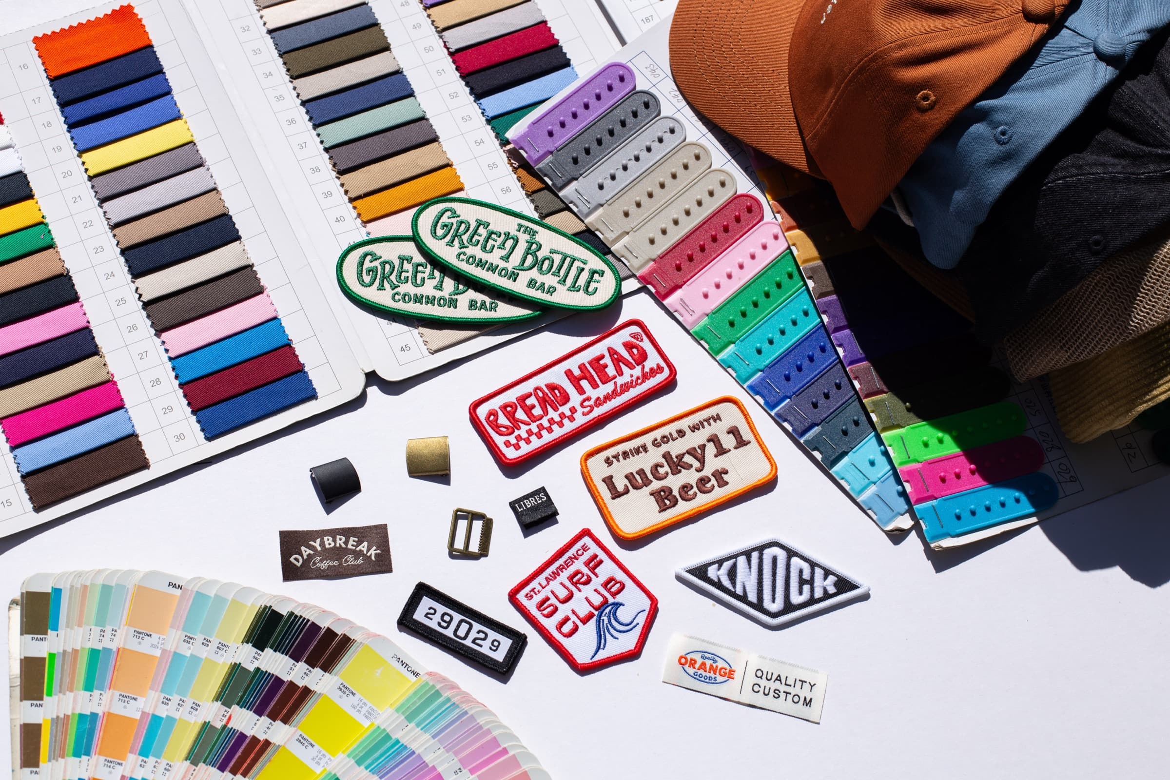
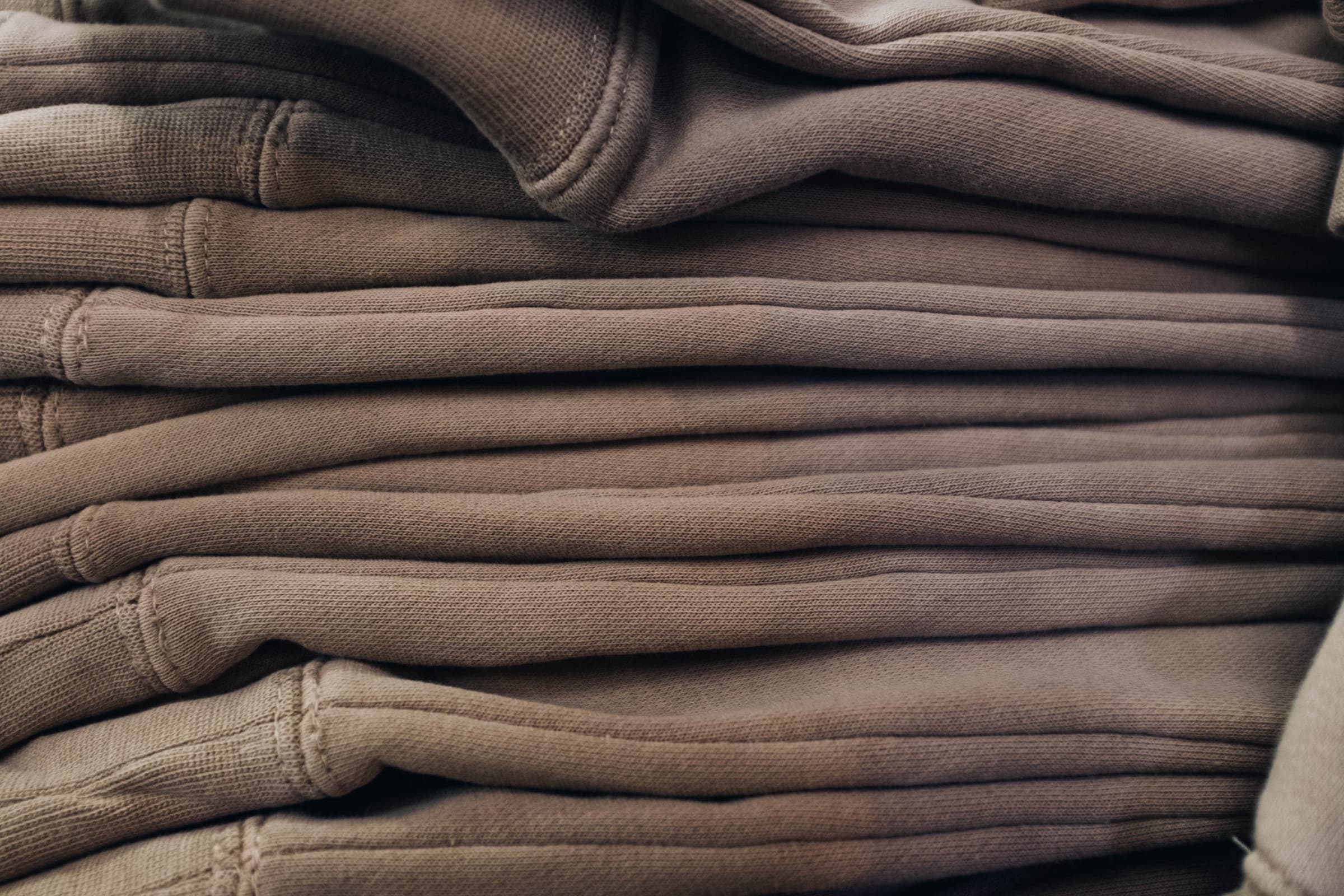
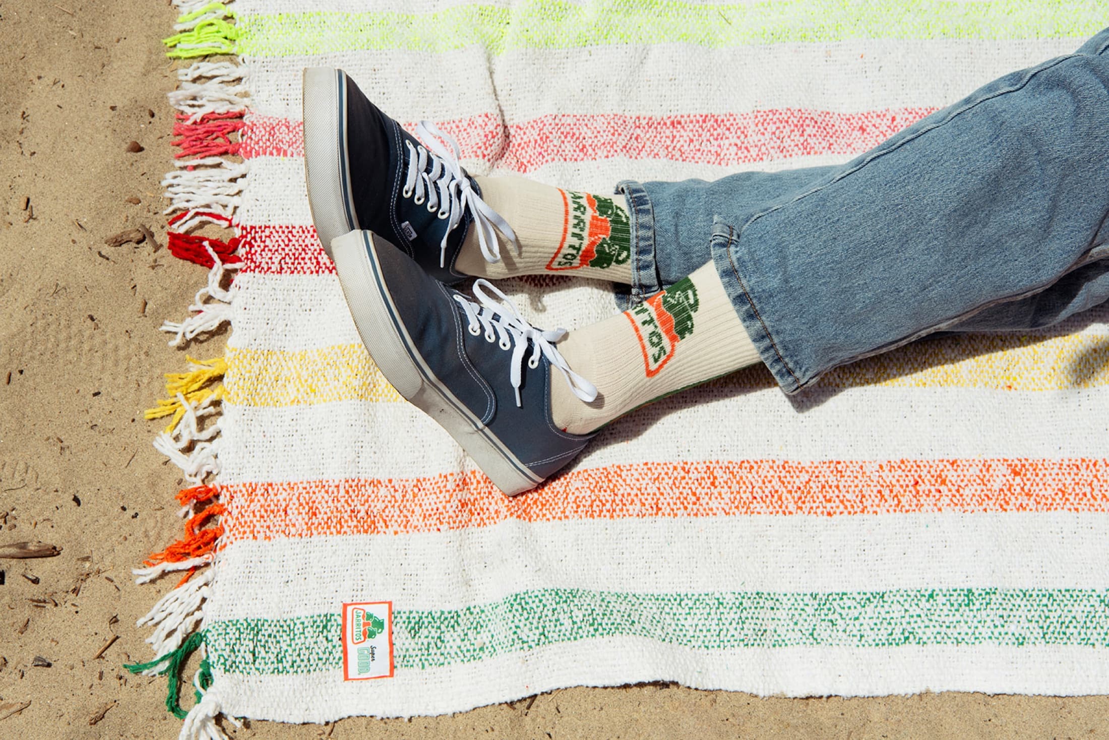
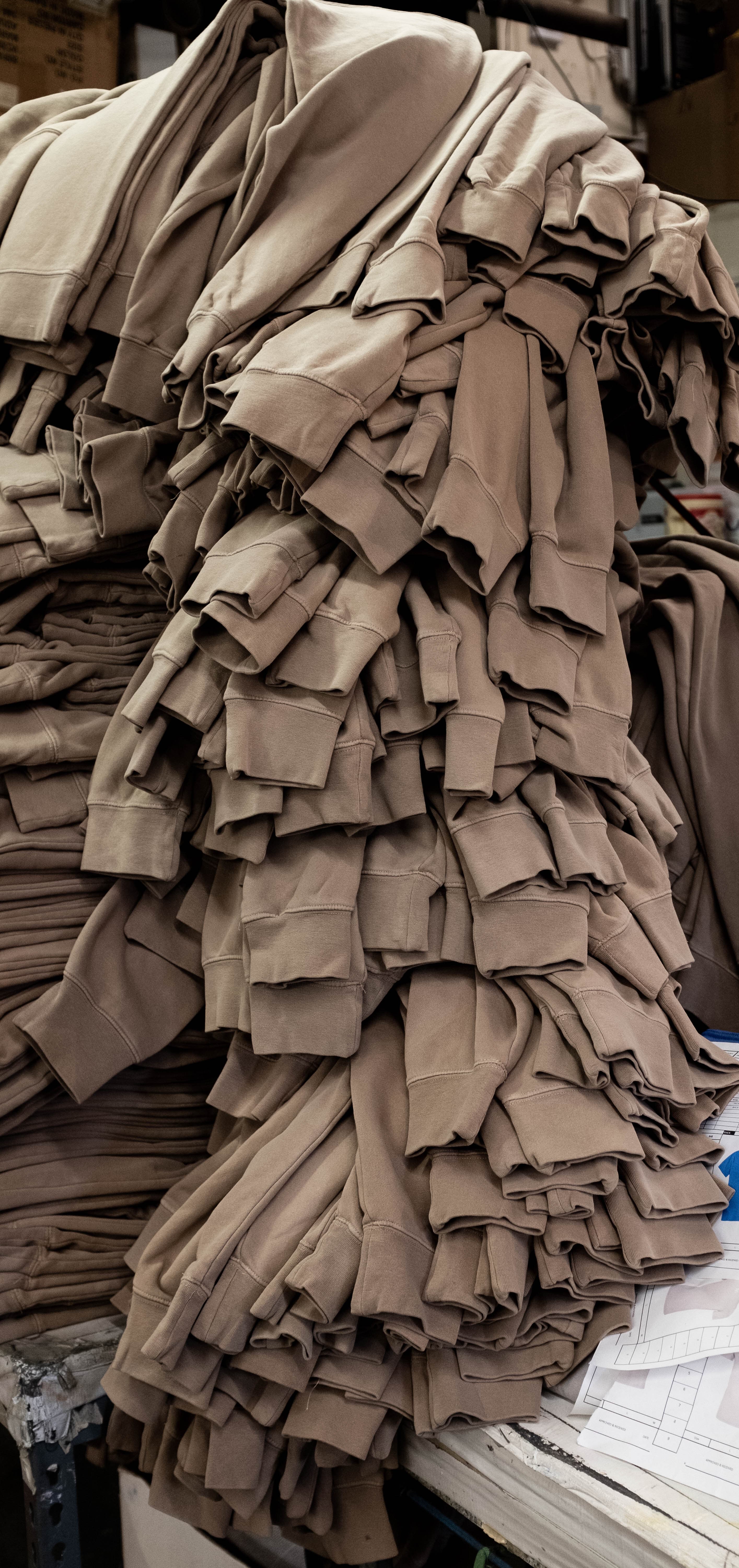
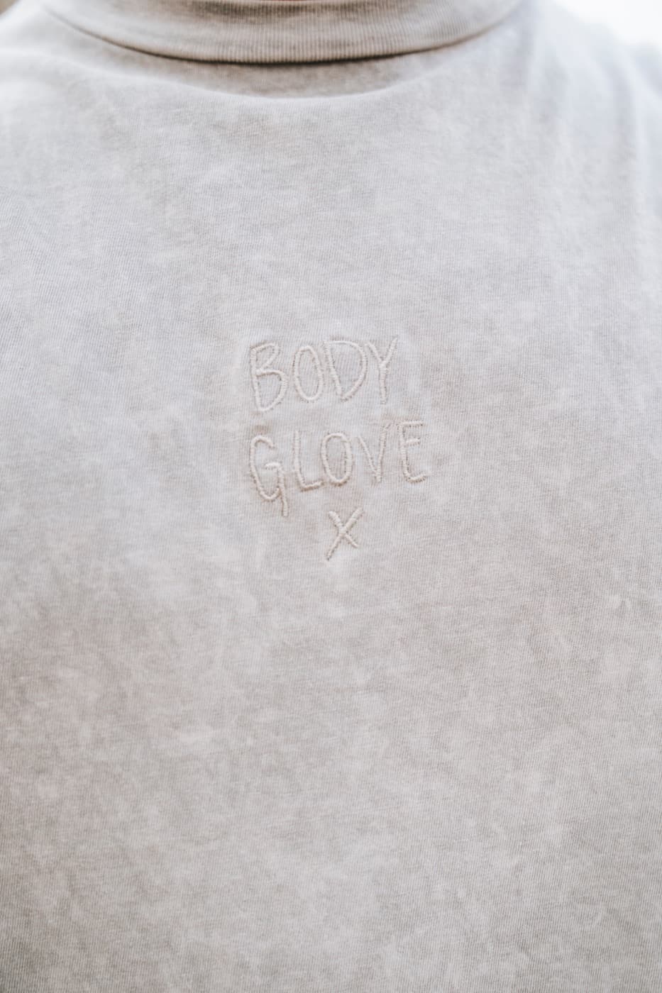
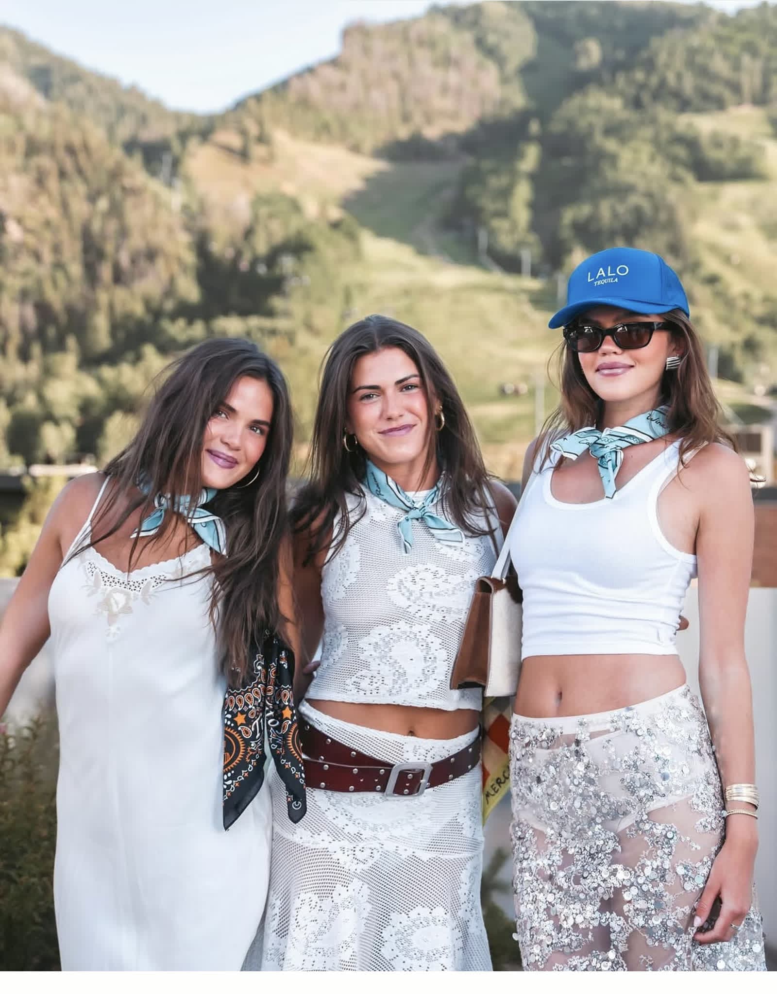
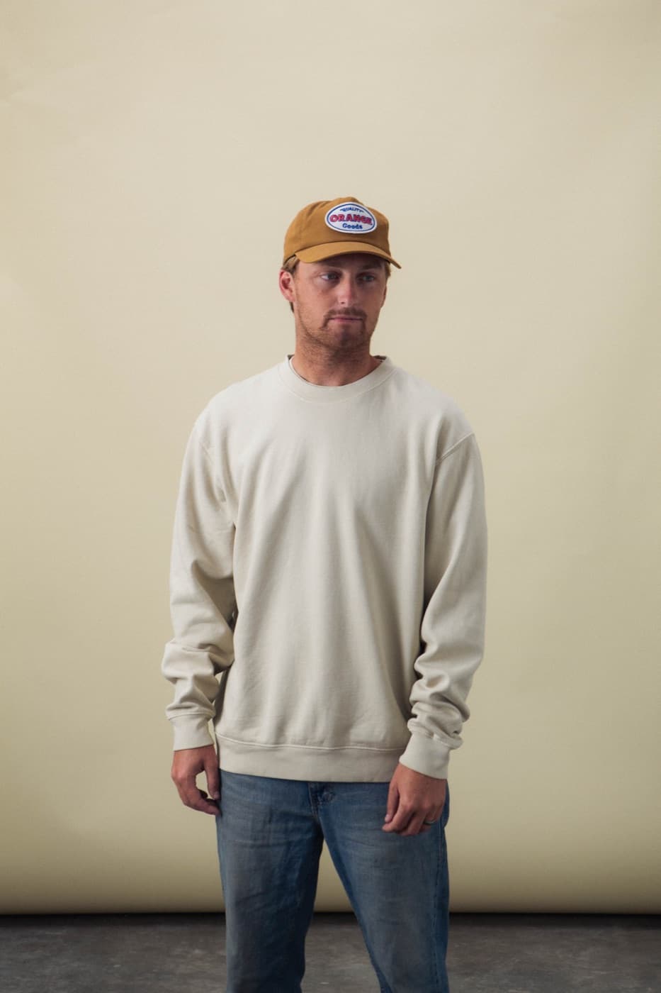
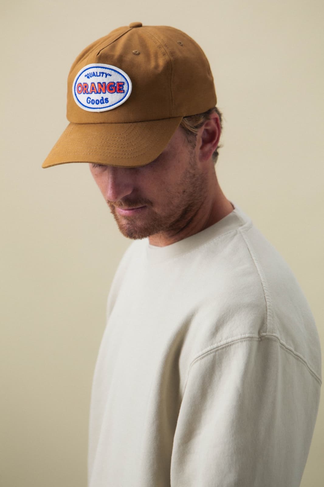
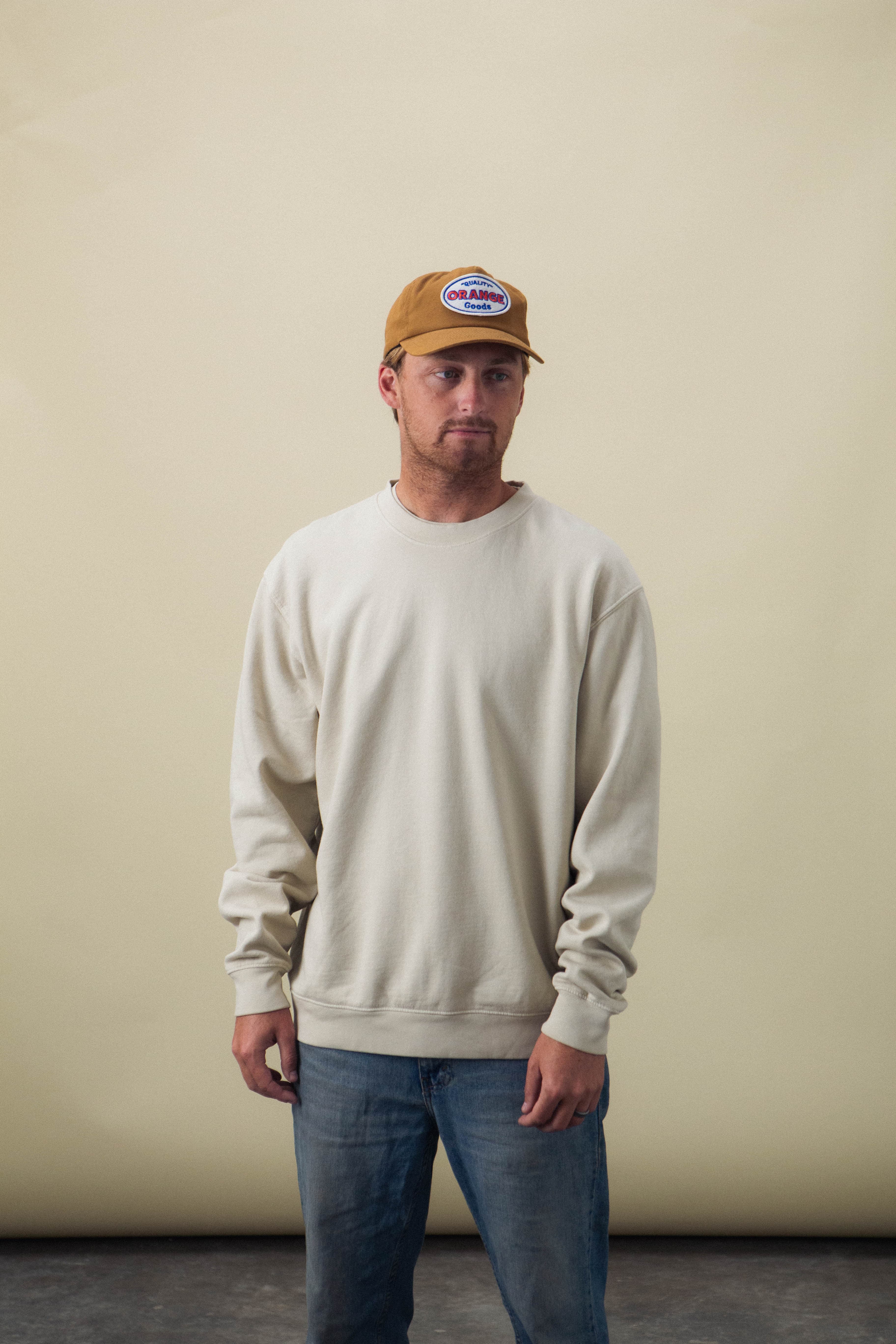
Brand colors can be useful, but the garment color should still make sense in a closet. Washed neutrals, deep colors, natural tones, and carefully chosen accents often sell better than forcing the main brand color across the entire piece.
Match decoration to the fabric
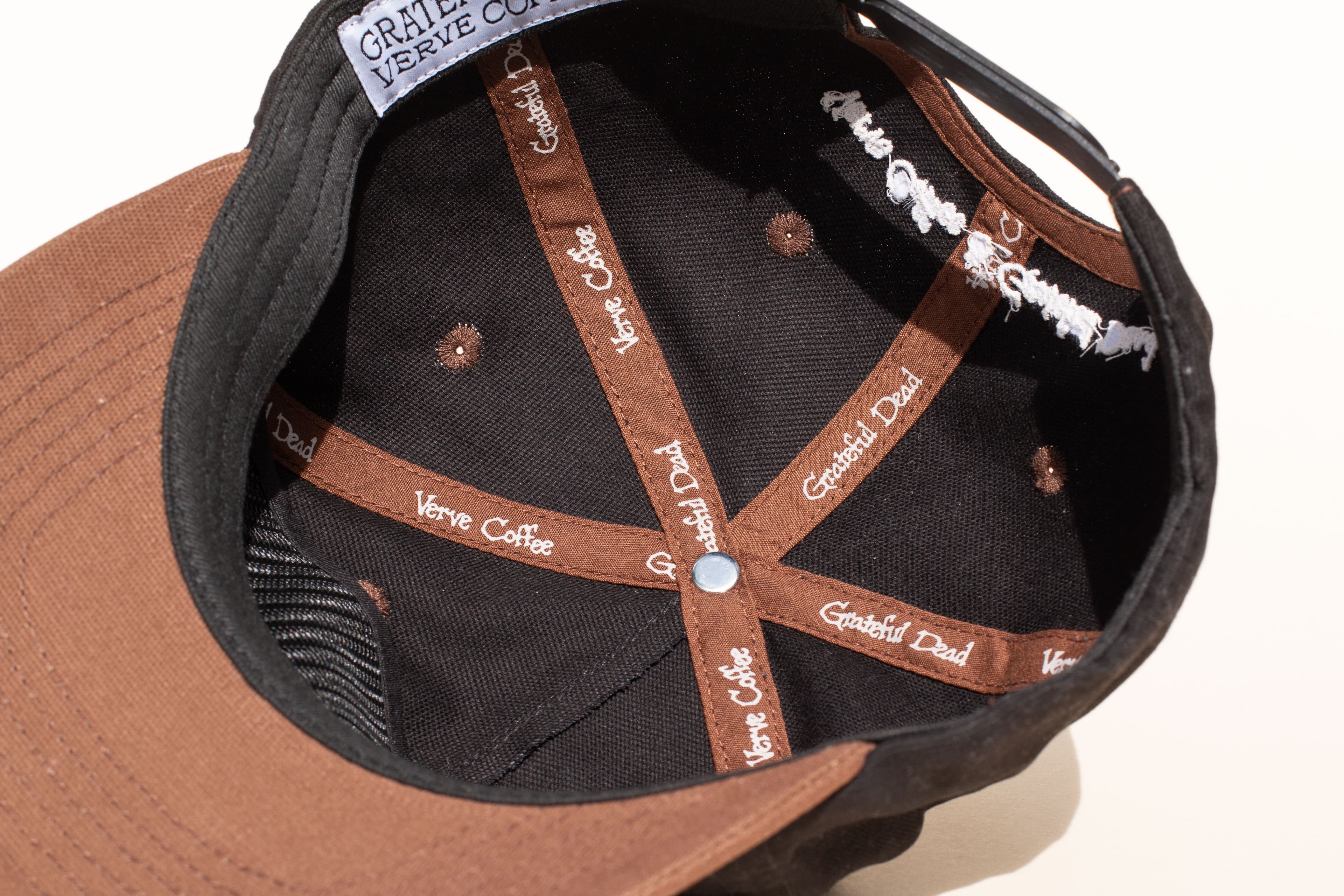
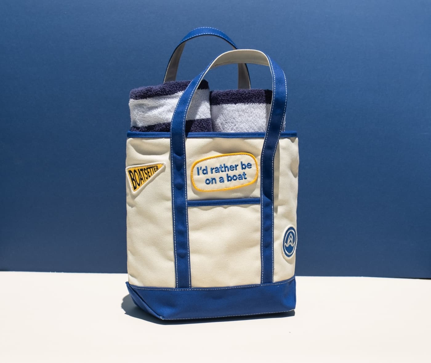
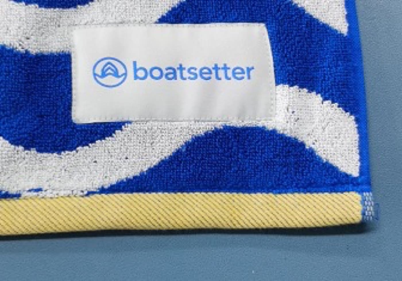
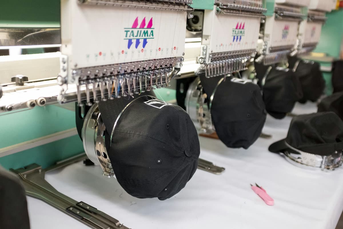
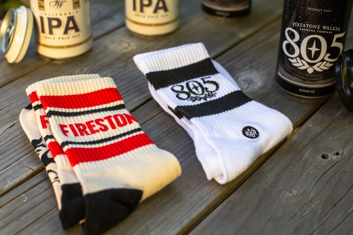
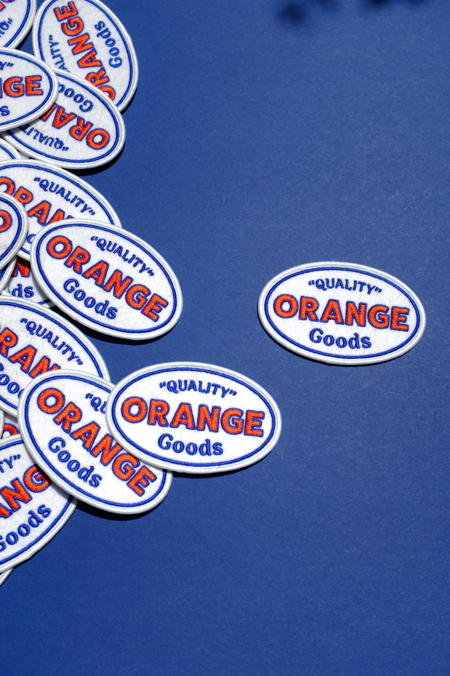
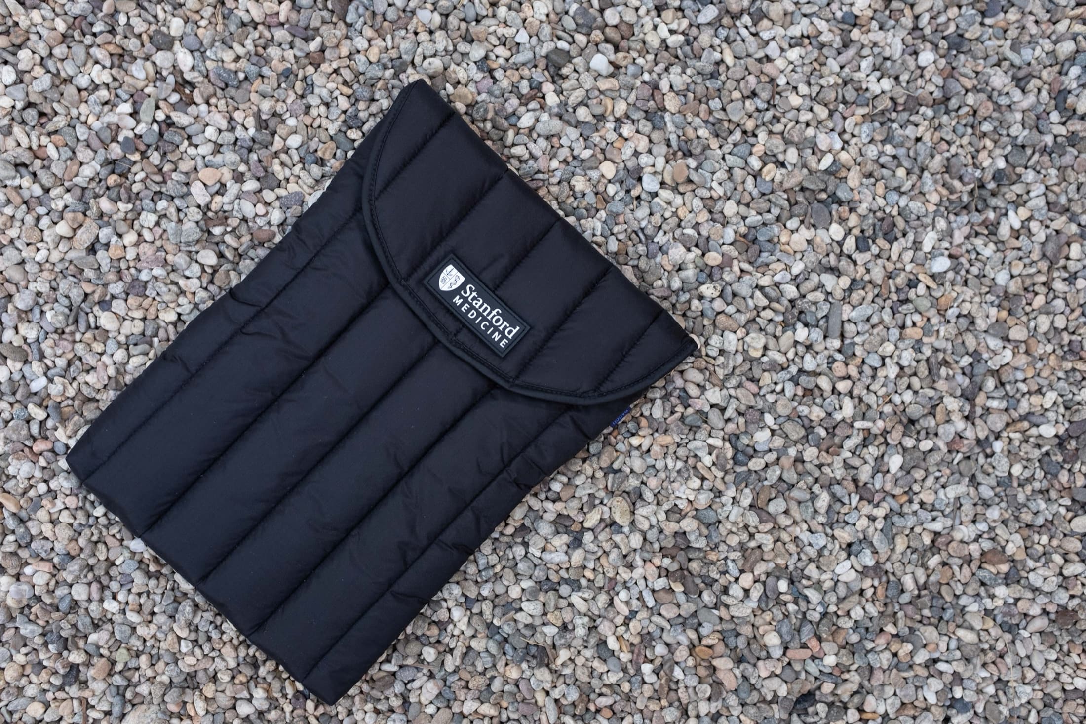
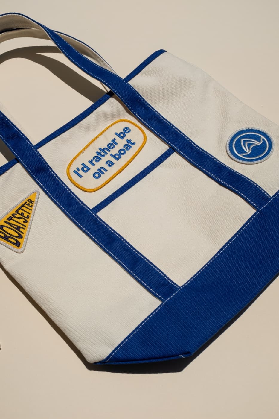
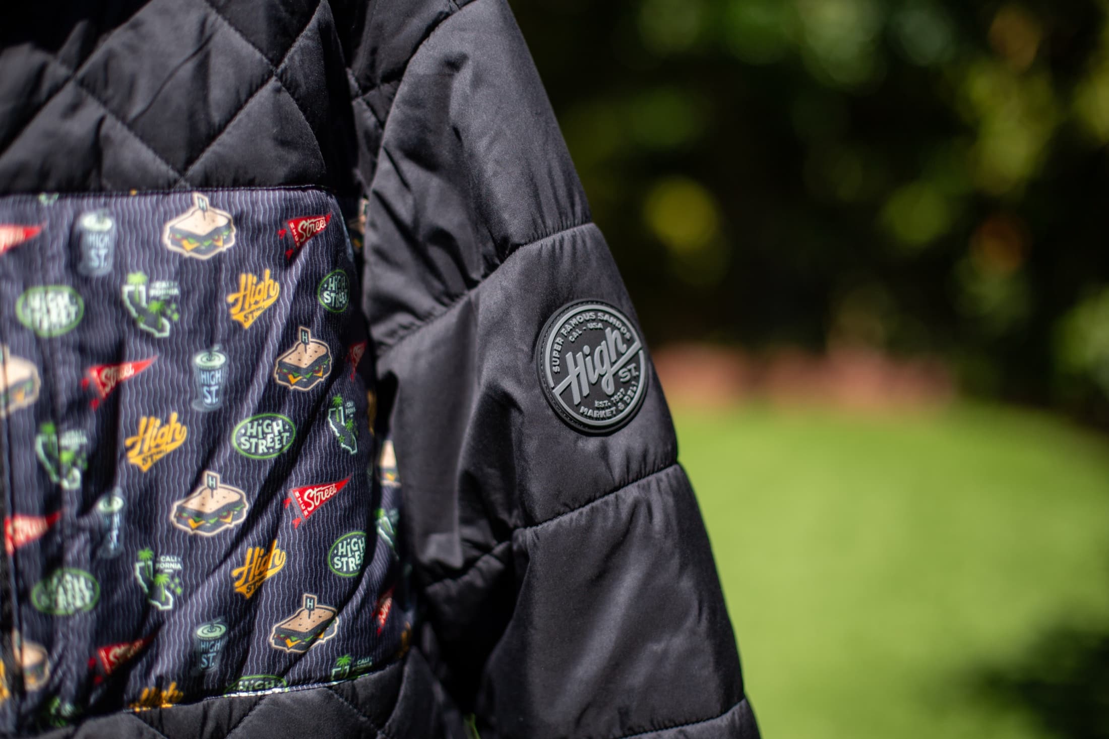
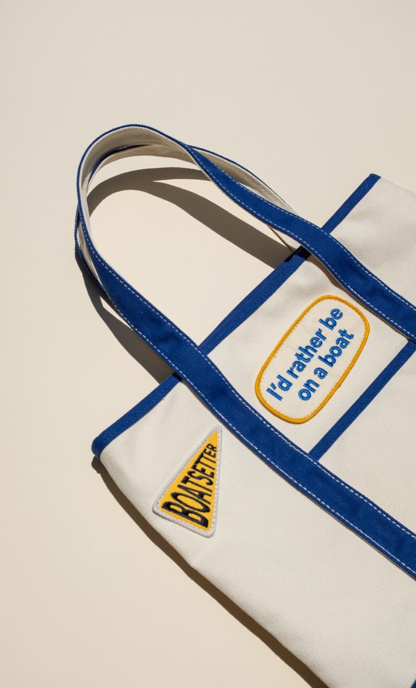
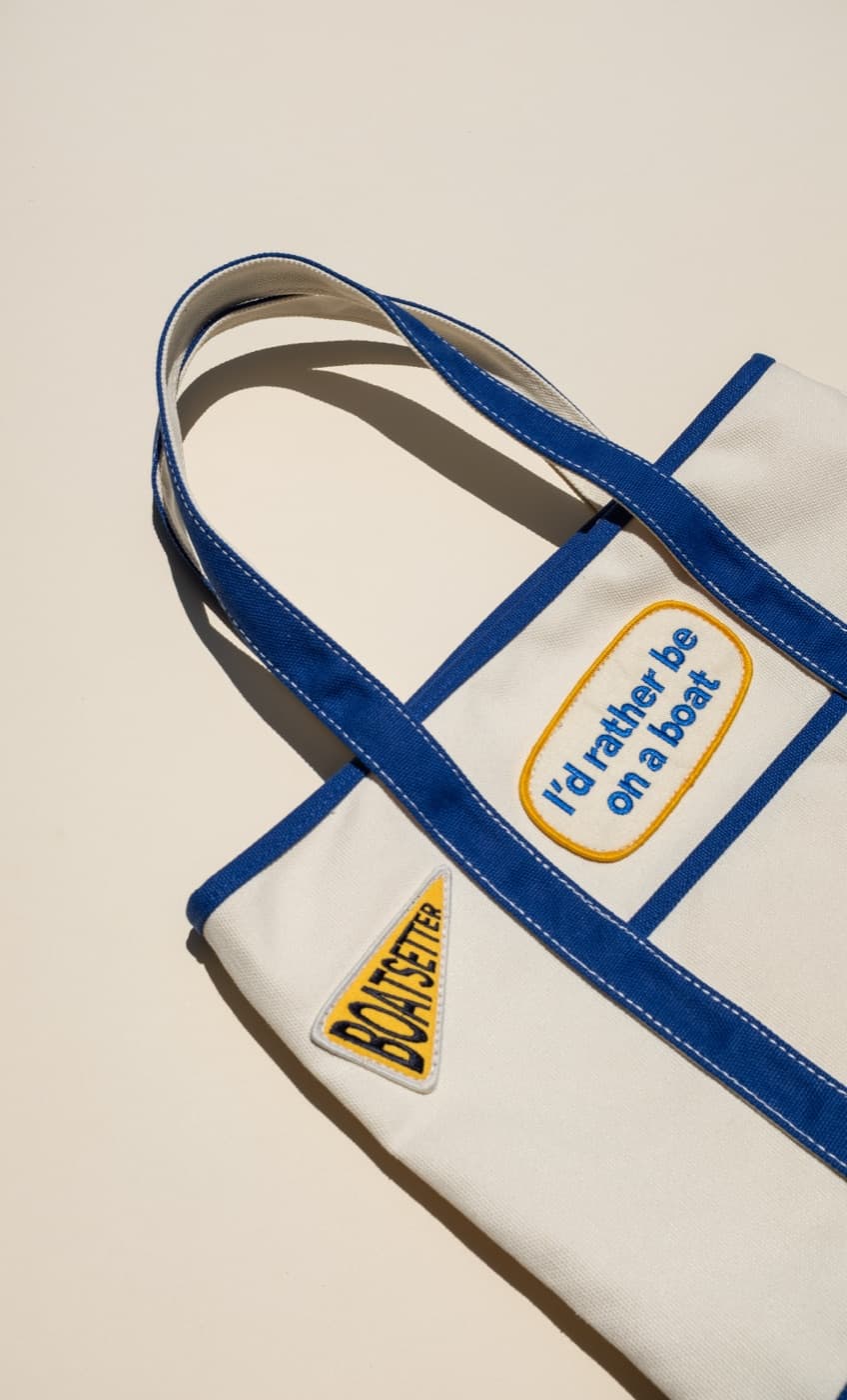
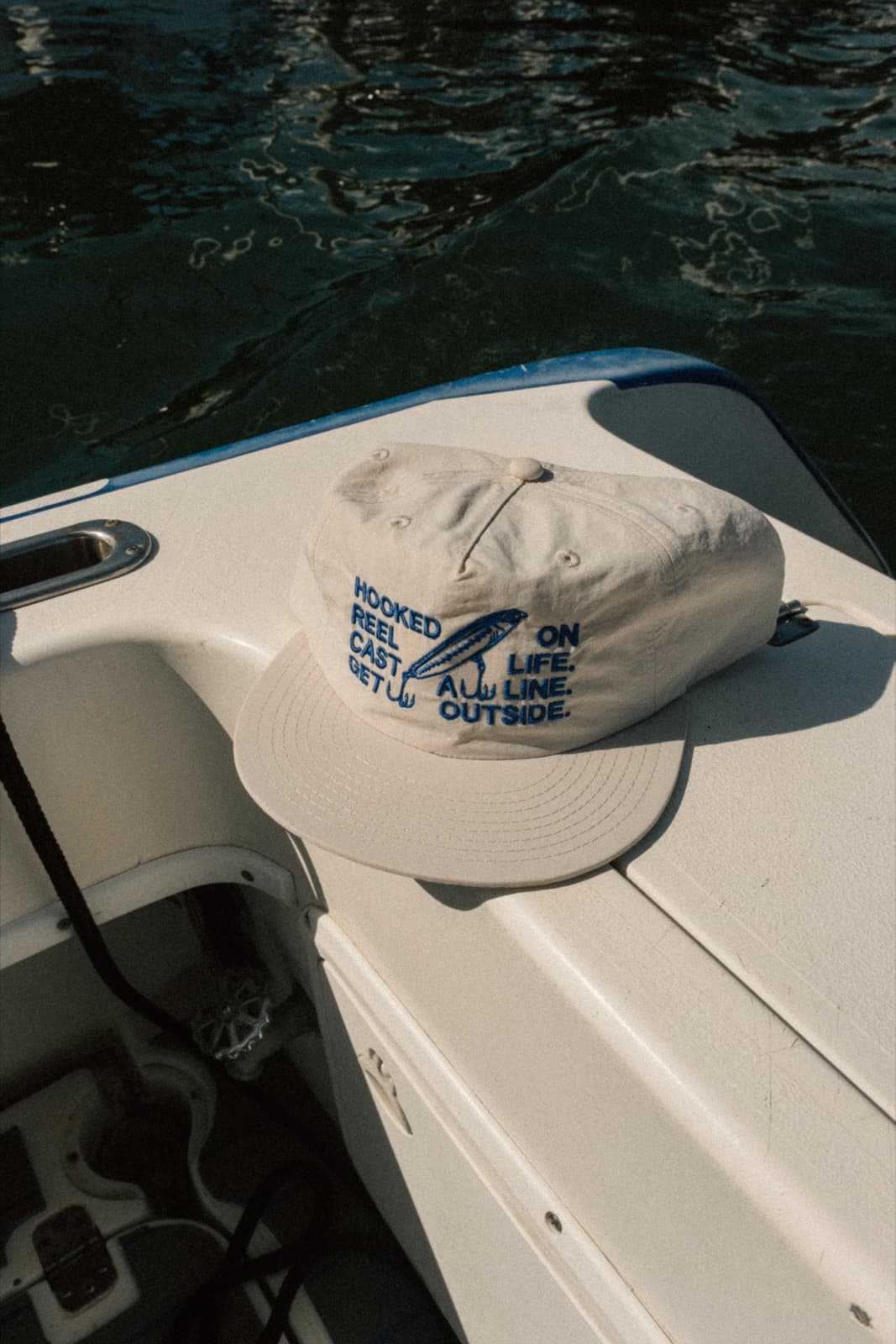
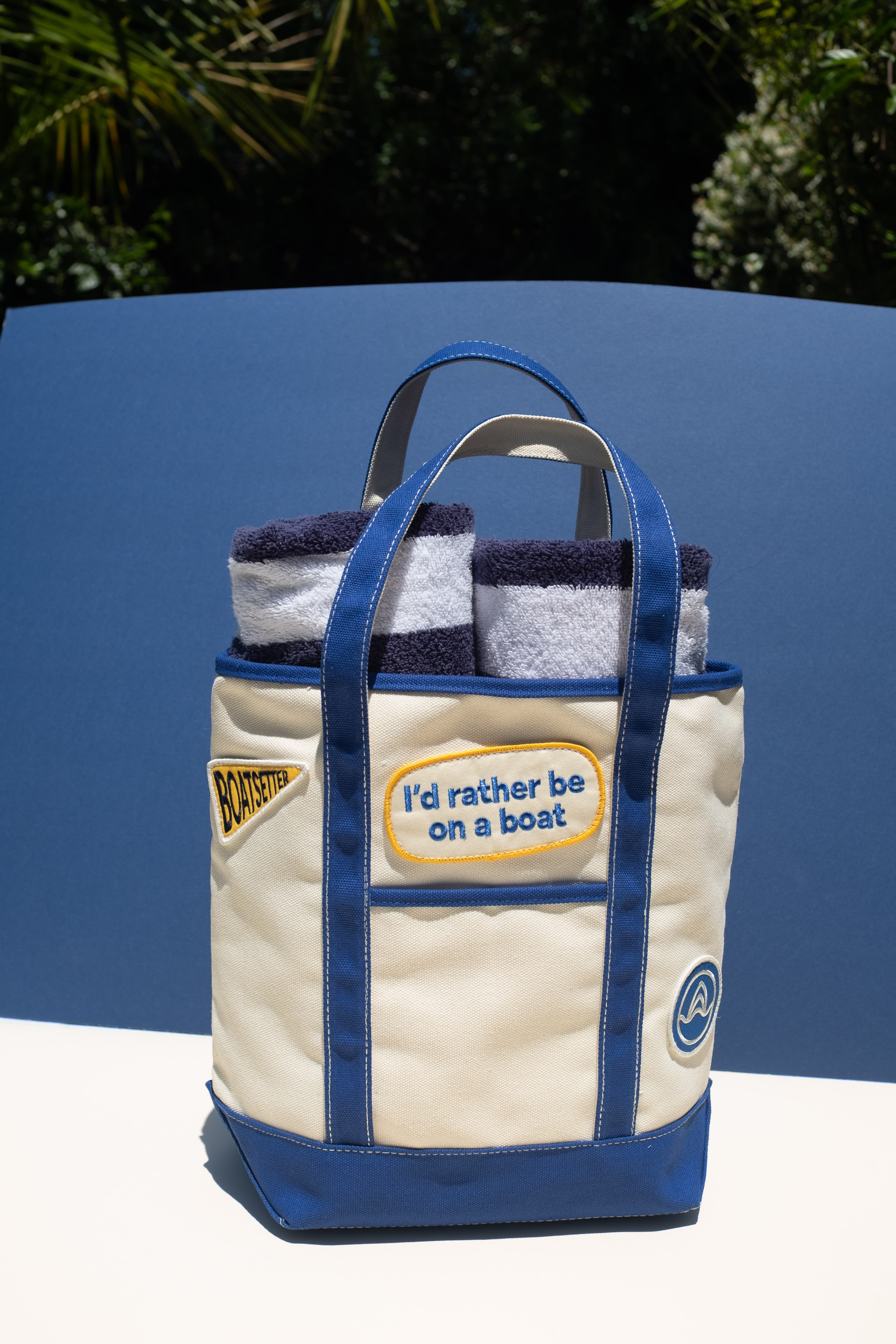
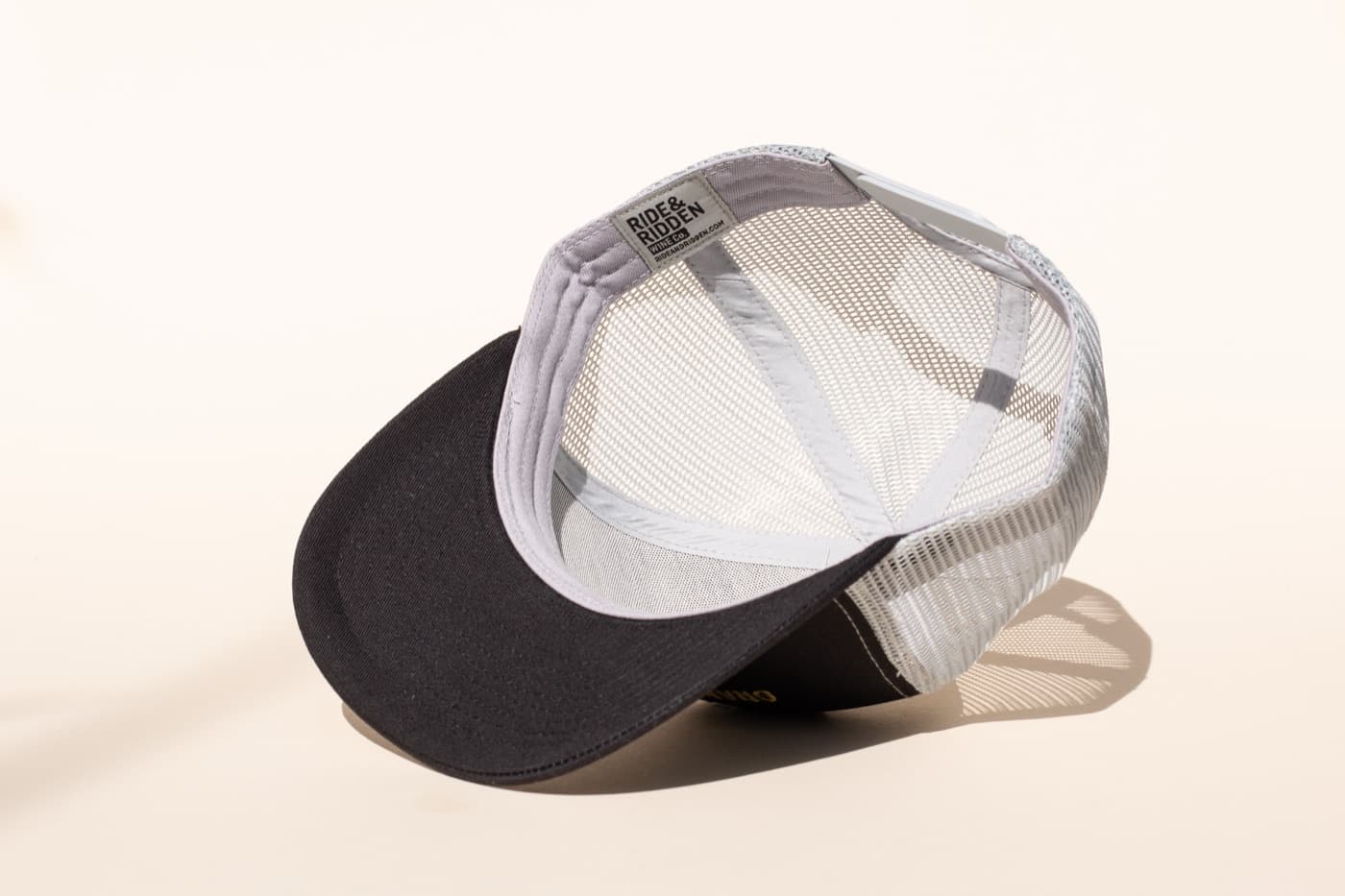
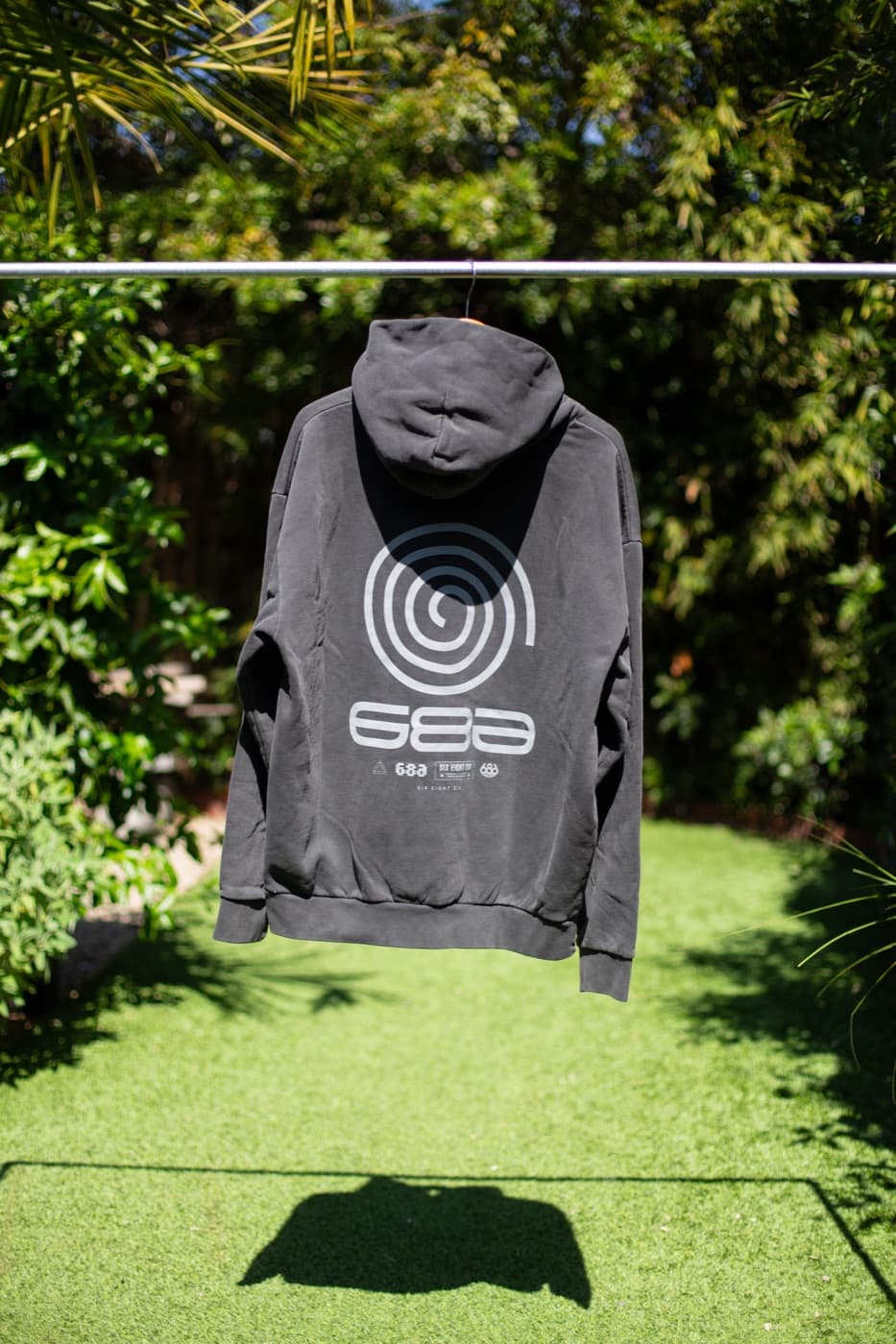
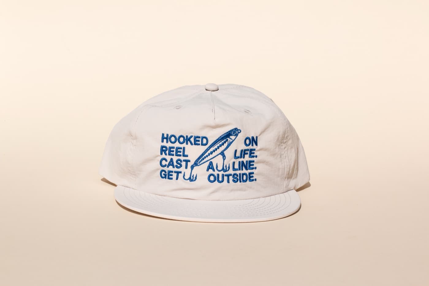
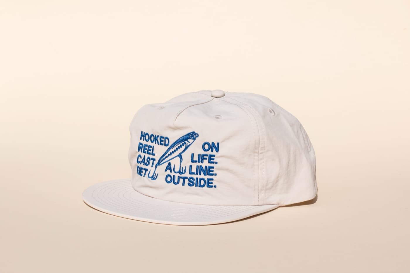
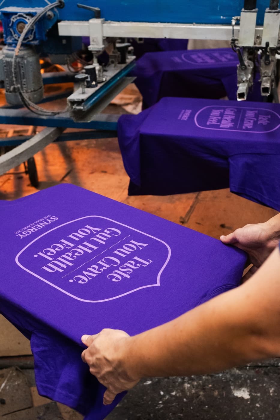
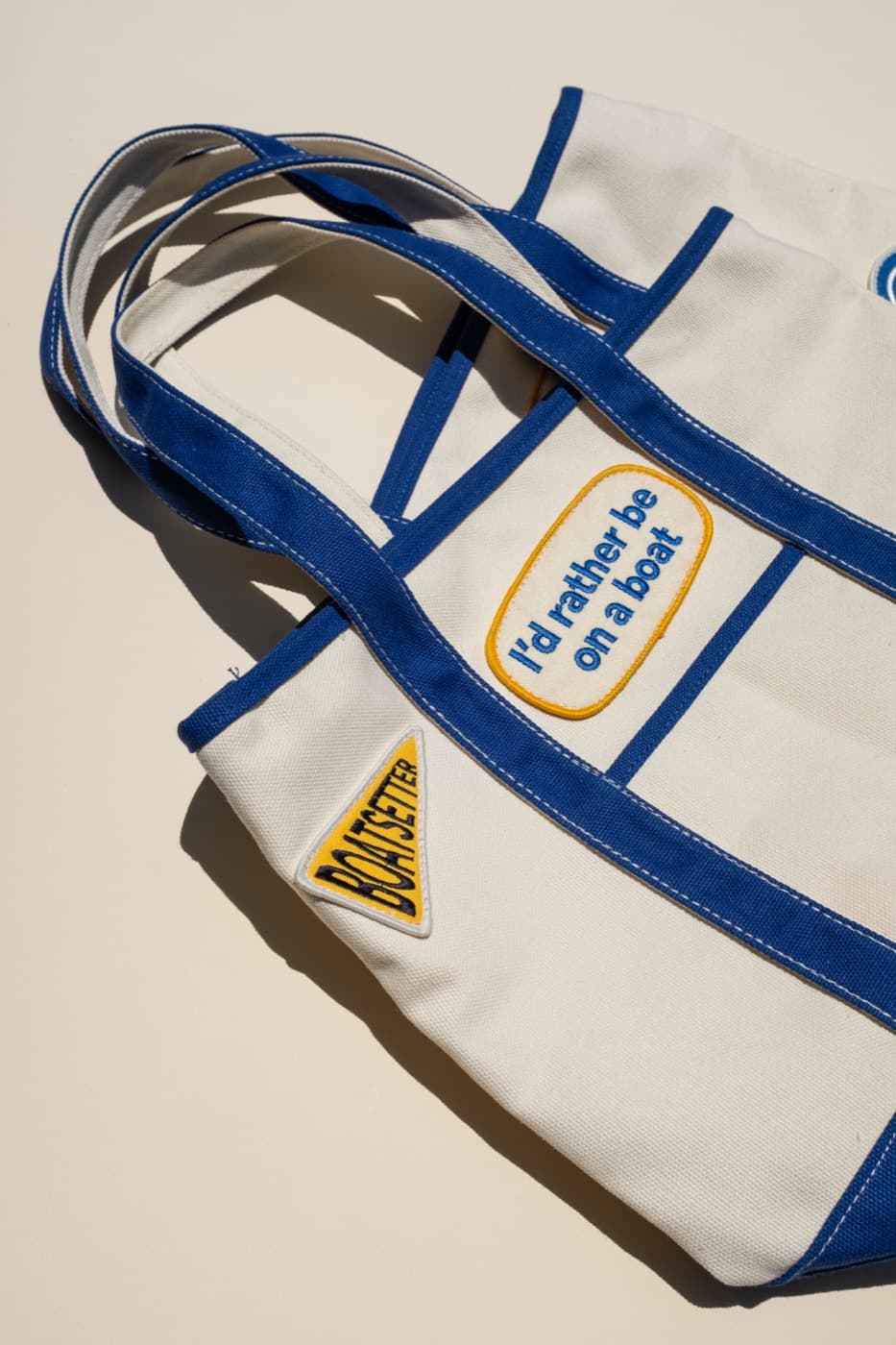
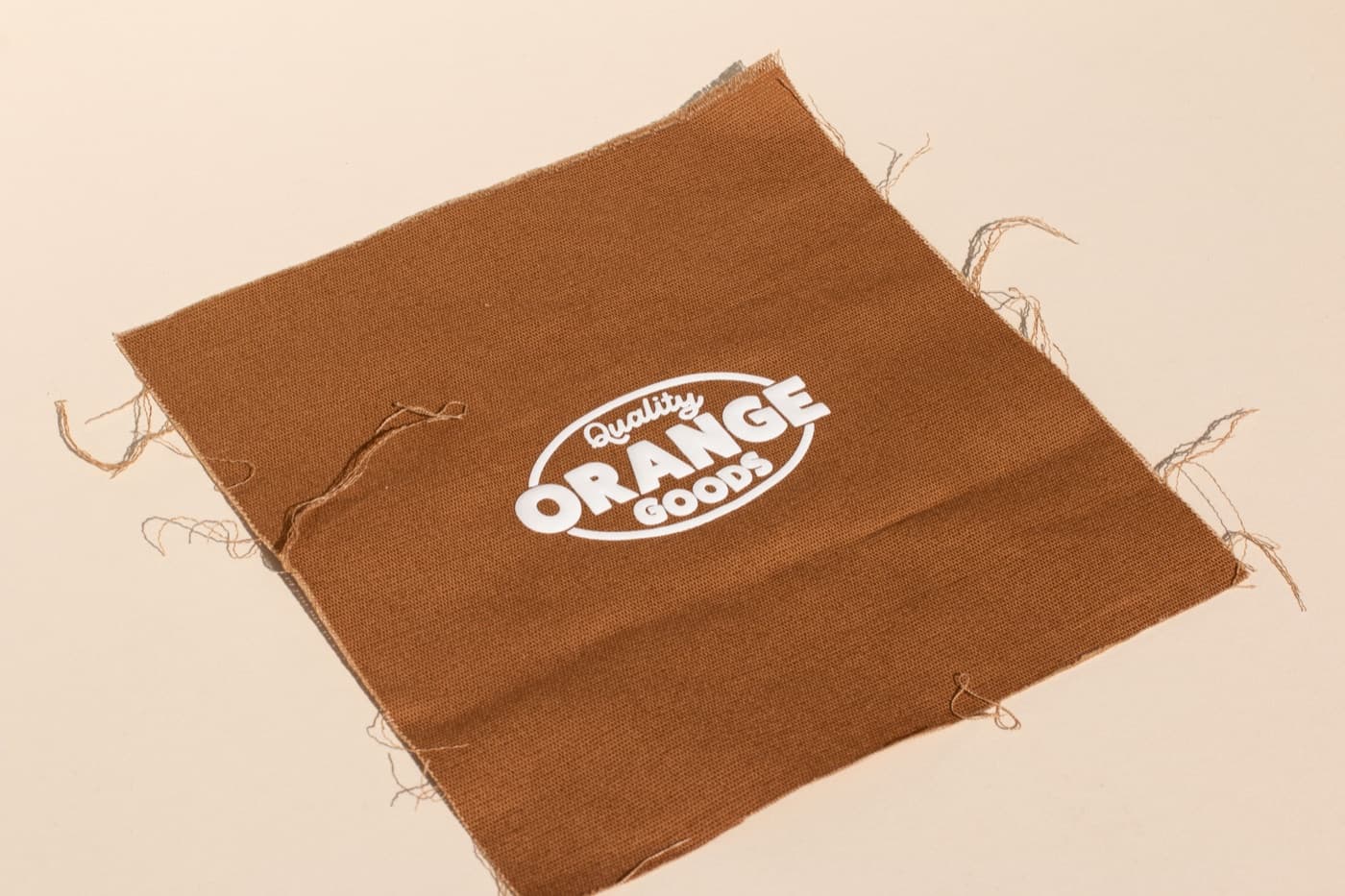
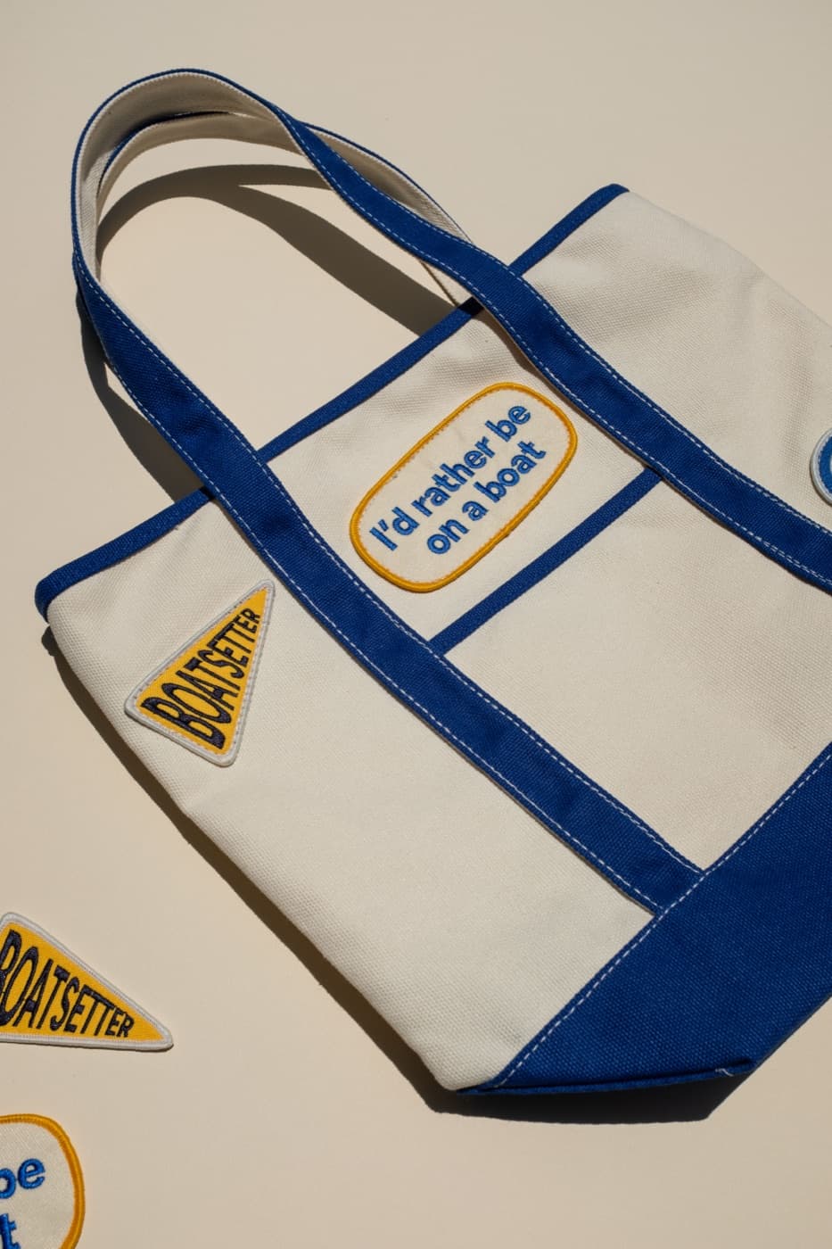
Screen print, embroidery, applique, woven labels, puff print, and transfers all behave differently on different fabric weights and surfaces. A heavy hoodie can carry a bigger print or patch. A lighter tee may need a softer print. A jacket may call for embroidery or a label instead of a large graphic.
The takeaway
Better apparel starts with a better blank. Orange Goods helps brands choose garments with the right fit, handfeel, color, and decoration method so the final piece has a real chance of being worn.