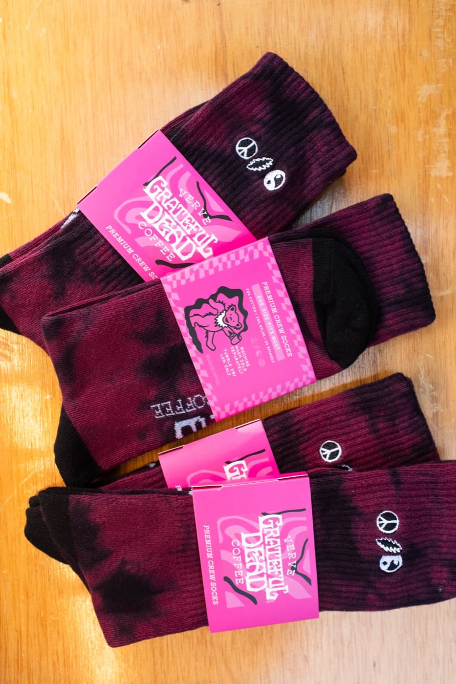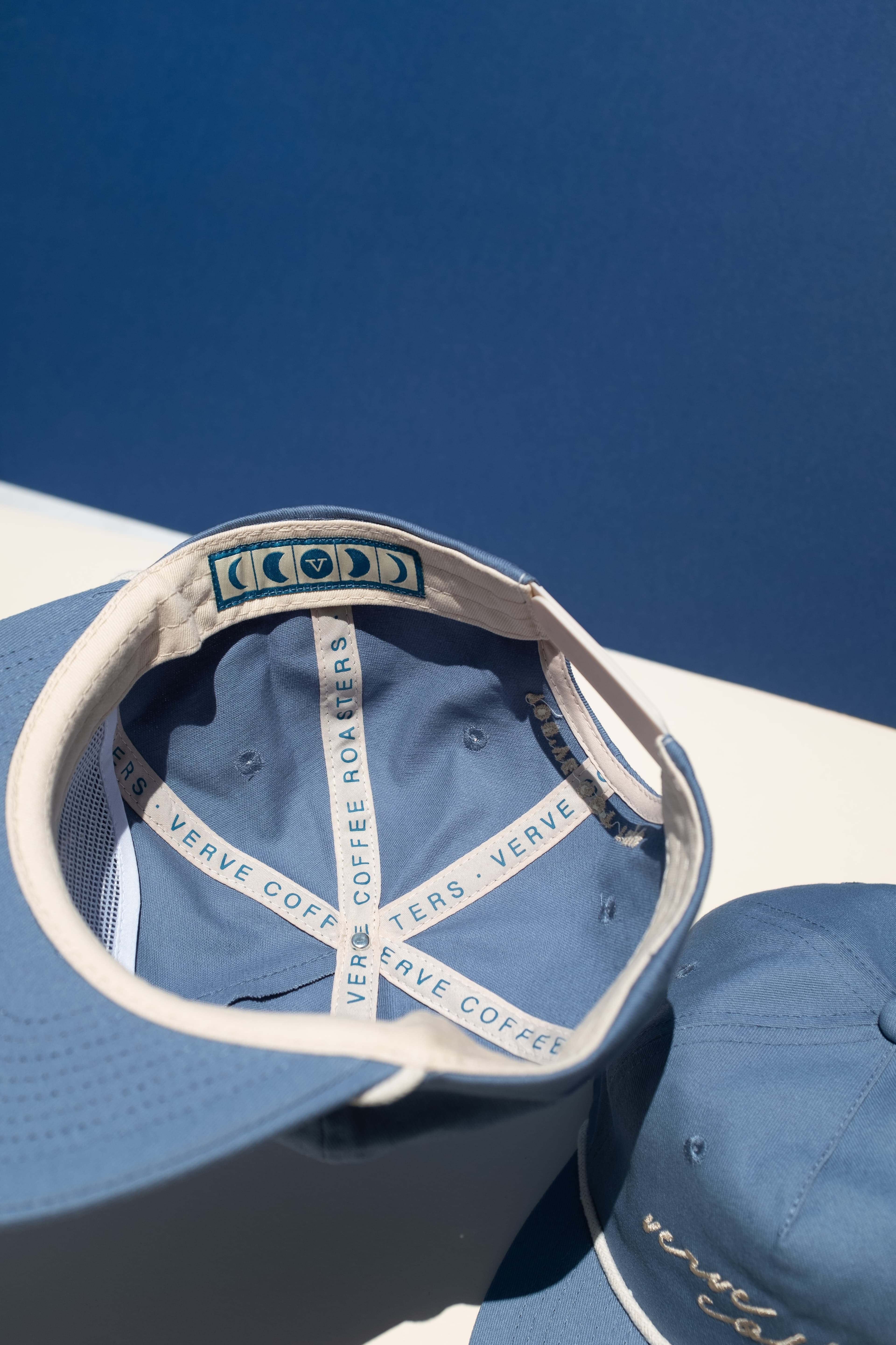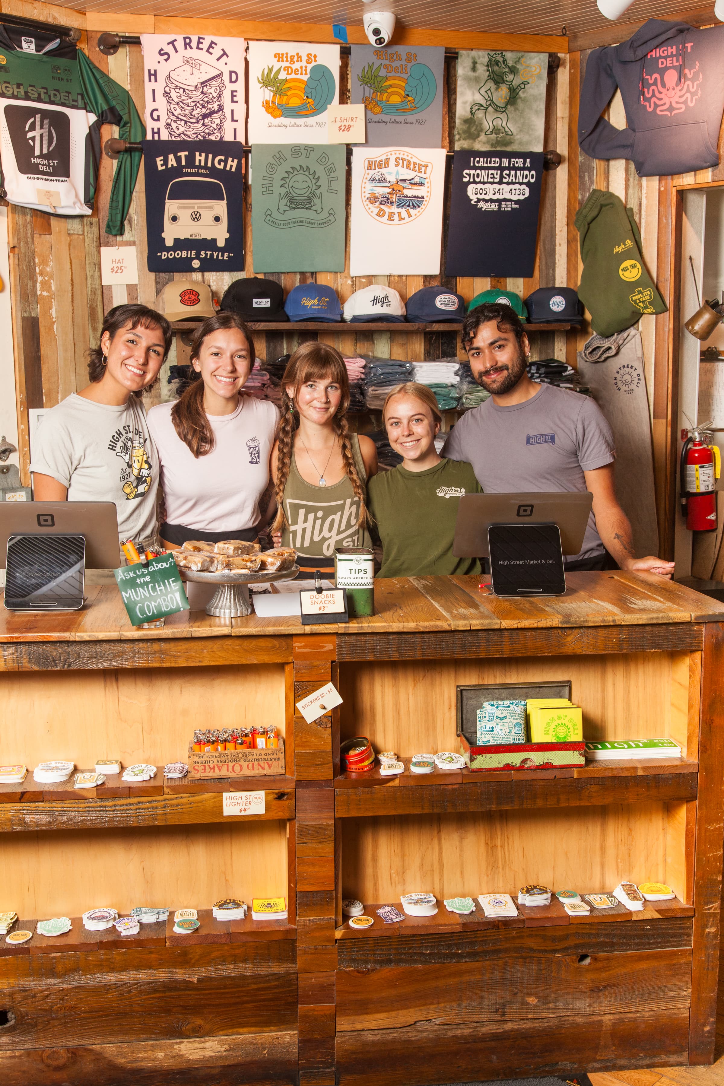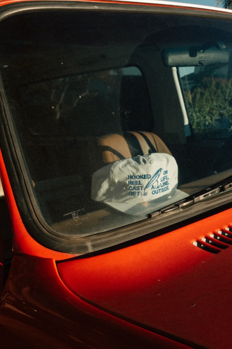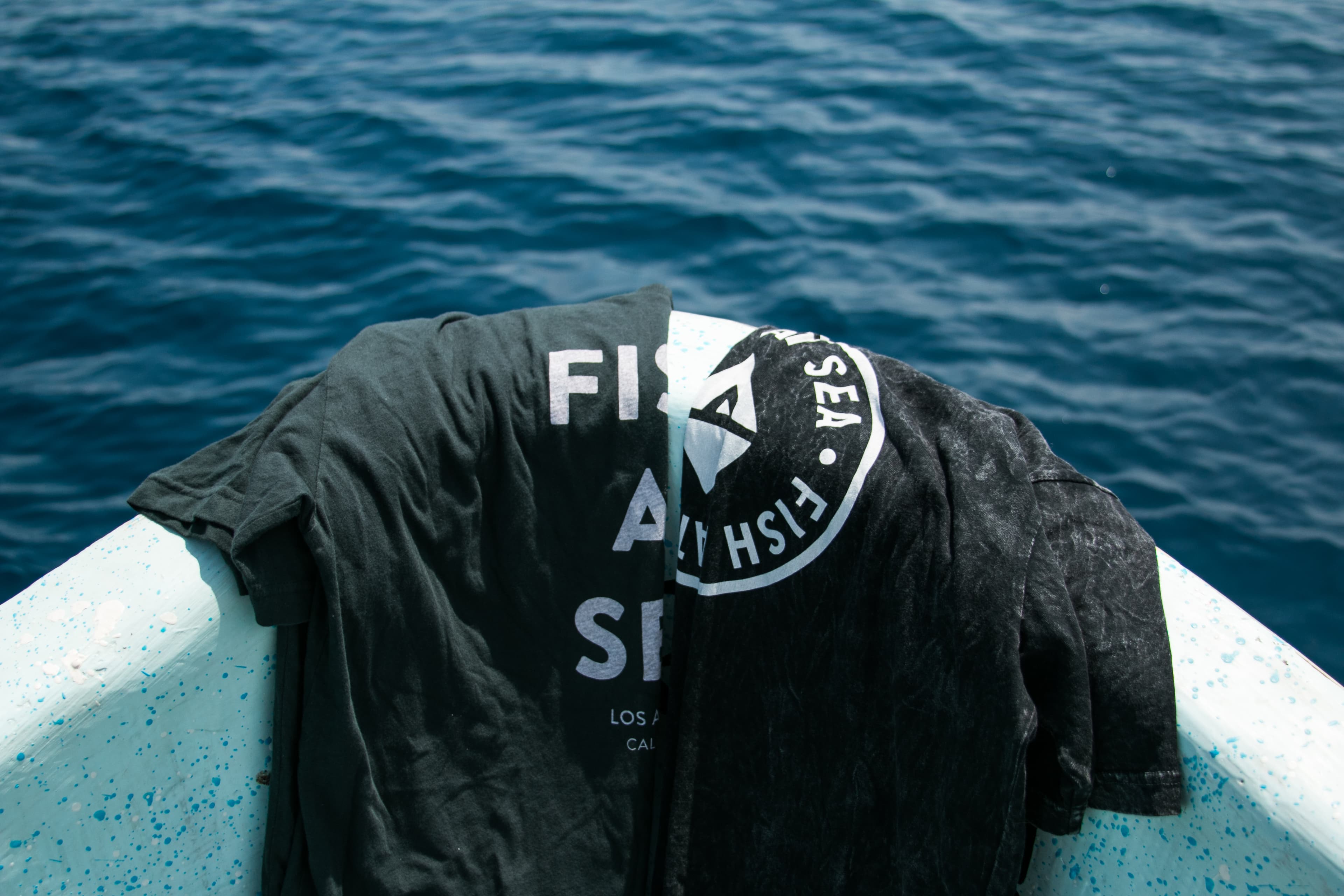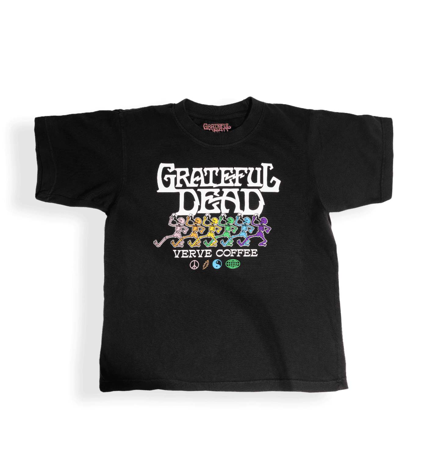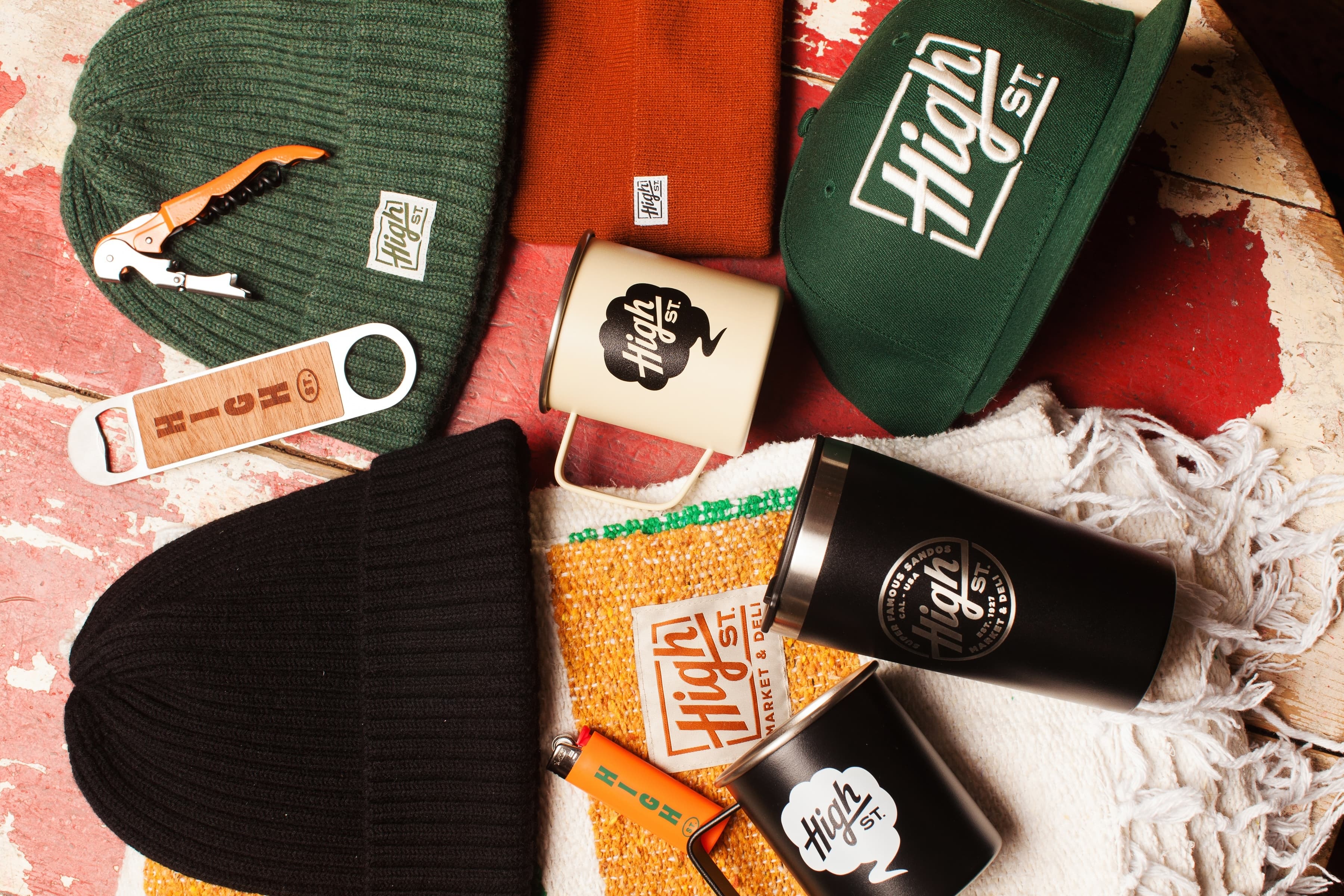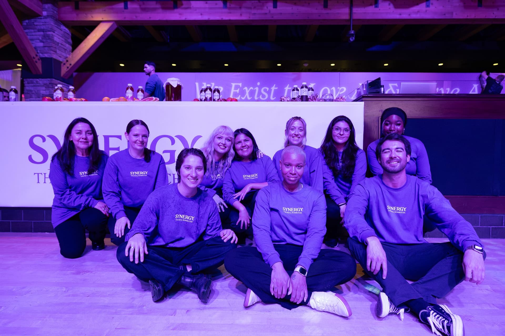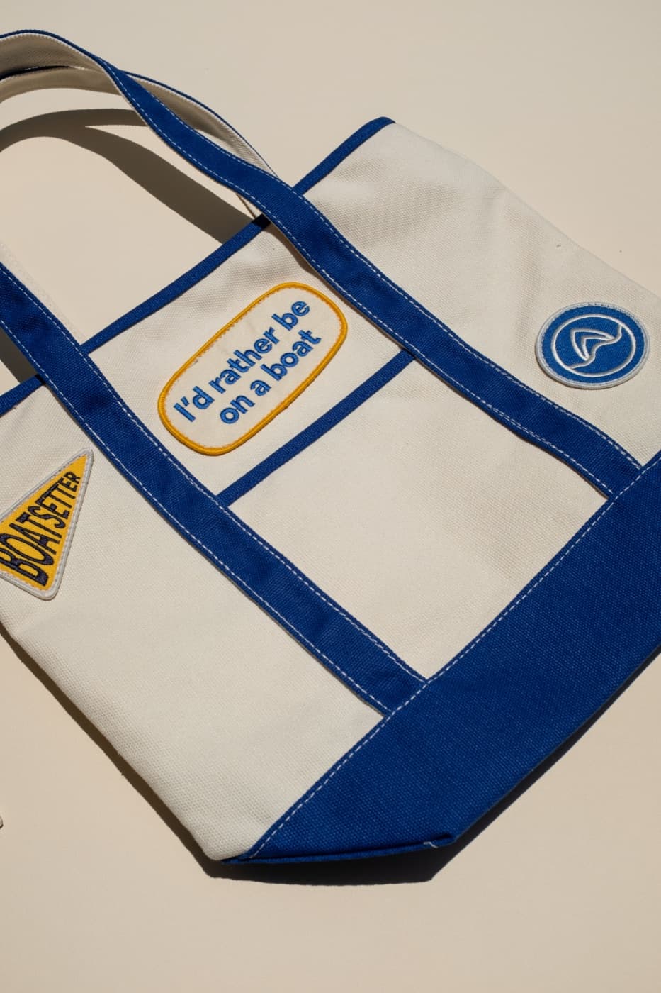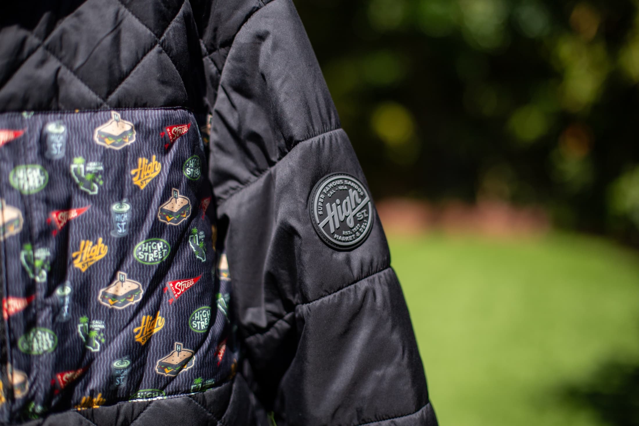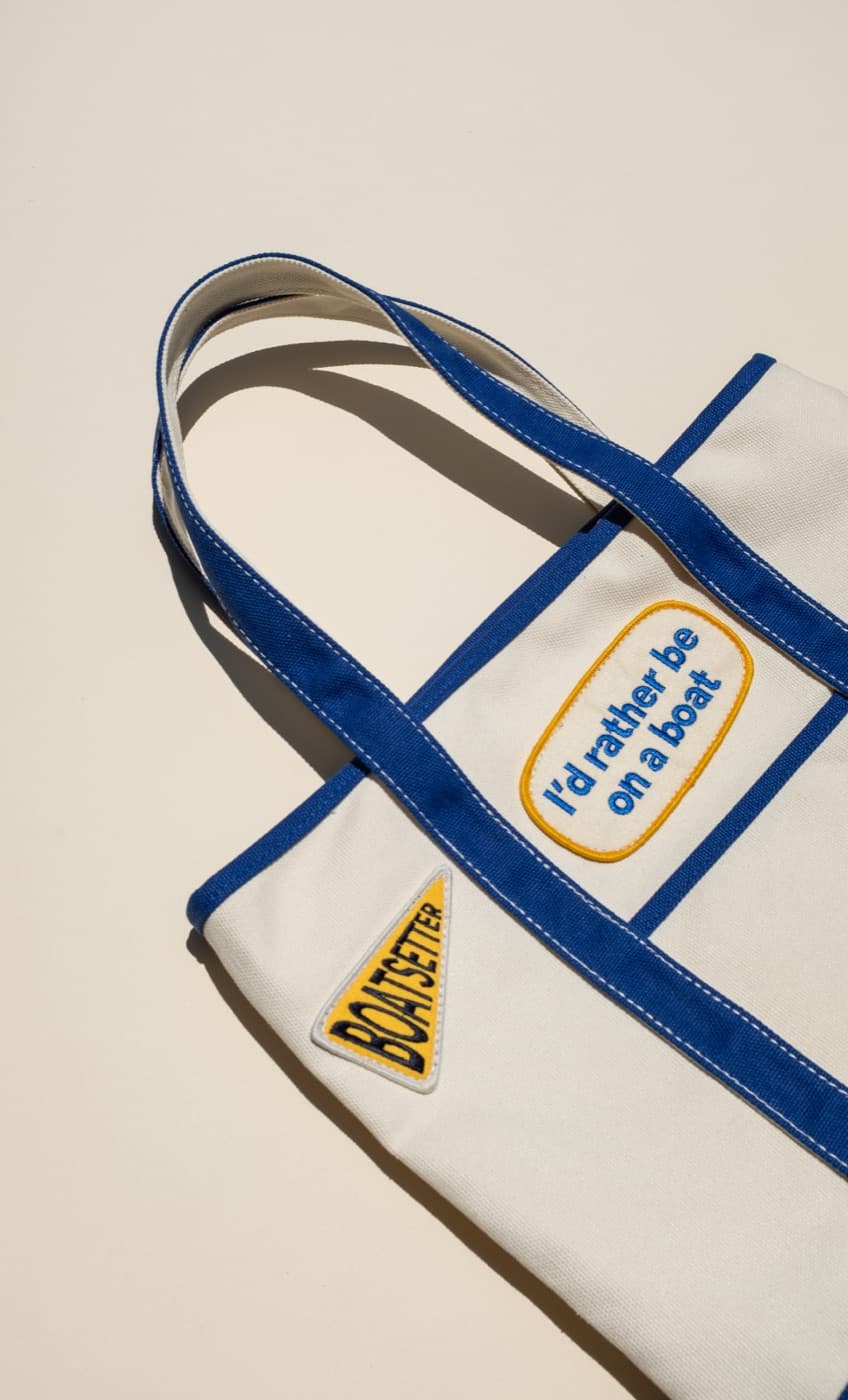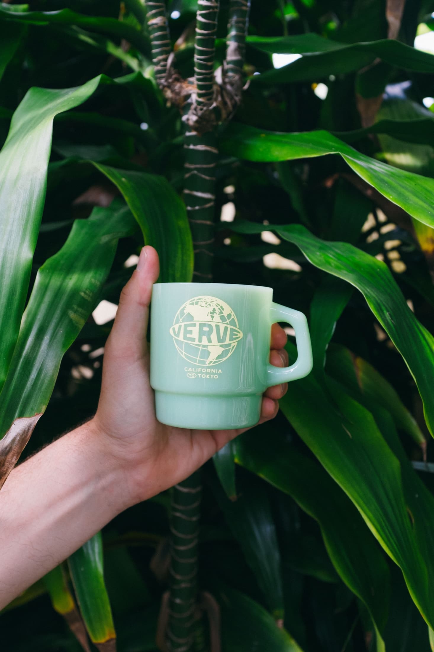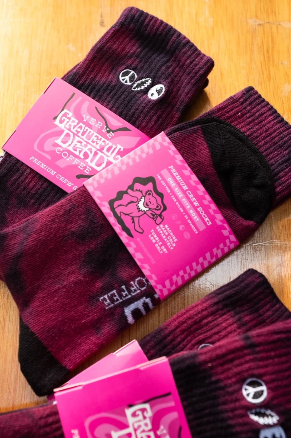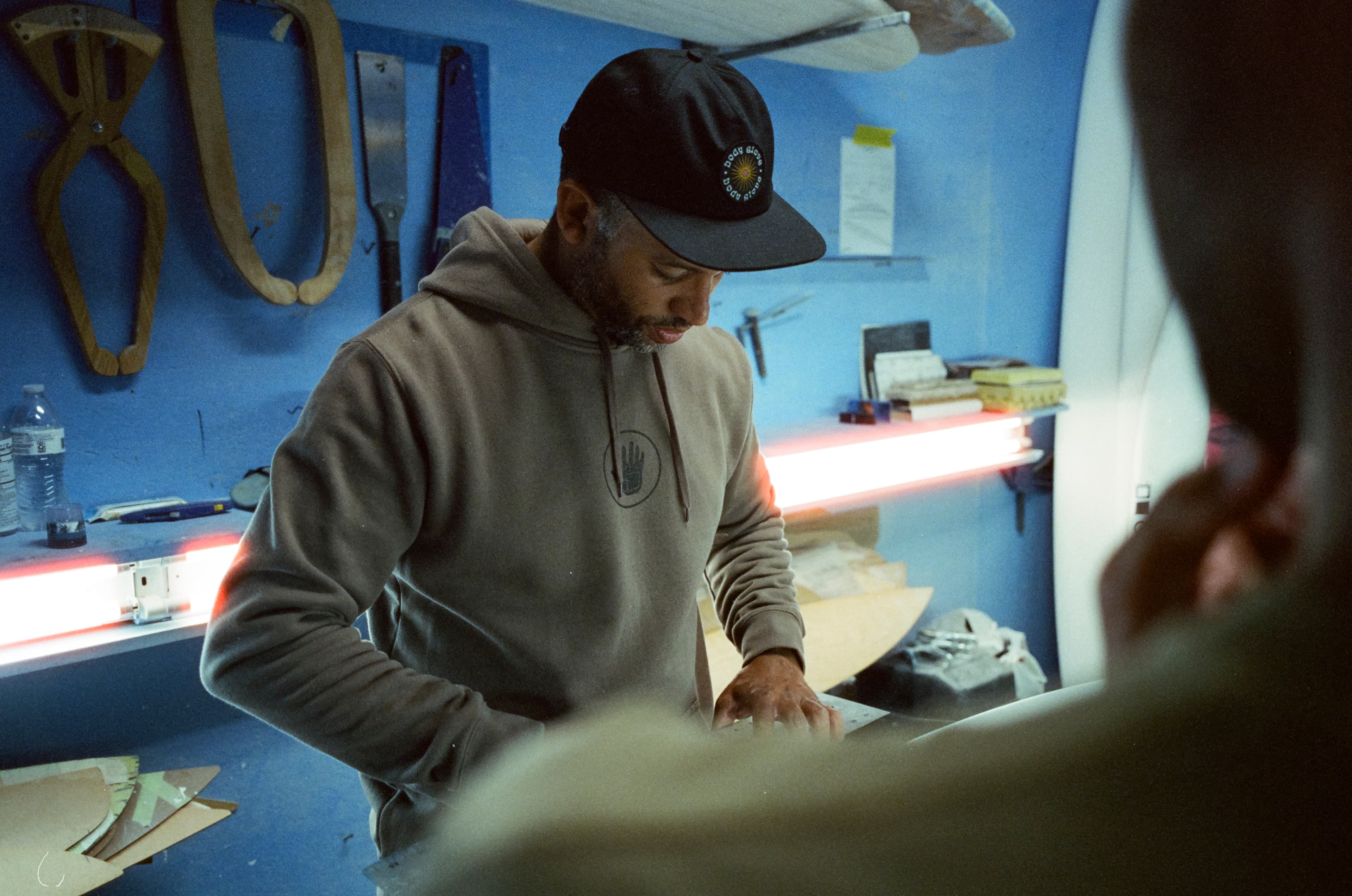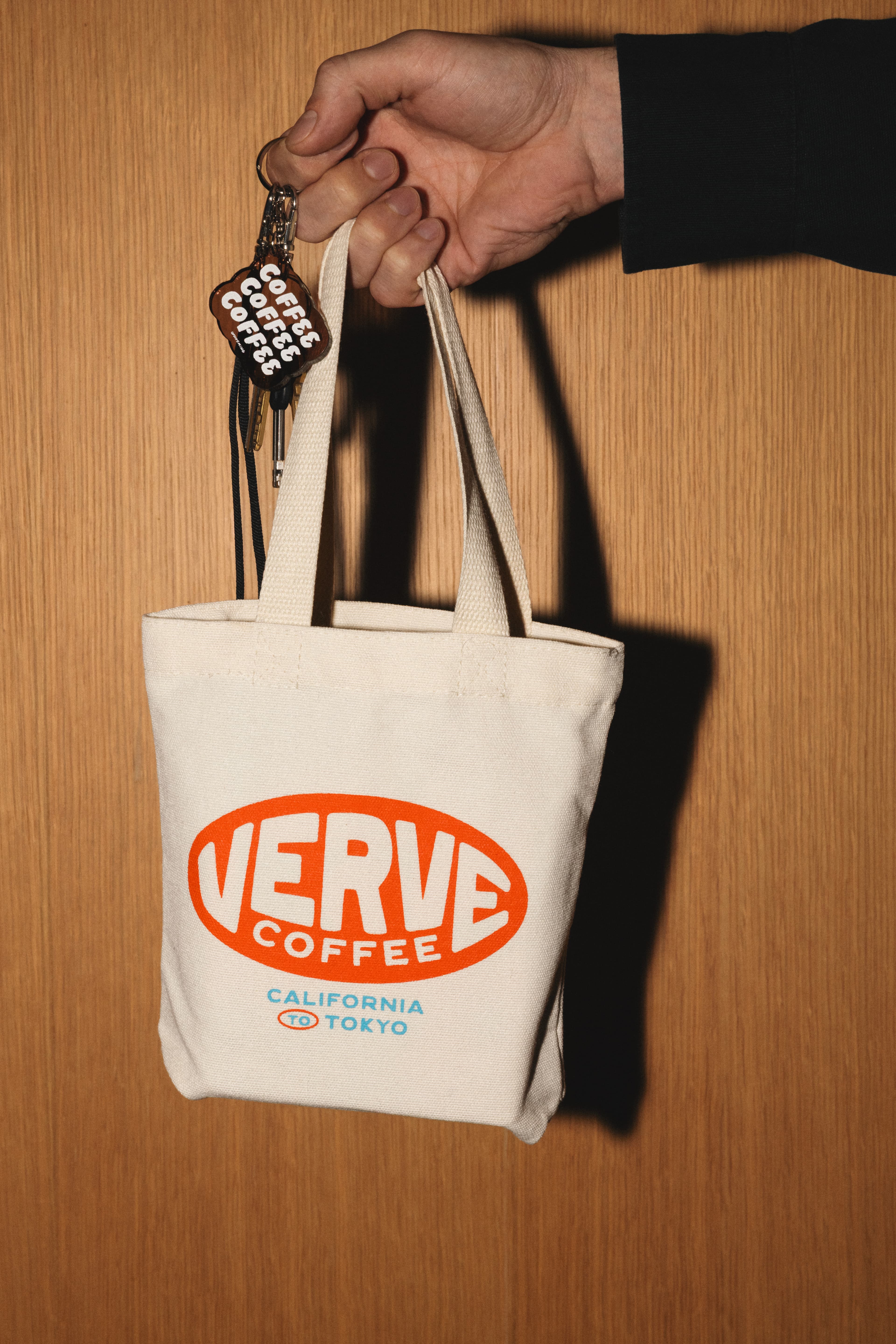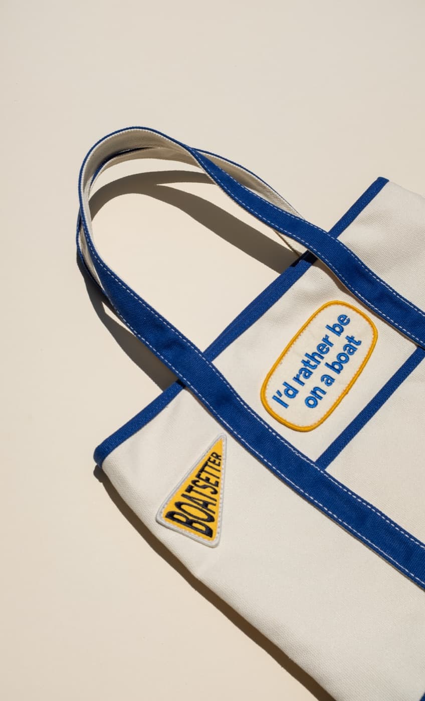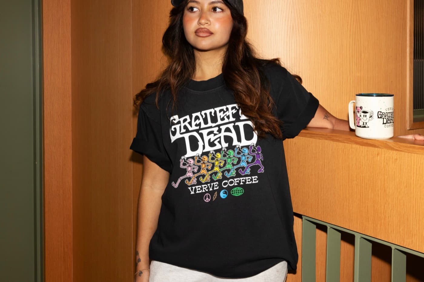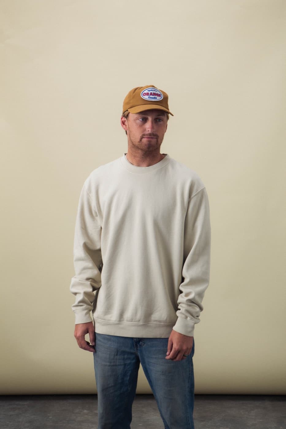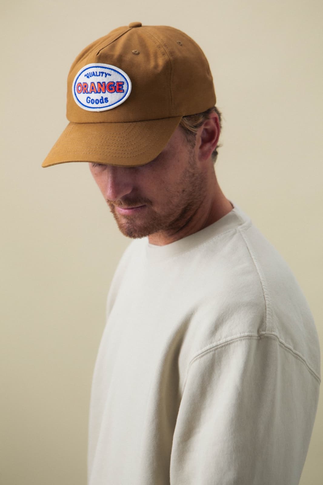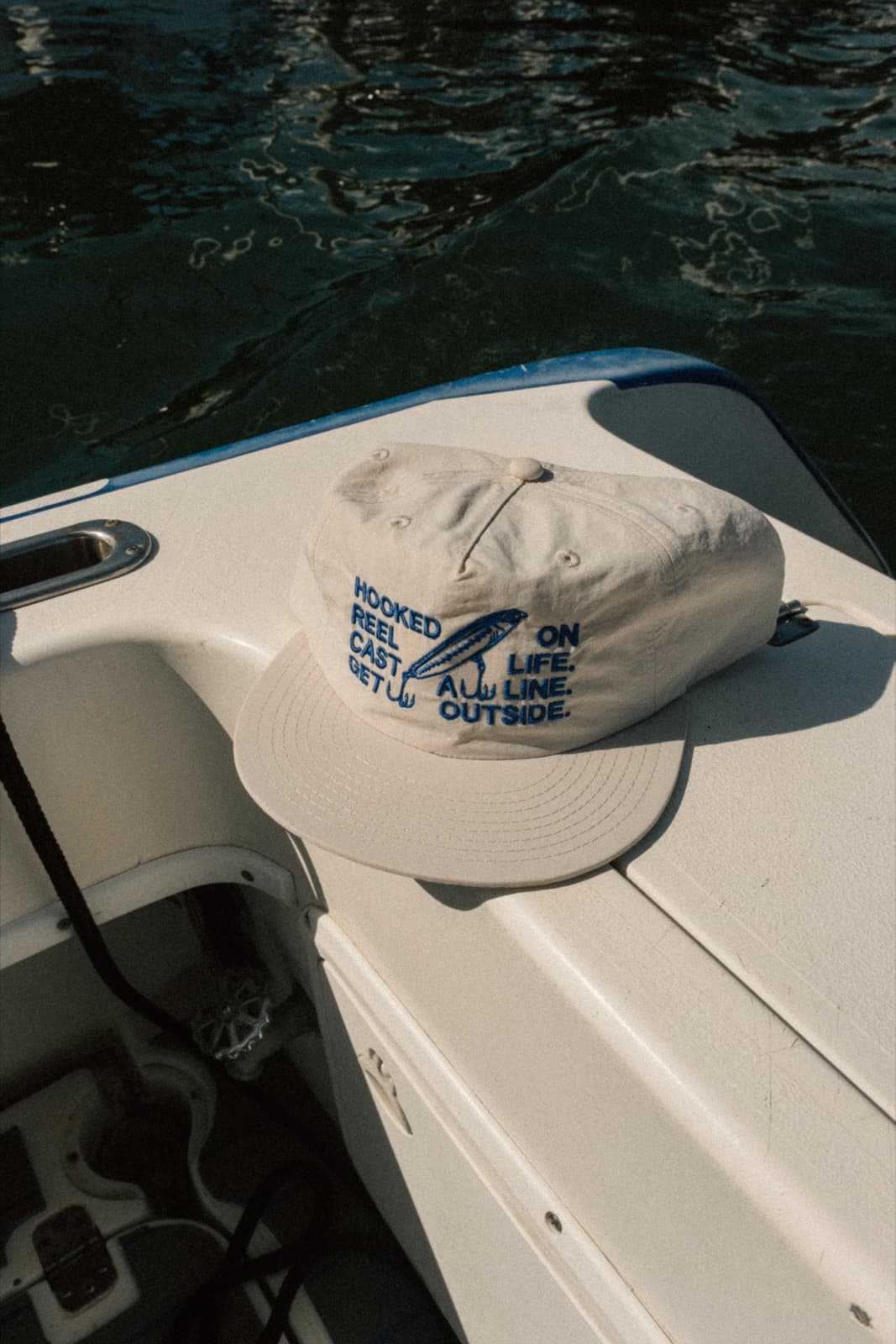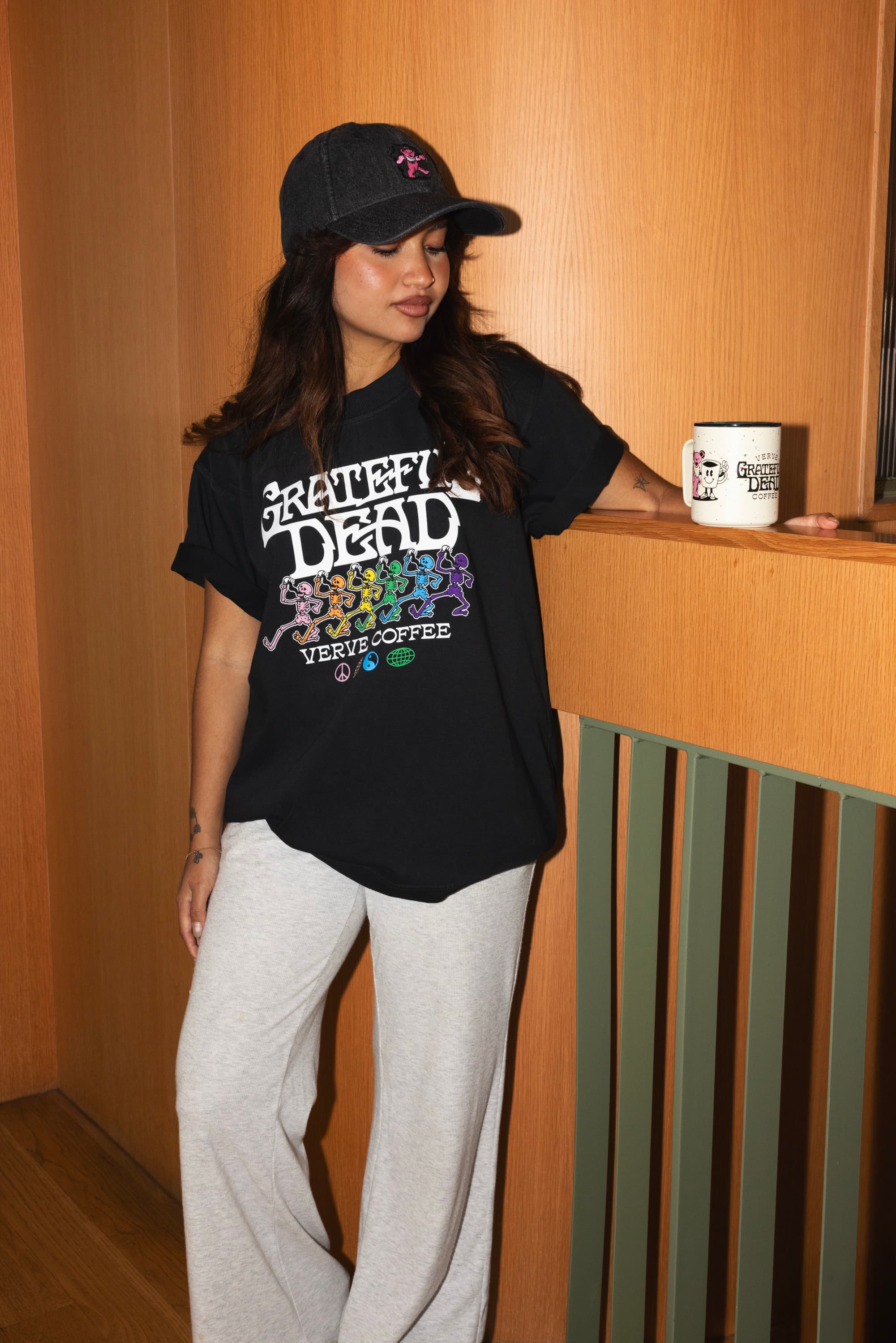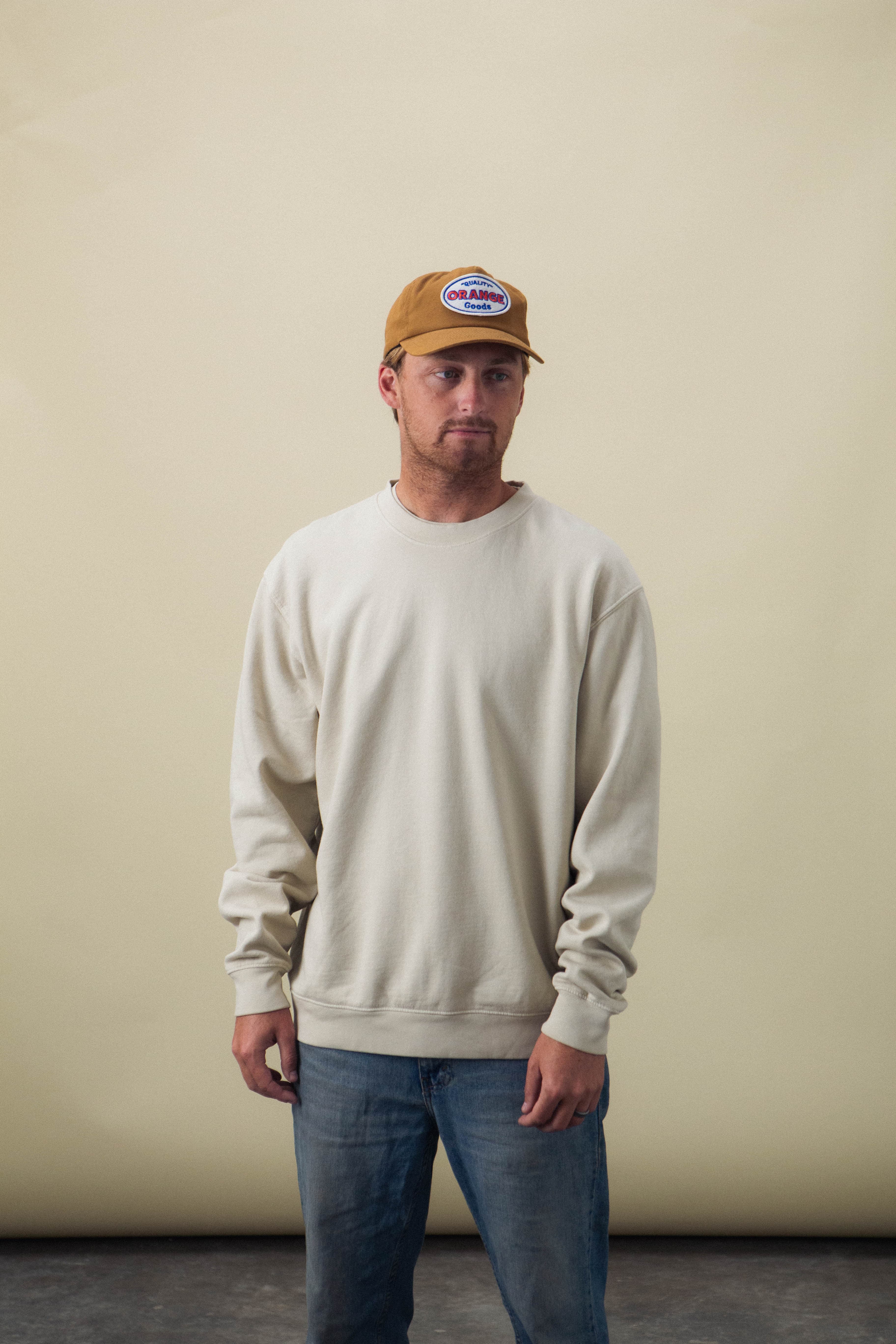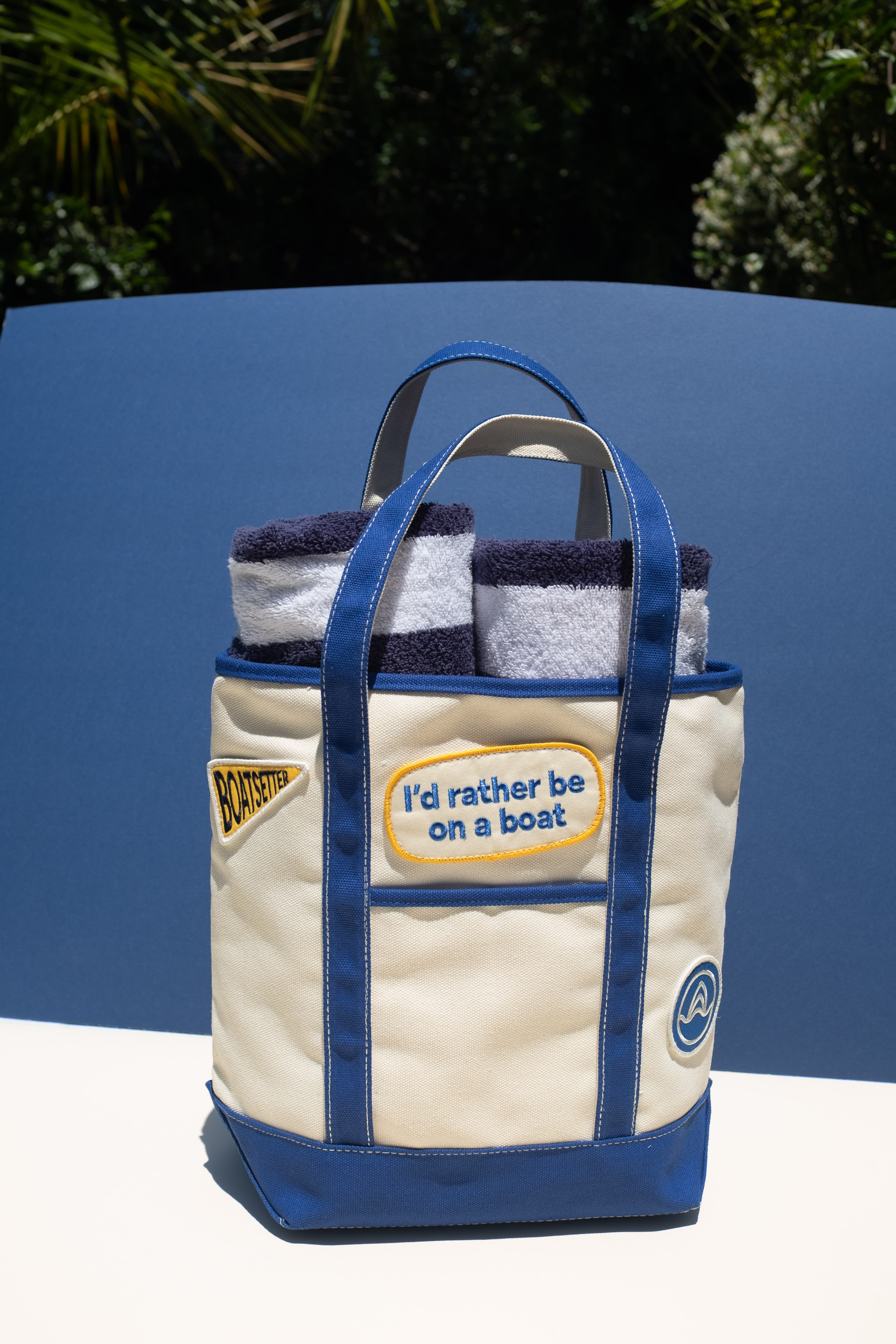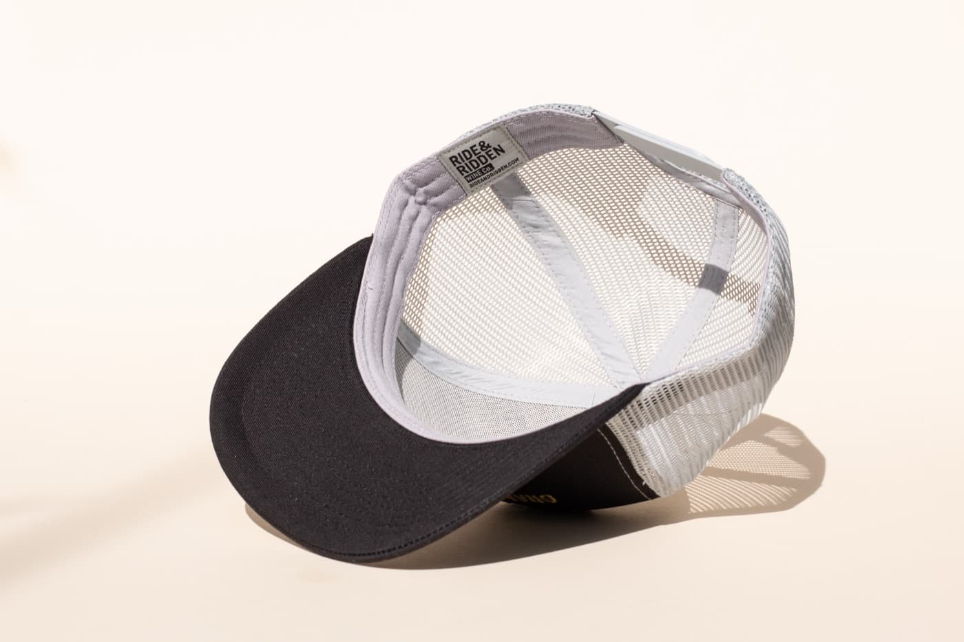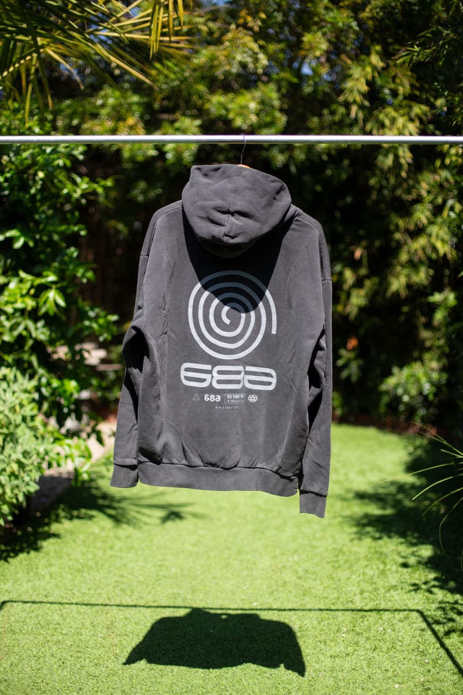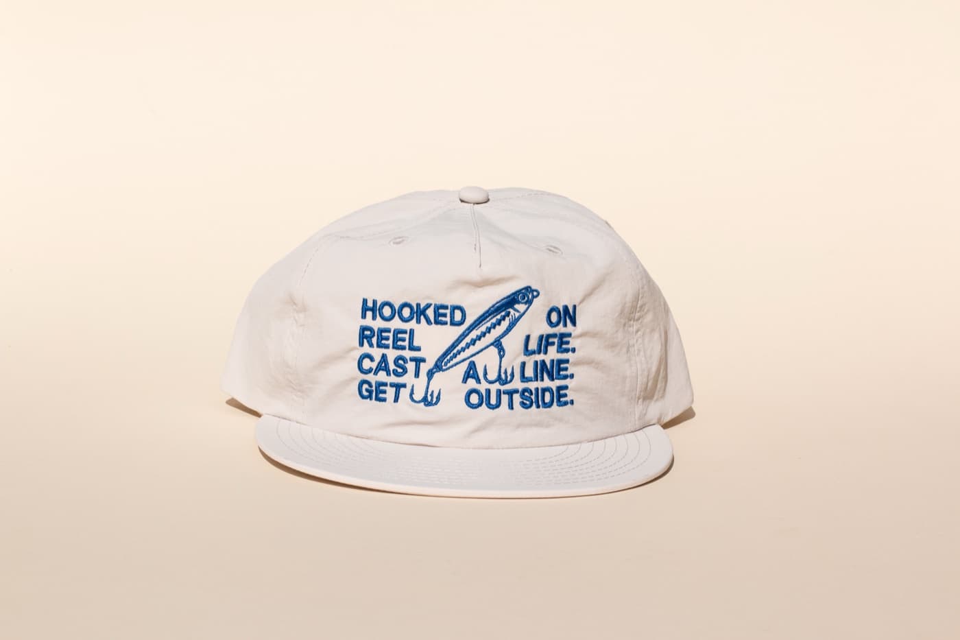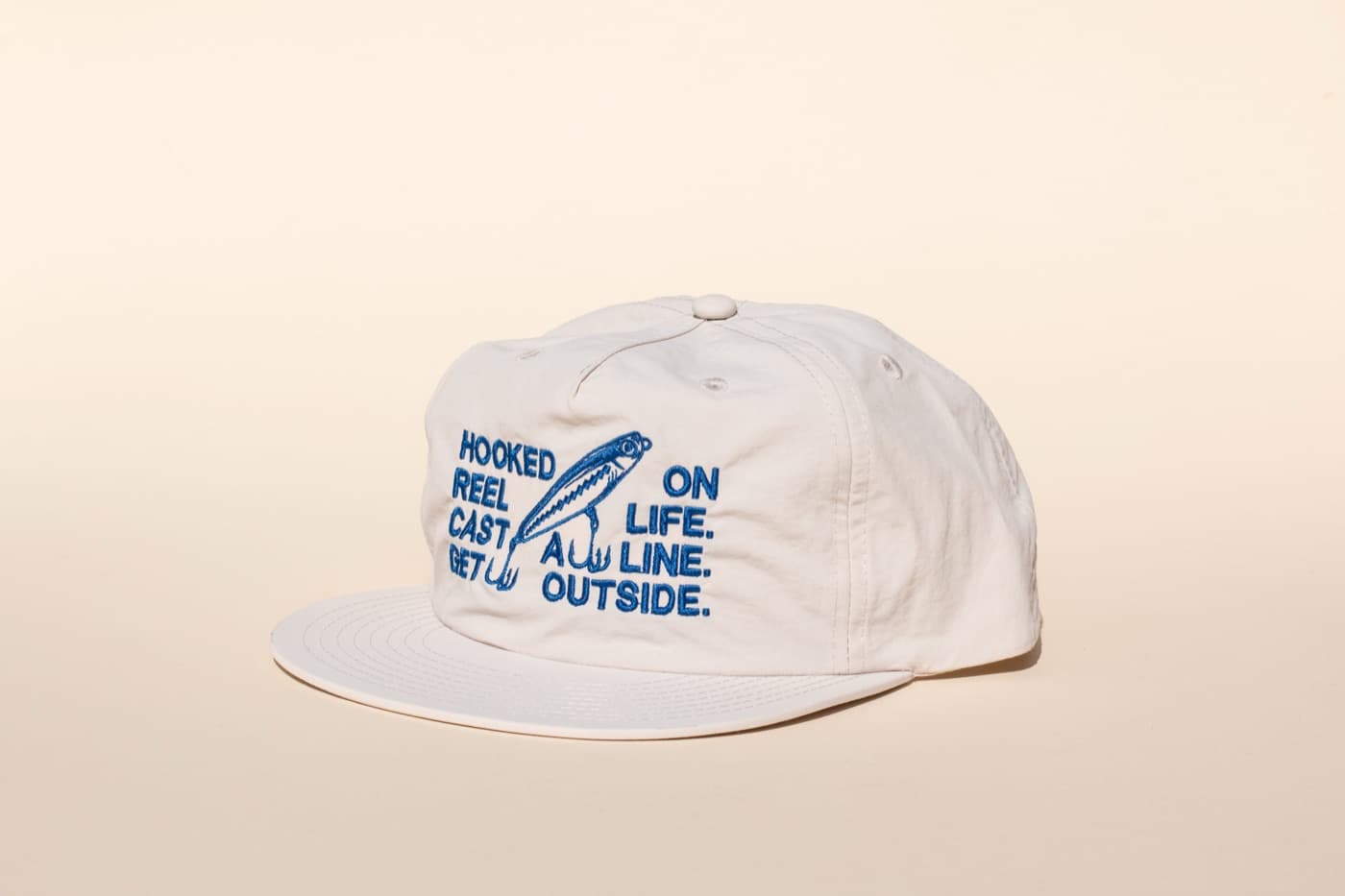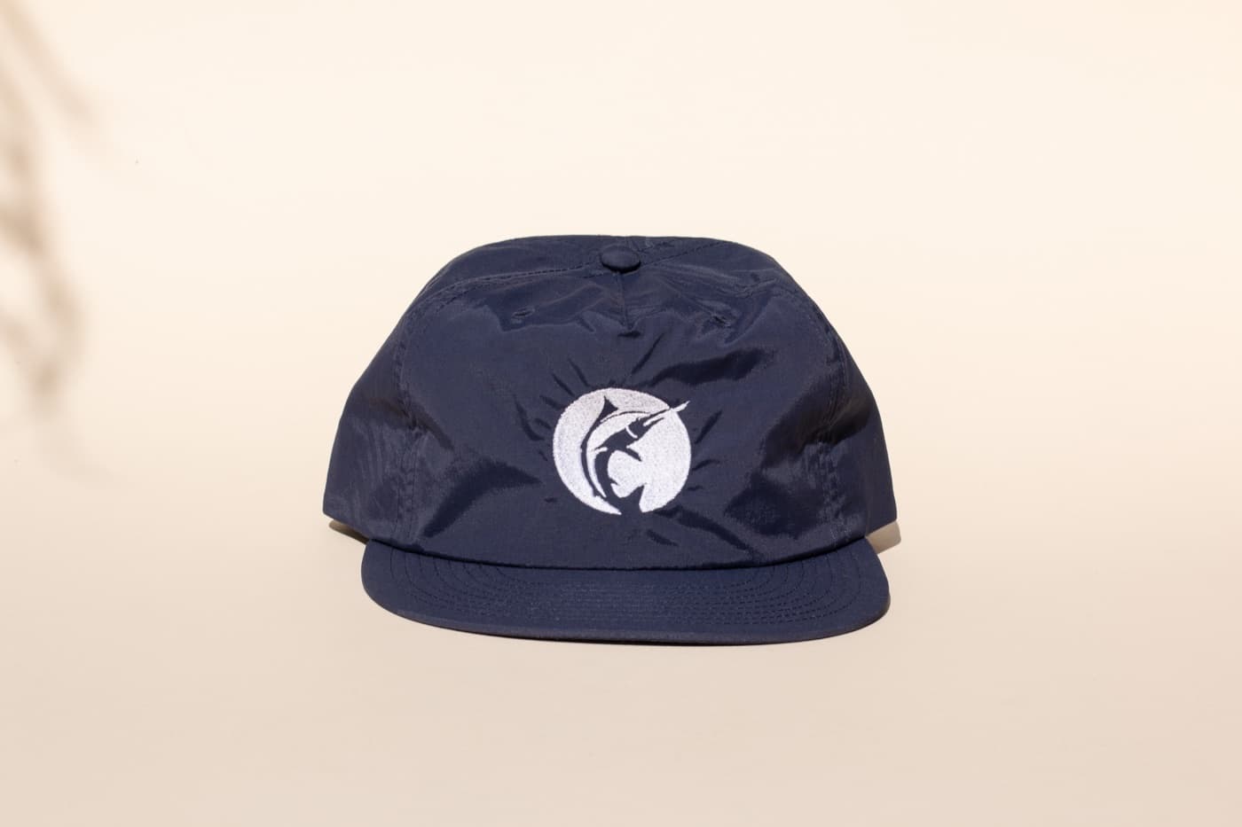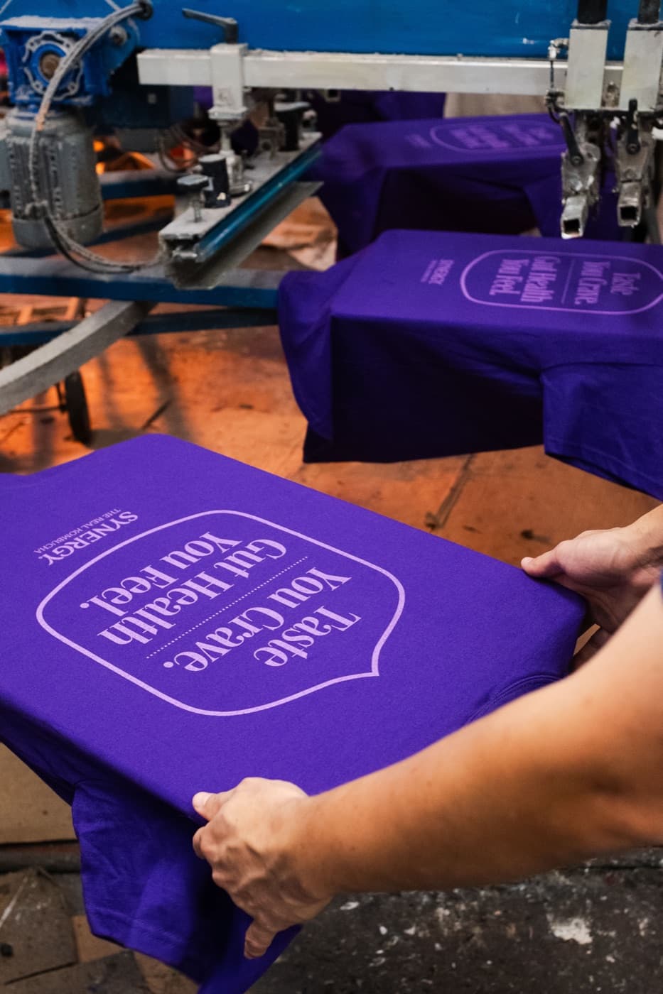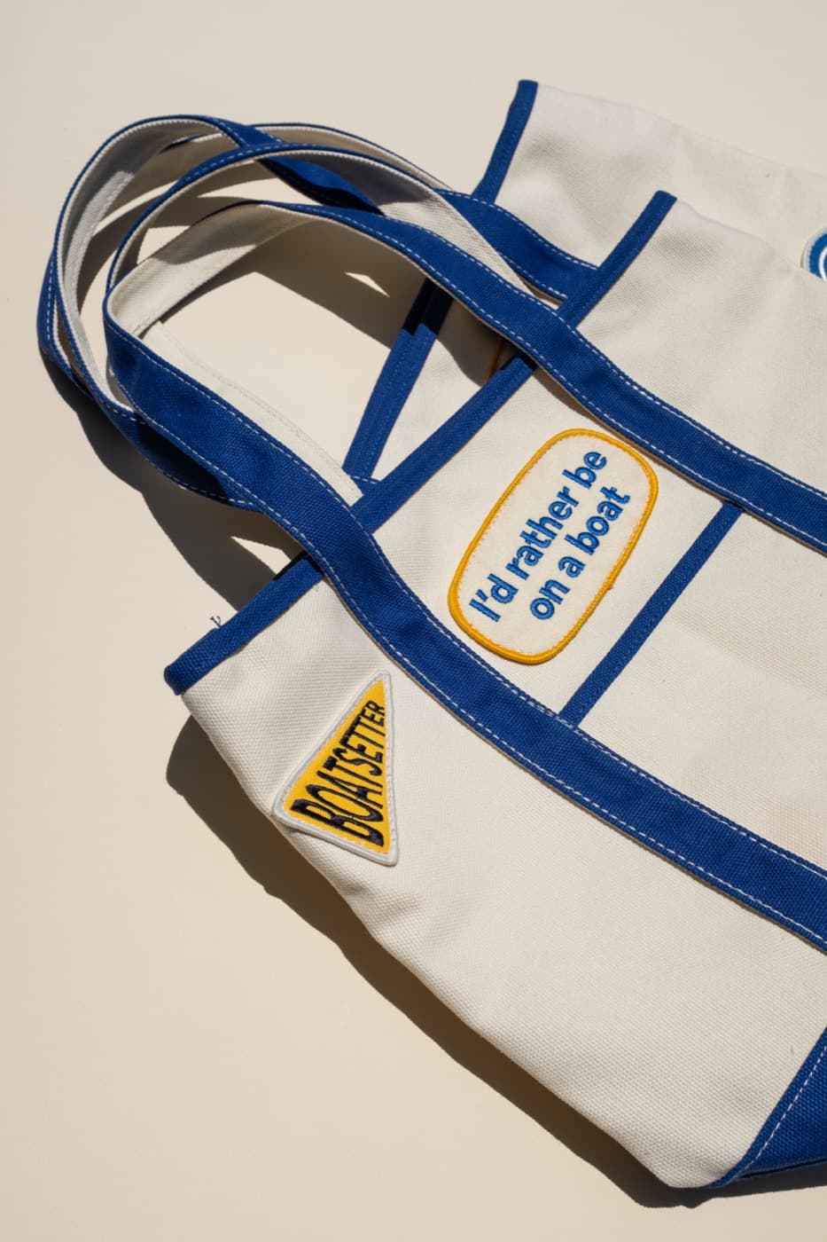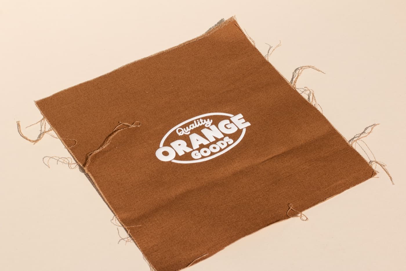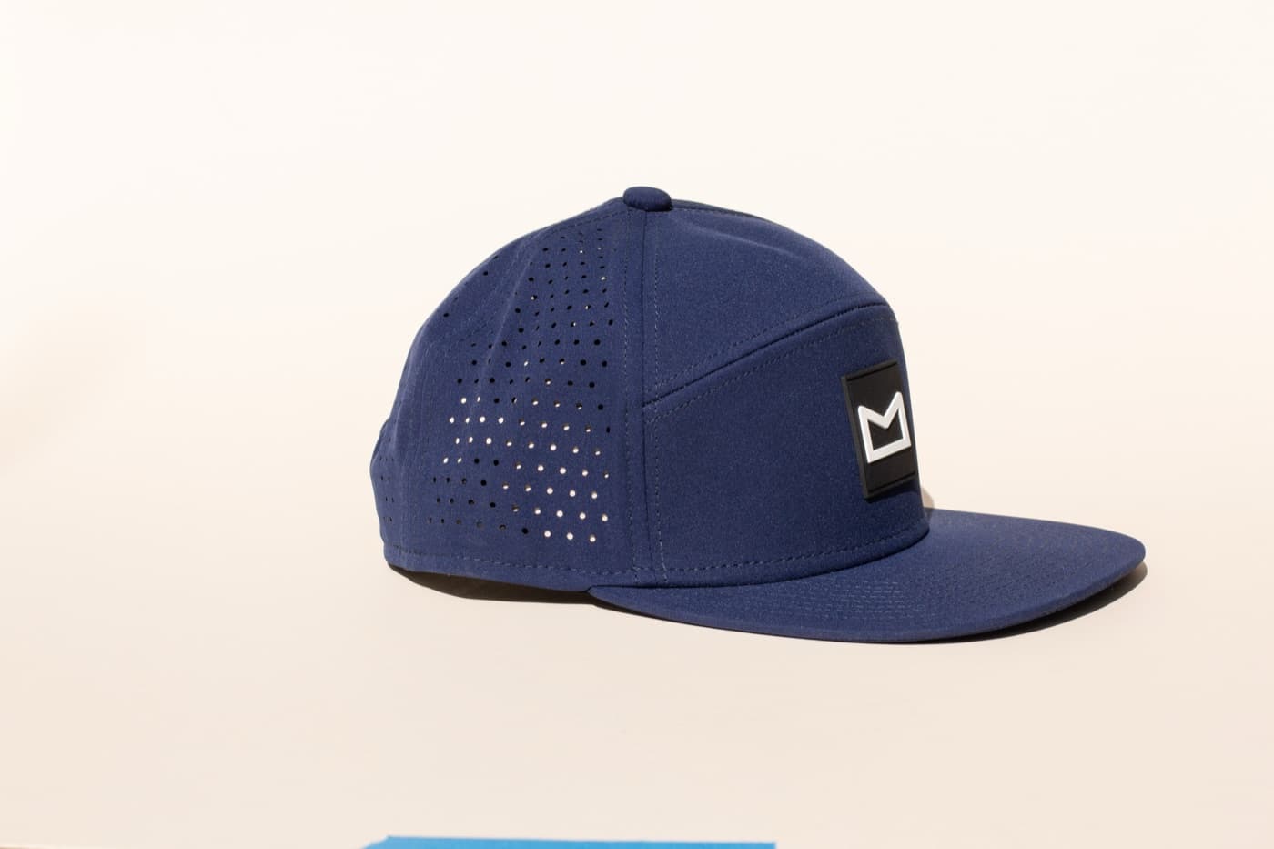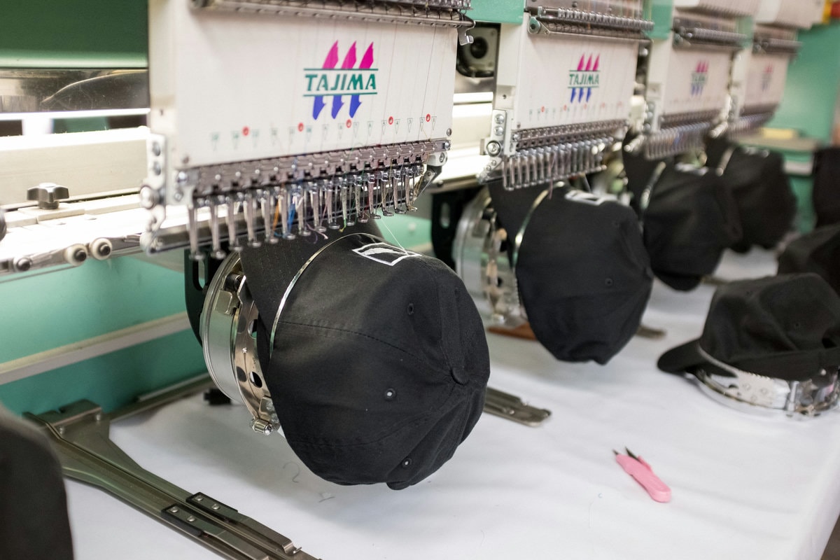
Merch design has to leave the screen. That is what makes it different from a social graphic, logo presentation, or moodboard. The artwork has to become thread, ink, patch, label, packaging, trim, engraving, or product color. If the design does not respect production, the final goods can feel weaker than the mockup promised.
Production-ready design is not less creative. It is more useful. It gives the finished piece a better chance of looking clean, feeling intentional, and staying on budget.
Know the decoration method early
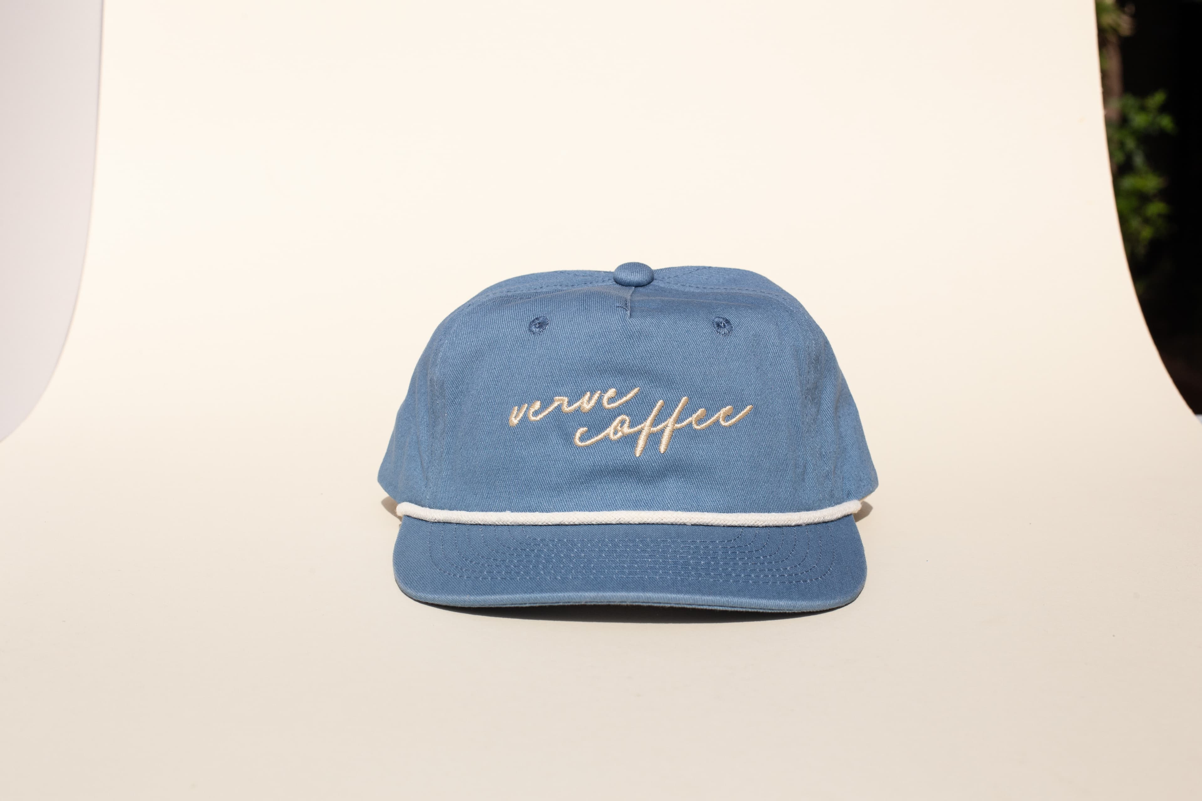
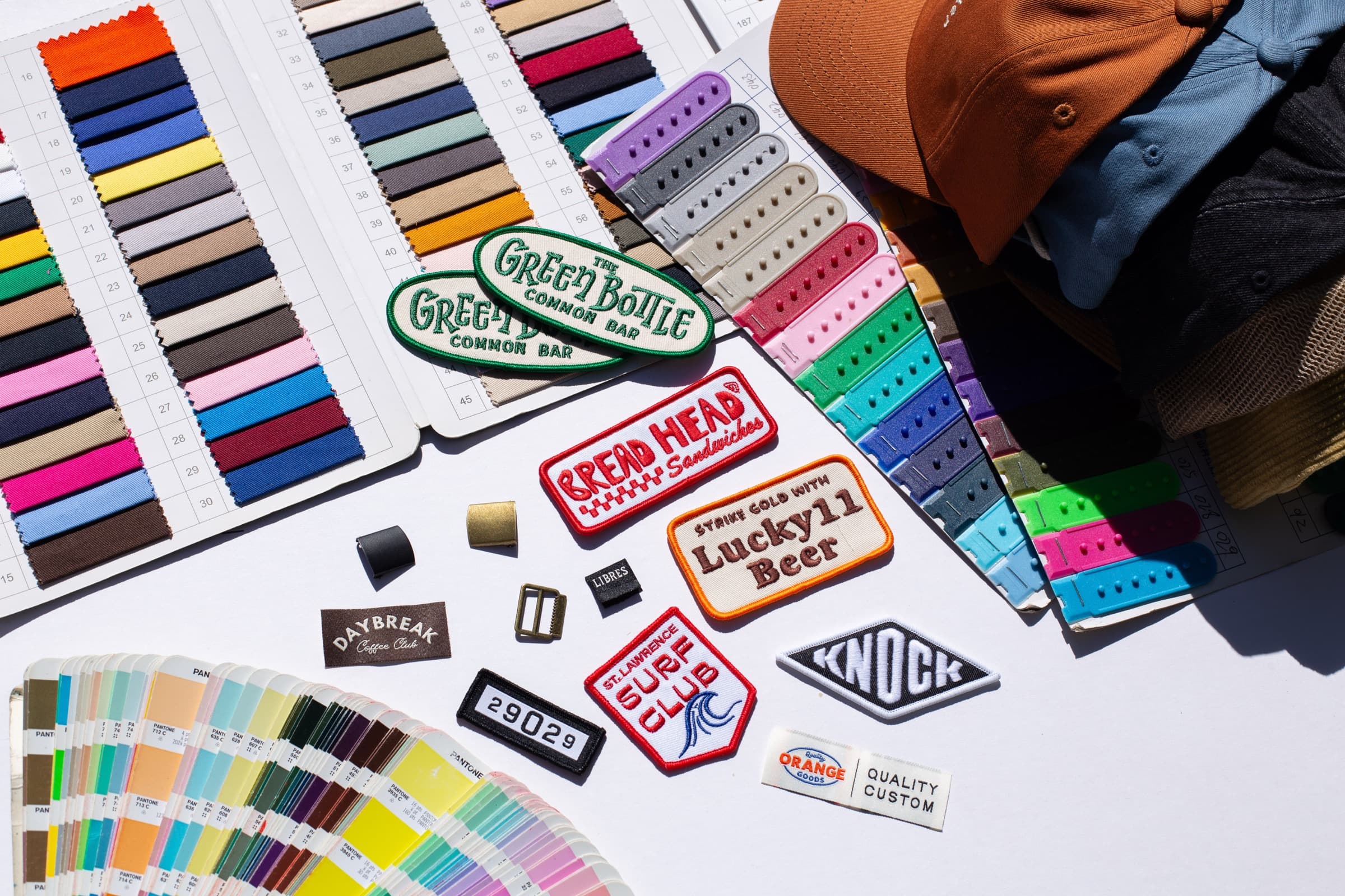
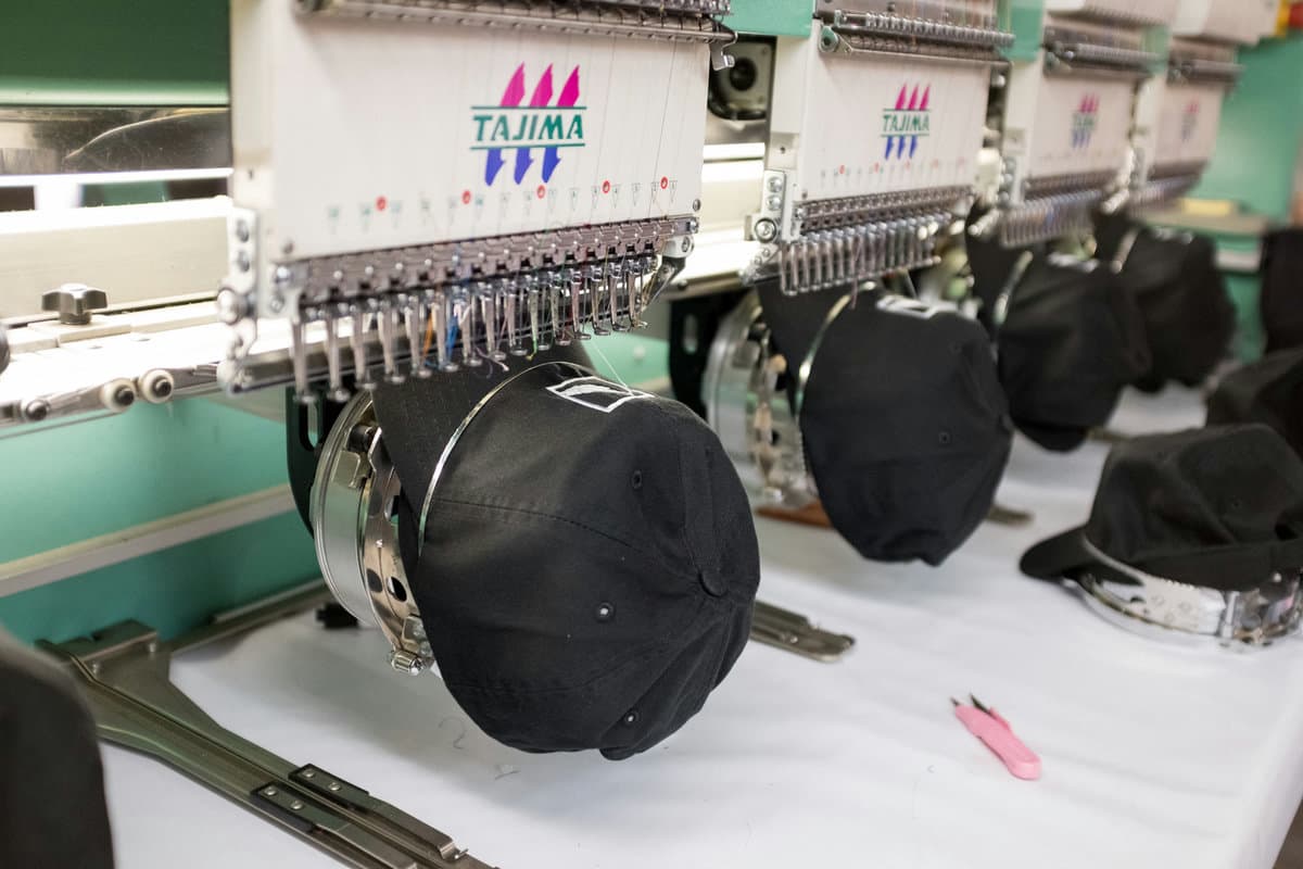
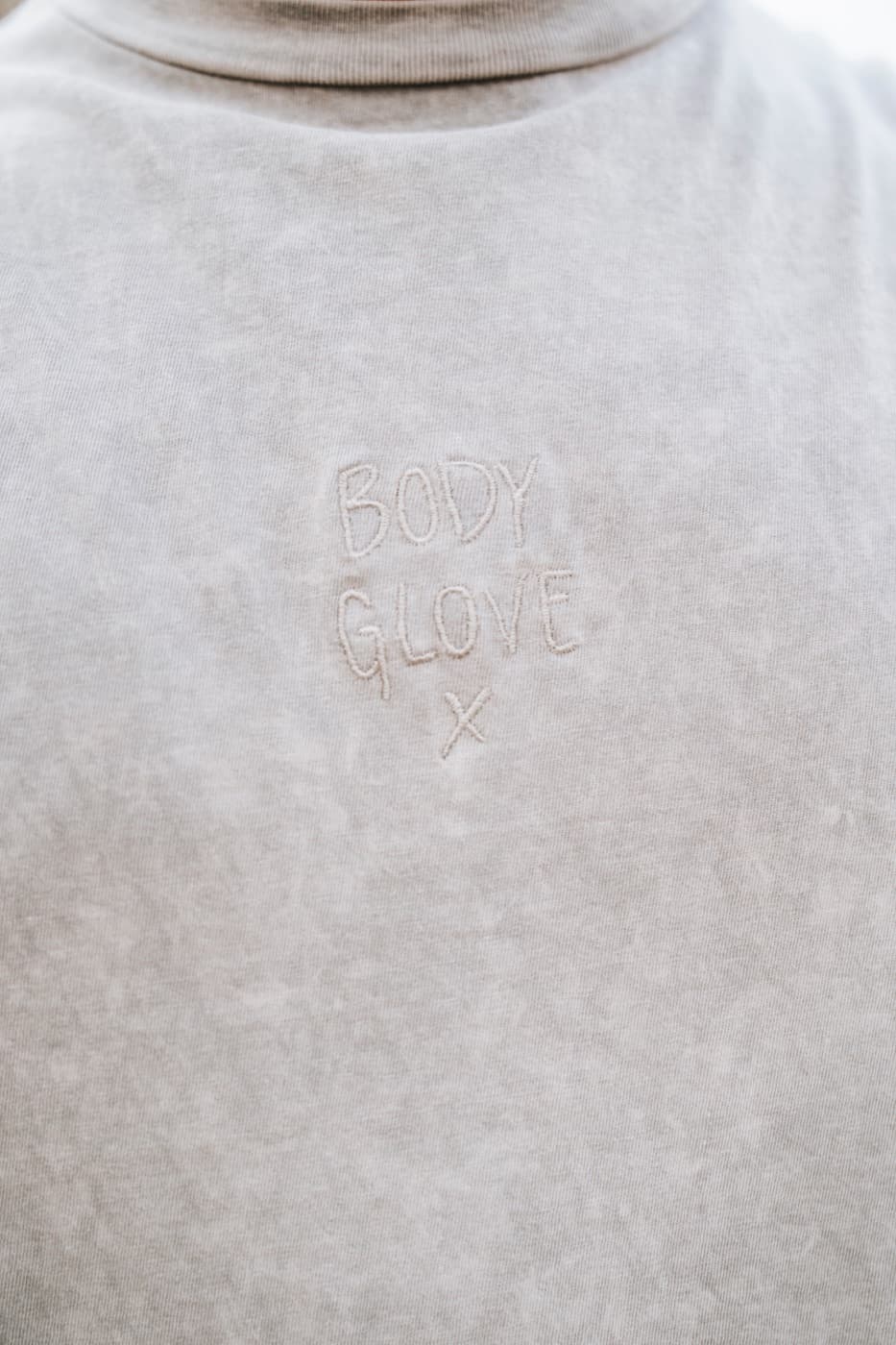
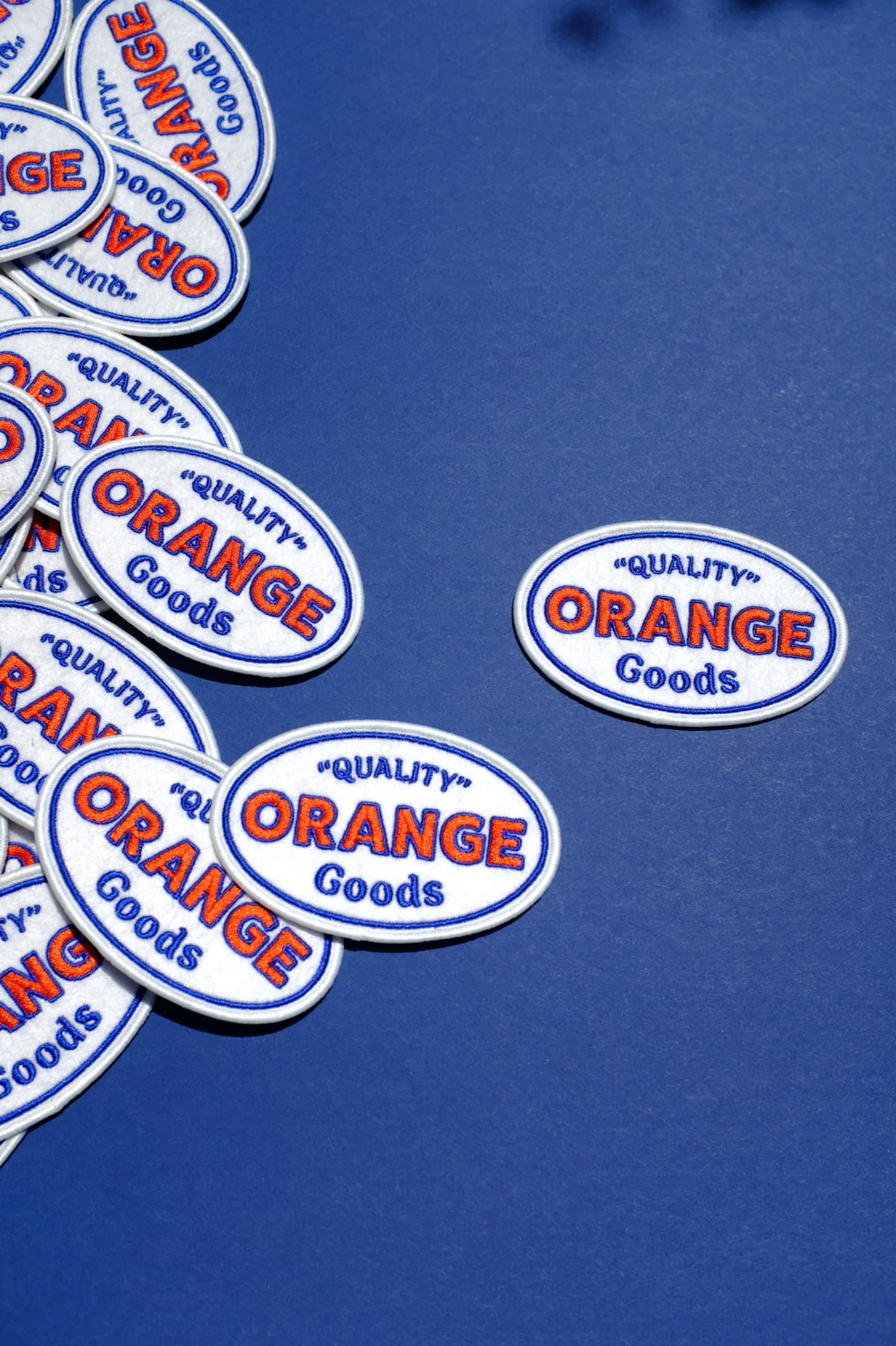
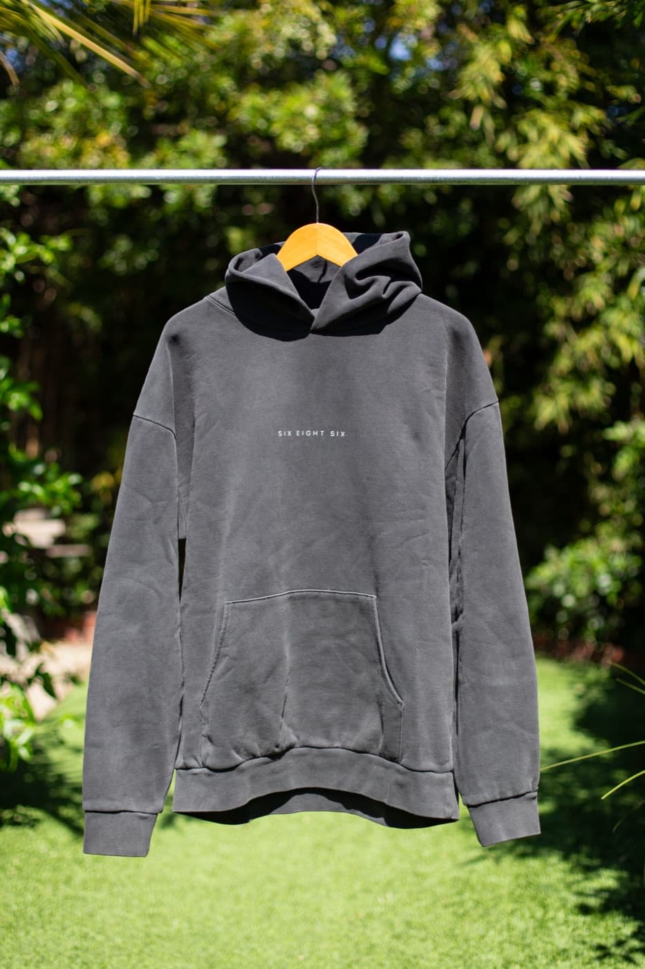
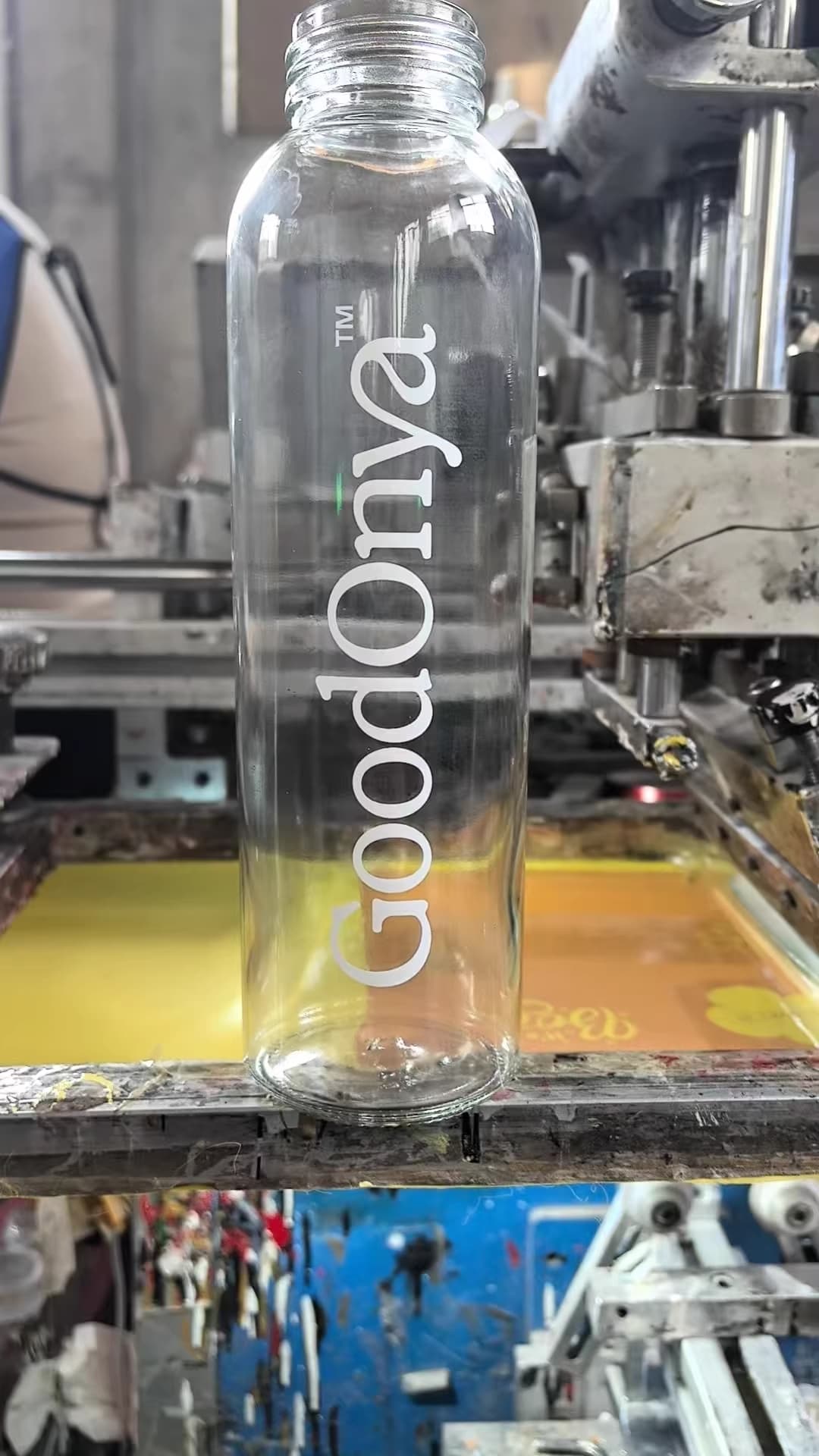
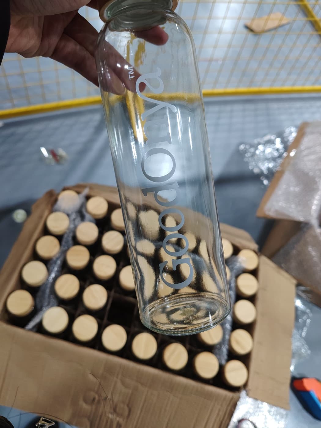
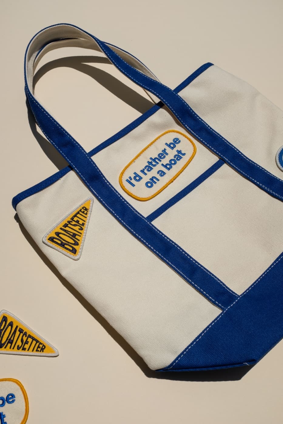
Embroidery, screen printing, woven patches, embroidered patches, labels, engraving, and transfers all have different strengths. A thin-line illustration may be beautiful as a screen print and difficult as embroidery. A tiny wordmark may hold better as a woven label than a patch. A big hoodie graphic may need a soft ink instead of heavy embroidery.
The design process should consider the method before the artwork is finalized. That saves time later and avoids watered-down production compromises. A good designer can adjust line weight, simplify detail, separate colors, and build files that the production team can actually use.
Scale changes everything
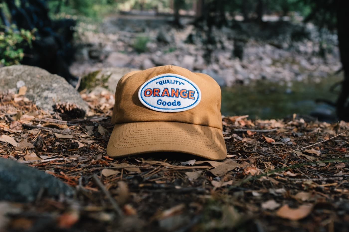
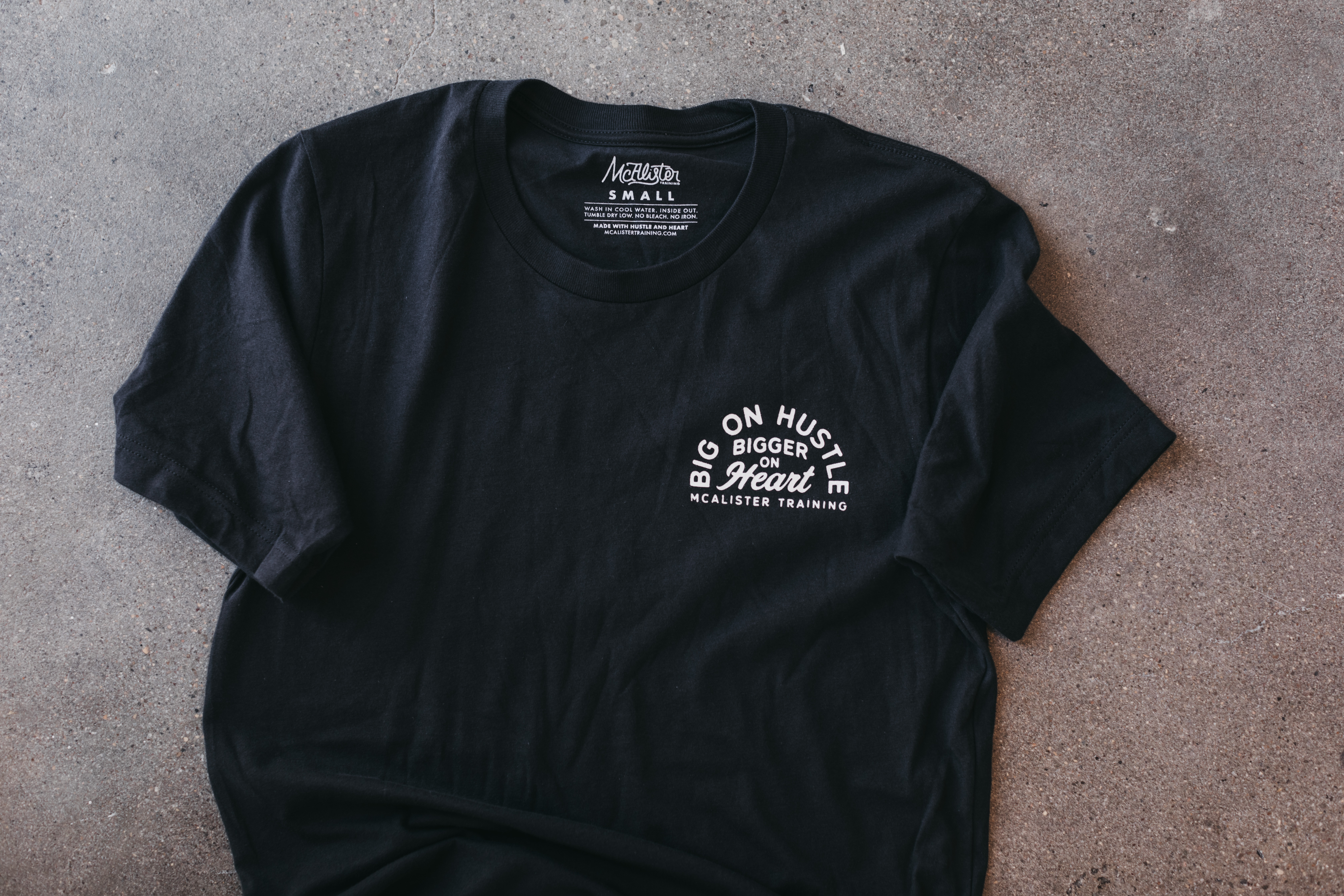
A logo that looks clean at four inches wide might fail at one inch. A graphic that feels balanced on a flat mockup might sit too low when worn. A hat front panel has a different visual center than a tote. A sleeve print has different constraints than a full-back tee graphic.
Scale is where merch design becomes physical. The designer has to imagine how the item is worn, held, folded, washed, carried, and photographed. This is why proofs matter and why exact placement should be discussed before production.
Color is material-specific
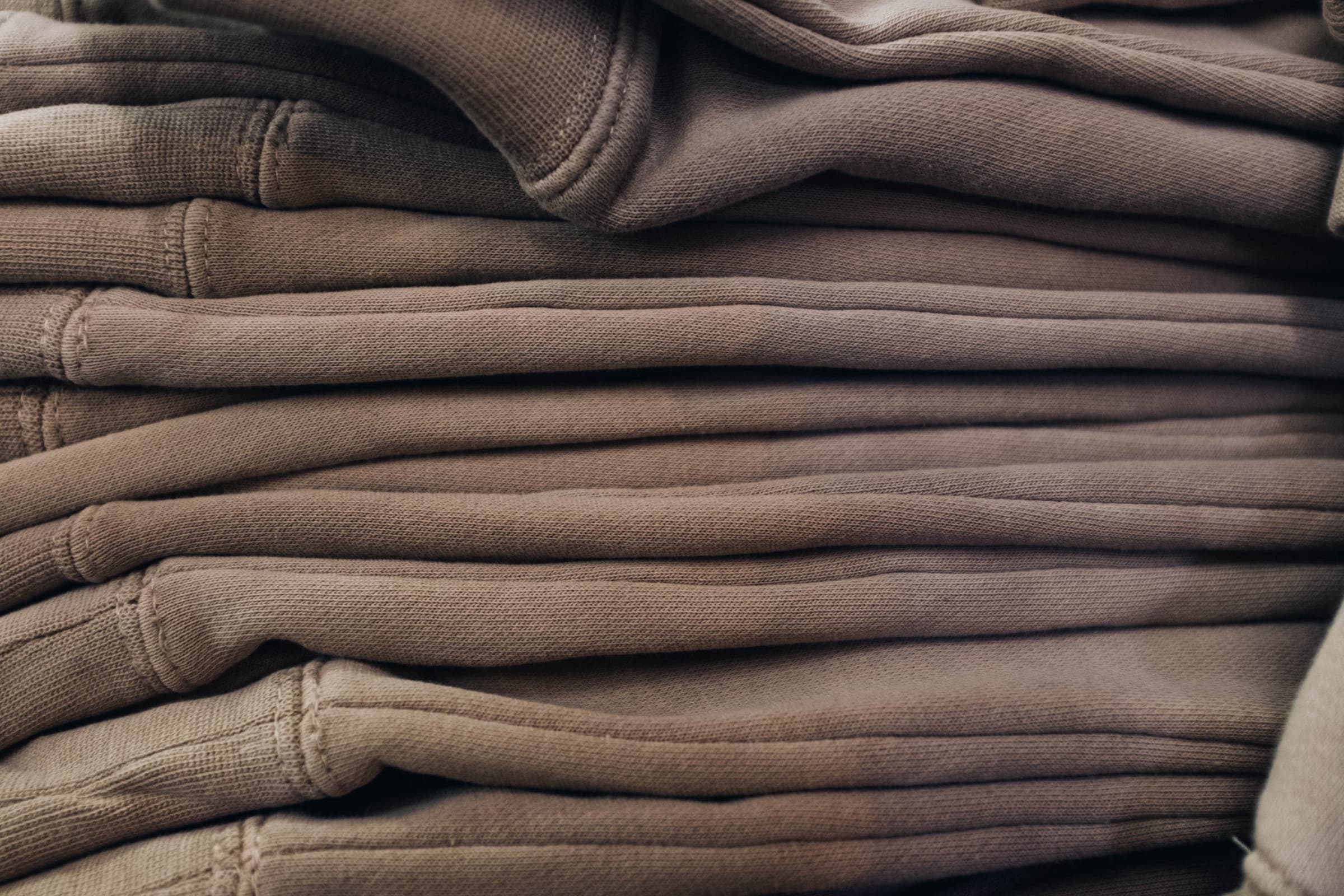
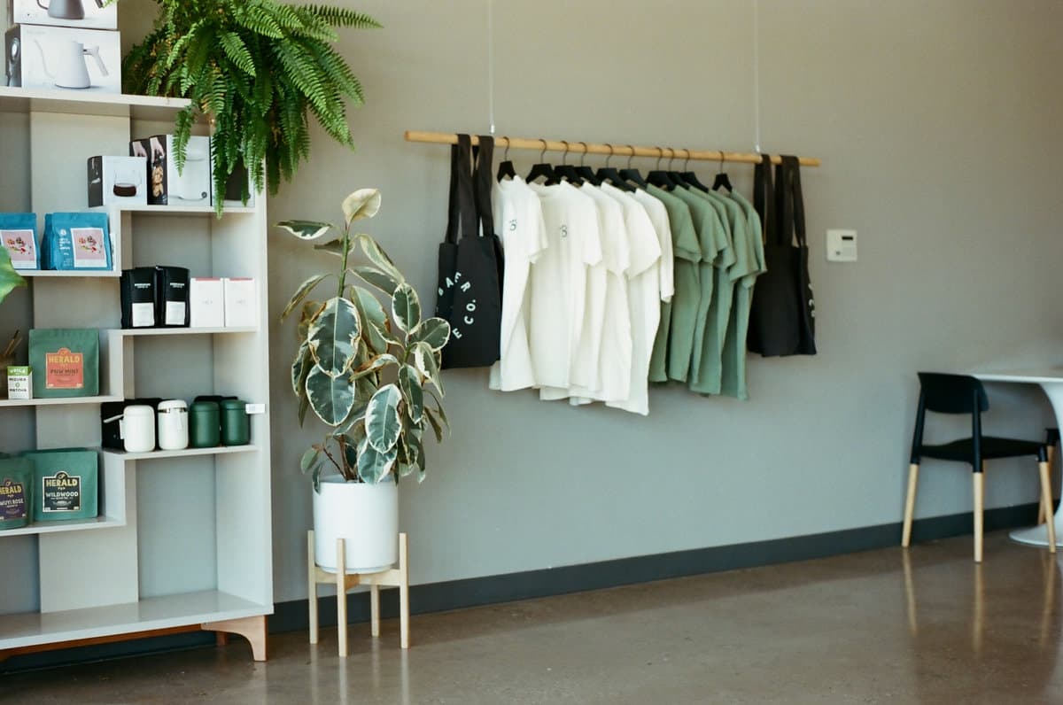
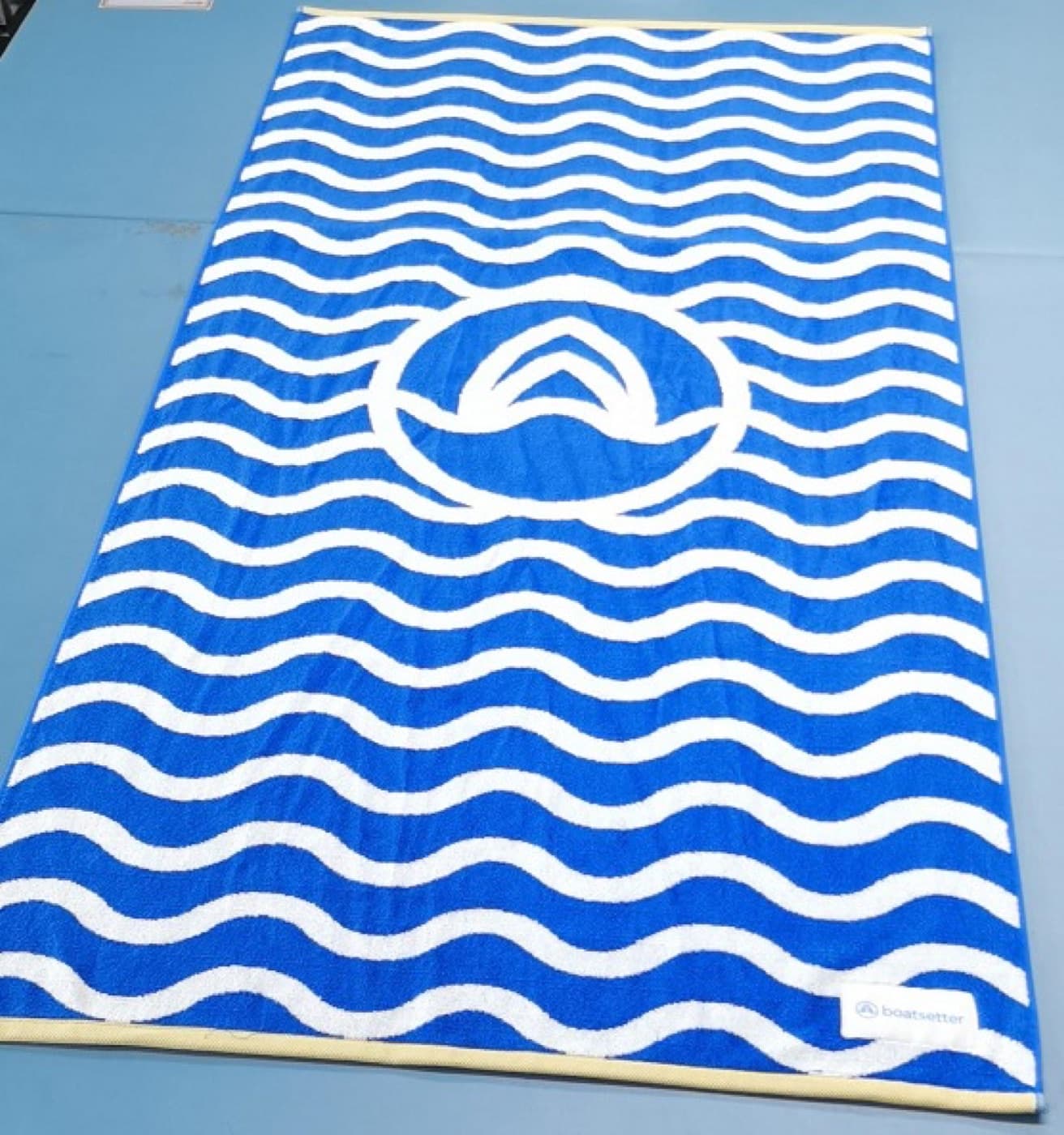
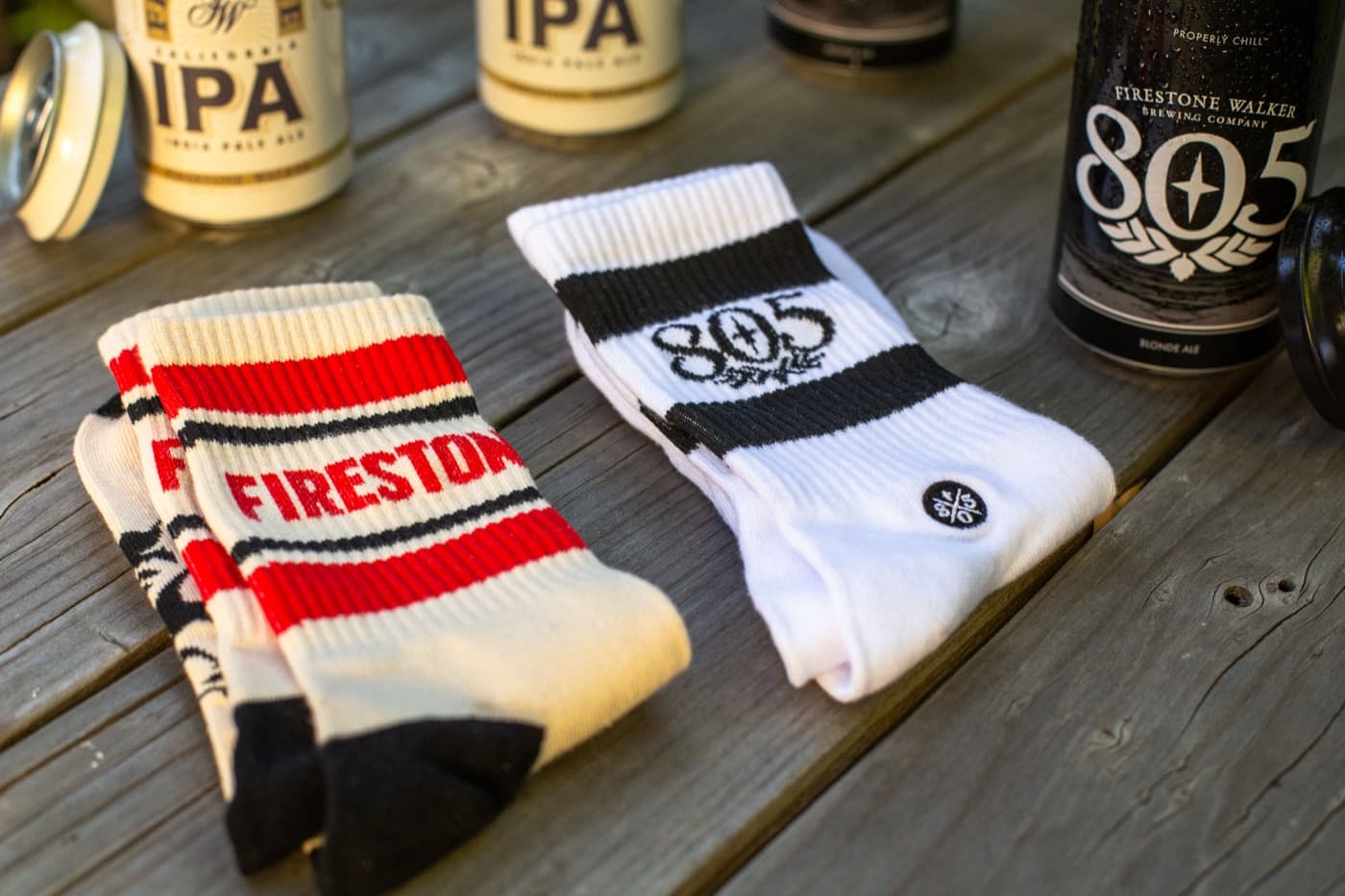
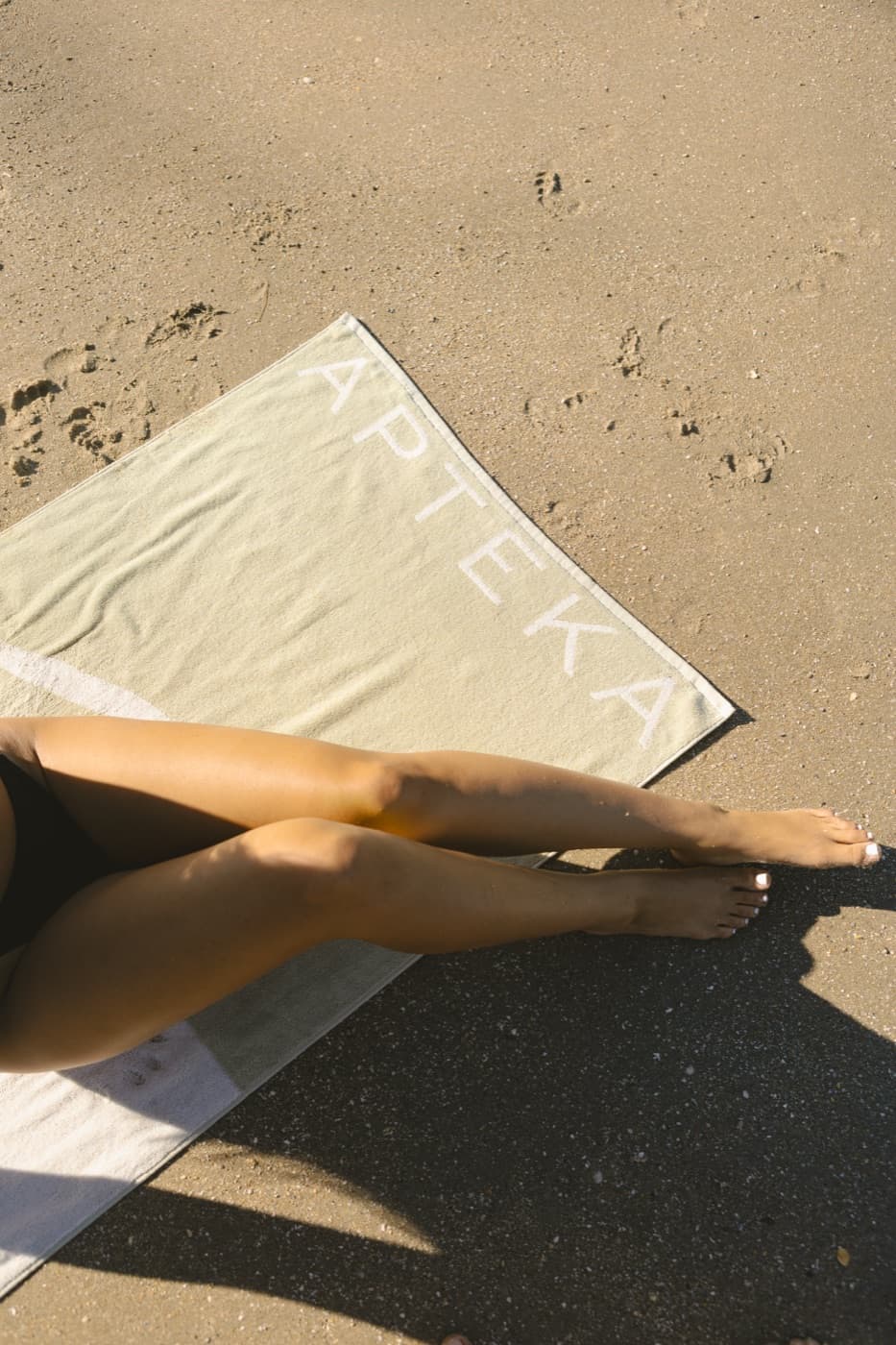
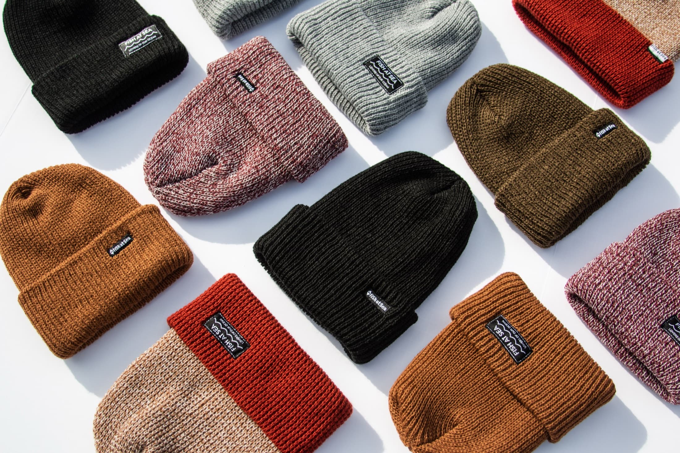
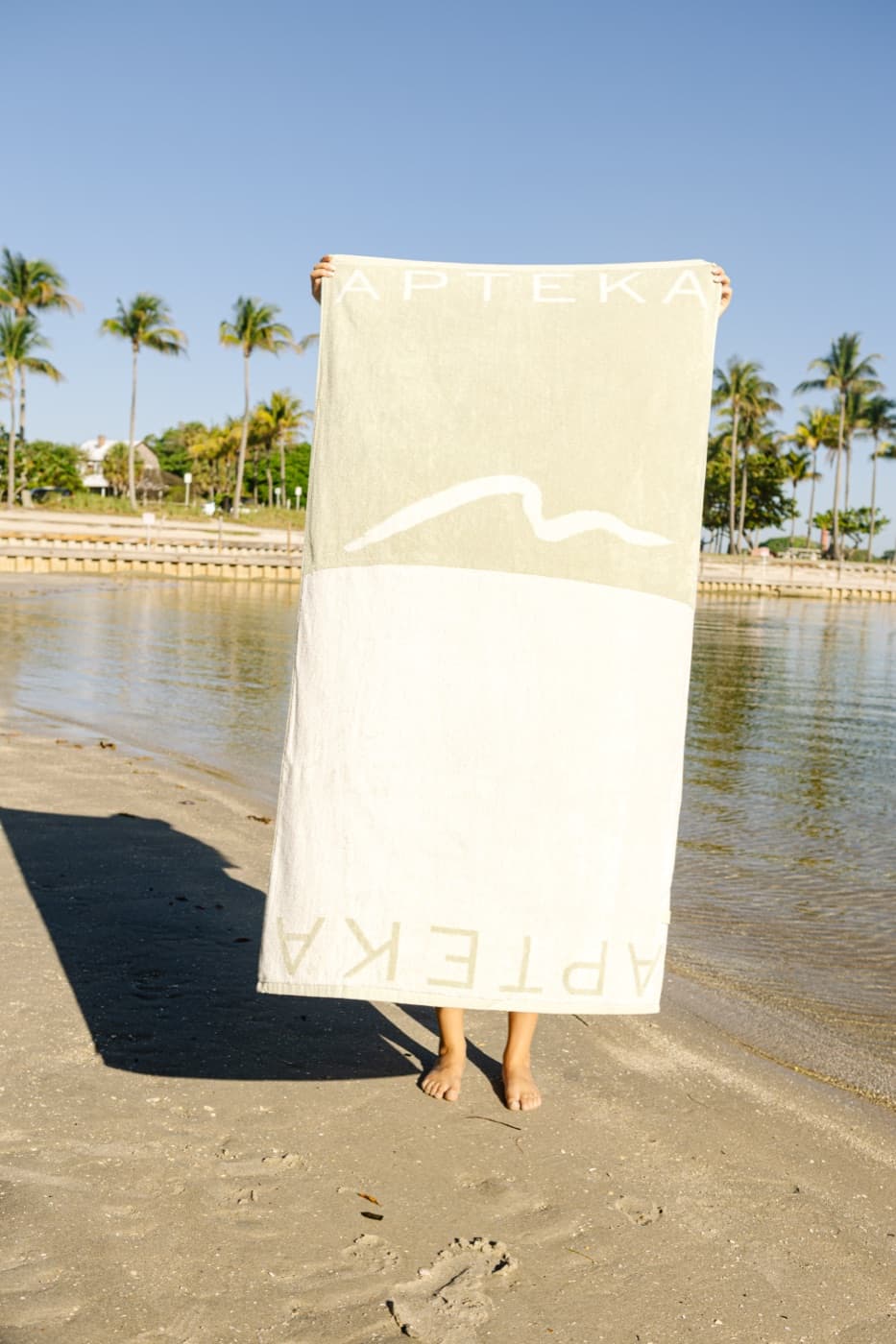
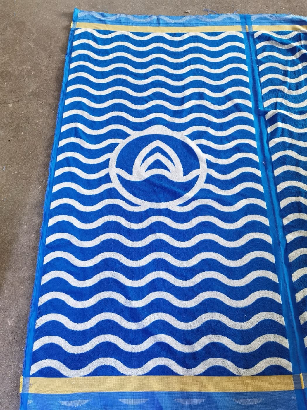
Digital color is not the same as thread, ink, dyed cotton, powder-coated stainless steel, or woven fabric. A brand blue may look different across a hat, tee, tote, and bottle. Sometimes exact matching is possible. Sometimes the better answer is choosing the closest material-specific option and making the overall system feel consistent.
This is especially important for brands with strict guidelines. A merch project may need to translate the brand palette into embroidery threads, garment colors, ink mixes, and product finishes. That translation is design work, not admin.
Mockups should be honest
Mockups are useful when they help a client understand the final piece. They become a problem when they hide production limits. A logo placed perfectly on a curved hat in Photoshop may not stitch that way. A print that appears smooth across a pocket or seam may be difficult or impossible. A mockup should make the goods clearer, not sell something production cannot make.
Honest mockups show scale, placement, product color, and decoration intent clearly. They should support the proofing process and create better decisions before money is spent.
Design can make simple goods feel custom
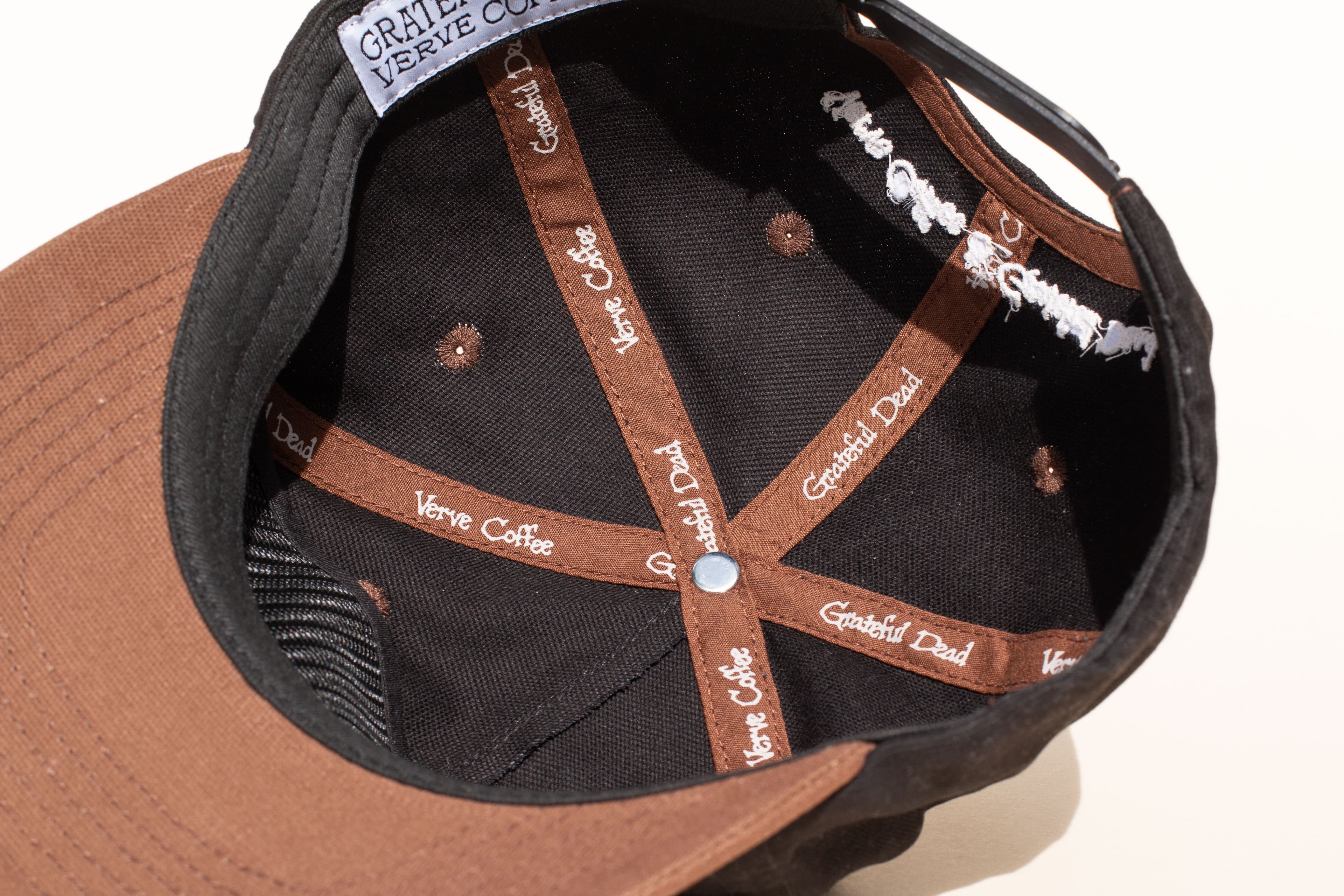
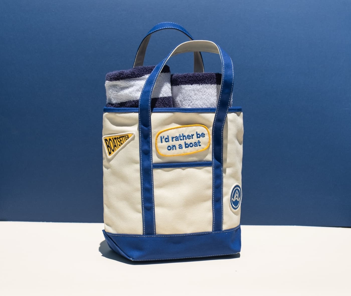
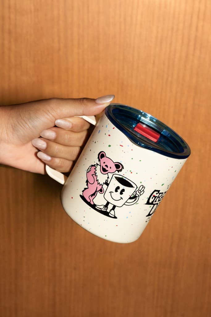
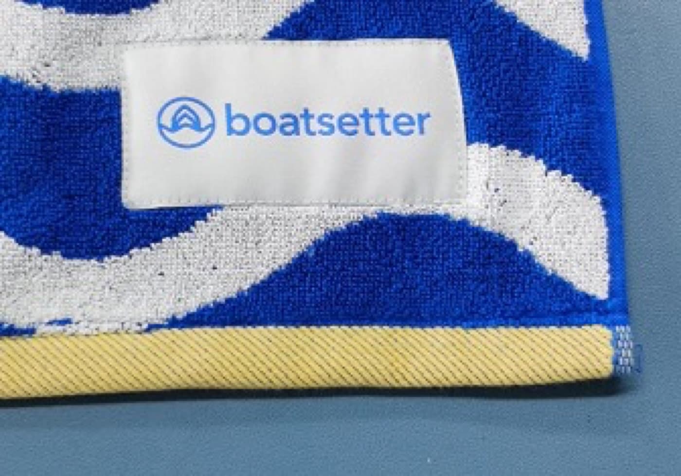
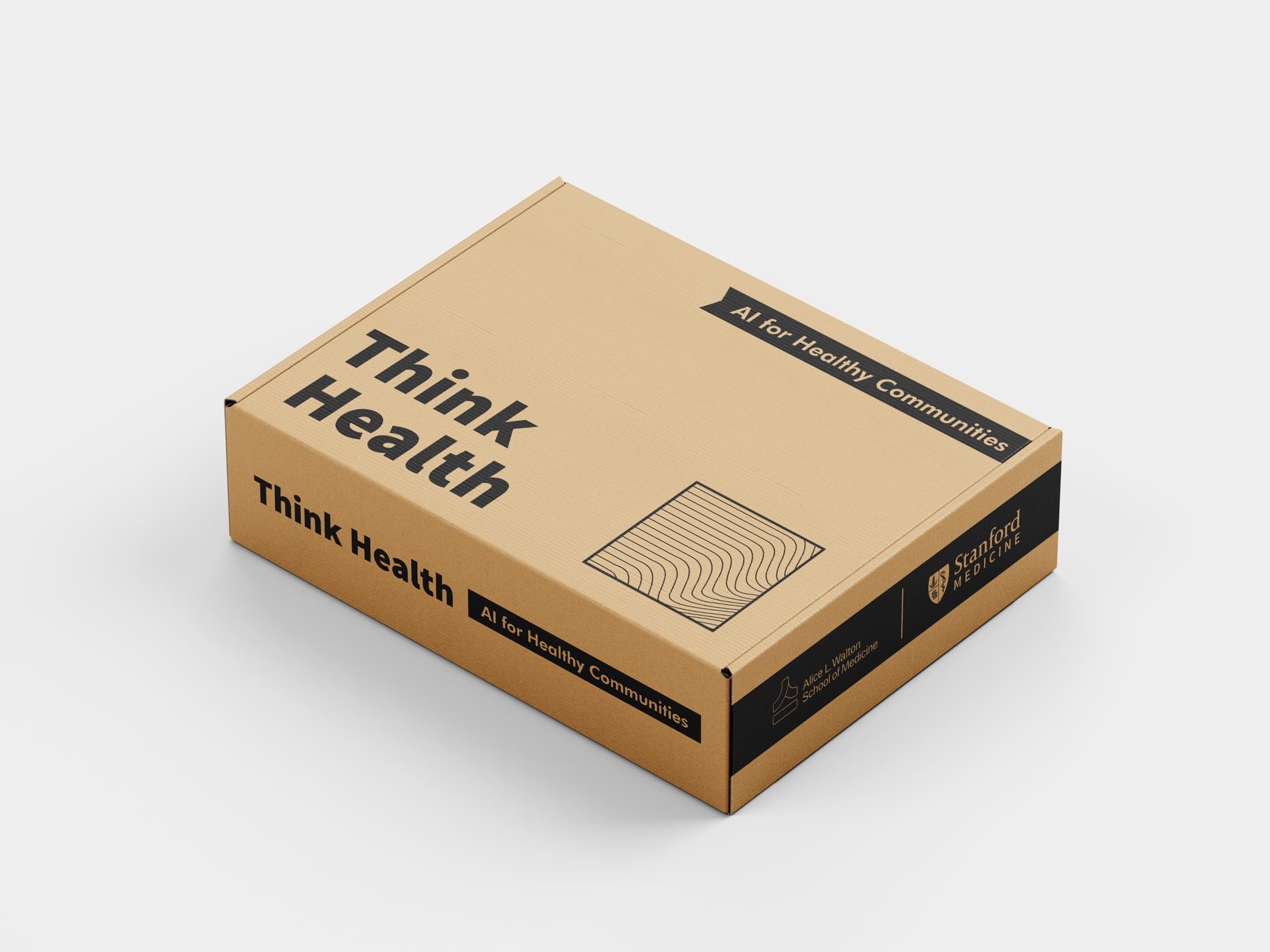
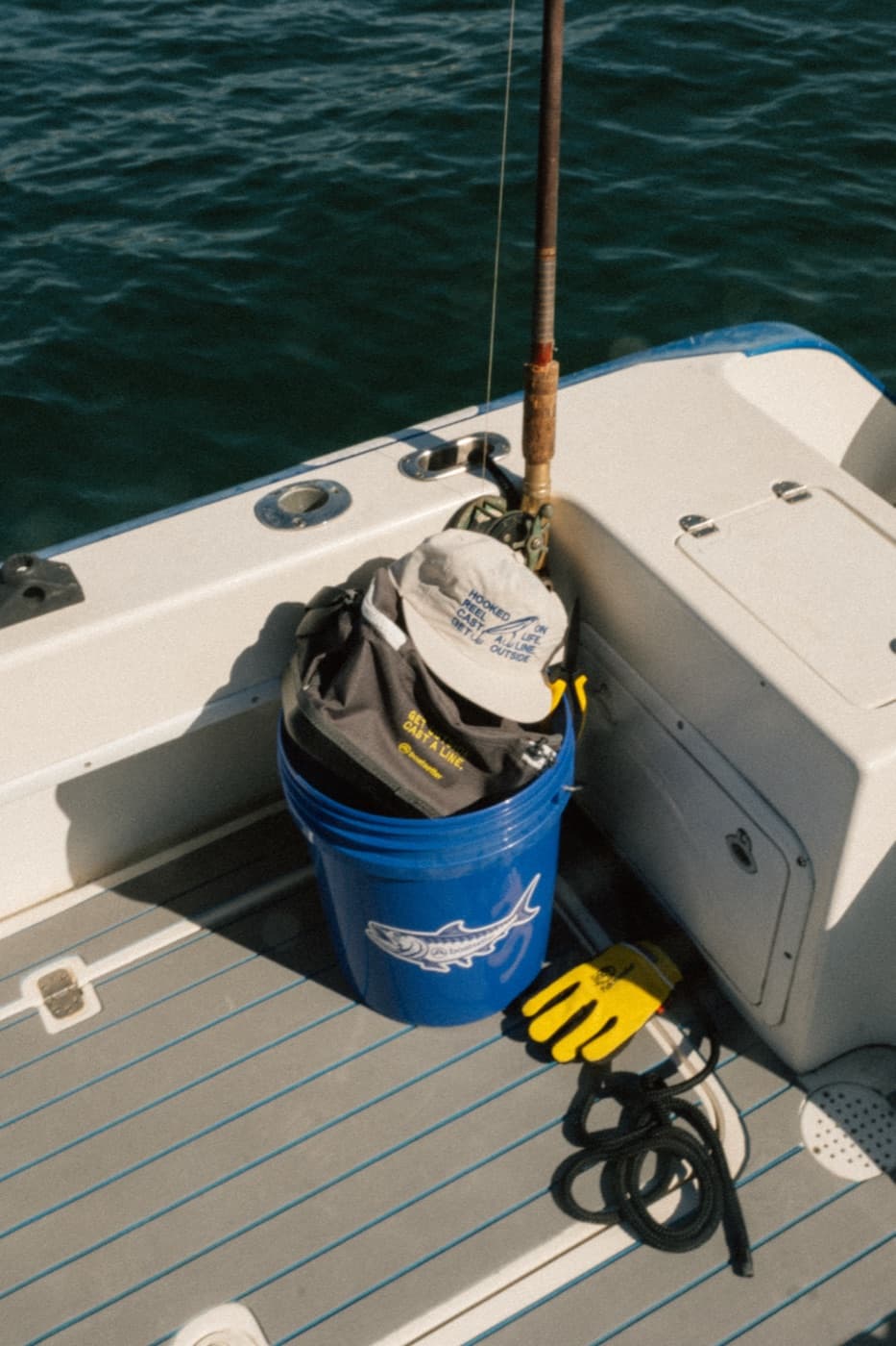
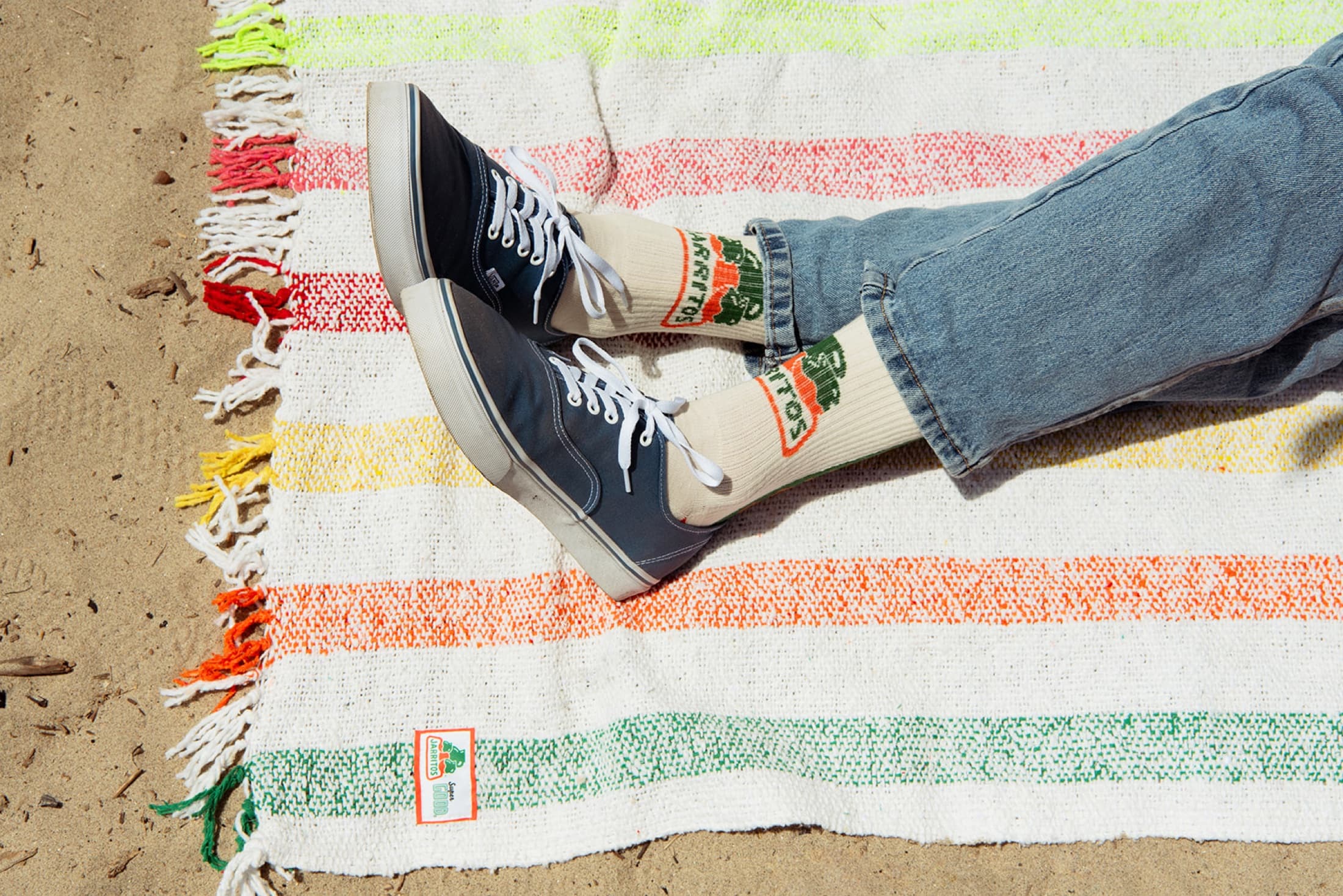
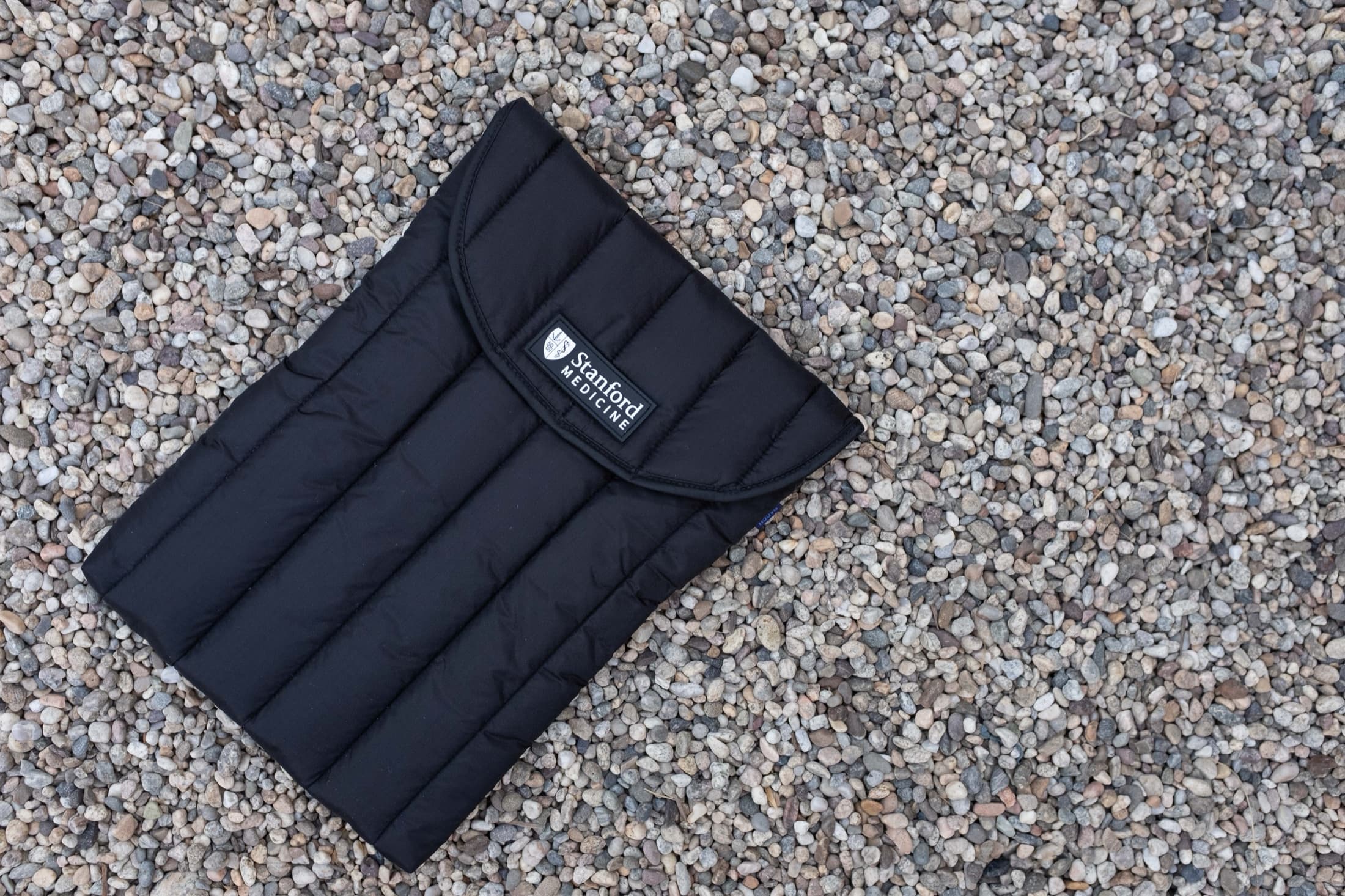
Production-ready design is not only for complex projects. A simple tee, hat, or tote can feel much more finished with the right art direction: a better graphic, a small back hit, a woven label, a custom hang tag, a smarter color choice, or a restrained packaging detail.
Orange Goods connects design and production so the artwork is built for the real piece from the start. That means fewer surprises, cleaner goods, and merch that feels like it came from a brand with a point of view.