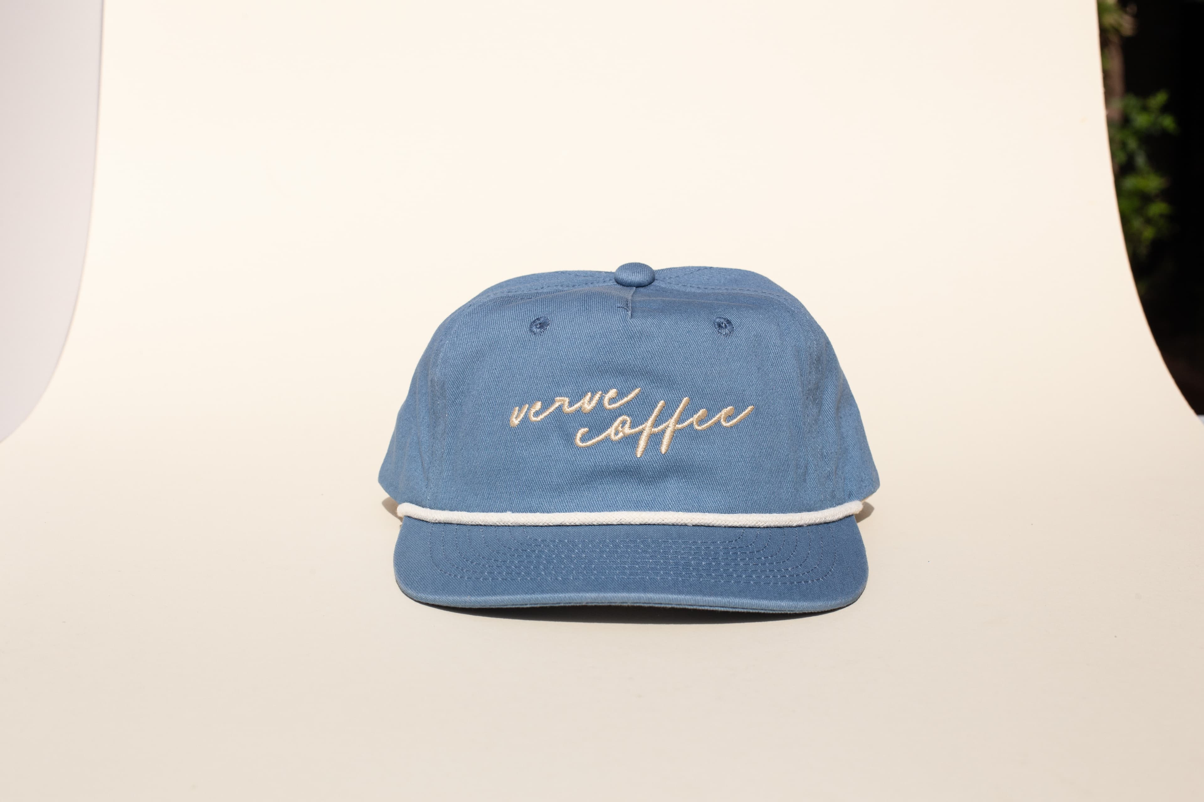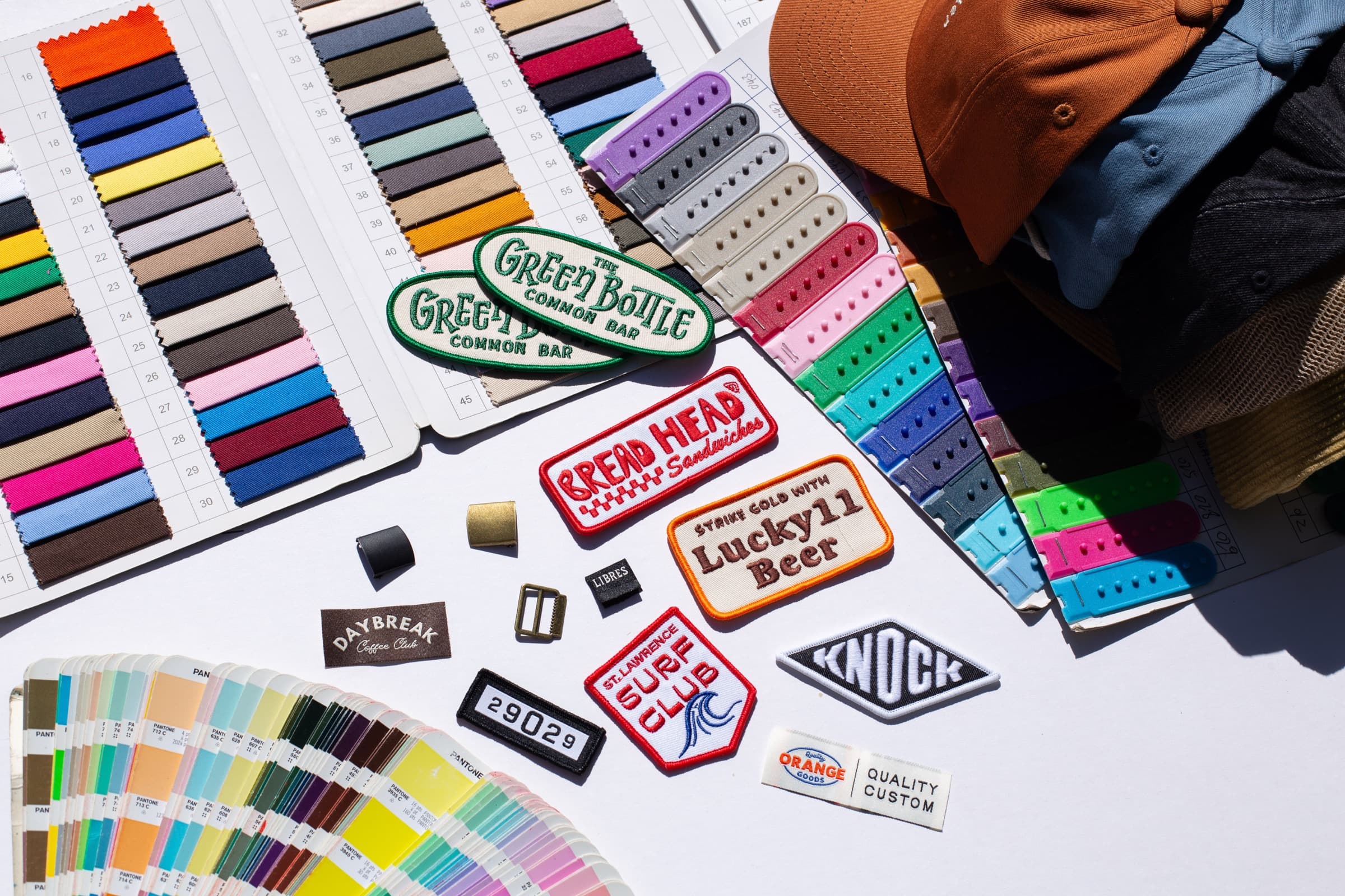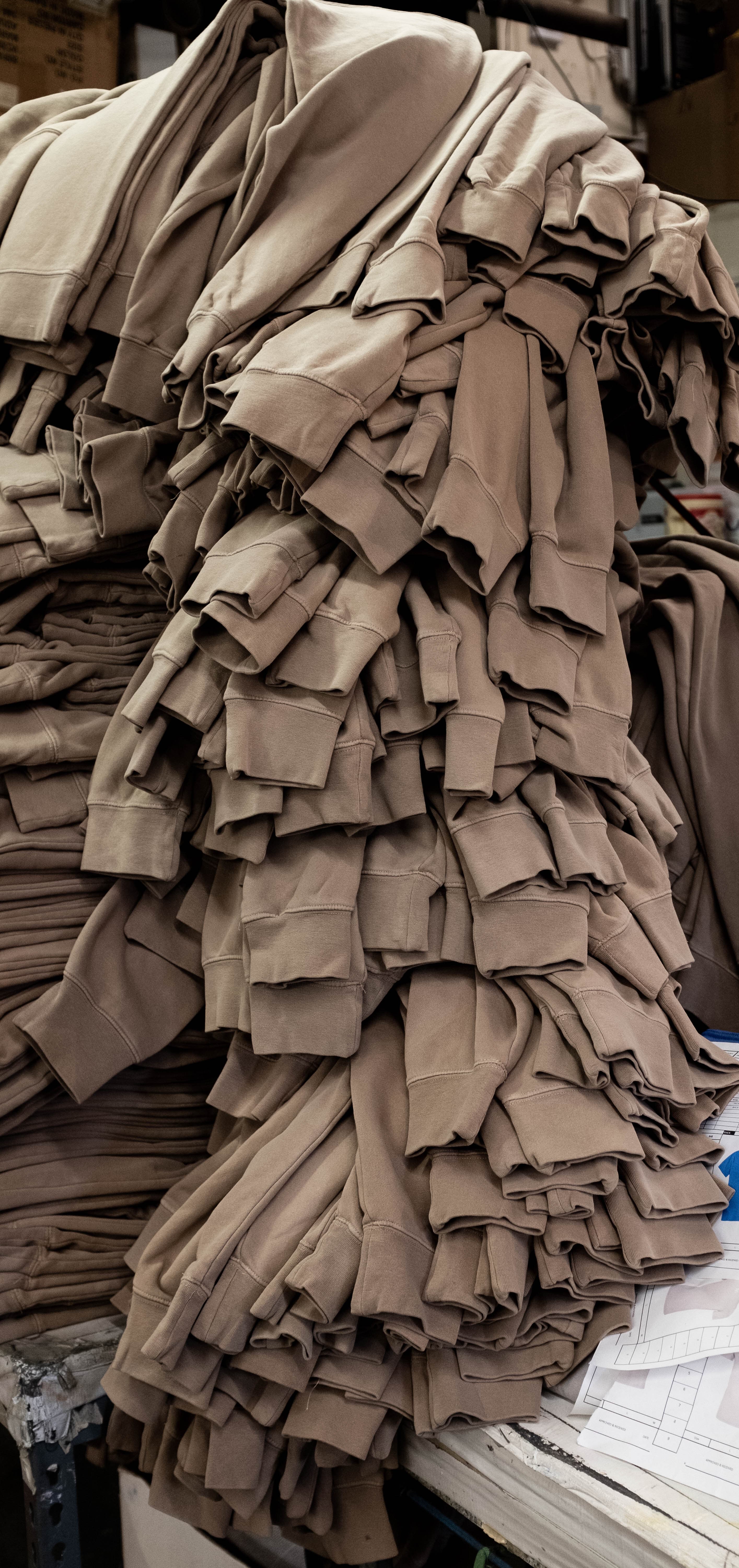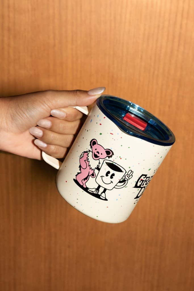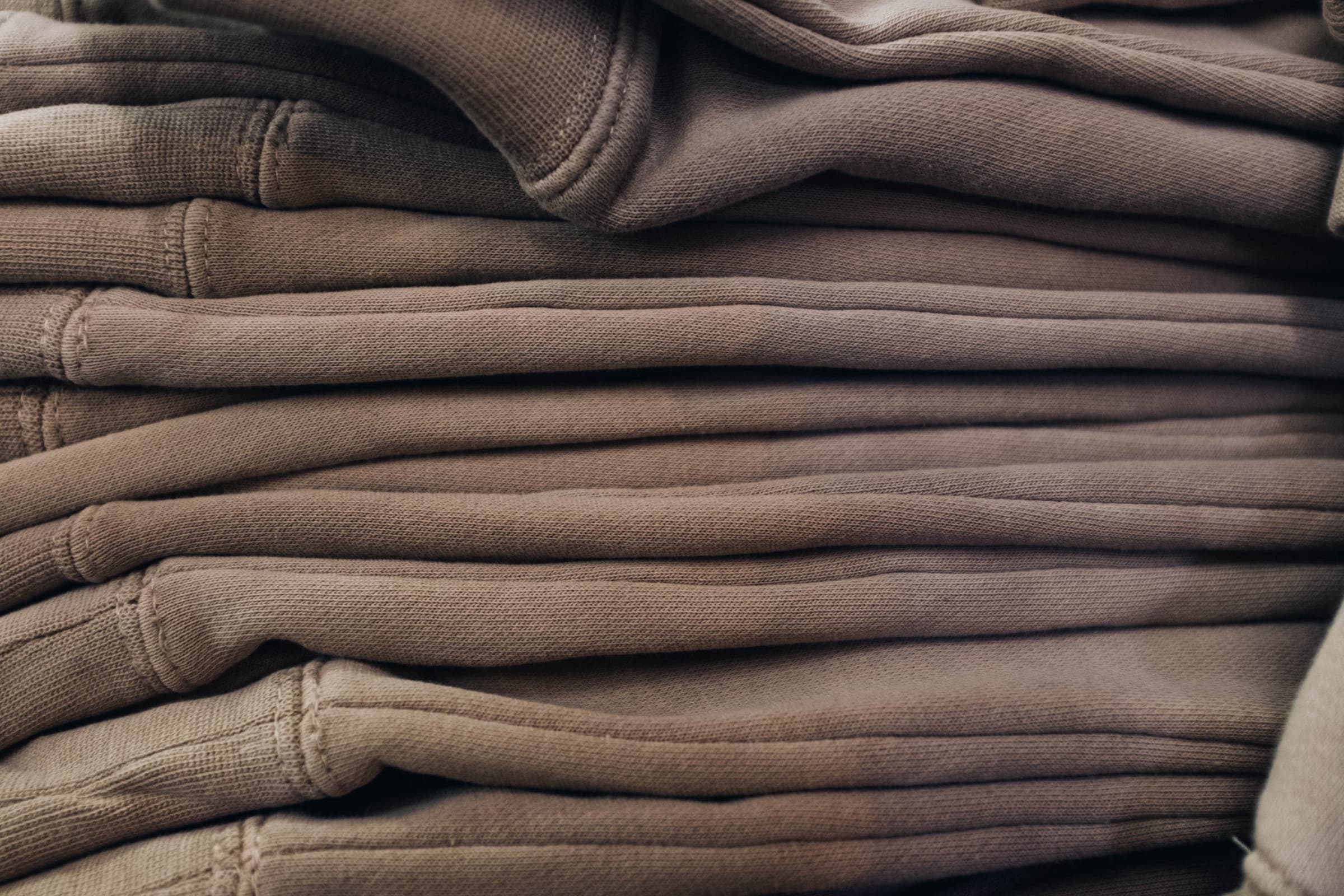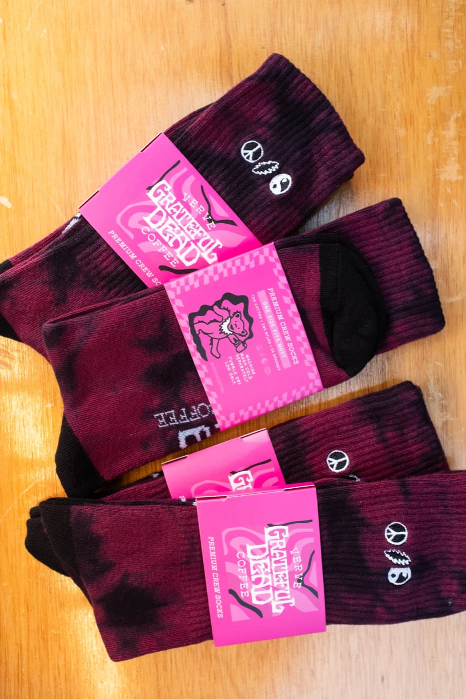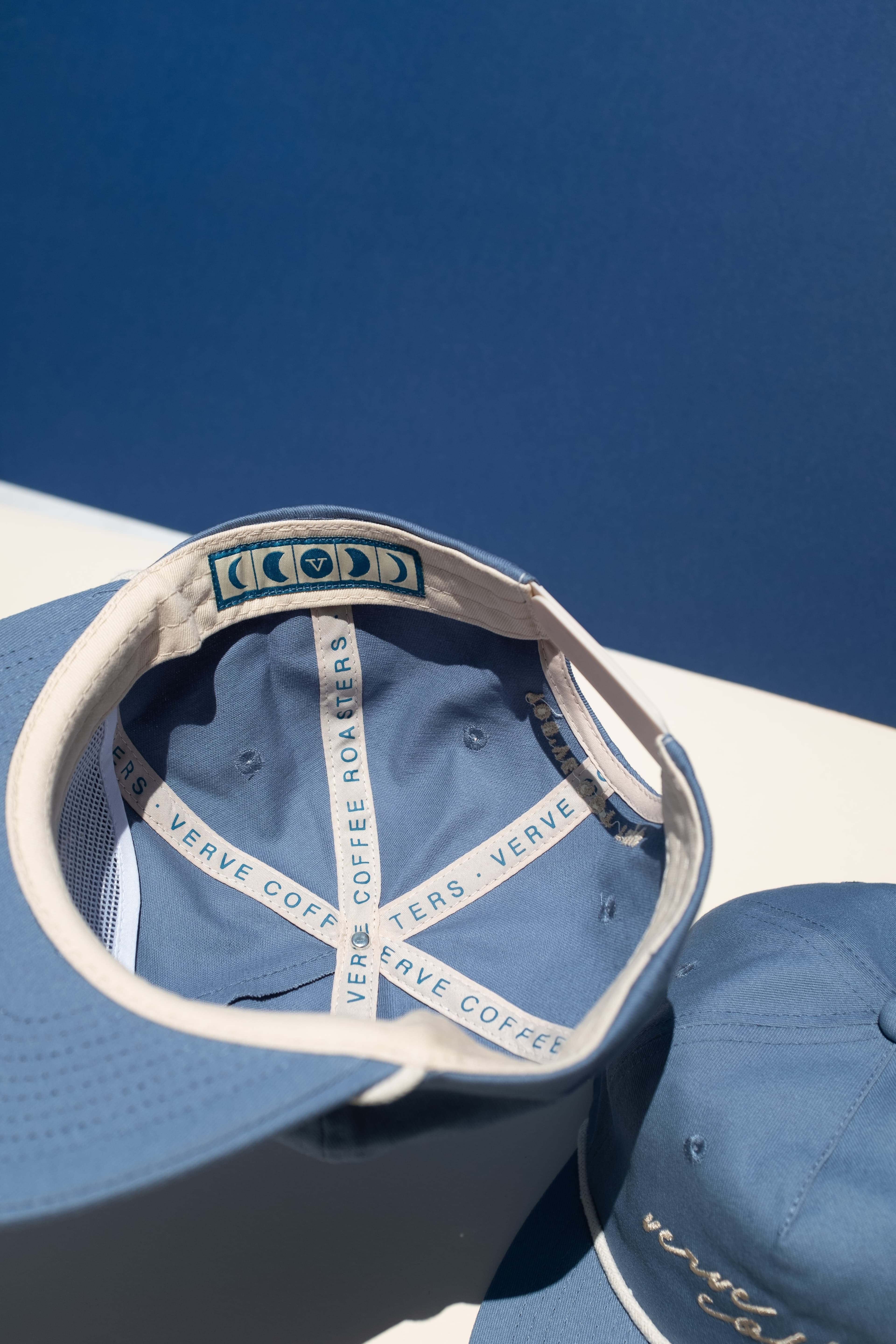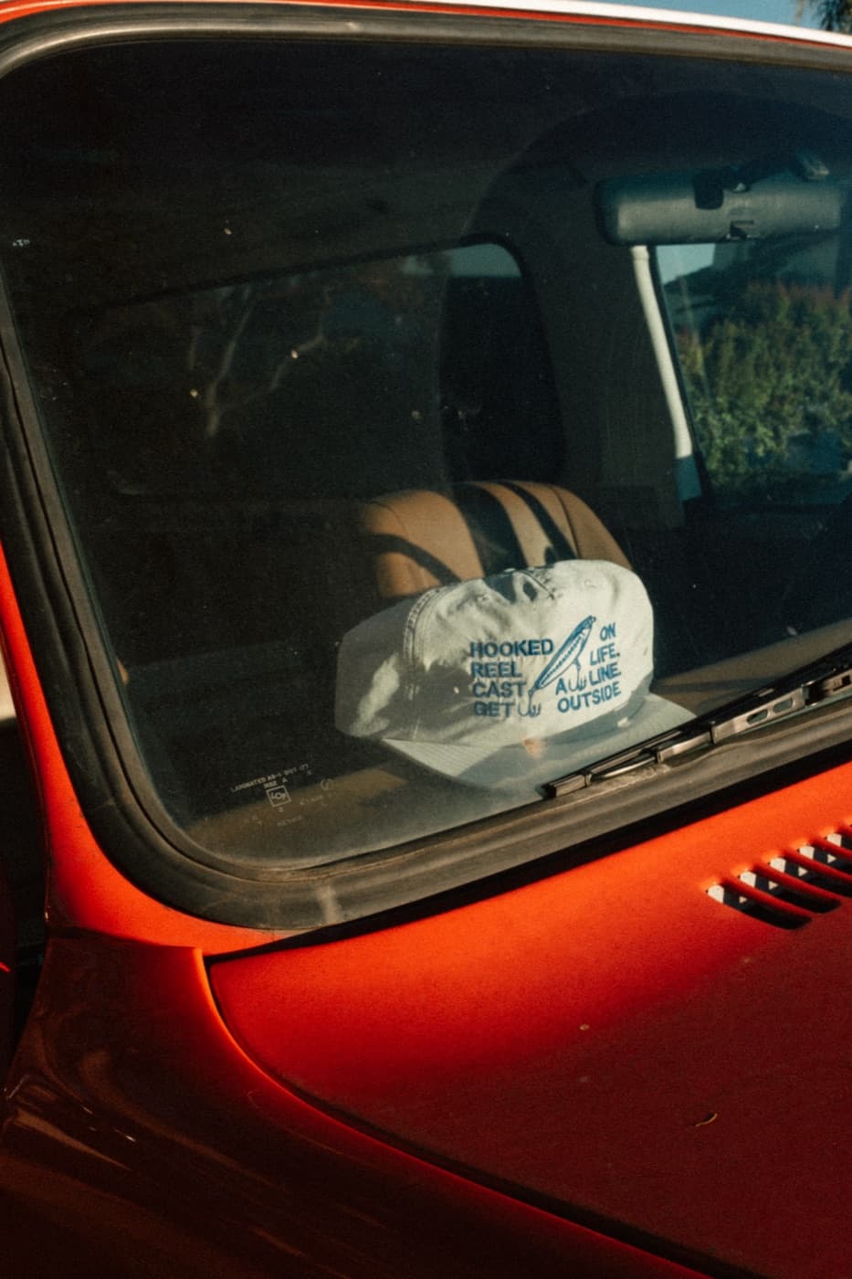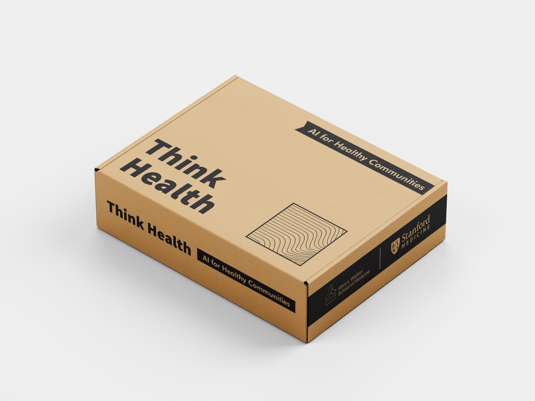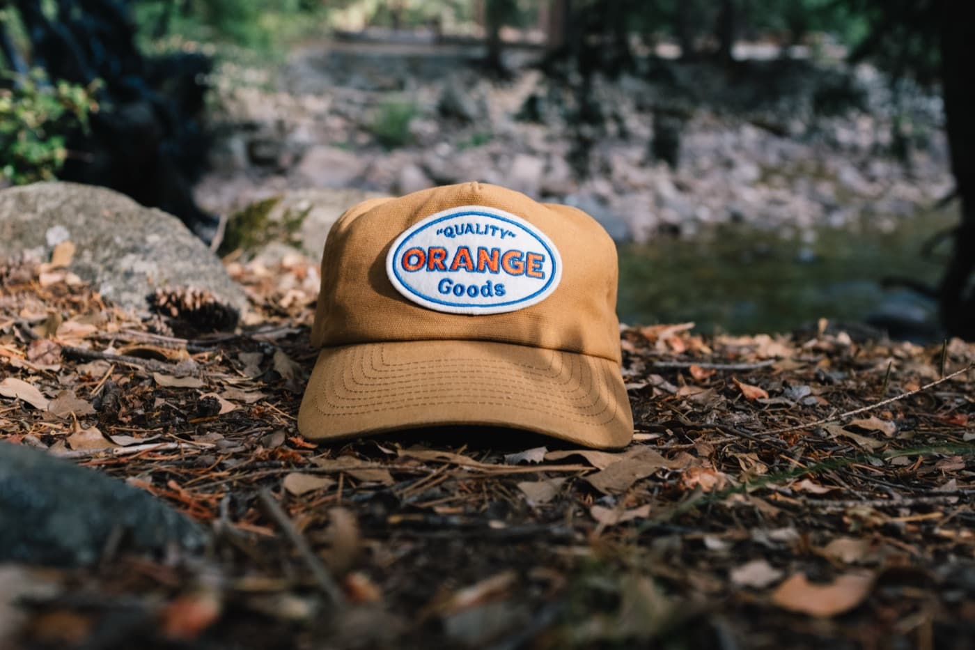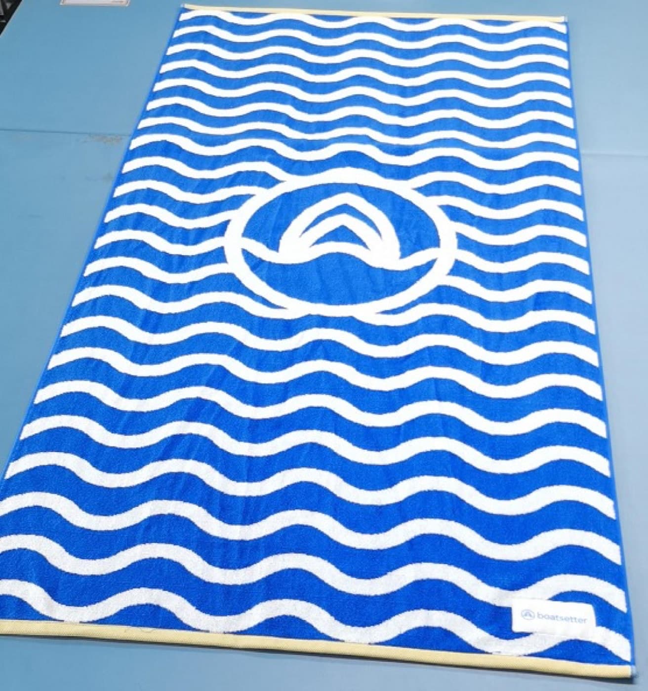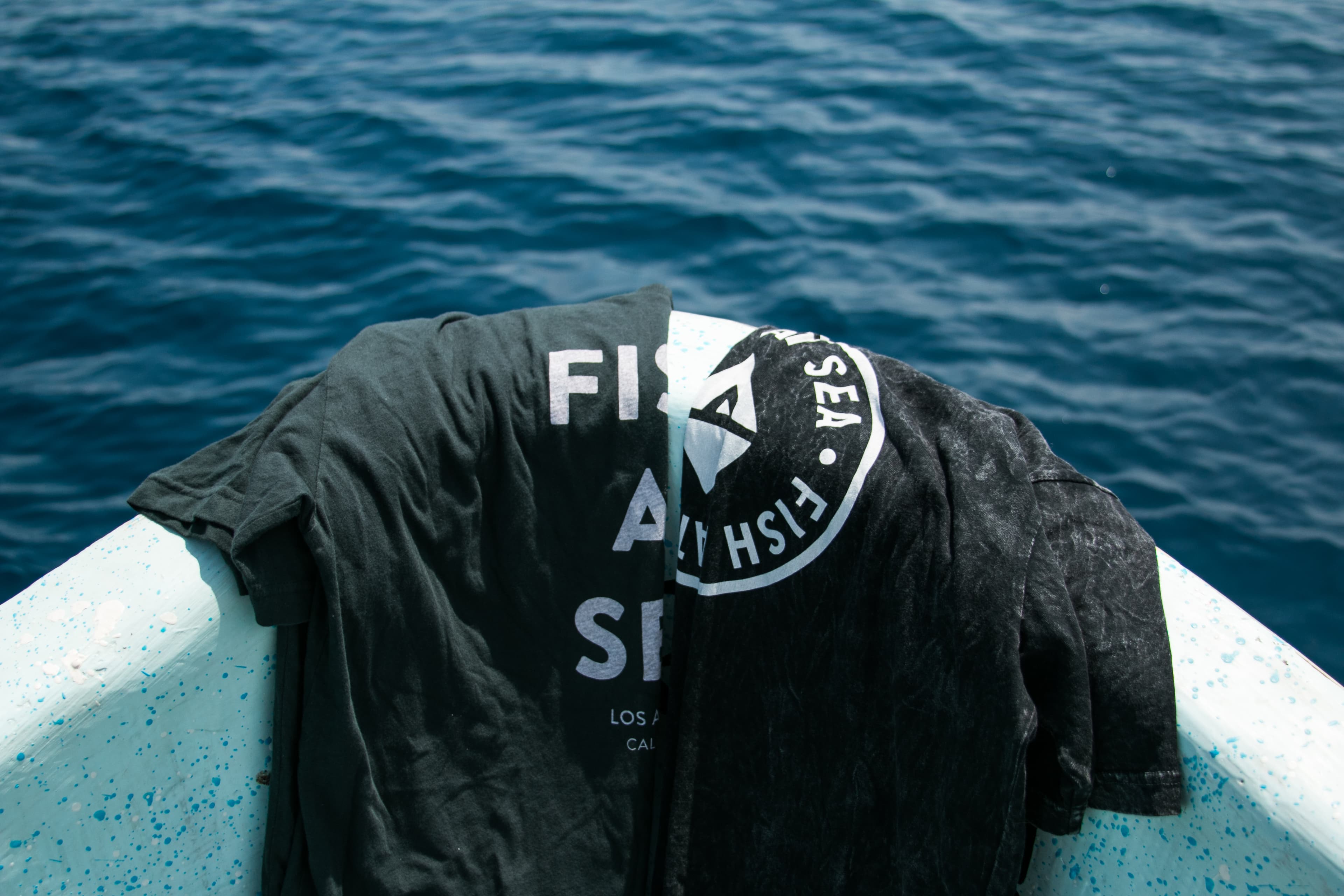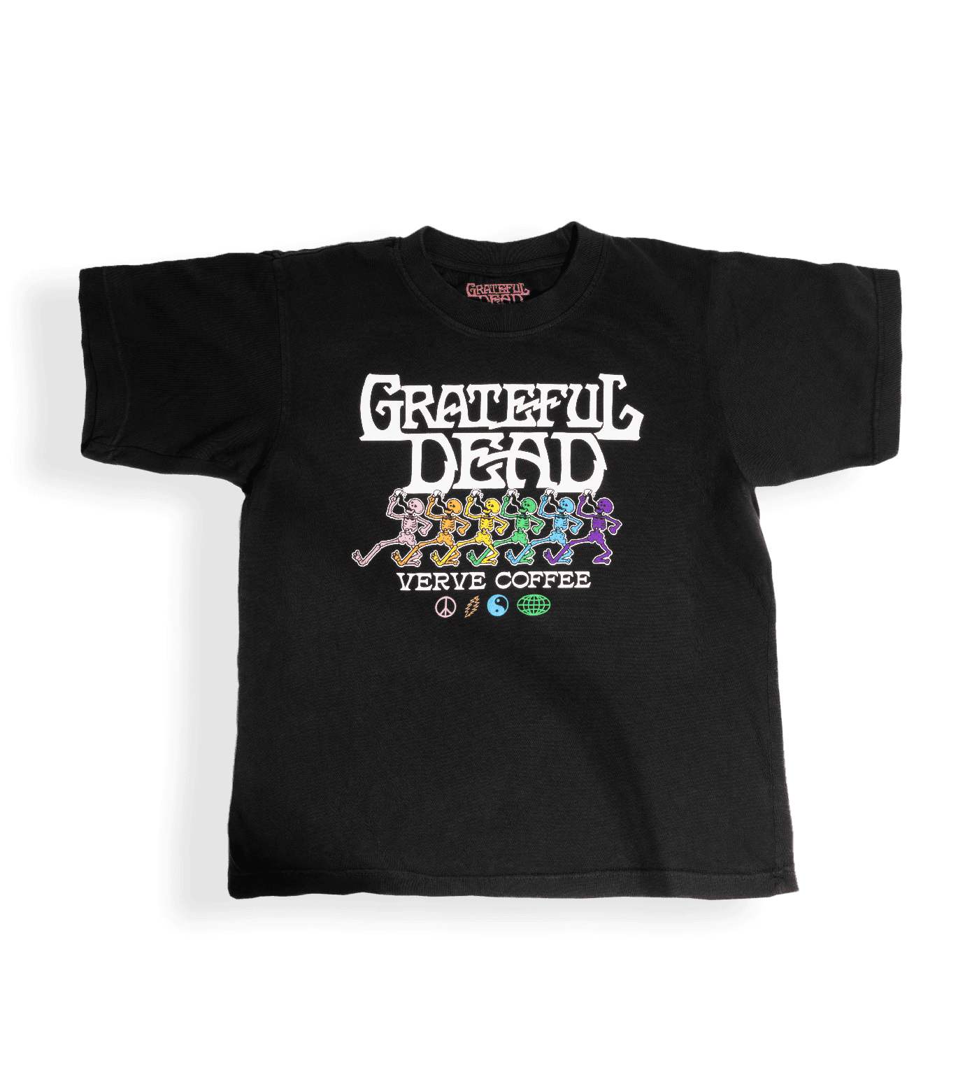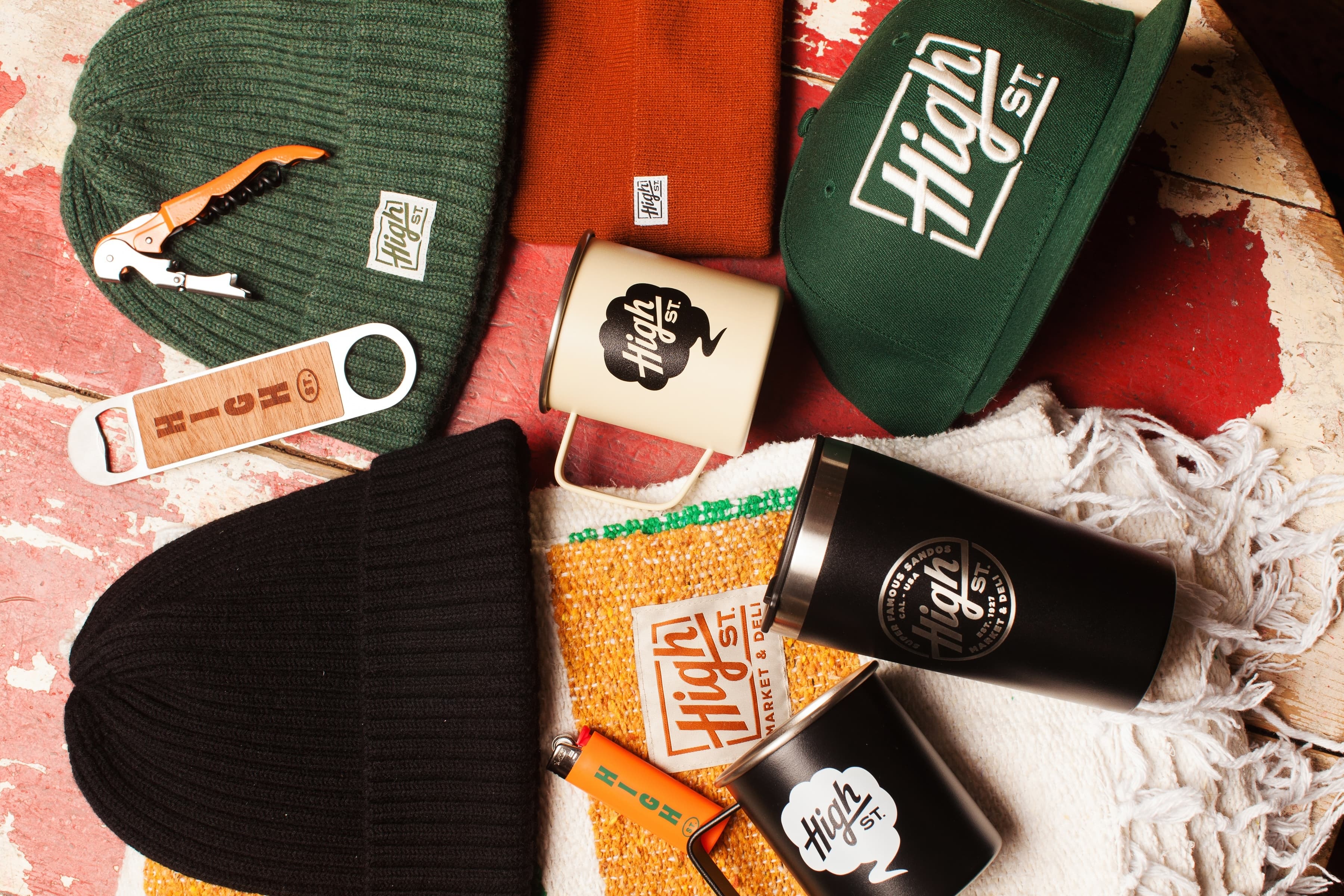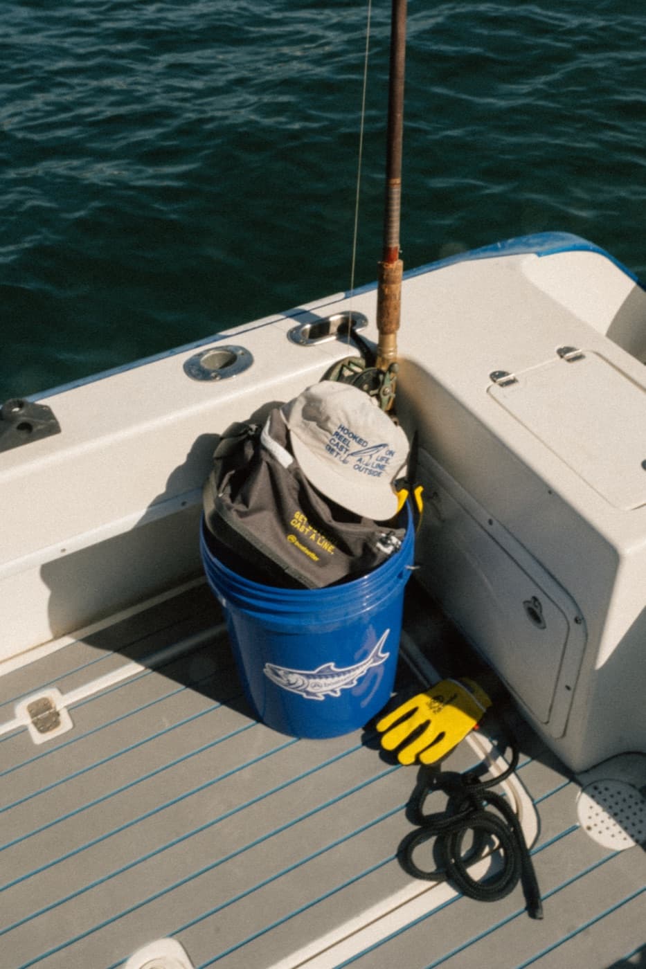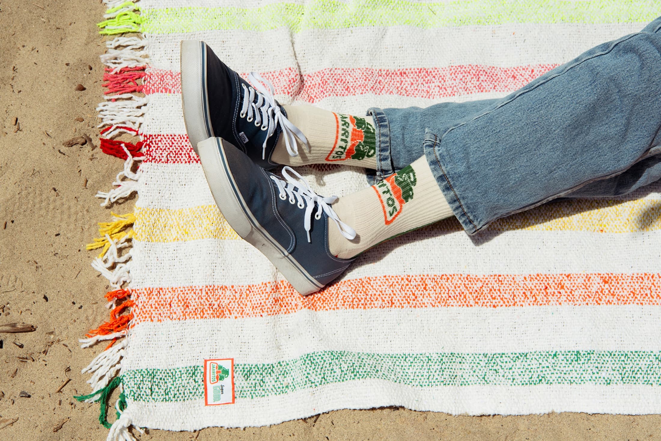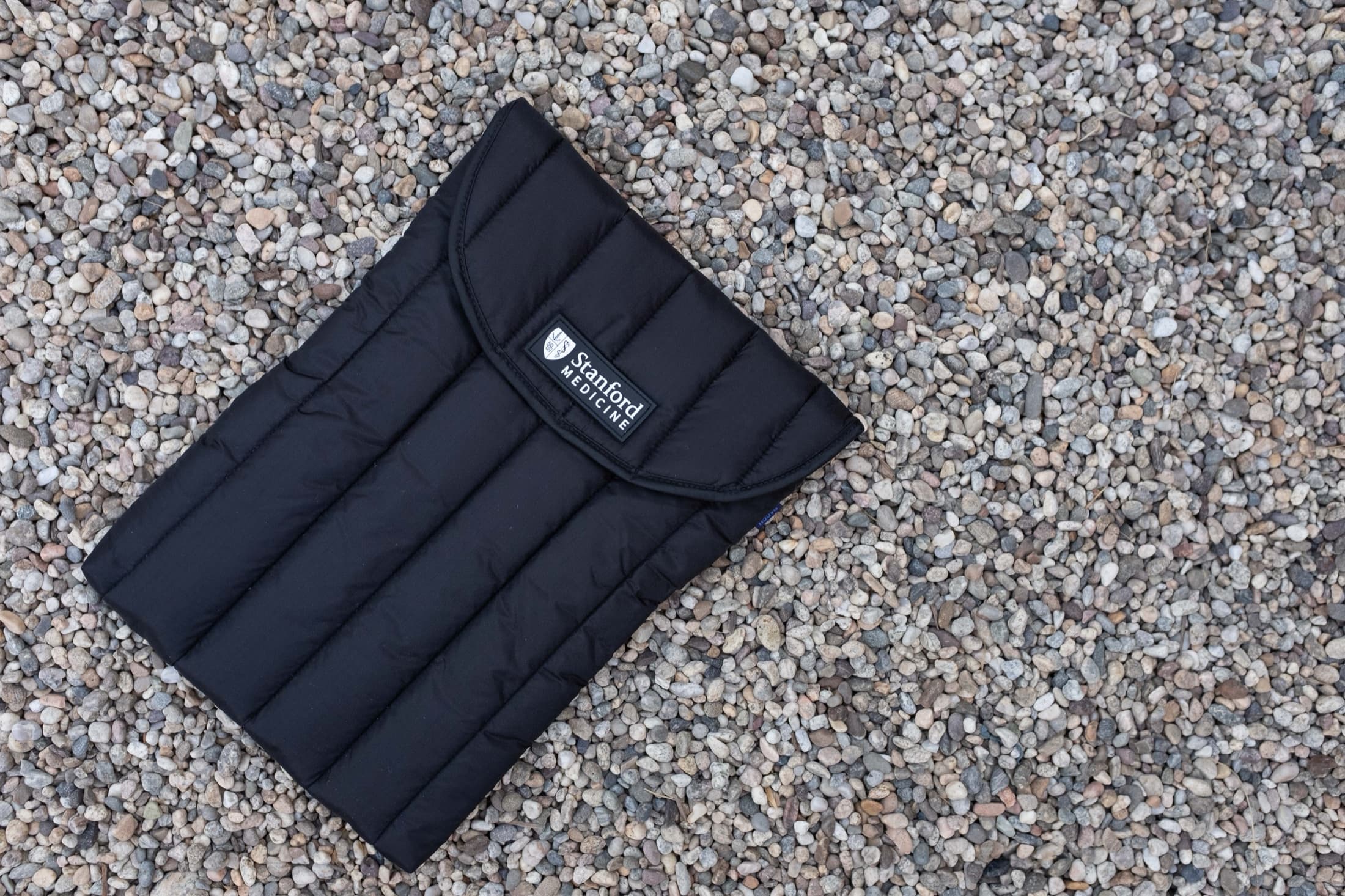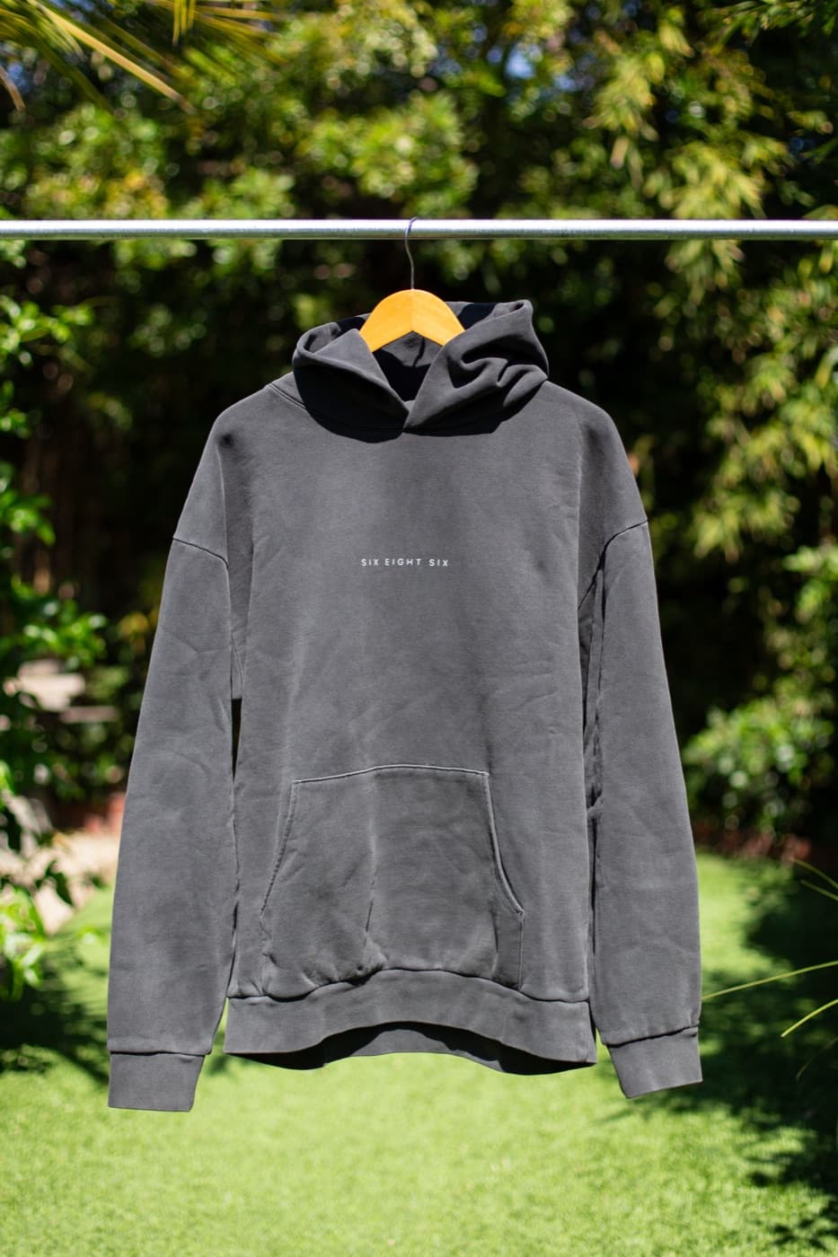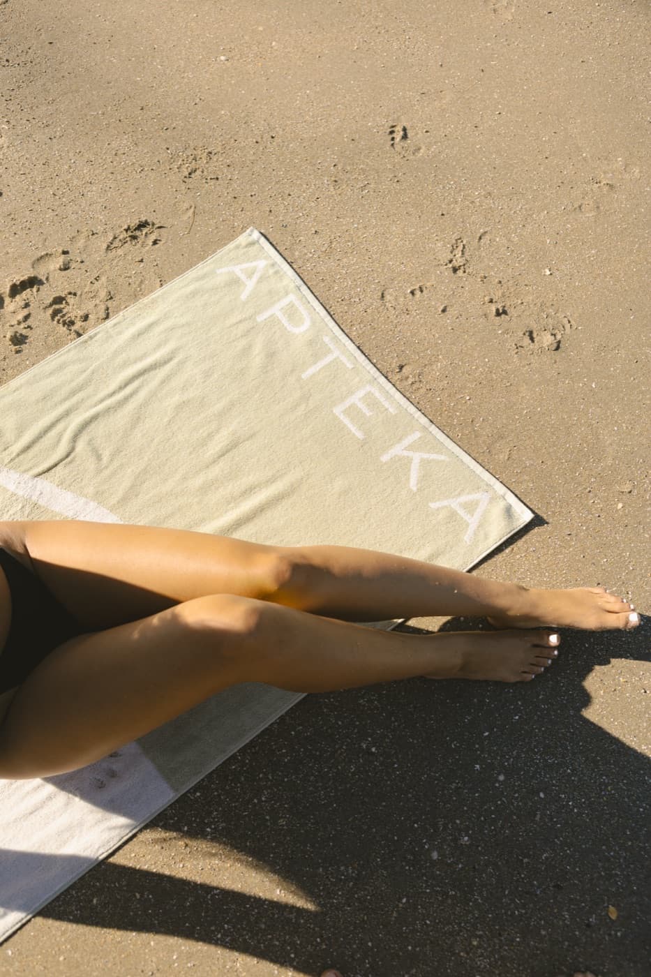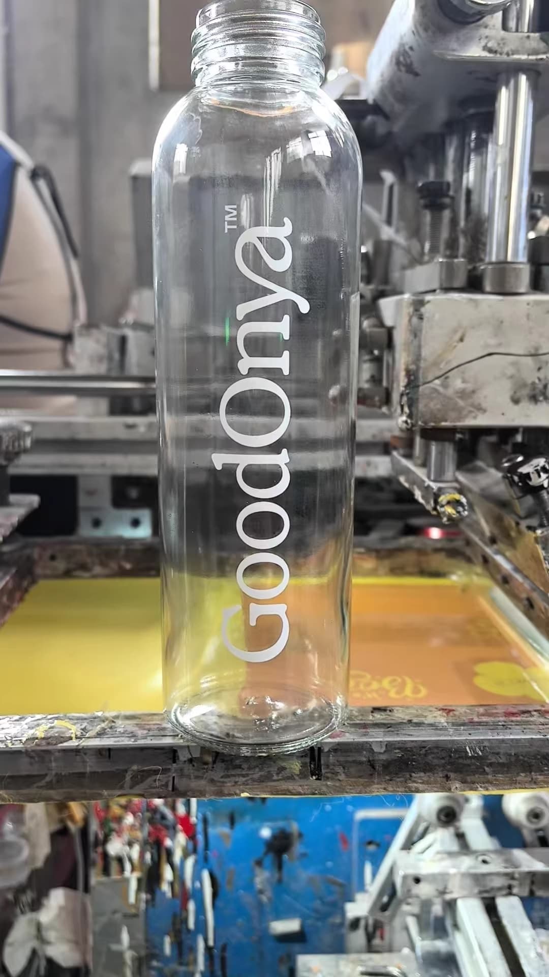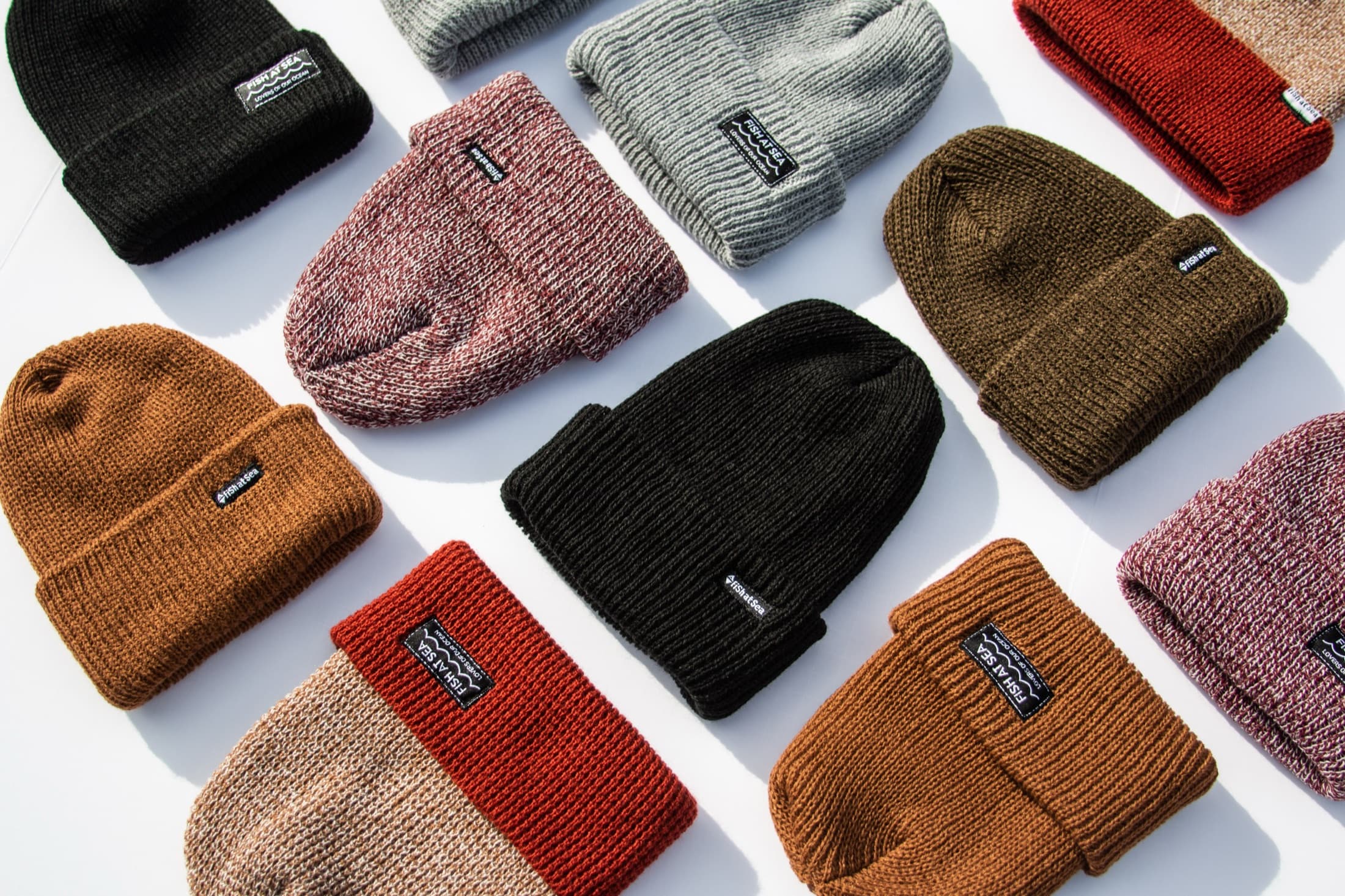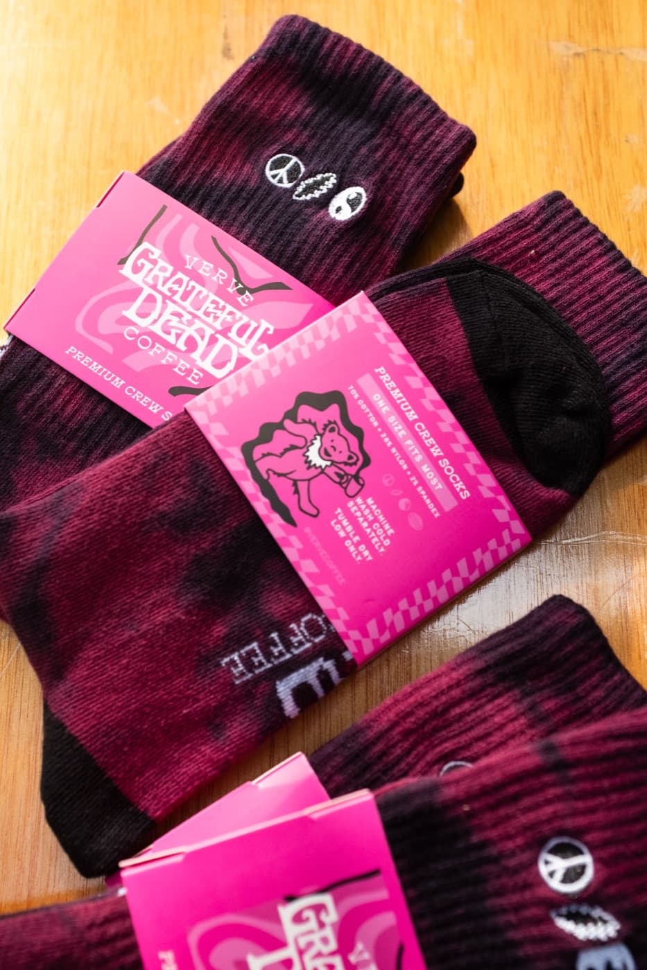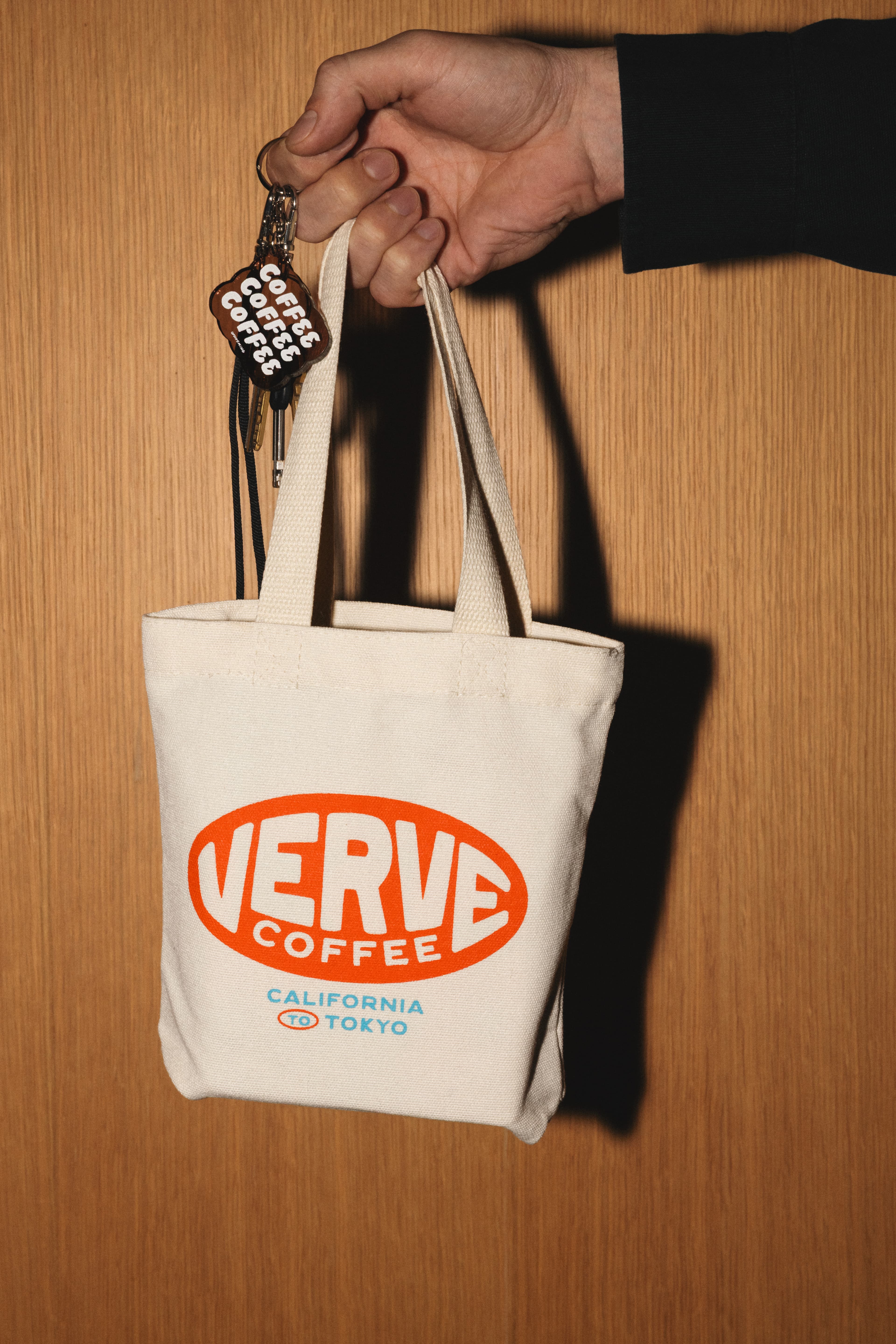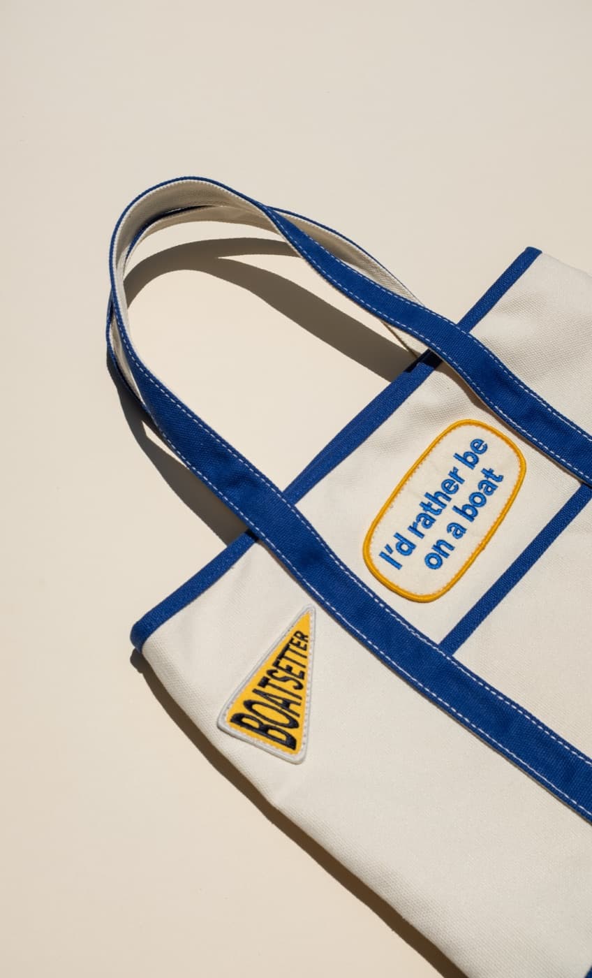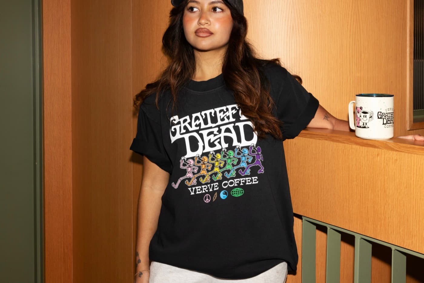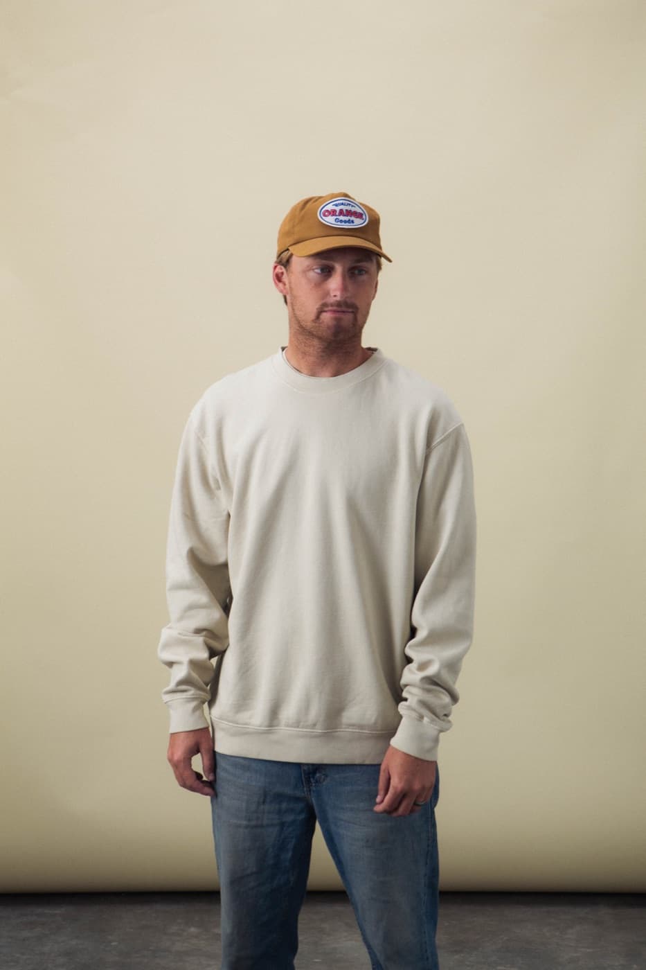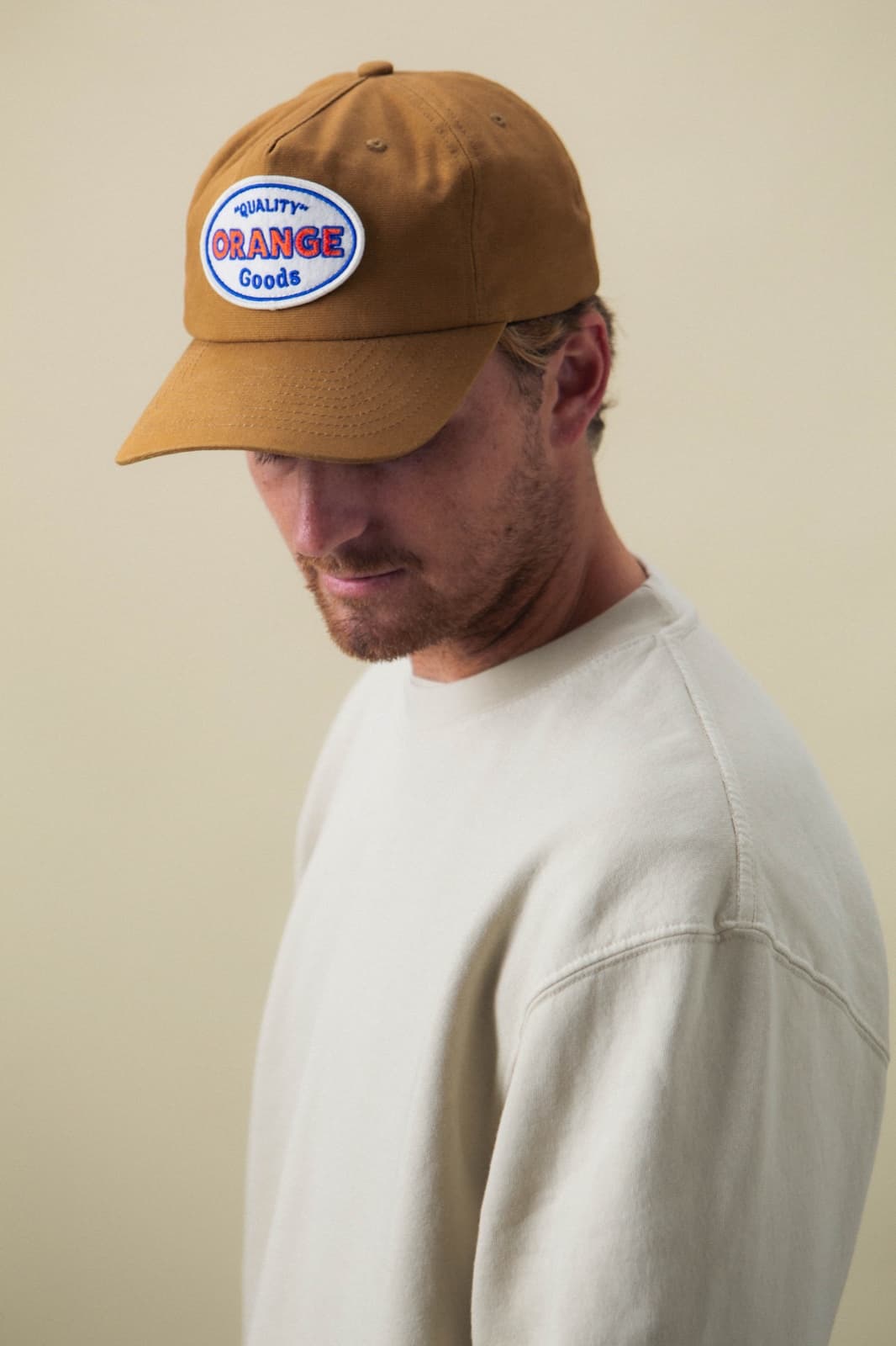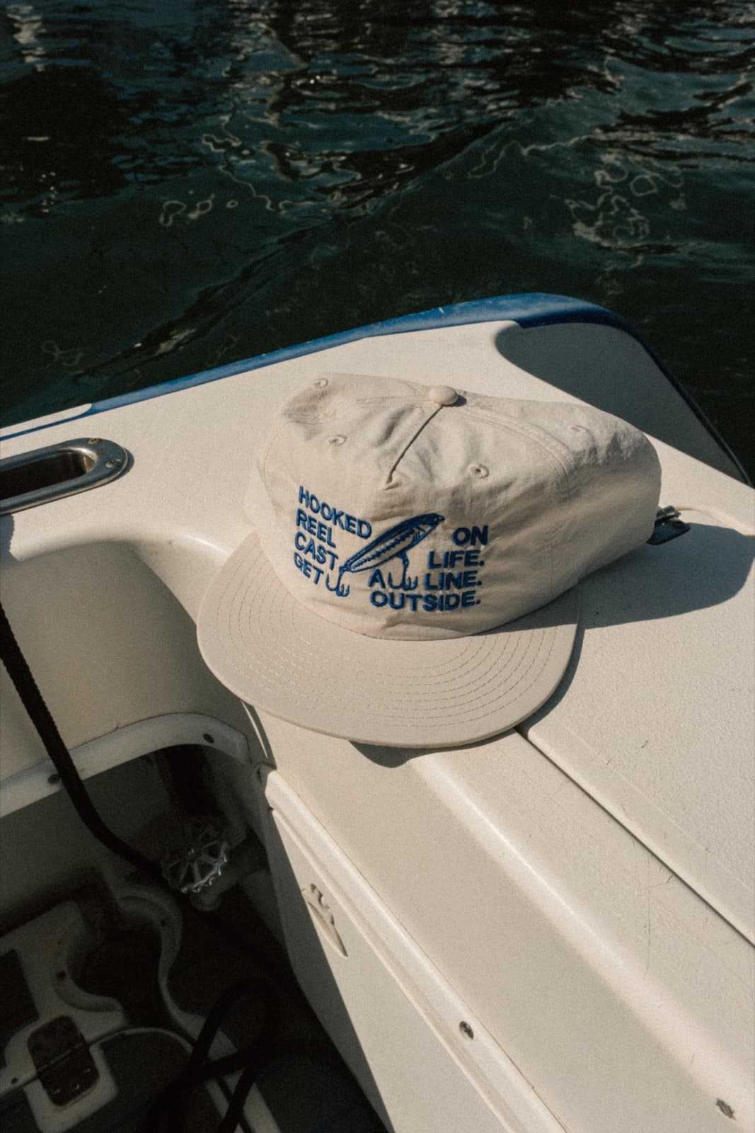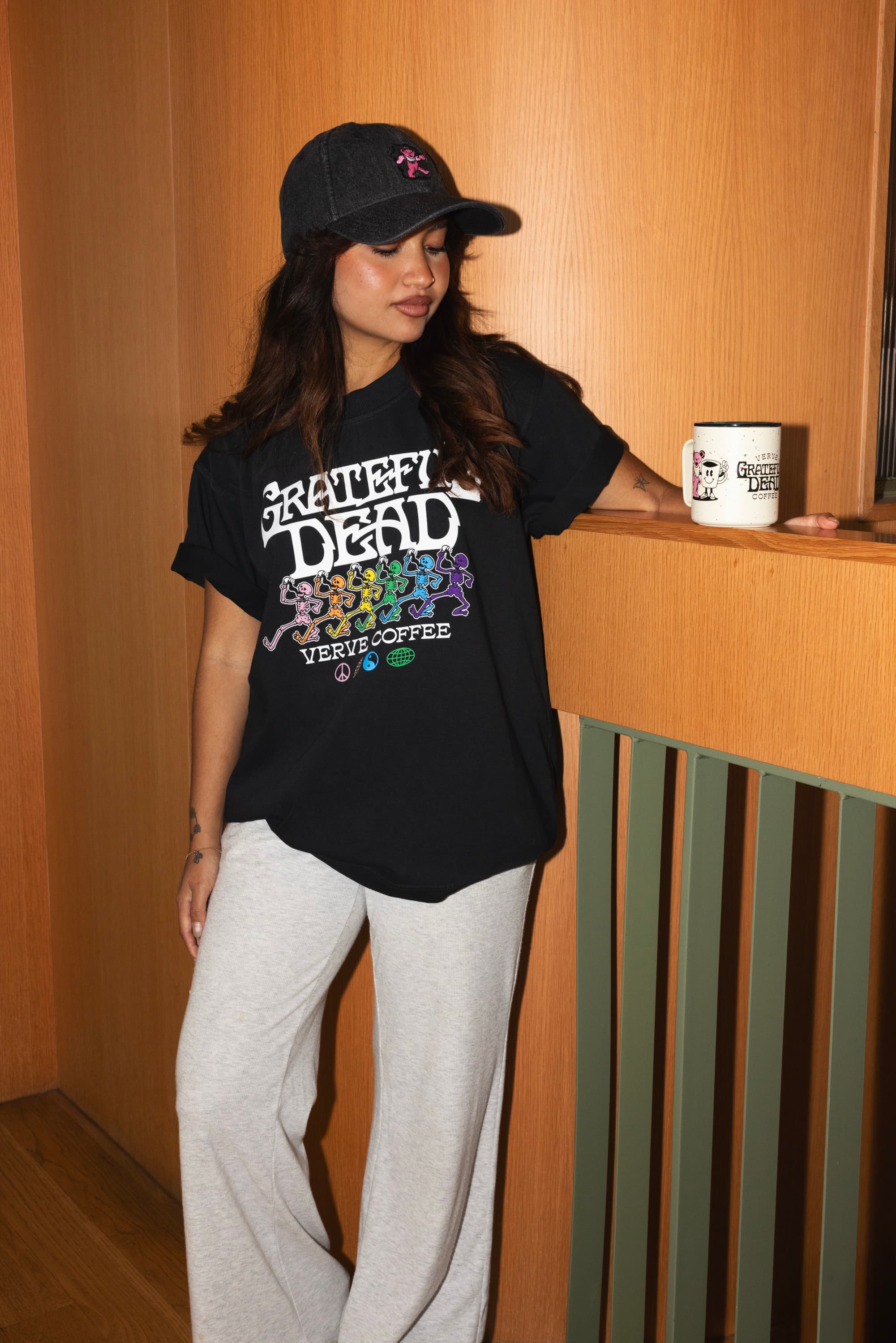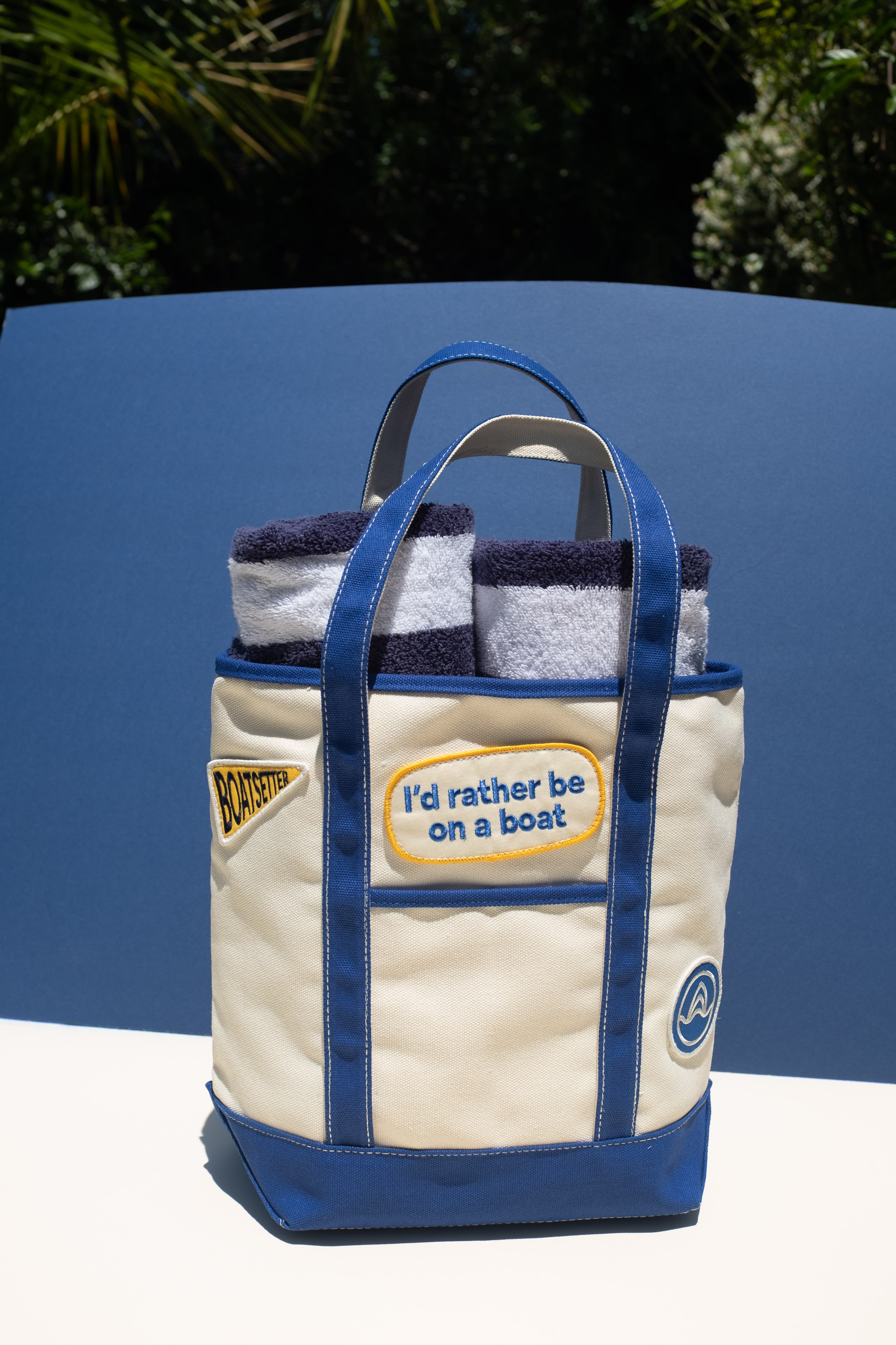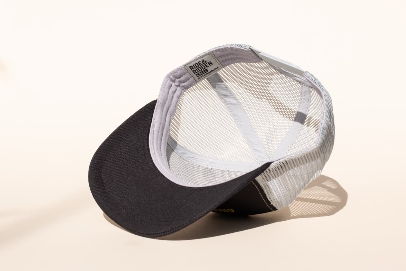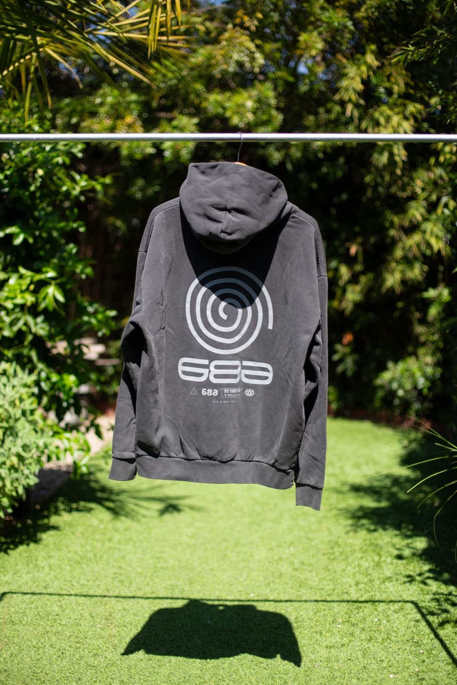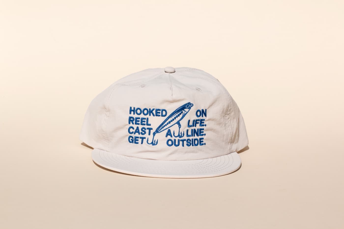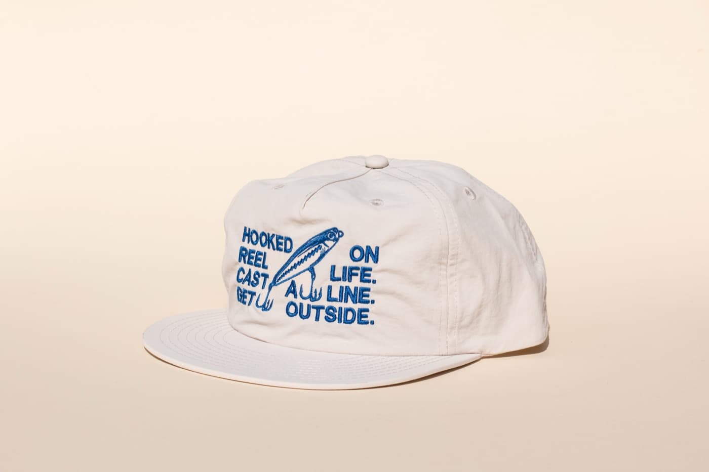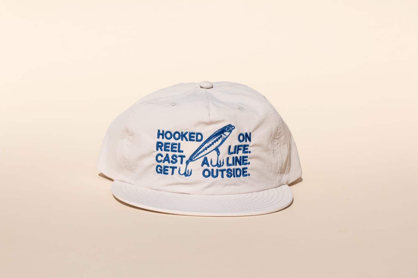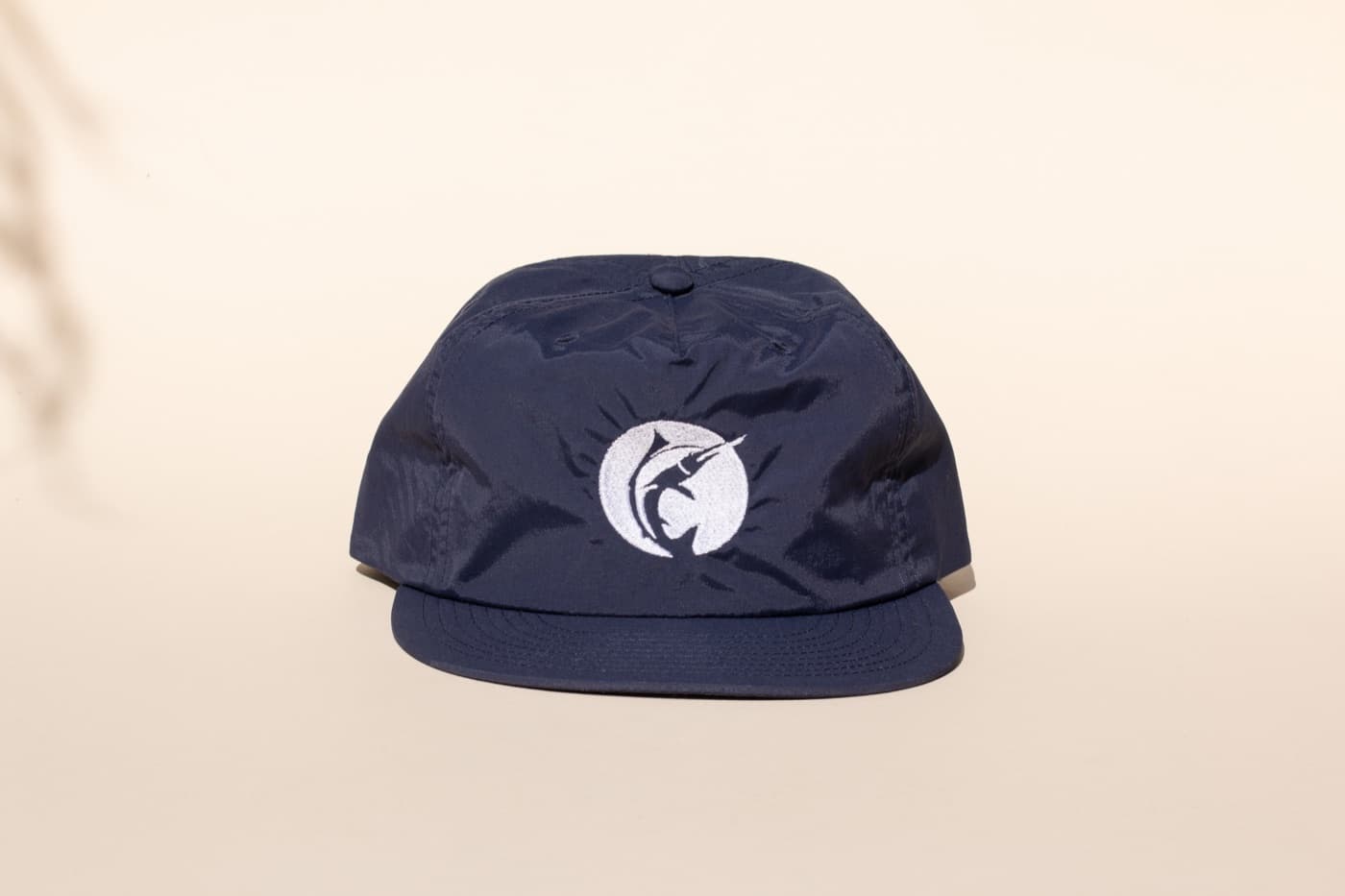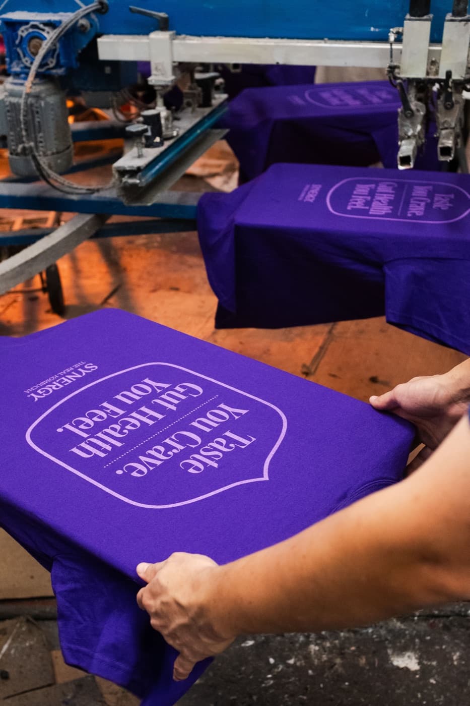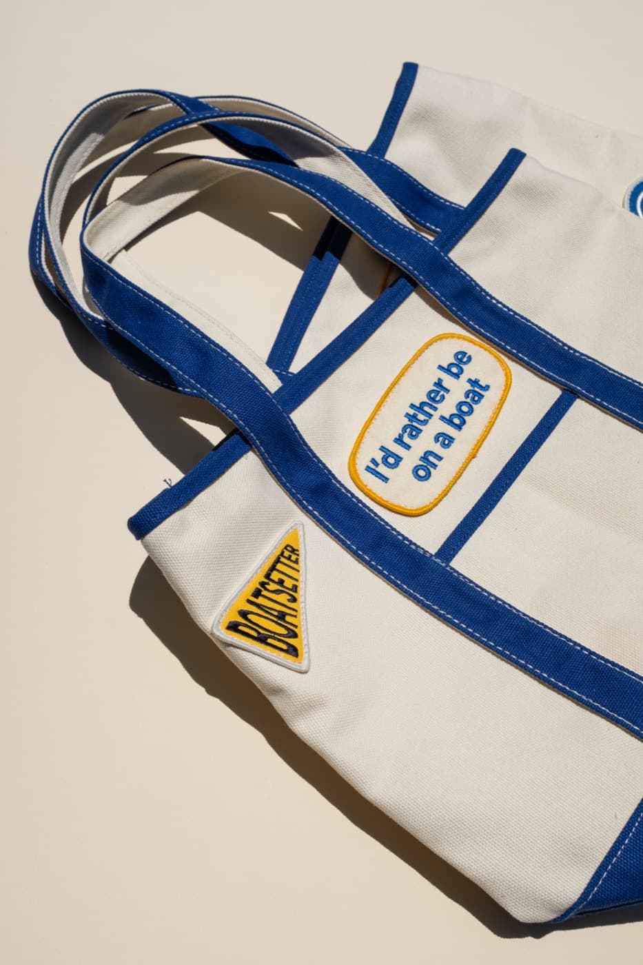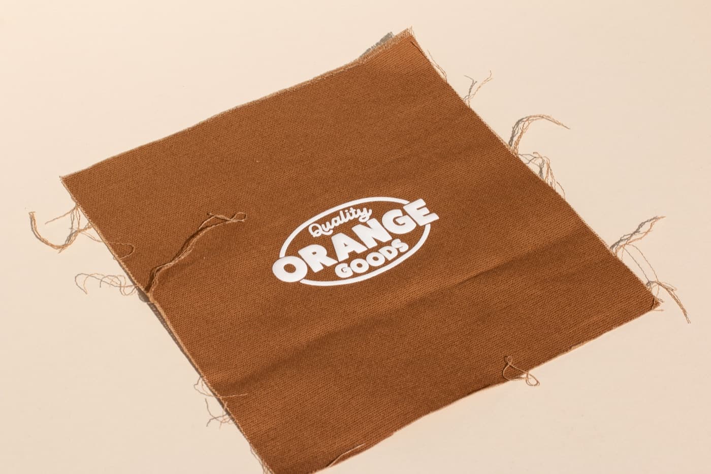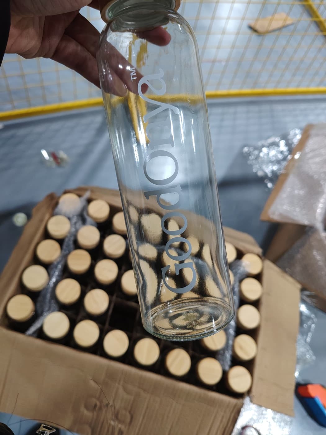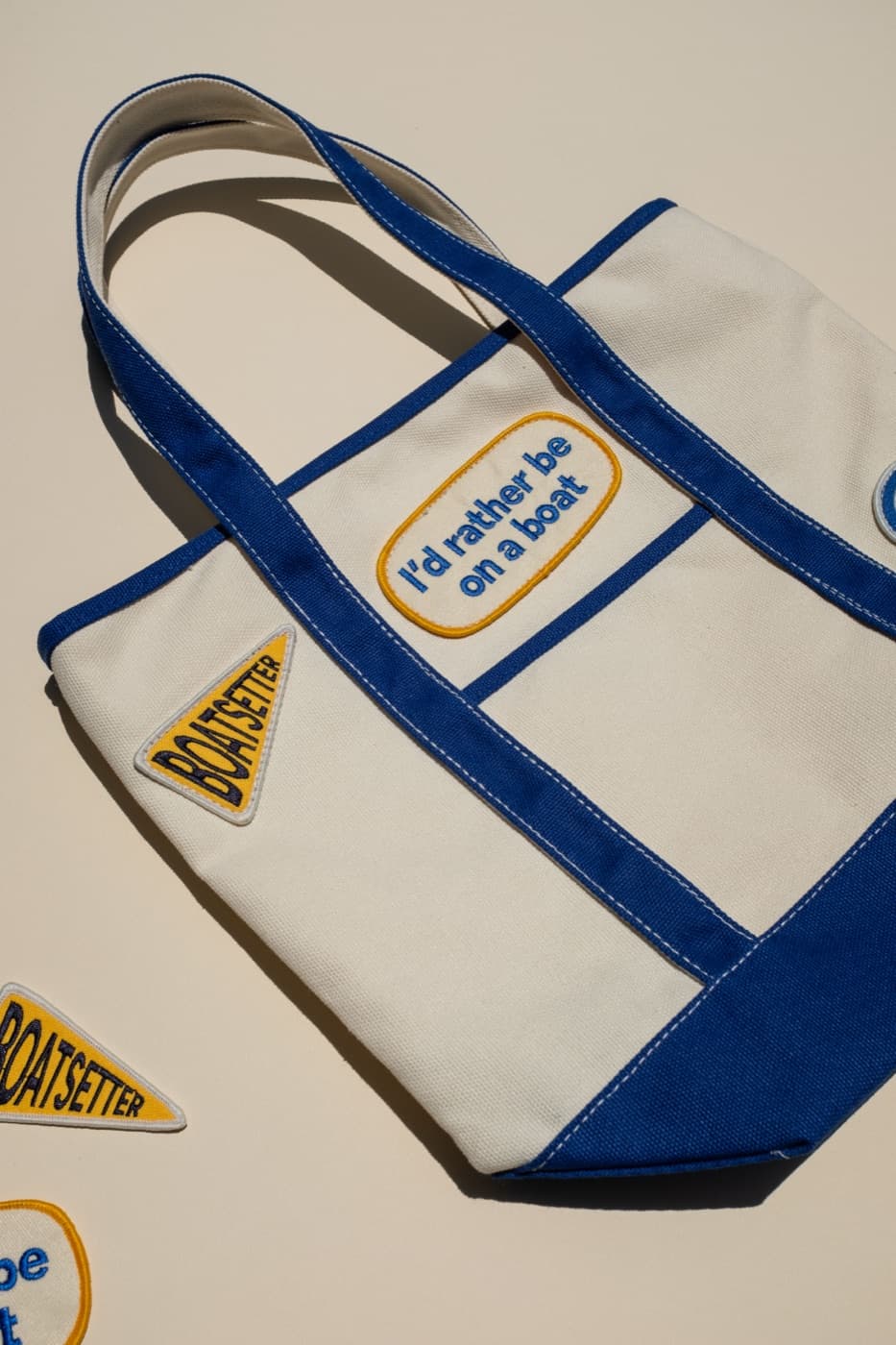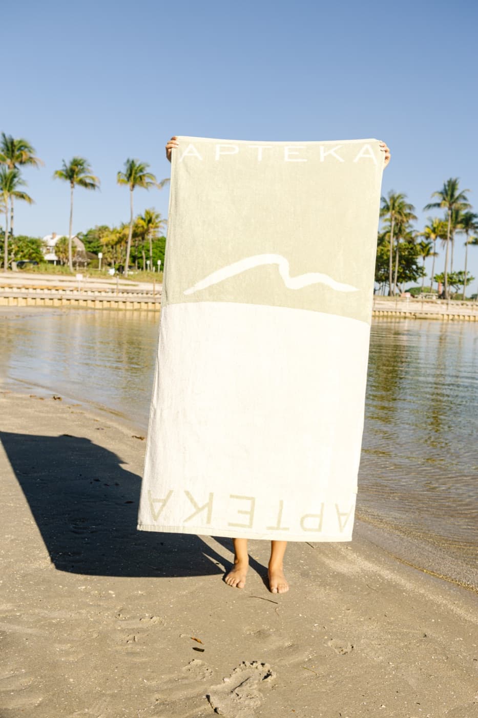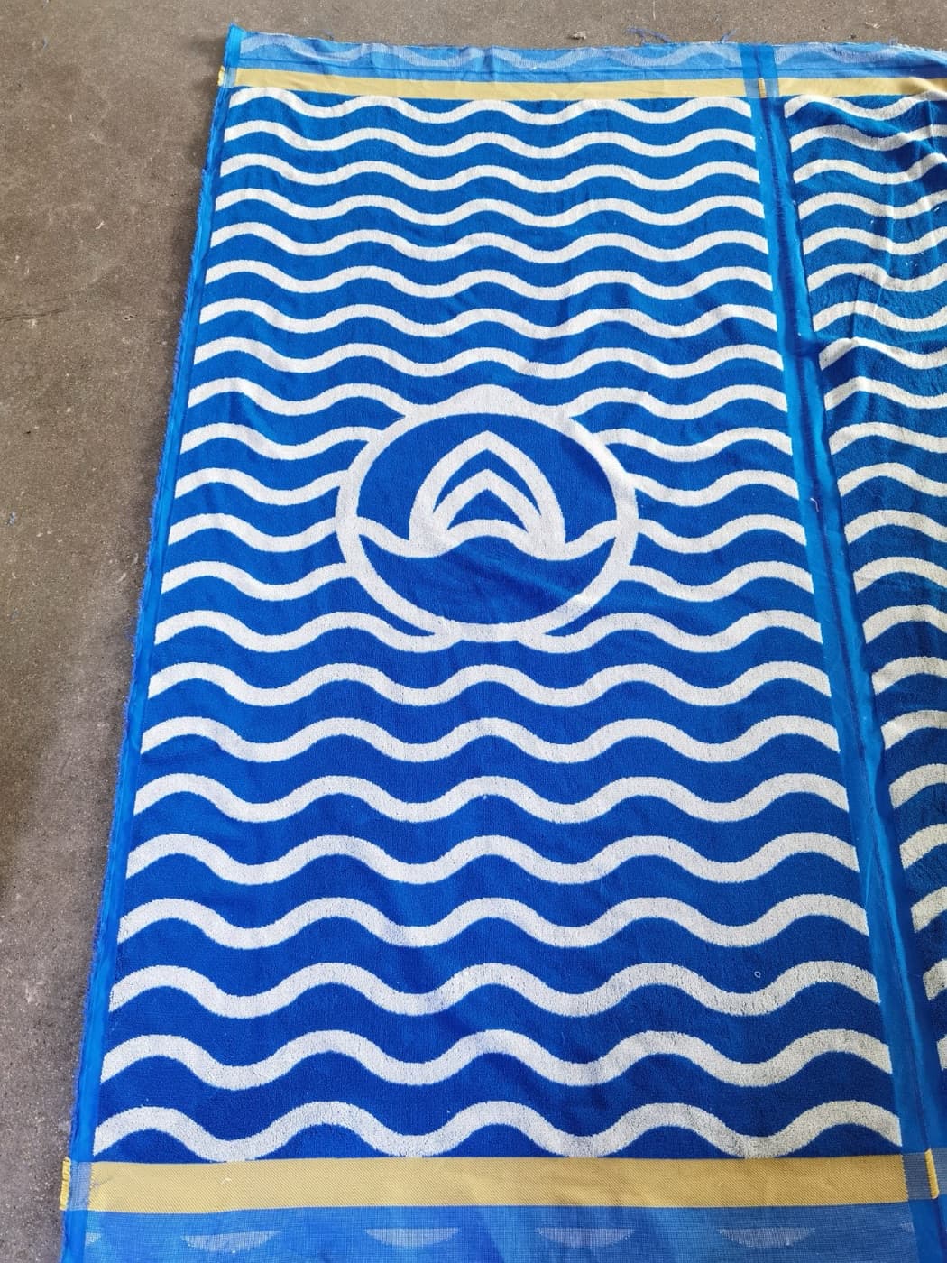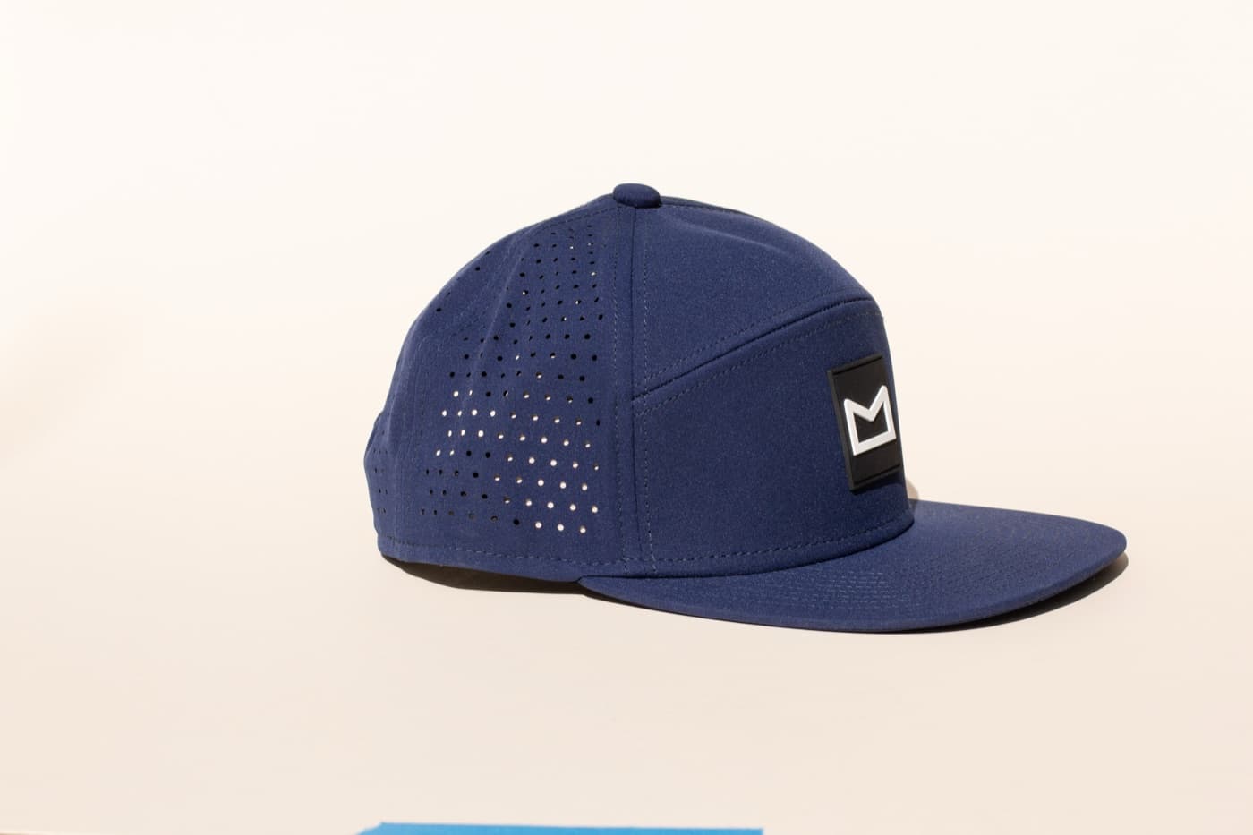
Color is one of the quickest ways merch can feel on-brand, but matching a brand color exactly is not always the best product decision. A perfect digital color can look different on cotton, fleece, embroidery thread, ceramic, nylon, glass, or woven labels. The merch palette has to work in the physical world.
The goal is recognition and wearability at the same time.

Separate brand color from garment color
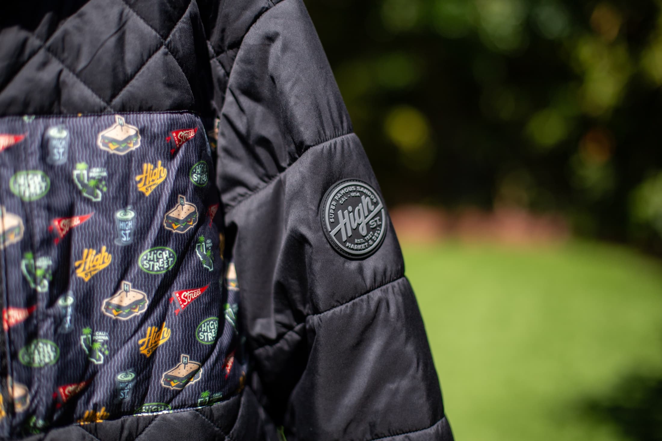
A brand color might be perfect for a logo and wrong for a full hoodie. Apparel color should be judged by how people will wear it, how the artwork lands on it, and how it photographs. Sometimes the better move is a neutral garment with brand color in the print, thread, label, or packaging.
Use materials to create depth
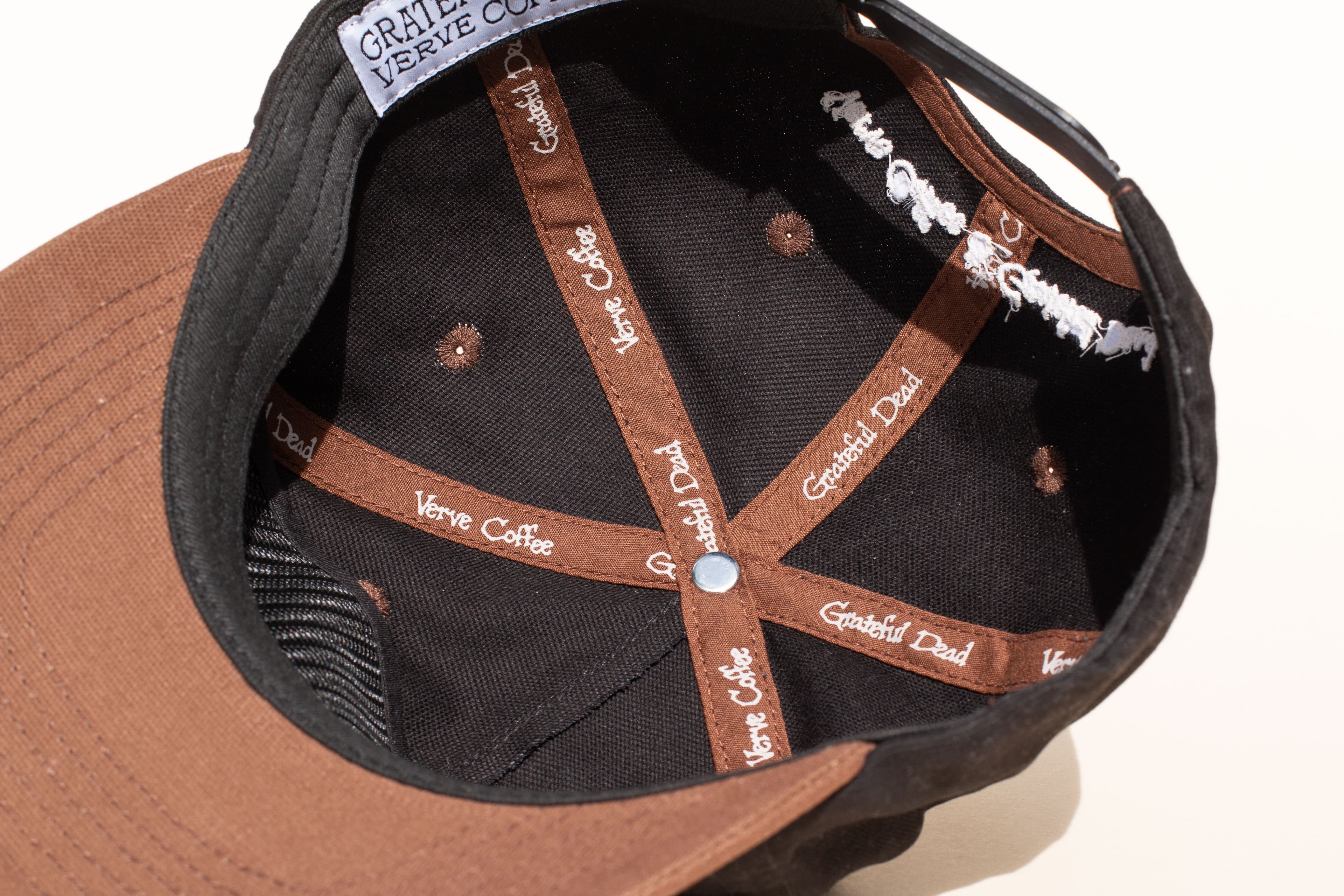
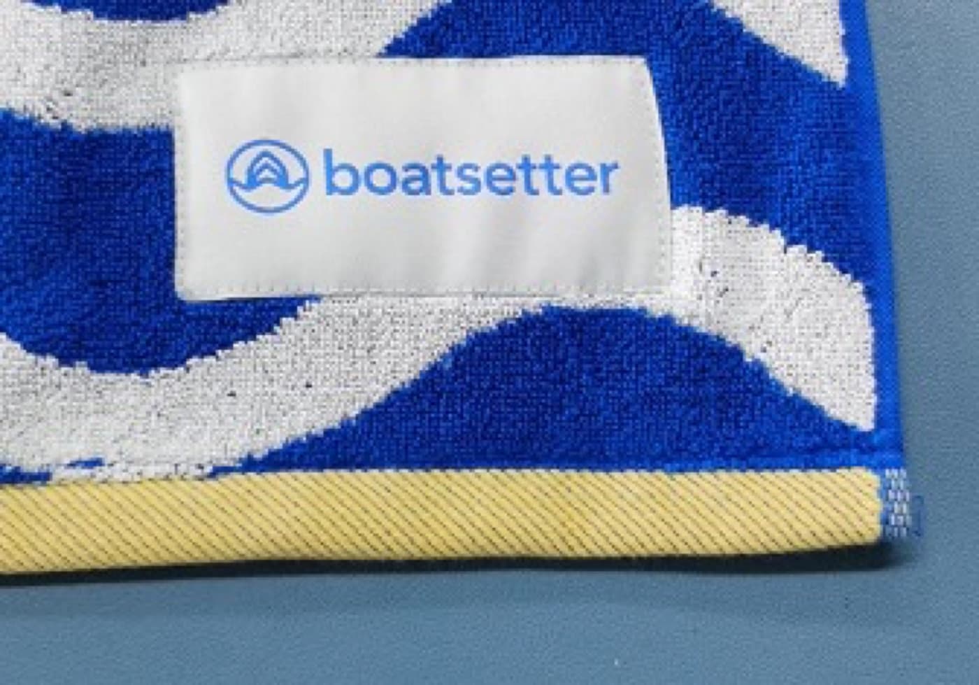
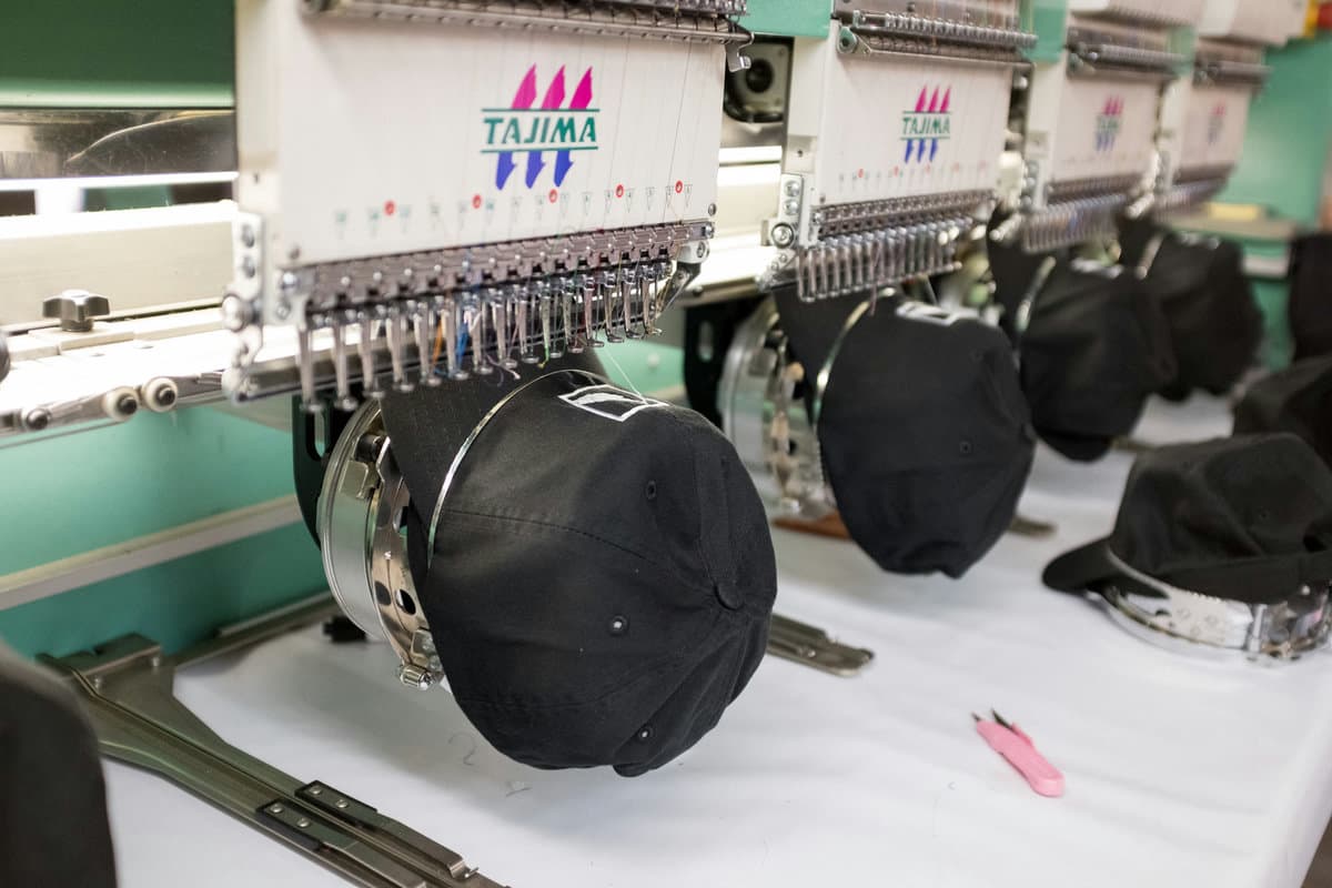
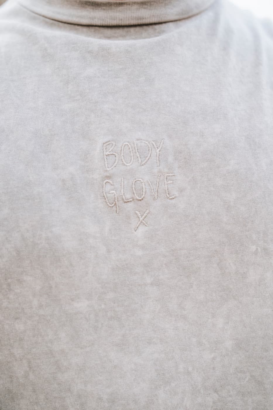
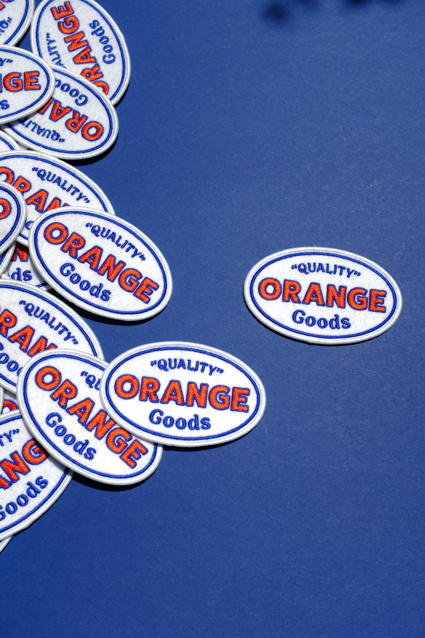
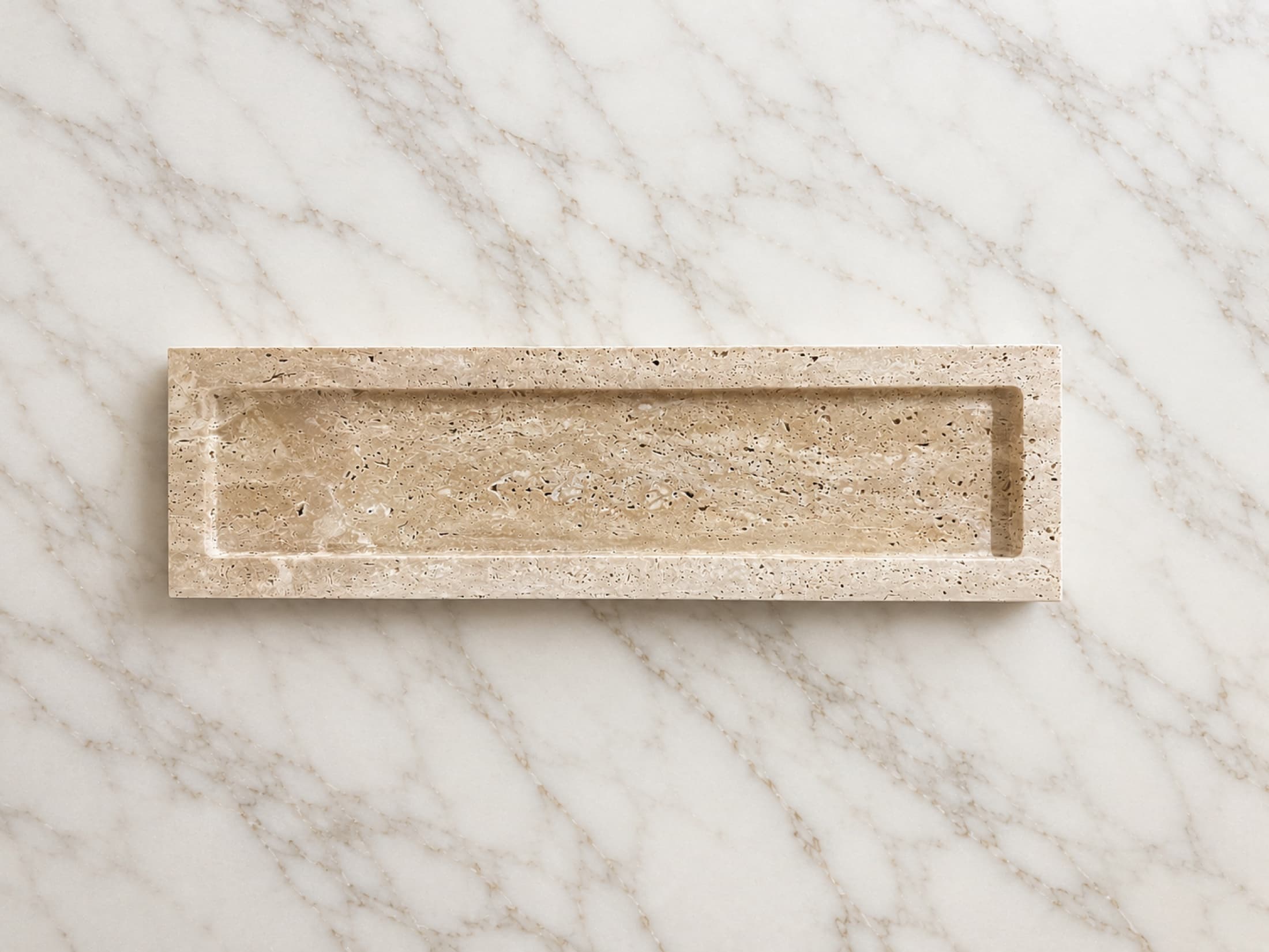
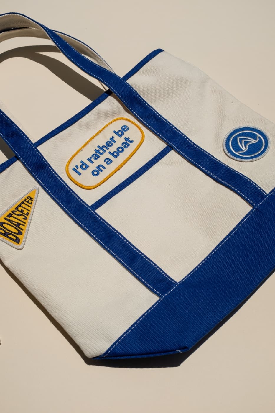
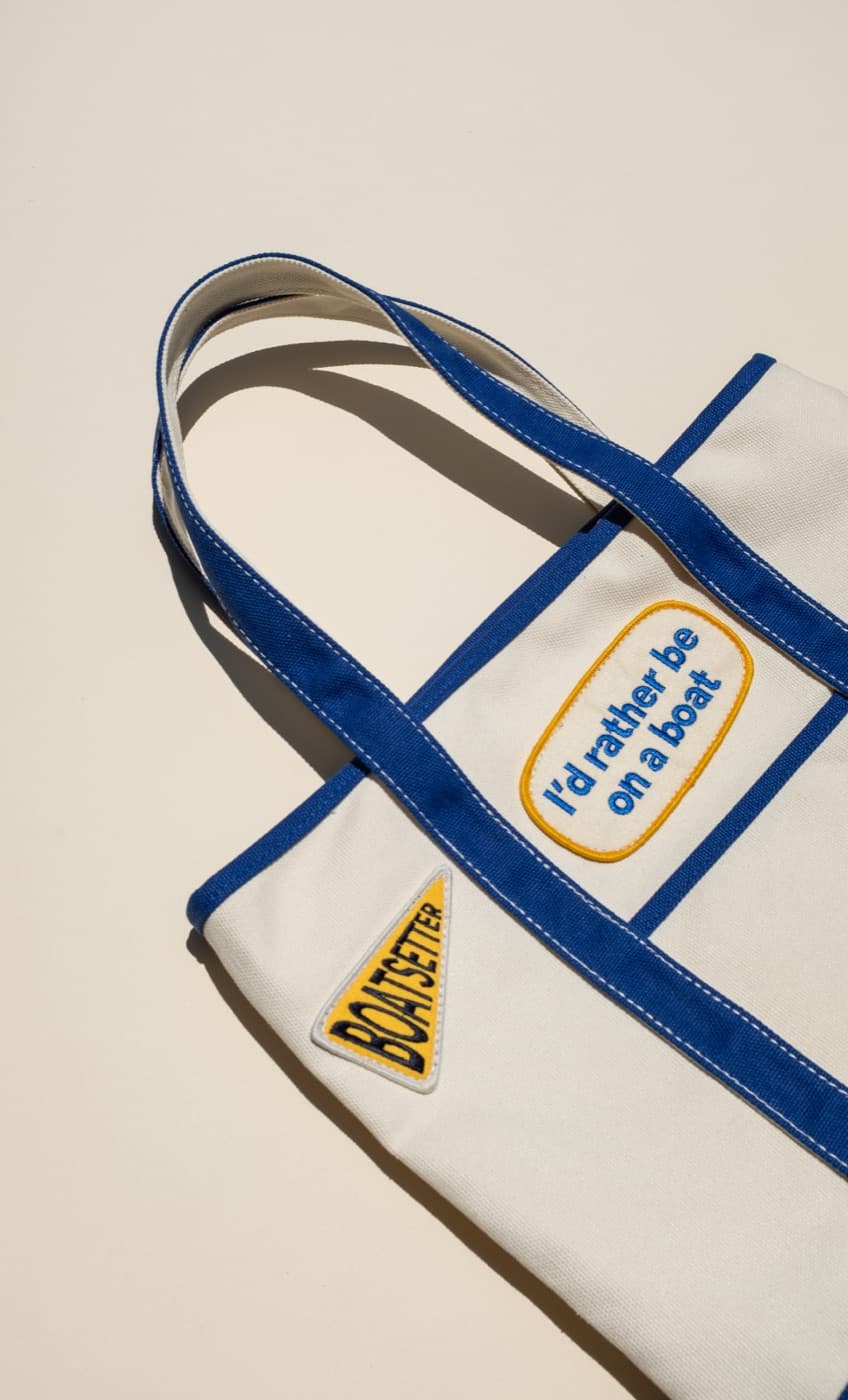
The same color behaves differently across fabric, ink, thread, ceramic glaze, powder coat, and woven material. That can be useful. A tonal embroidery, colored edge label, contrast lining, or printed insert can create a brand signal without making the product feel loud.
Plan the palette across the full assortment
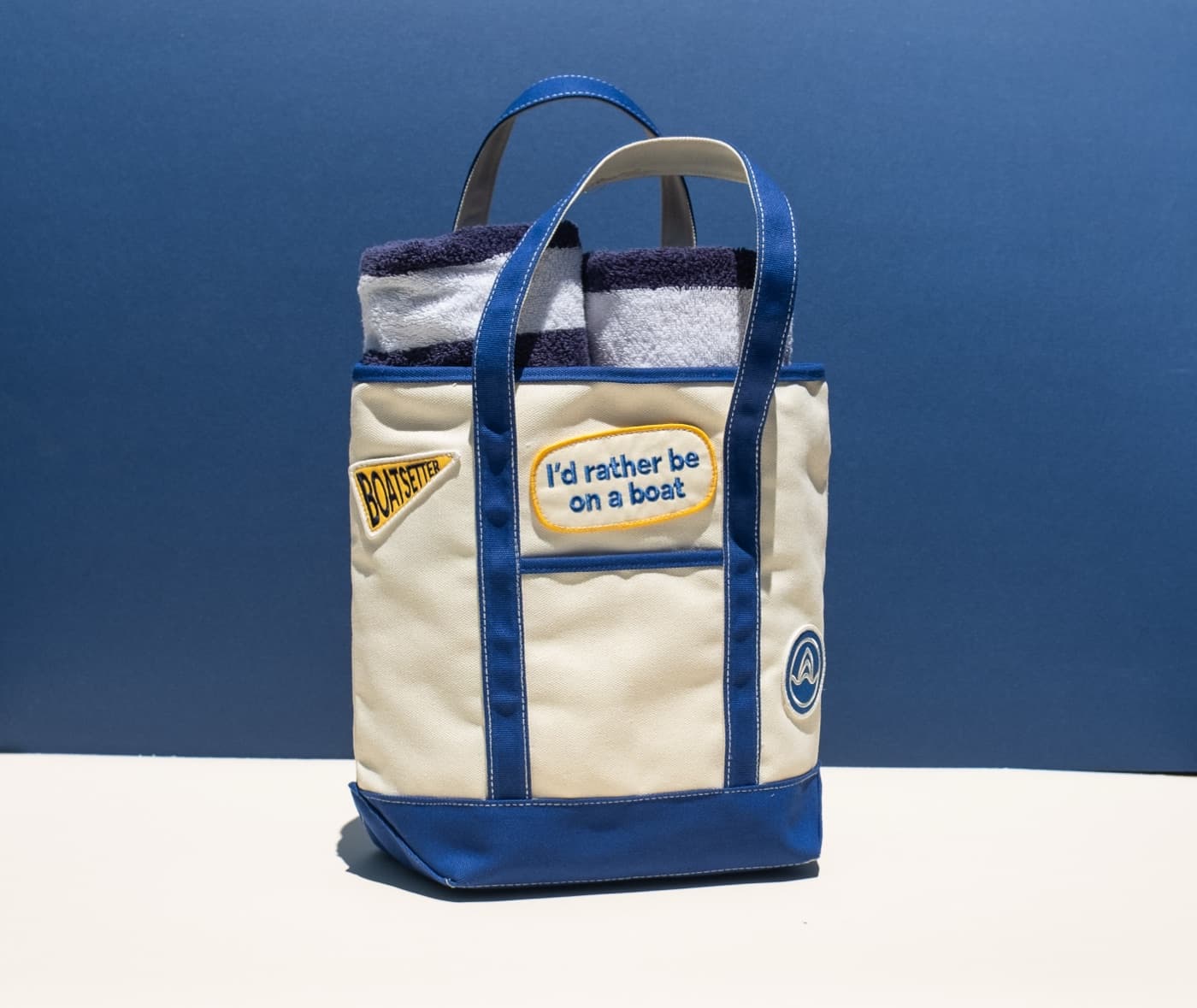
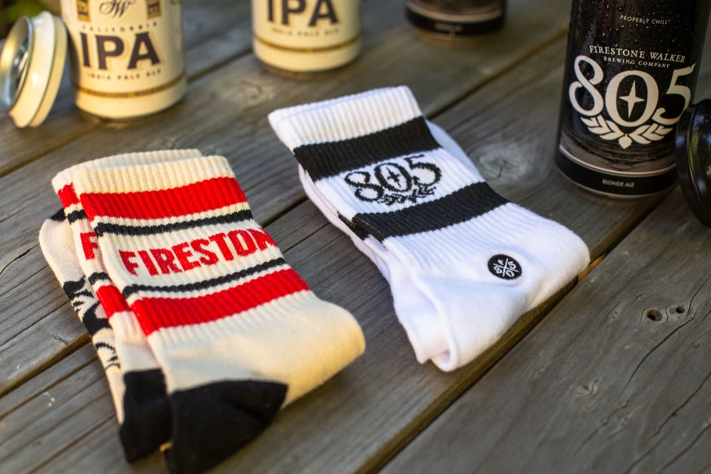
A hat, tee, tote, mug, and sock do not all need to be the same color to feel like a family. A shared accent color, repeated graphic detail, or controlled neutral base can hold the collection together. This is especially useful for retail drops and launch kits.
The takeaway
Brand color works best in merch when it is translated, not copied blindly. Orange Goods helps brands build color palettes that respect the identity while making the finished goods easier to wear, sell, photograph, and reorder.