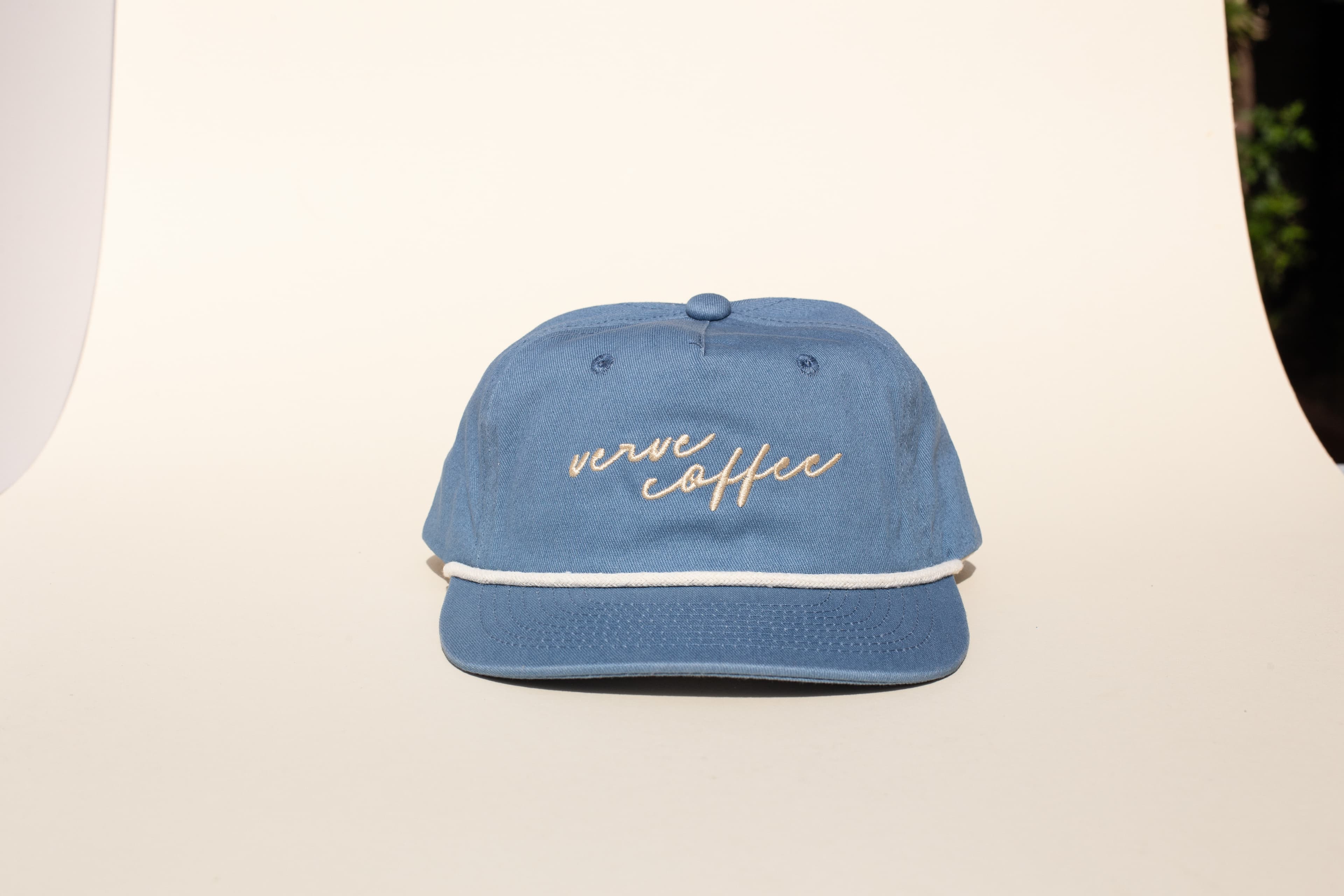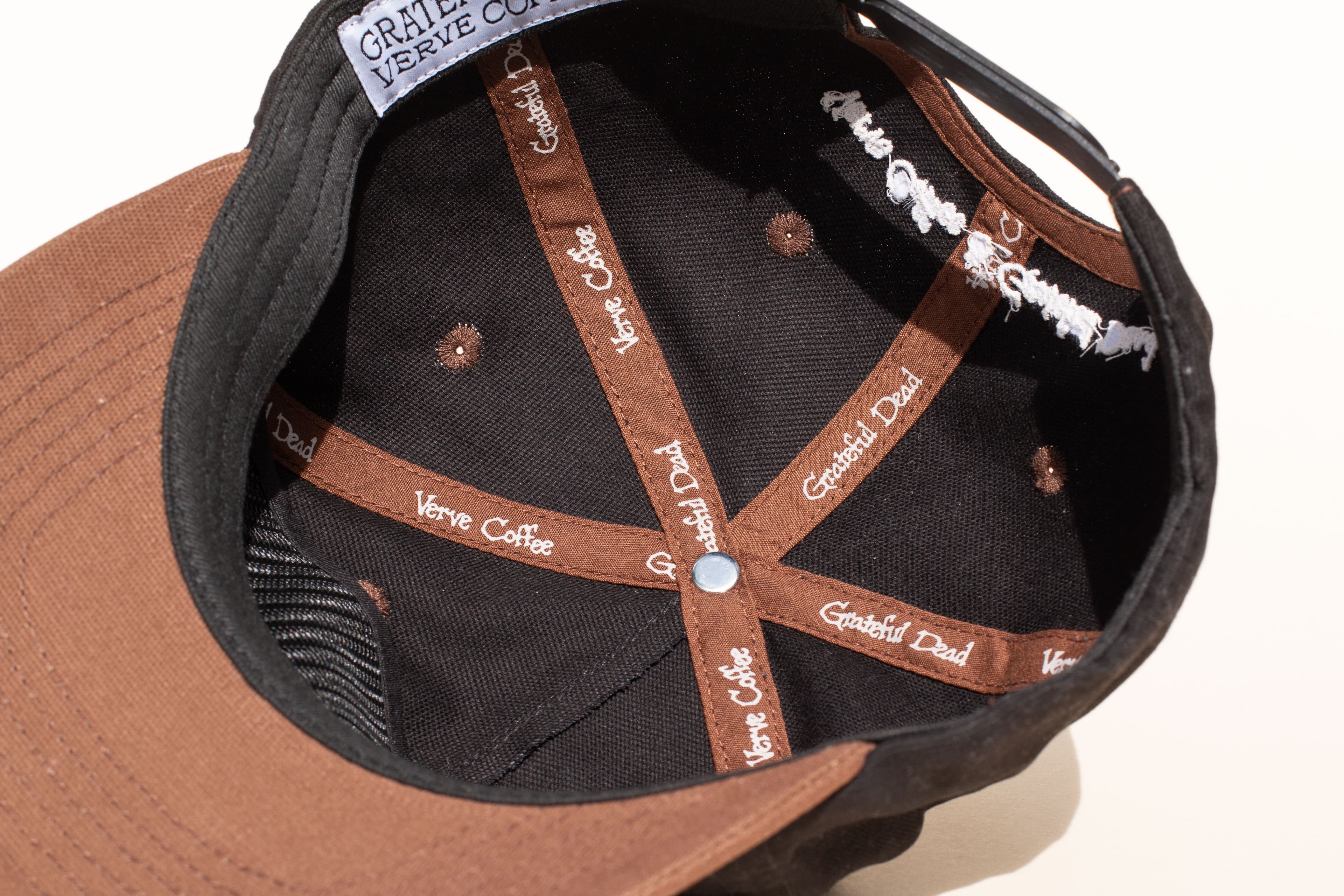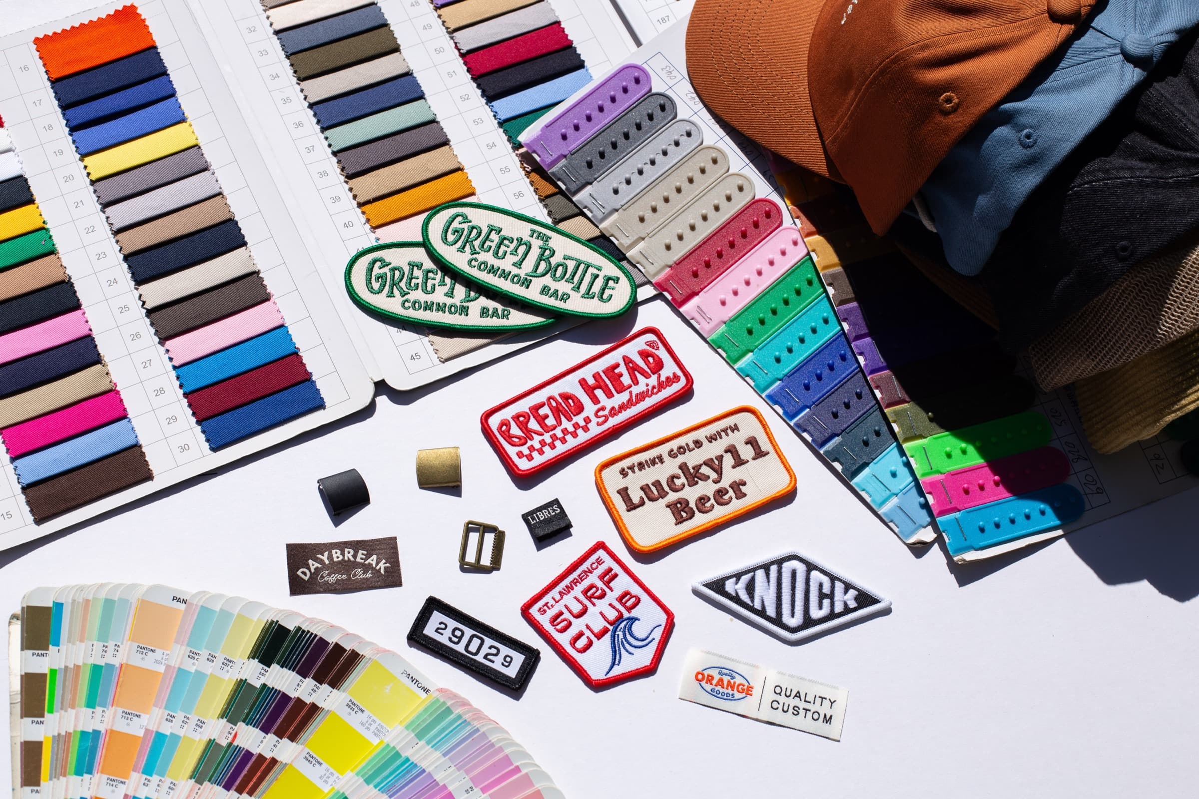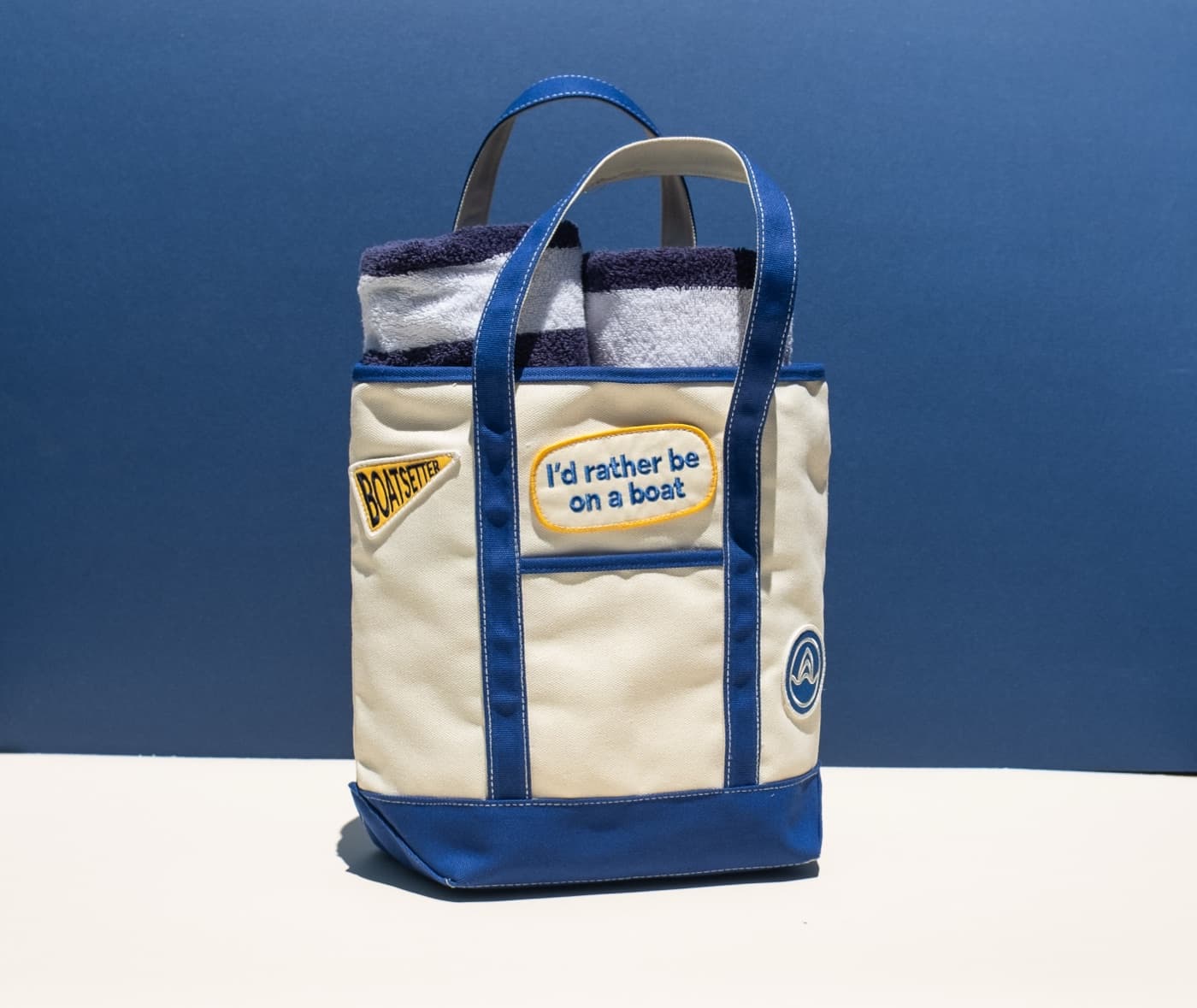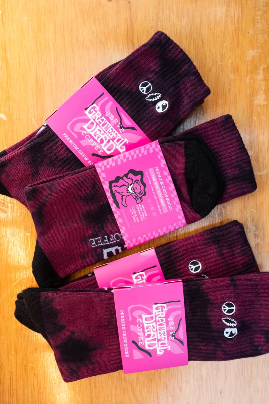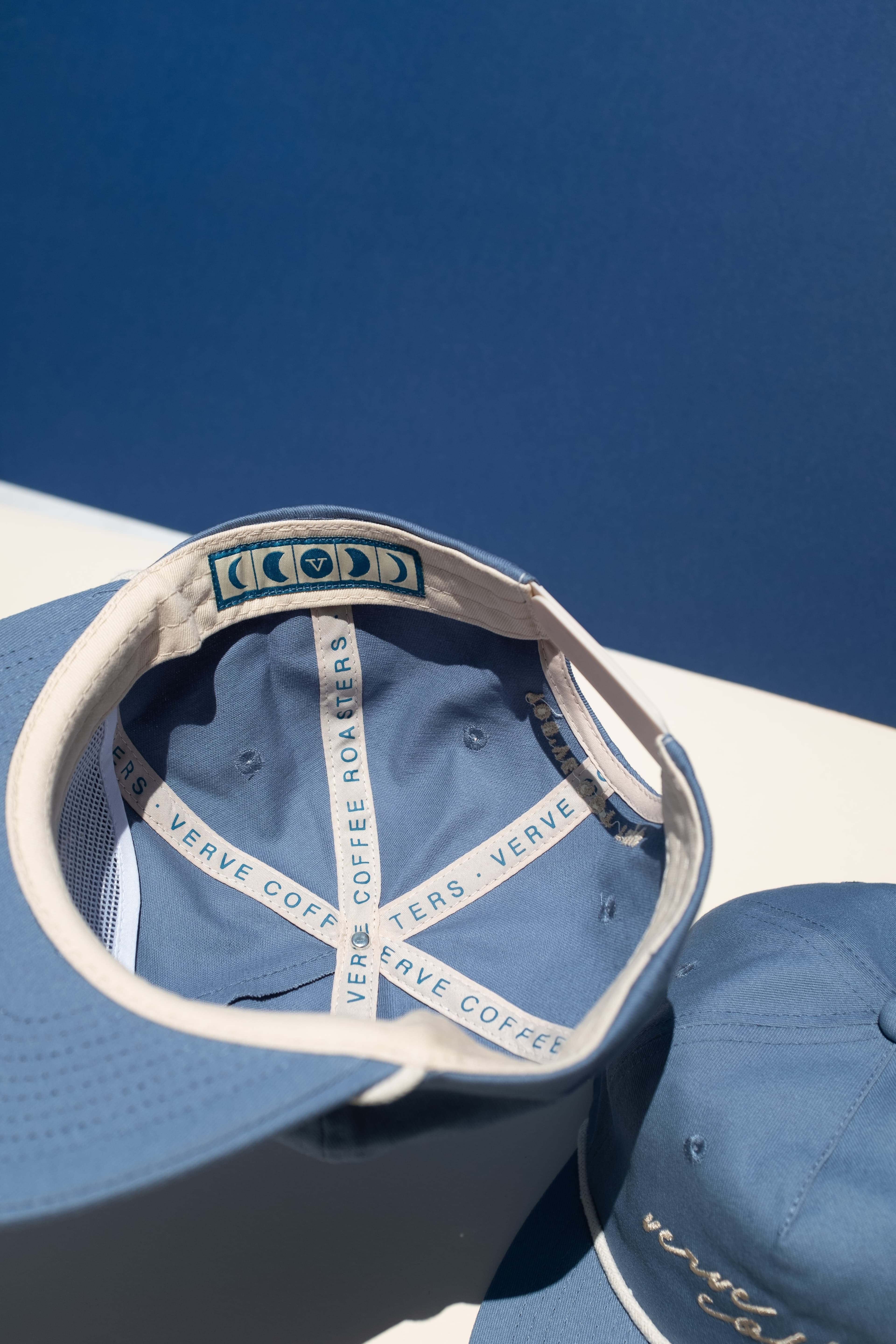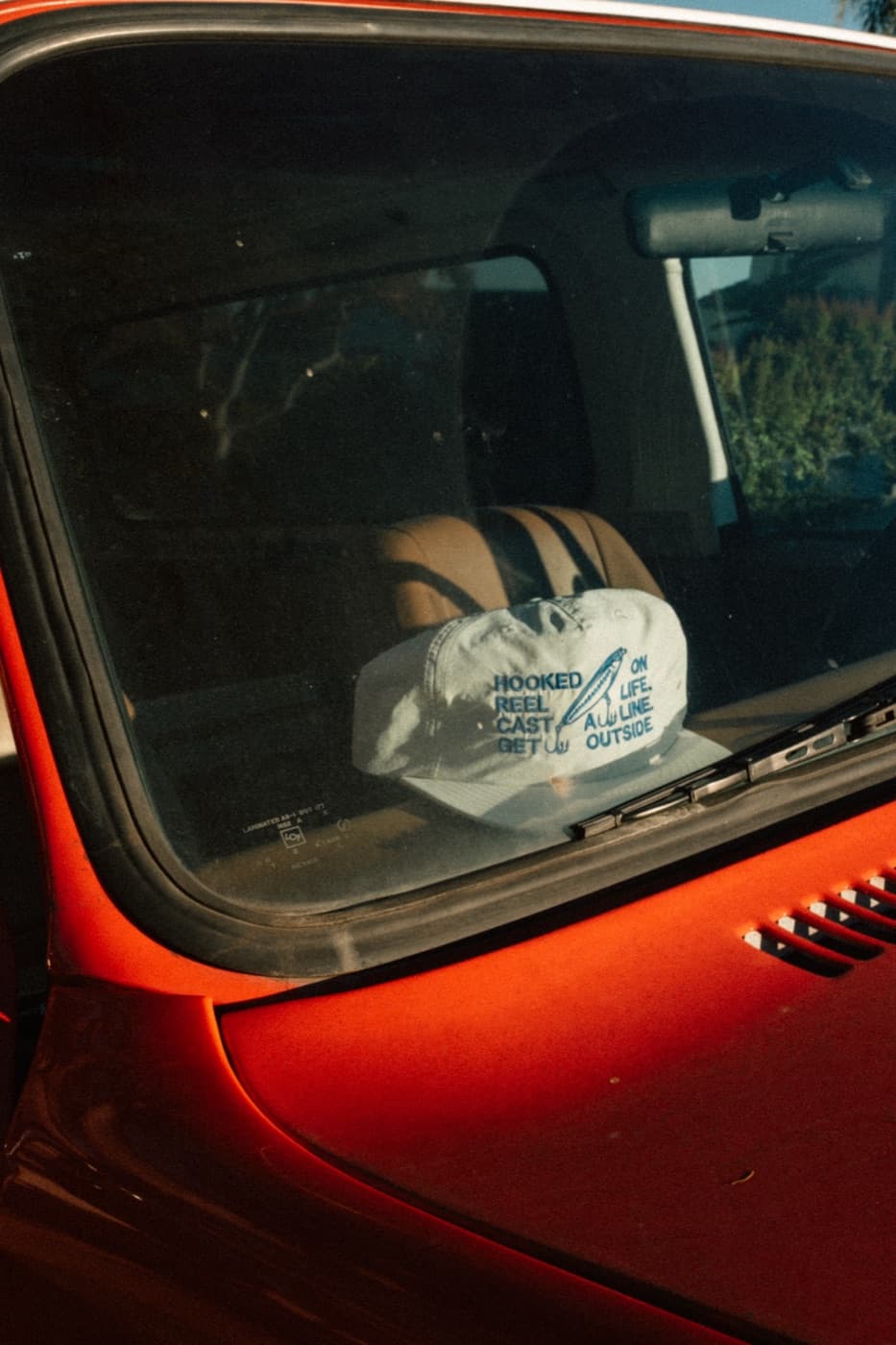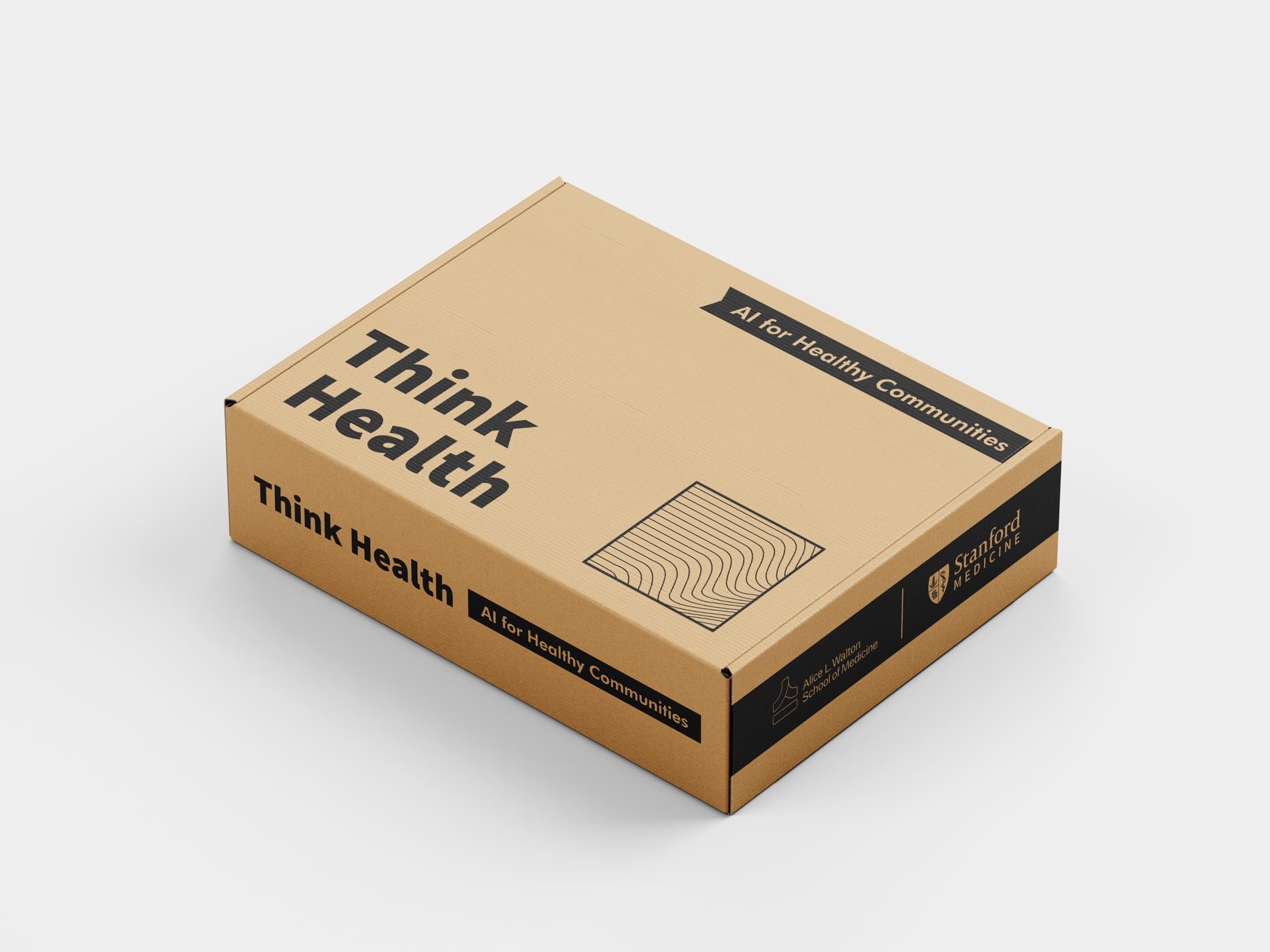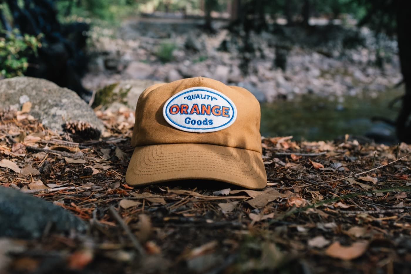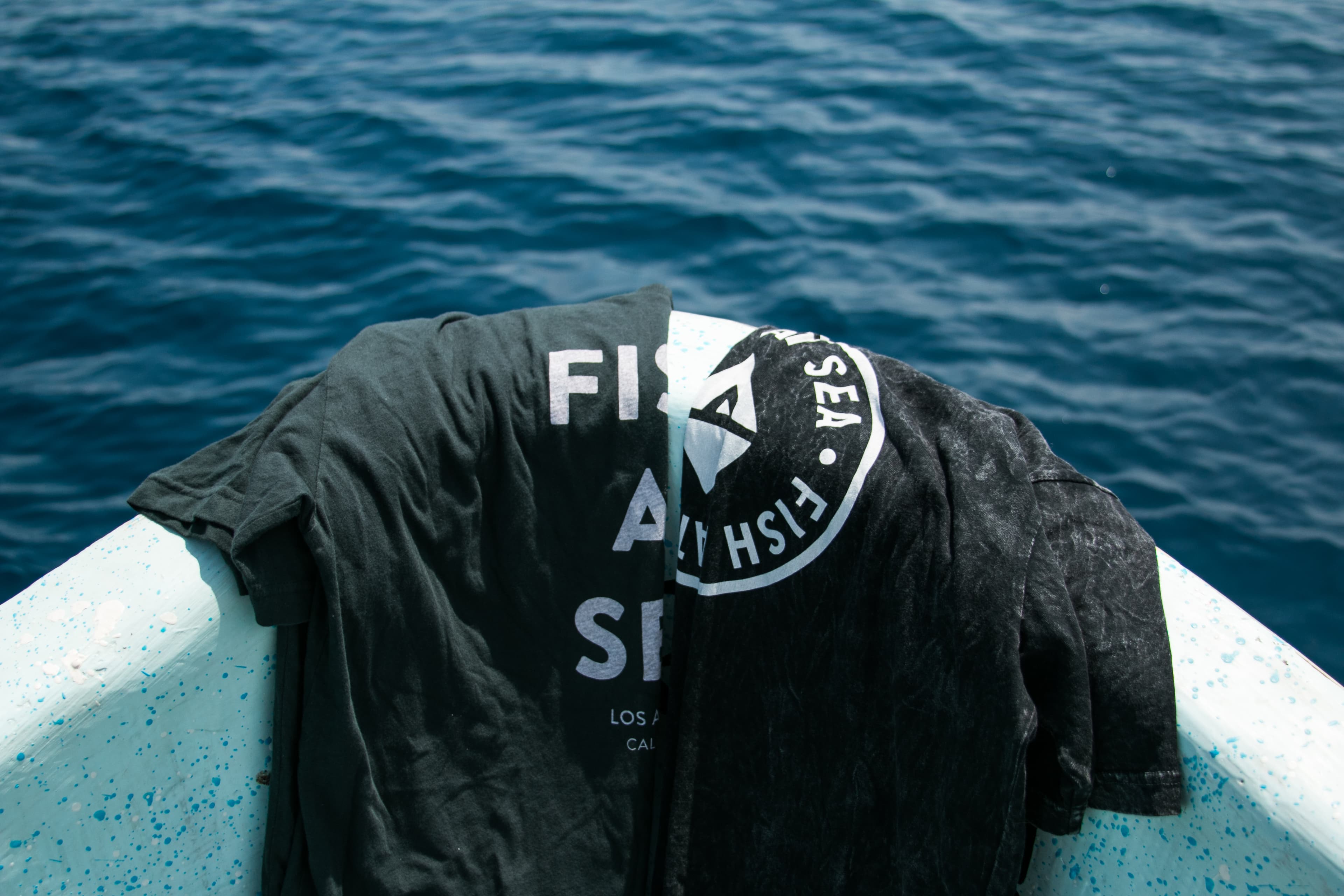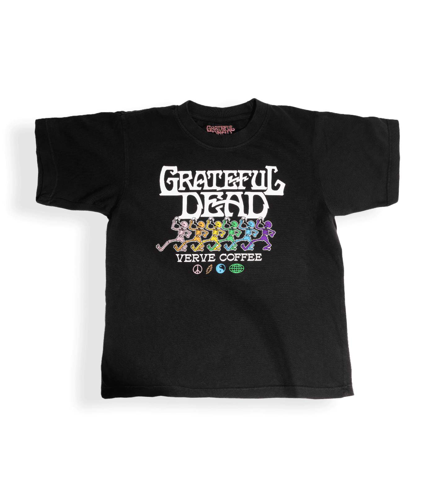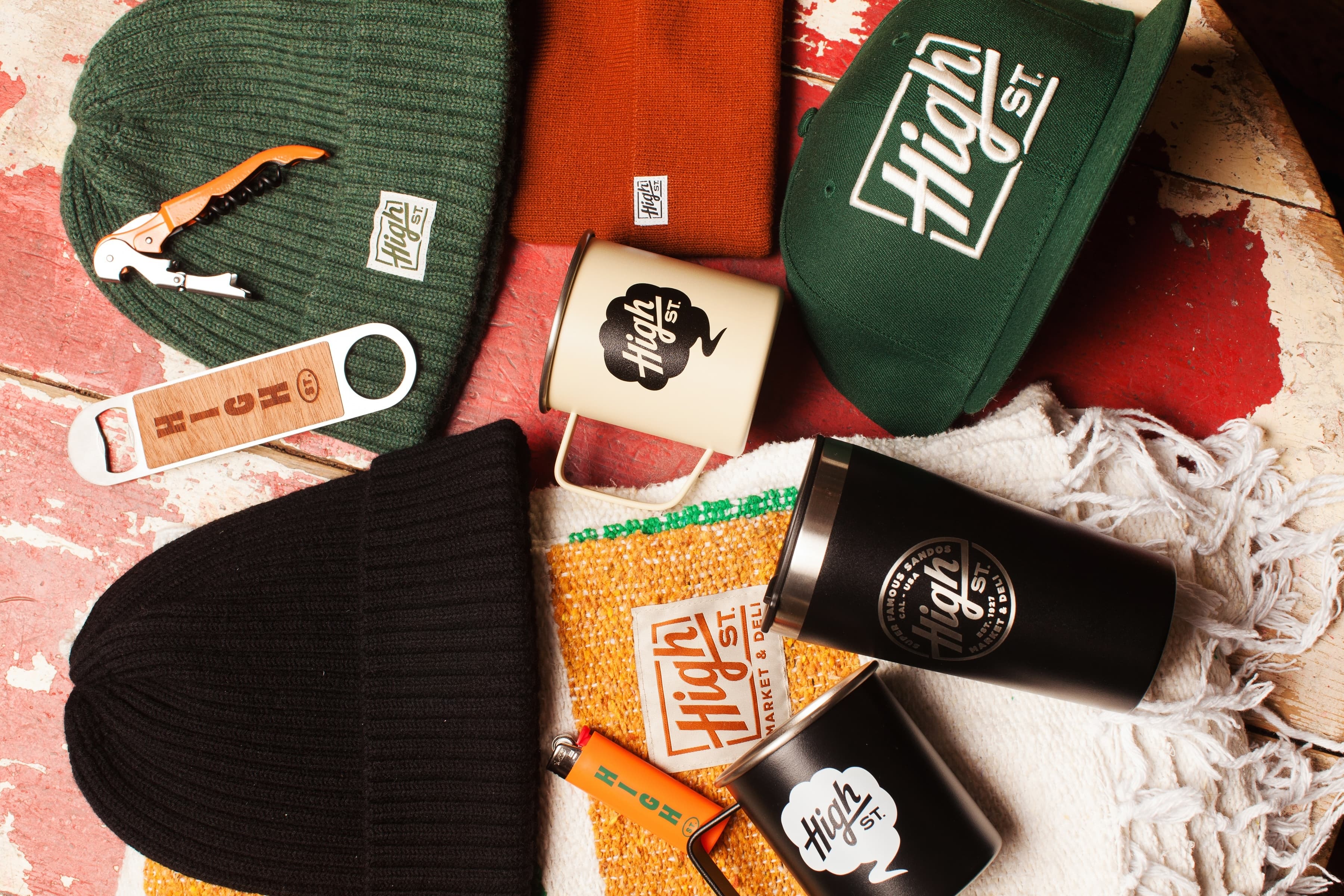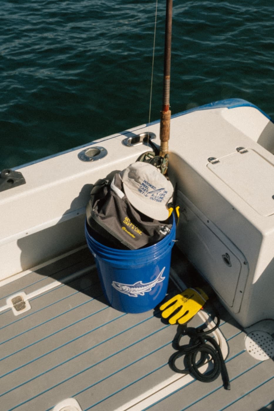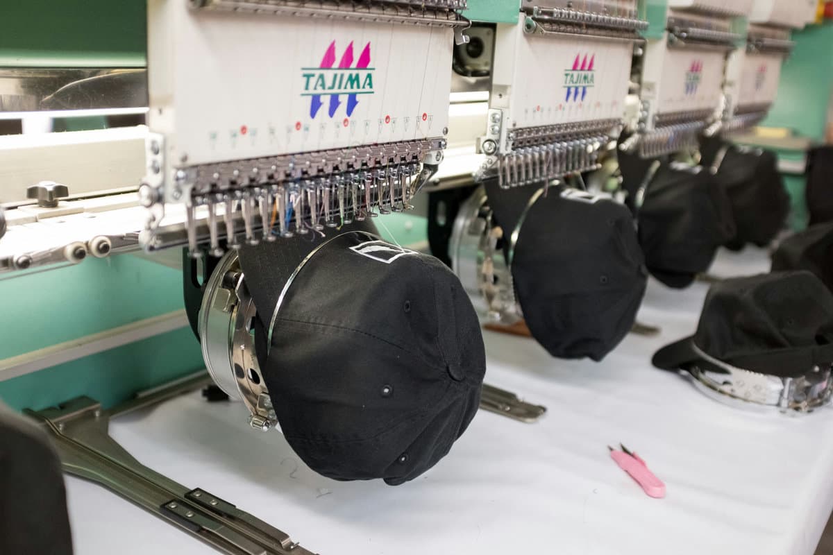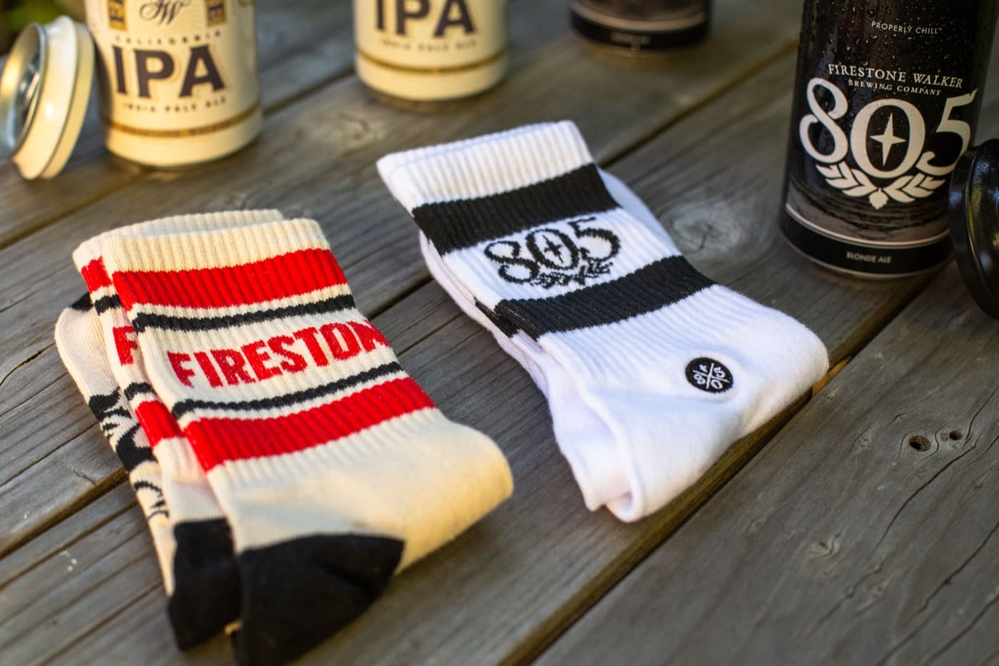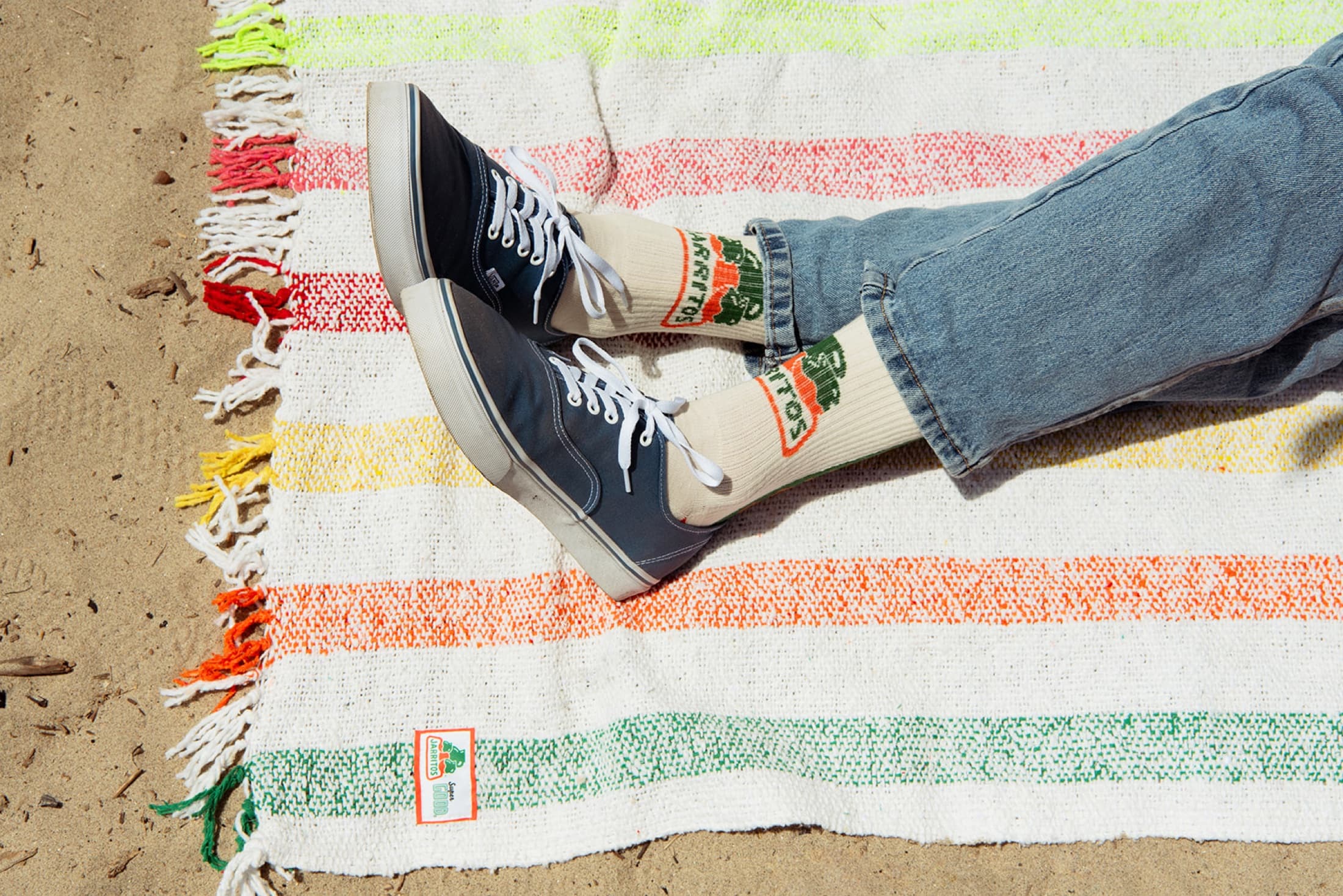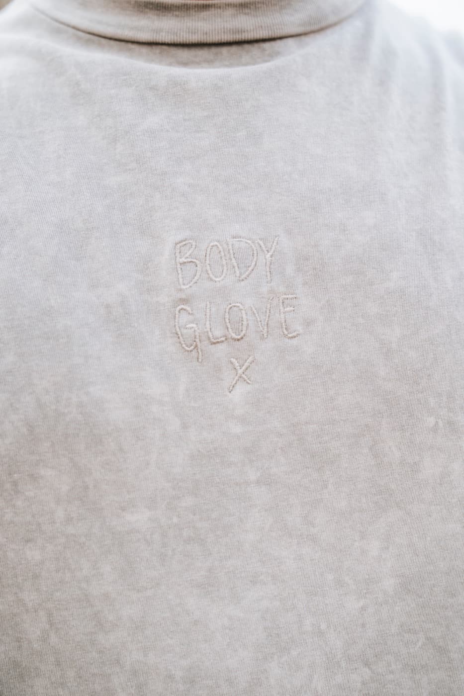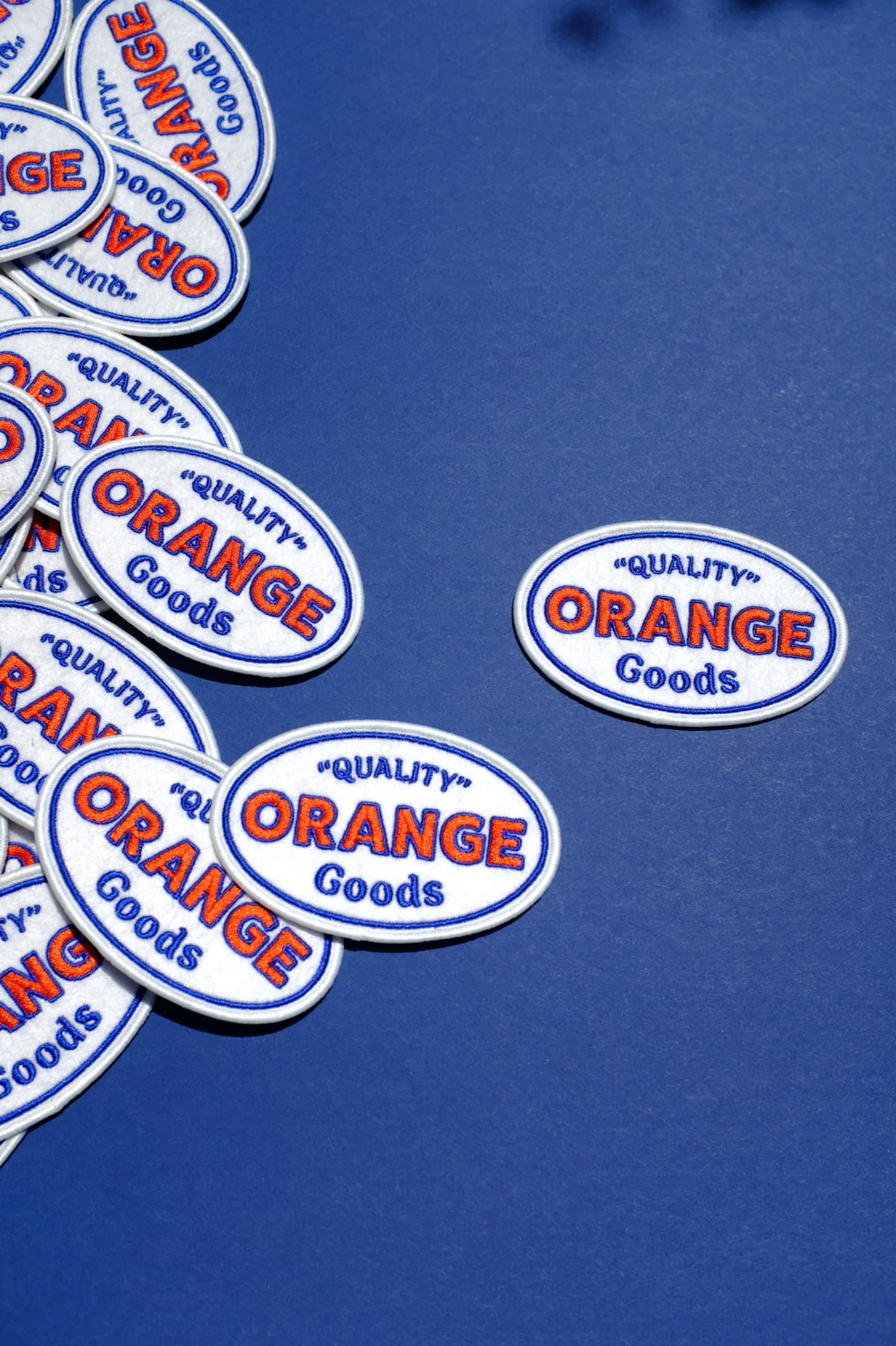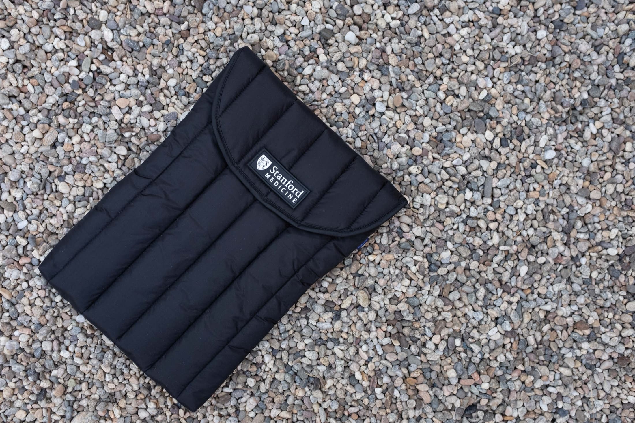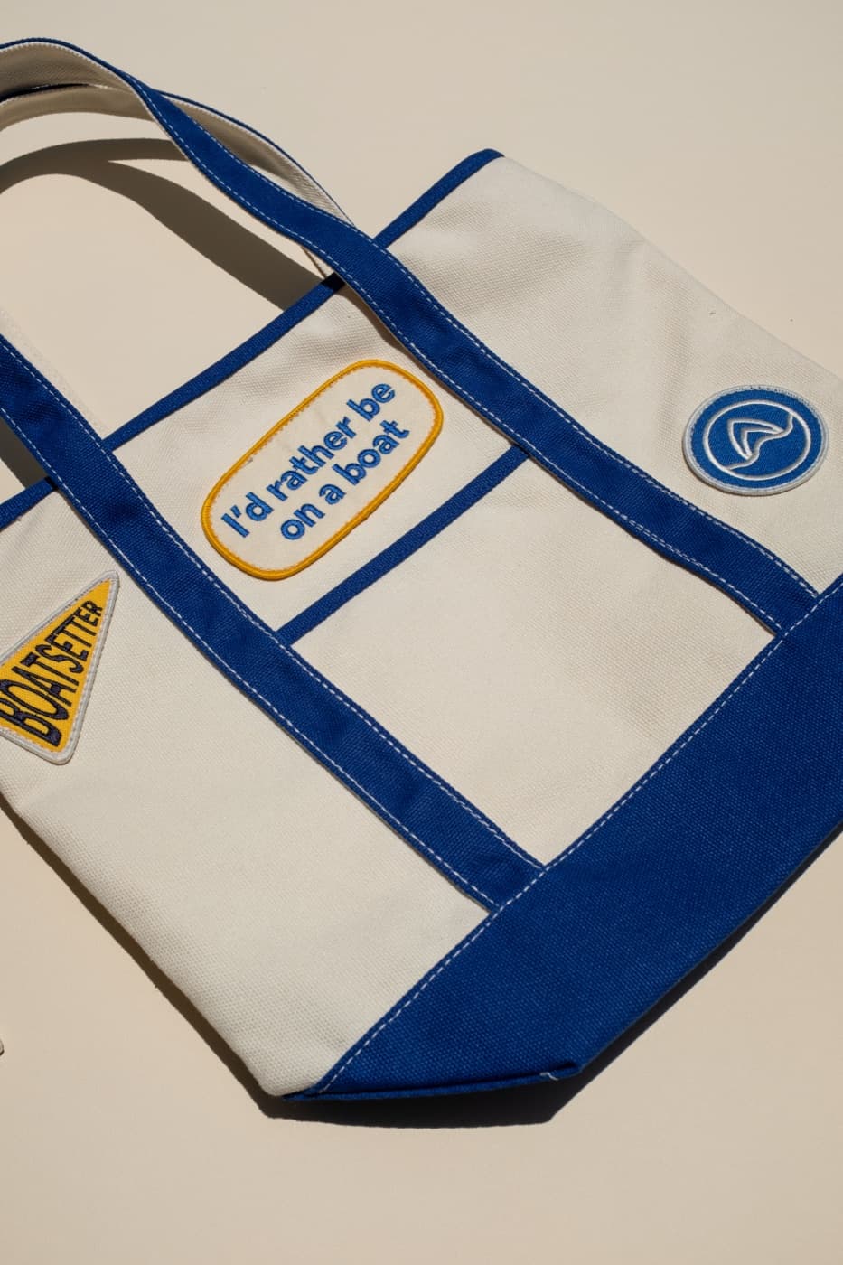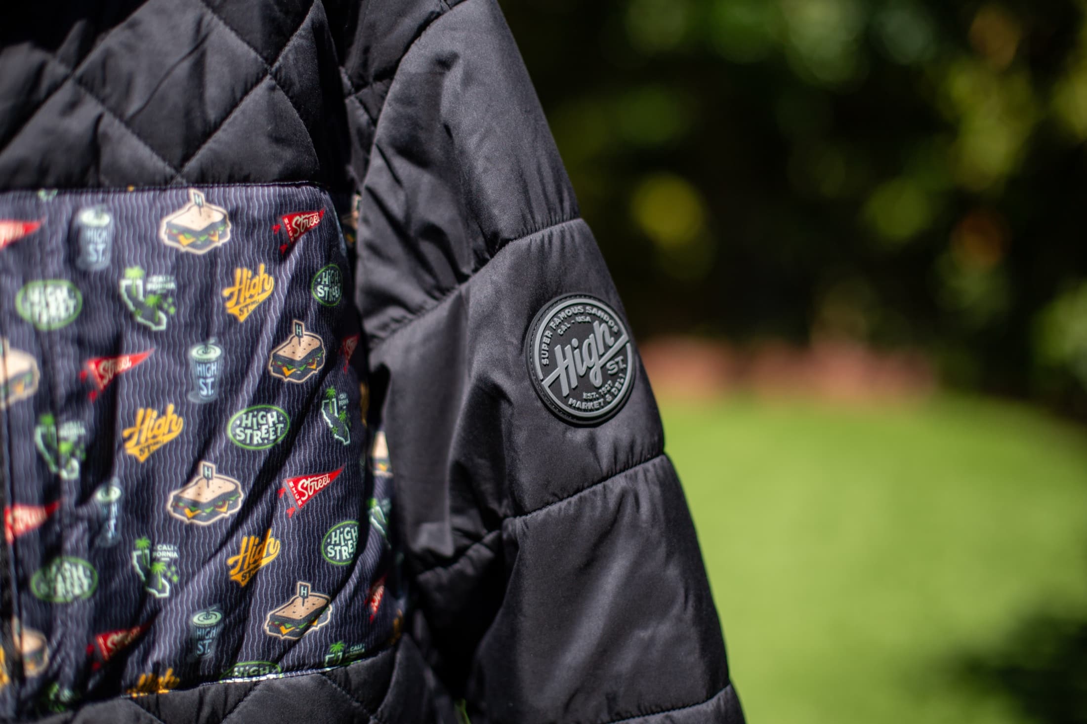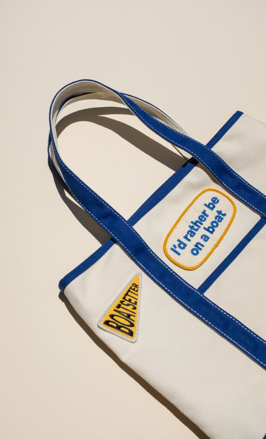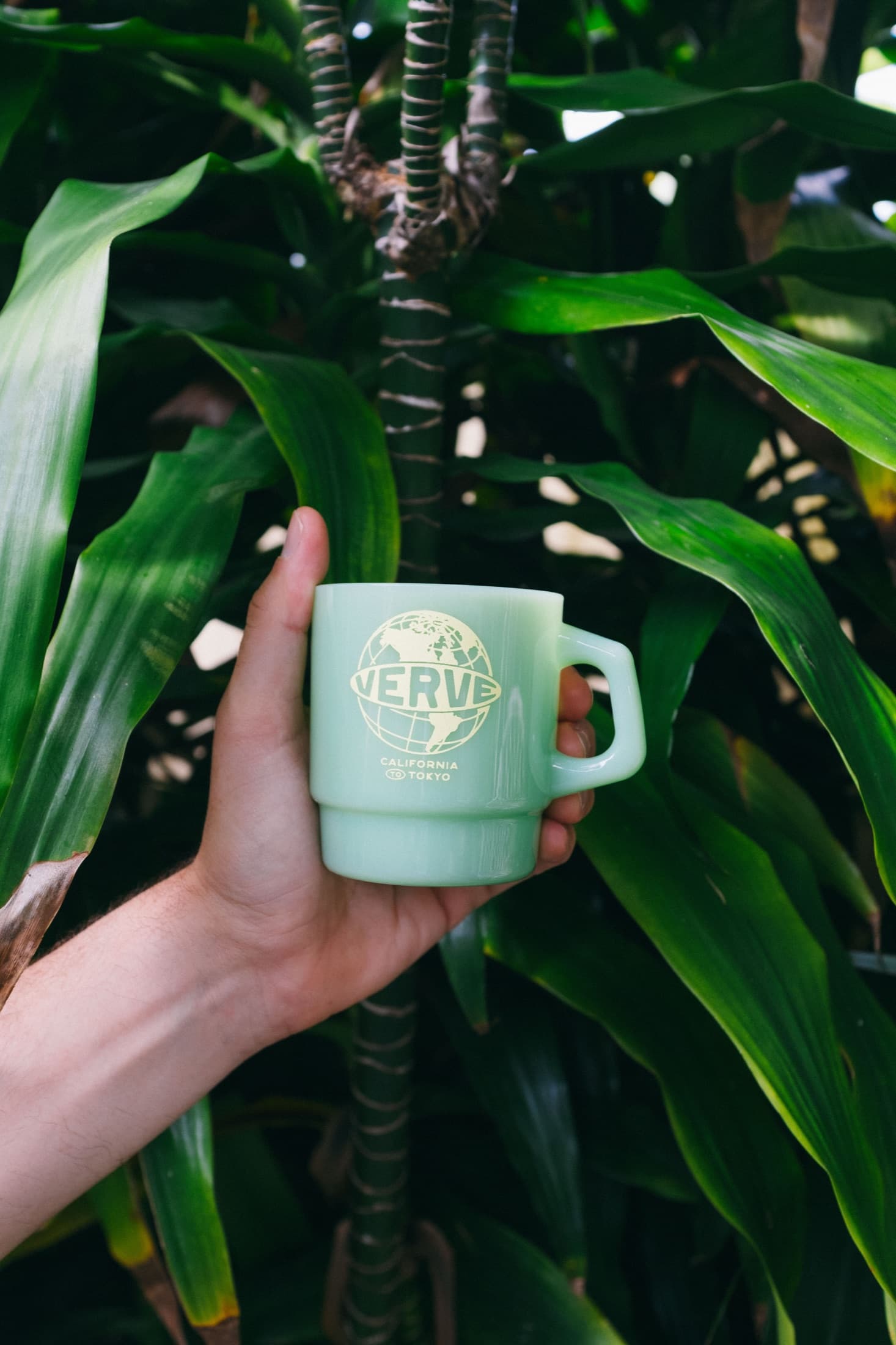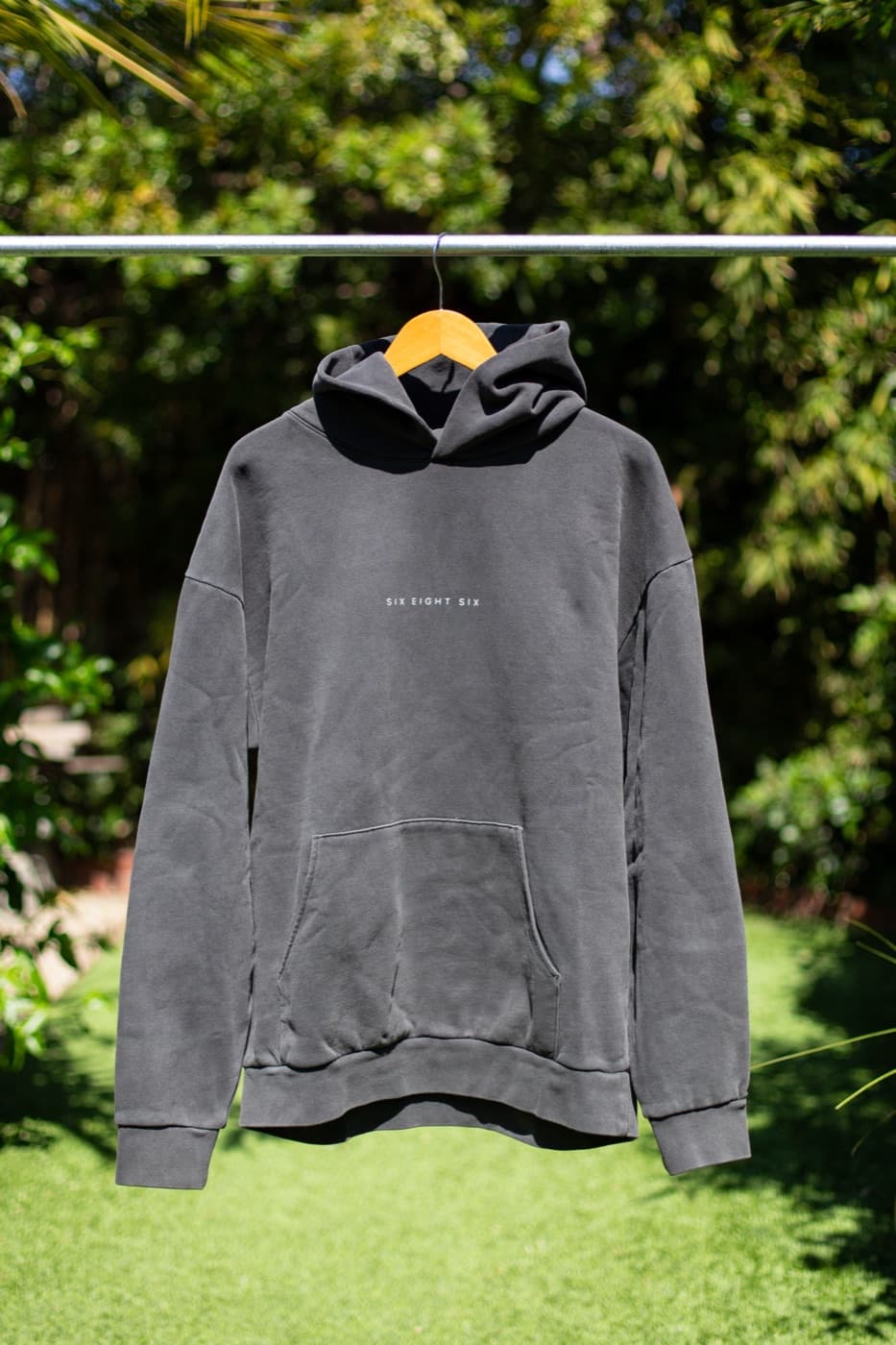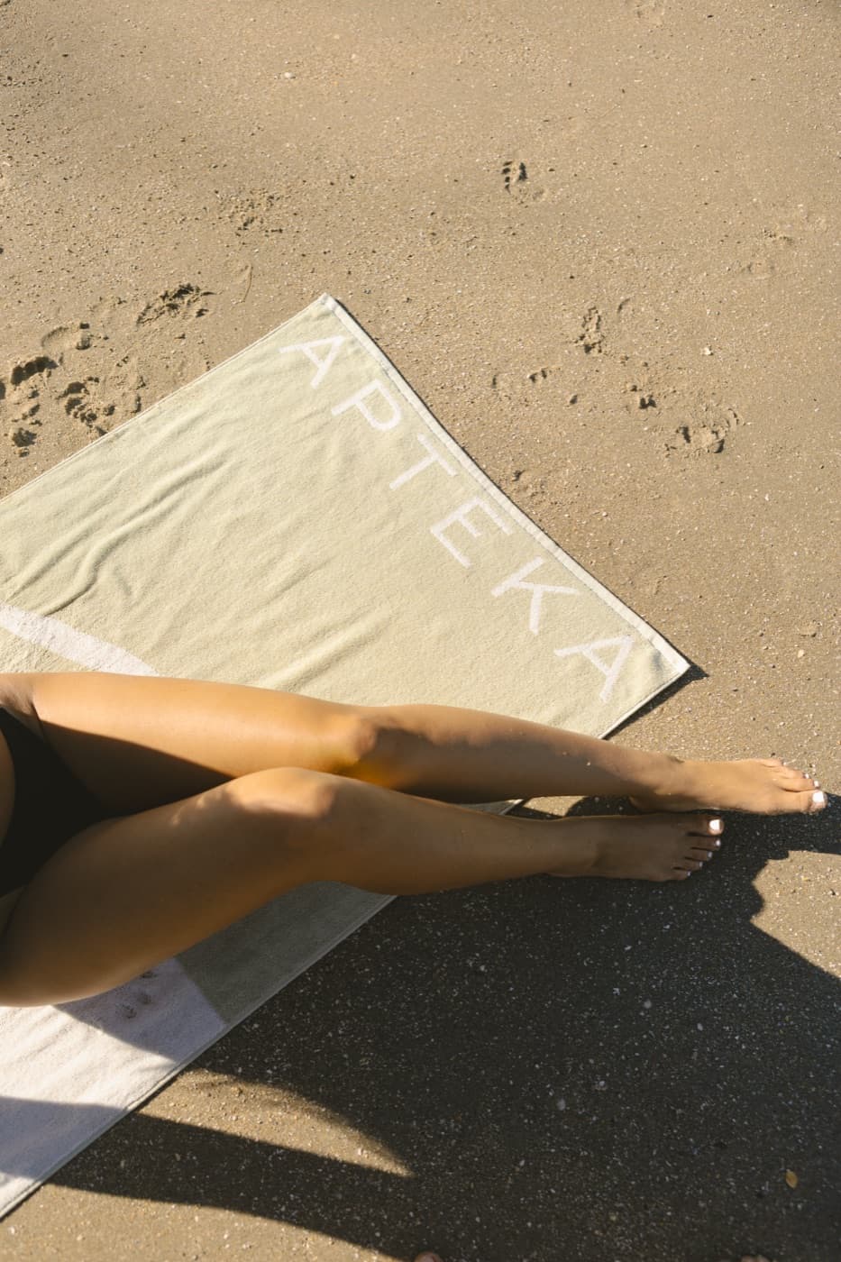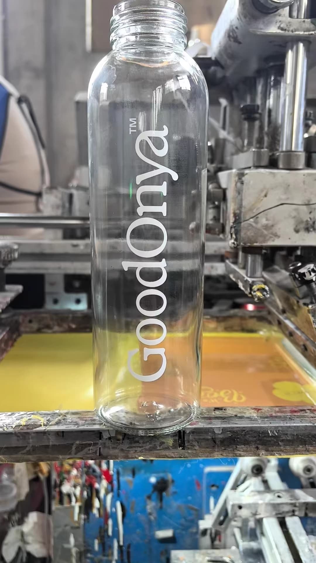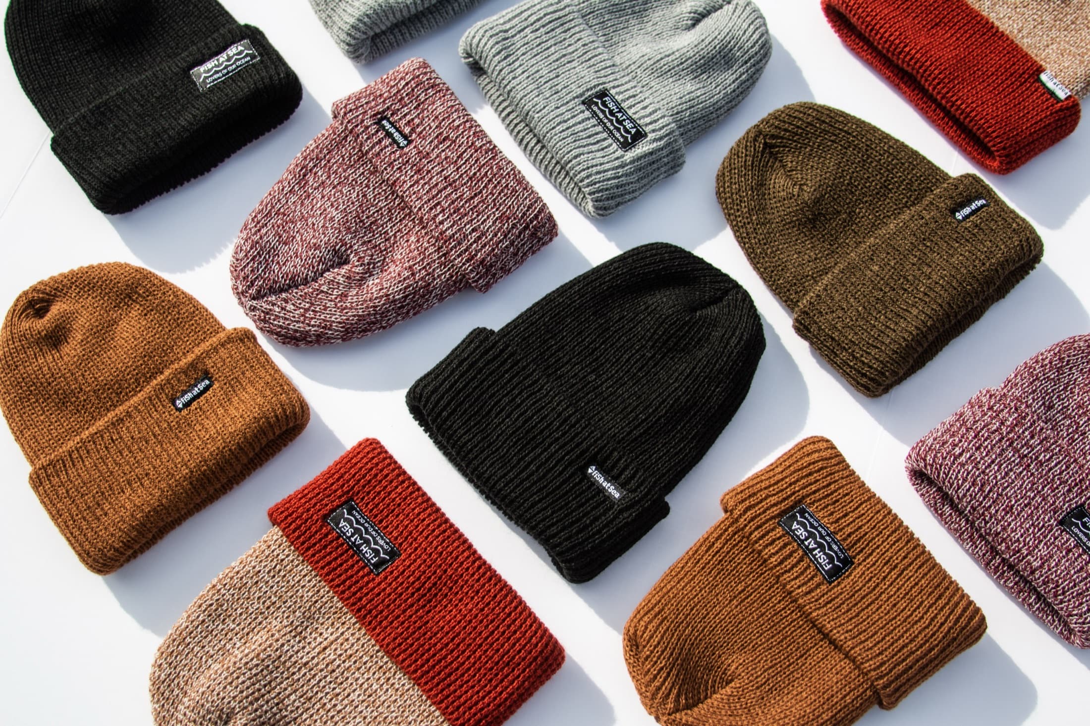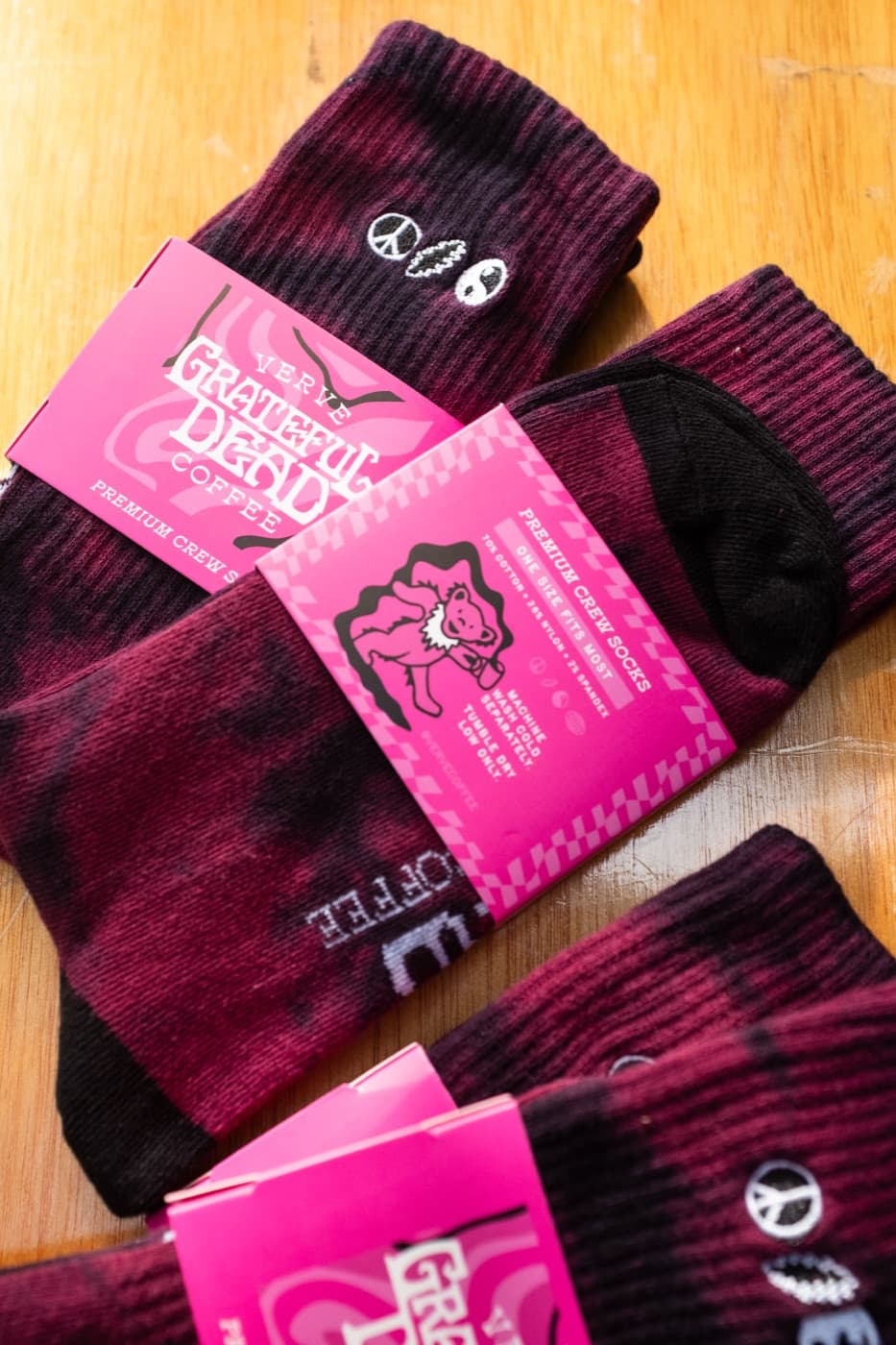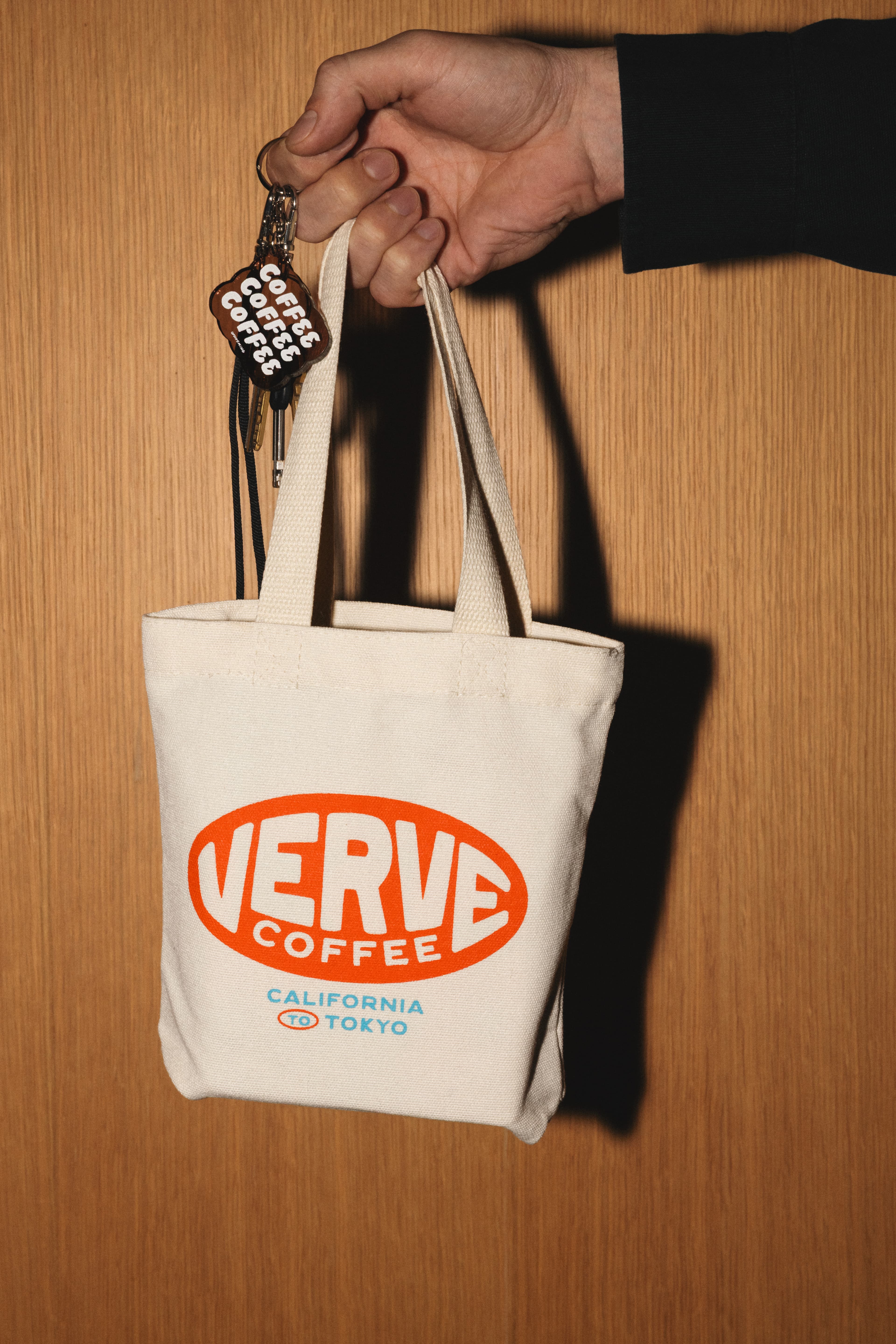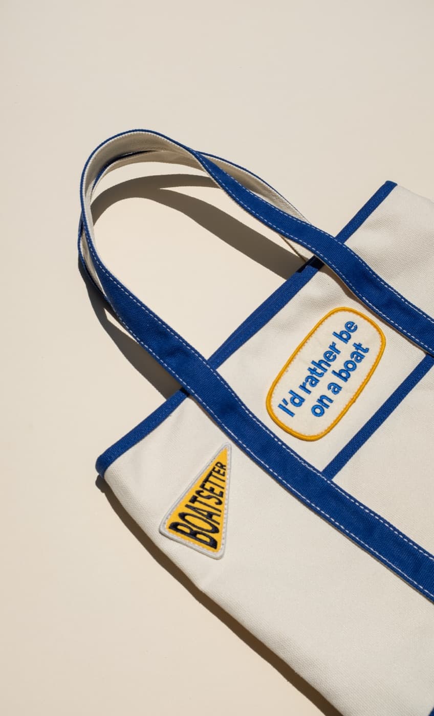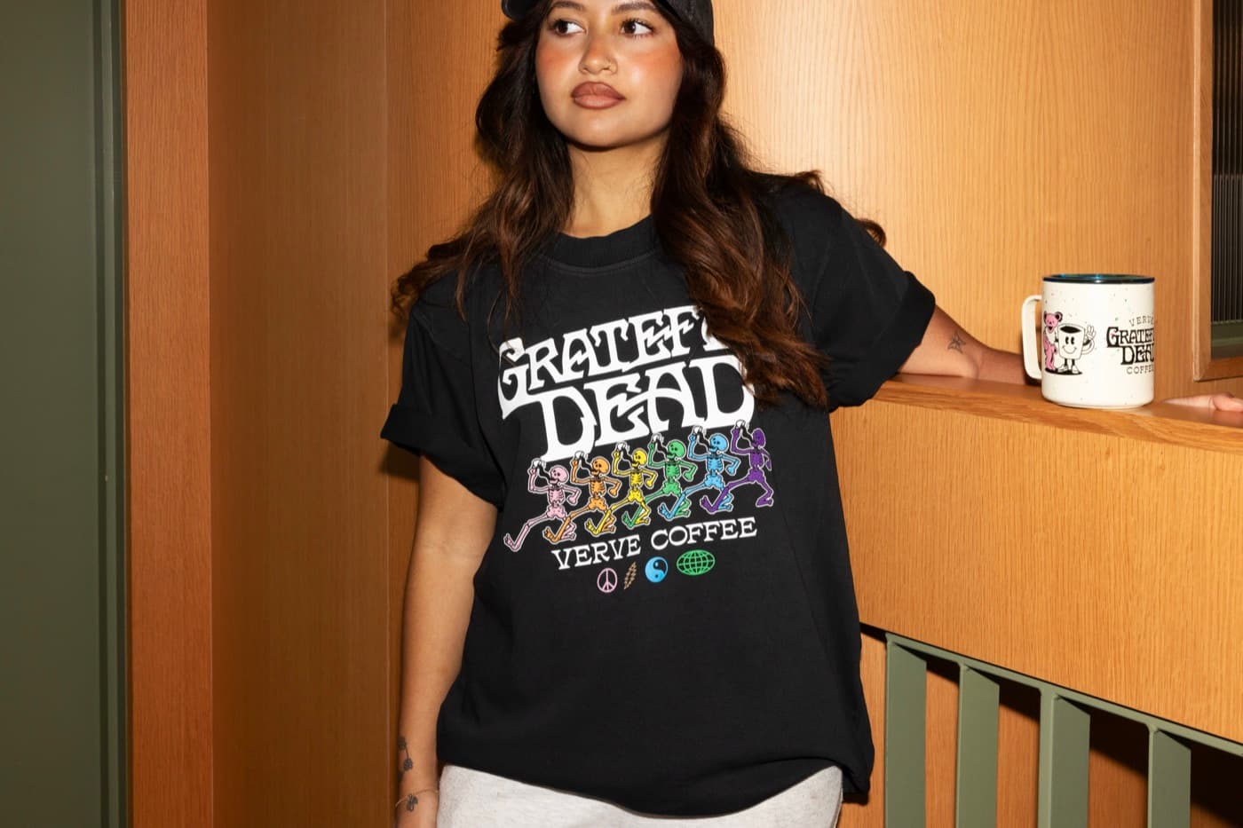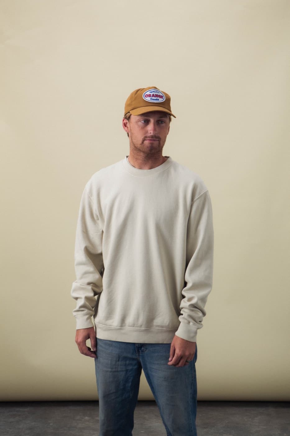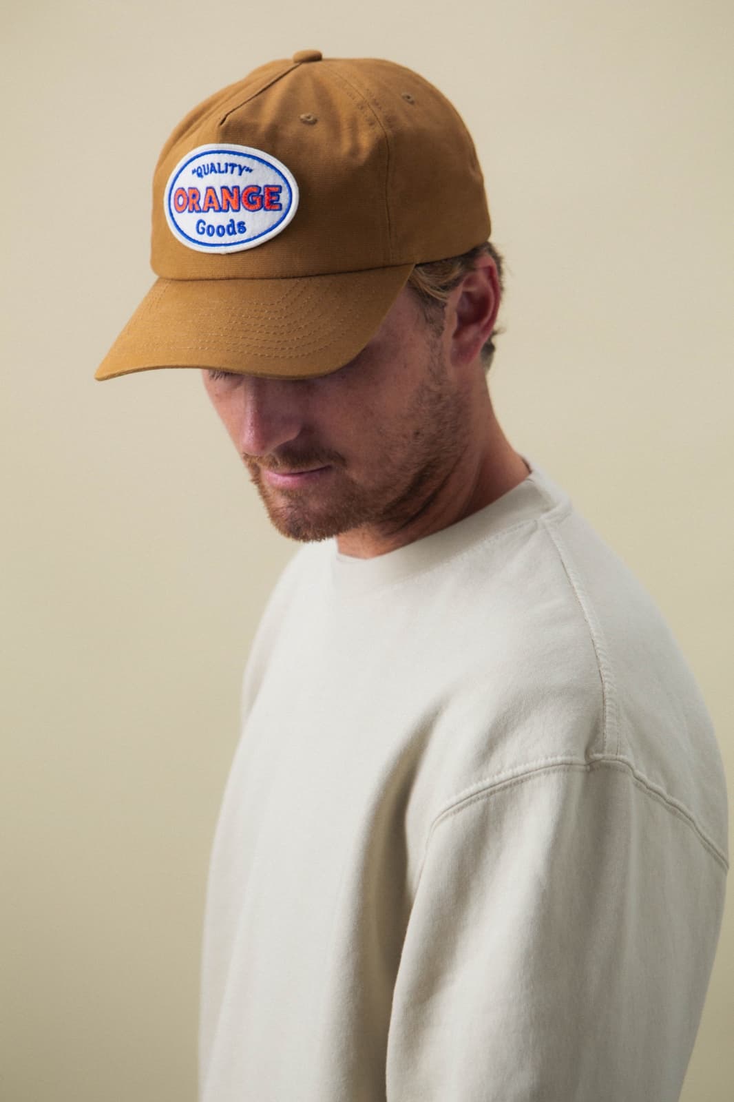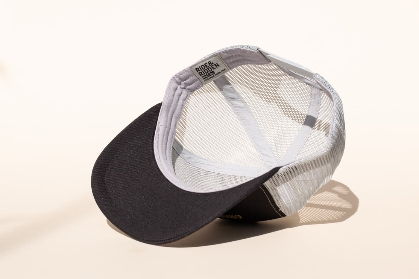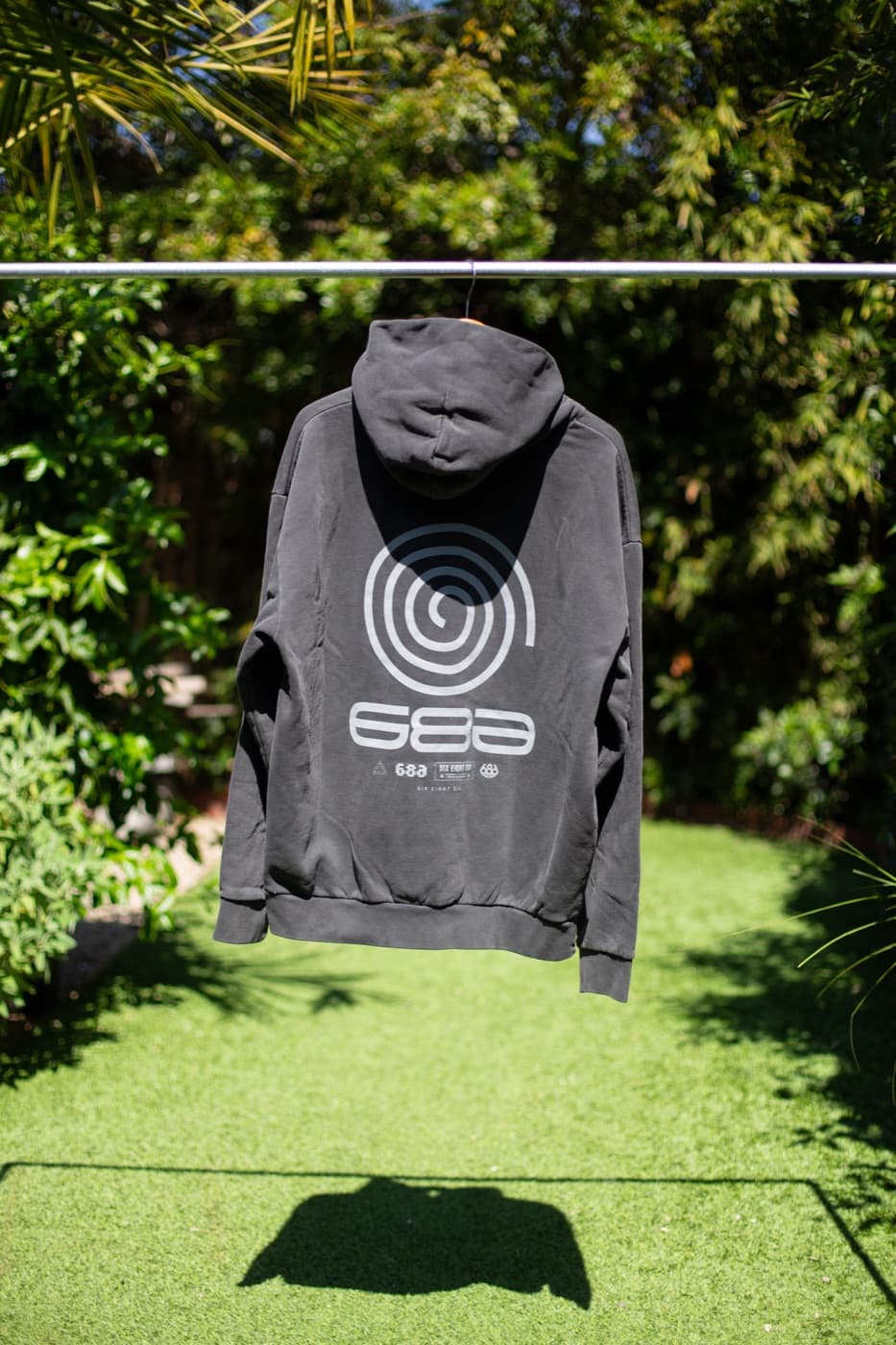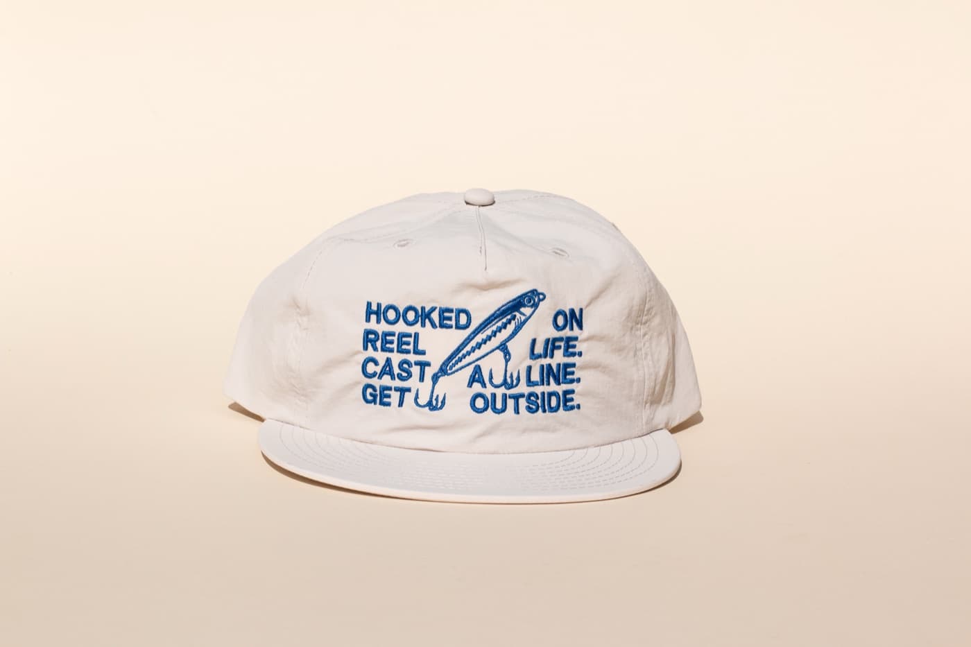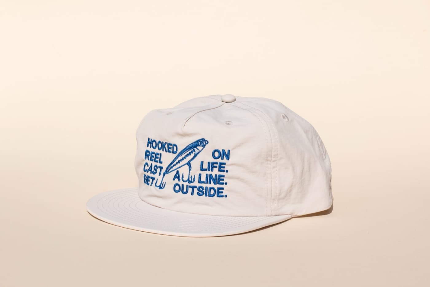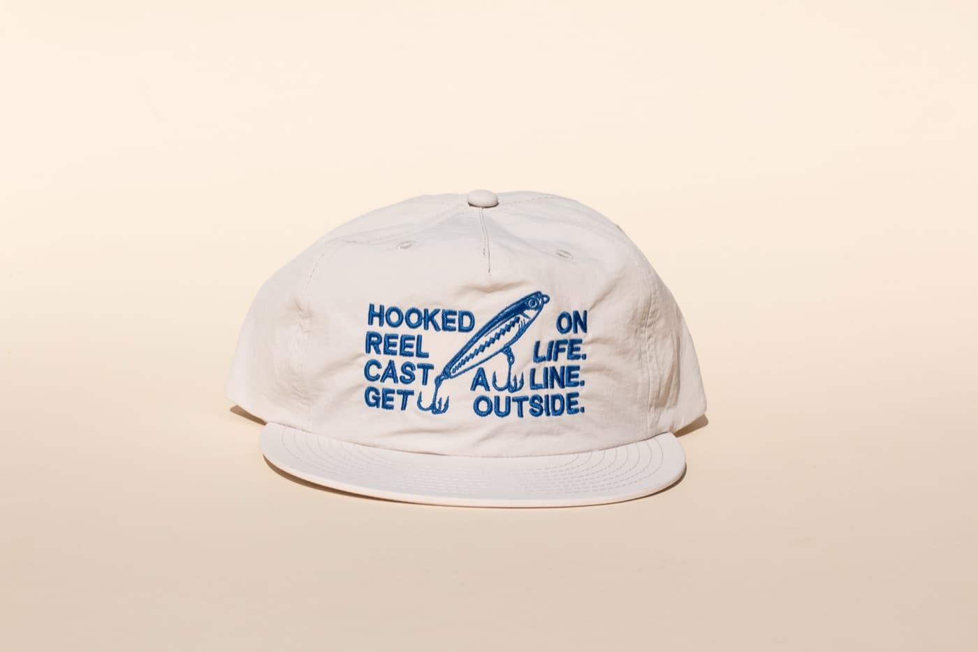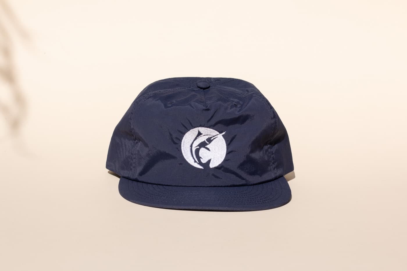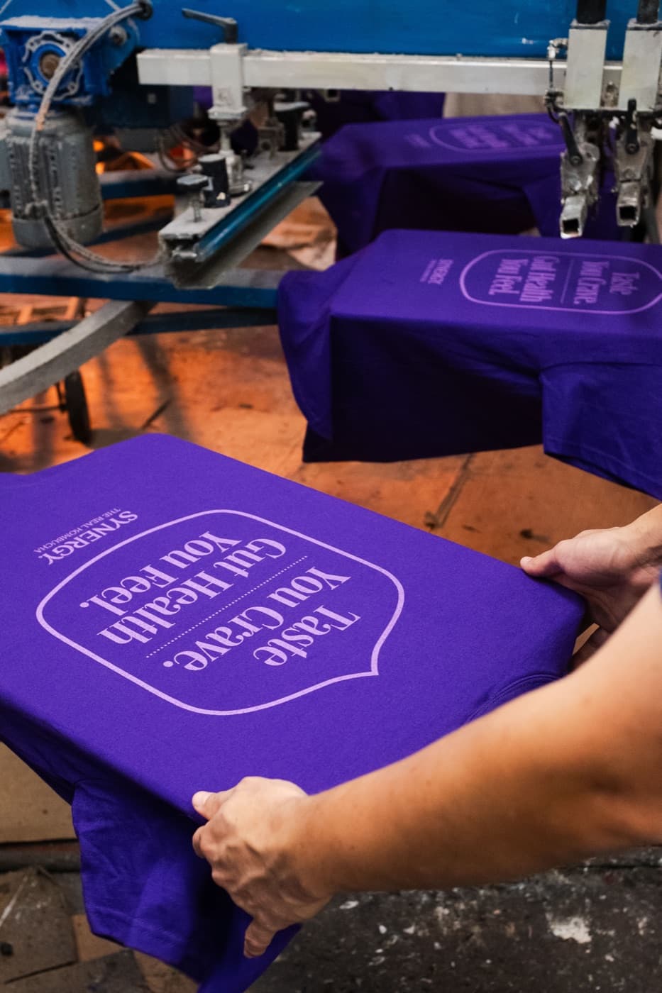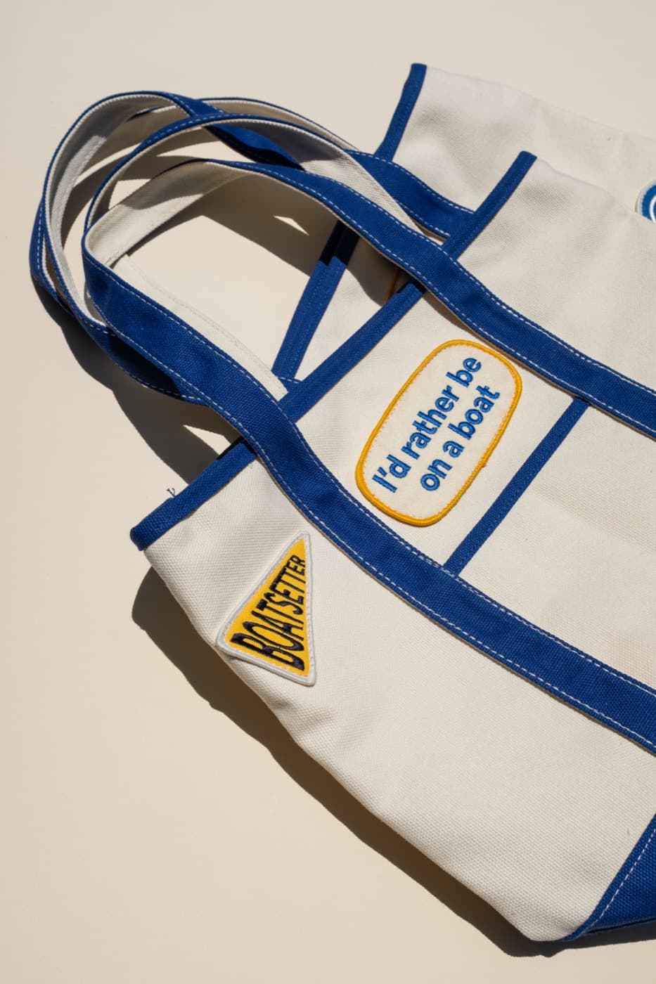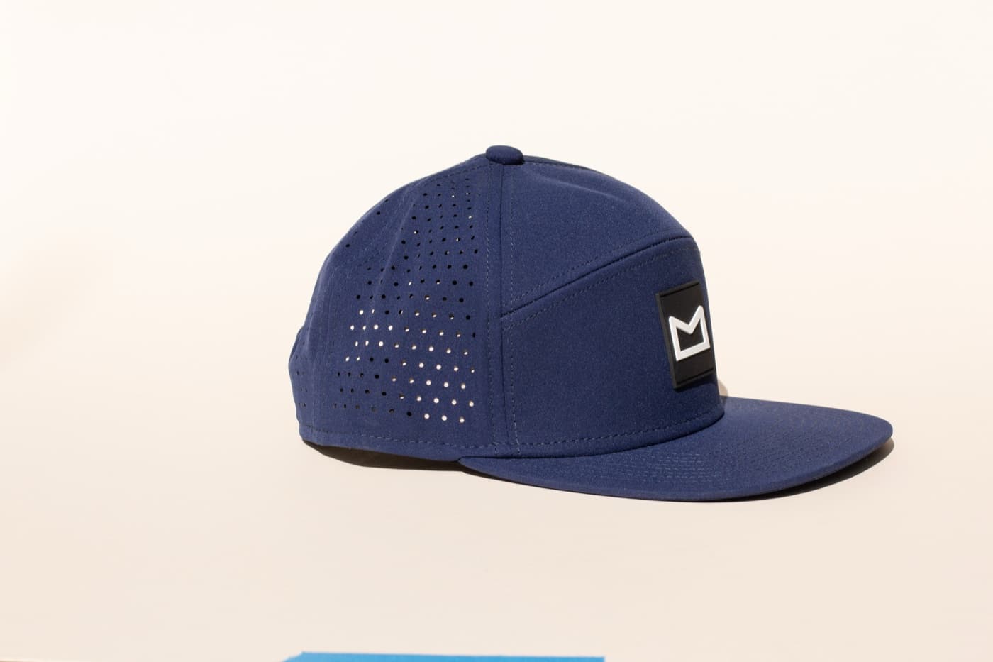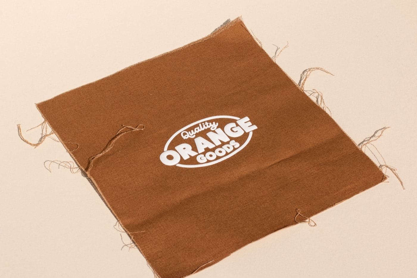
A logo that looks great on a business card or a website does not automatically work on a hat. Embroidery and screen printing have different constraints than digital formats, and understanding those constraints before you finalize artwork saves time, money, and frustration.
Simplicity scales better
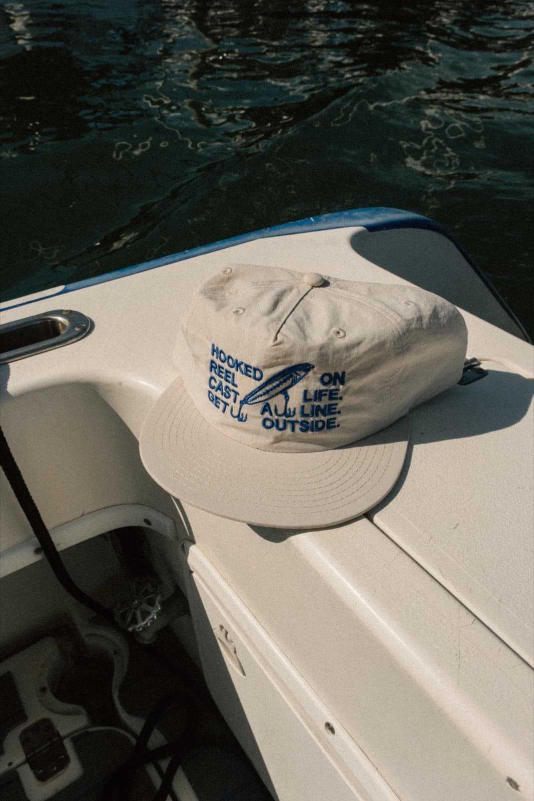
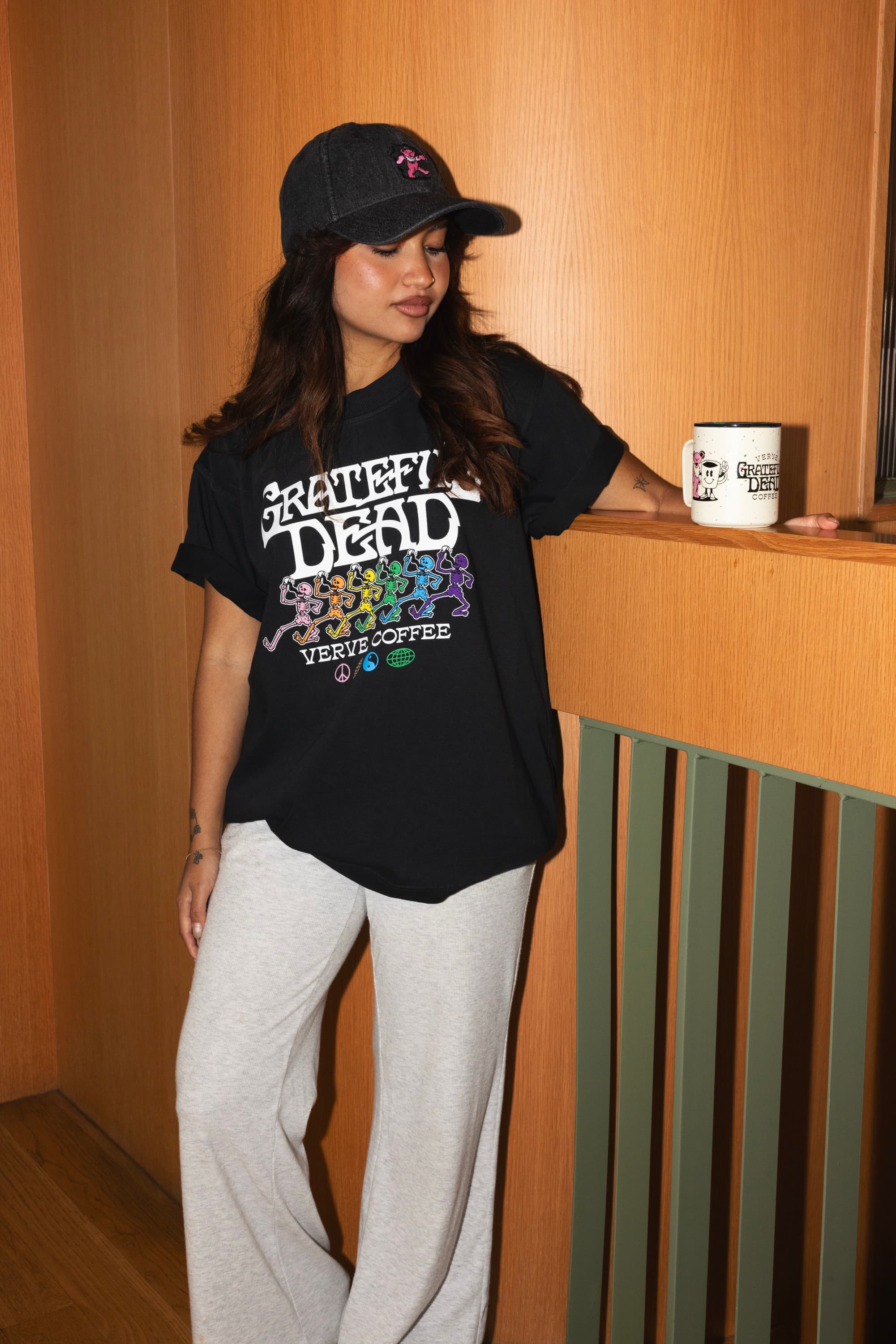
The logos that work best on merch are the ones that read clearly at small sizes and in a single color. If the logo requires 8 colors to look right, or if it has fine gradients and drop shadows, it is probably more complex than production can handle cost-effectively. That does not mean it is a bad logo for digital use — it means the merch version may need to be a simplified adaptation.
Think about the logo at the size it will appear on a hat. A left-chest placement on a cap is roughly 2 by 2.5 inches. A complex logo with thin lines and intricate detail loses those elements at that size. A bold, simple mark holds its identity.
Vector files are not optional
Embroidery and screen printing require artwork in vector format — typically Adobe Illustrator (.ai), EPS, or a clean vector PDF. A PNG or JPEG from a website is a raster format: it is made of pixels, and those pixels become visible when the file is scaled up to production size. A vector file can be scaled to any size without losing quality.
If you only have a raster logo, the options are recreation (redrawing the logo in vector) or auto-tracing (software conversion that works for simple marks but often needs cleanup). Expect to pay for this work if you need it. It is a one-time cost that pays off across every future production order.
Color count and embroidery thread
Each color in a screen print requires a separate screen setup — more colors means higher setup cost. Embroidery does not work that way (thread changes add time, not screens), but highly detailed multi-color embroidery can lose definition and look muddy at small sizes. The sweet spot for embroidery is 1–4 colors with clear separation. For screen printing, 1–3 colors keeps setup cost manageable on smaller runs.
Adapting the logo for merch
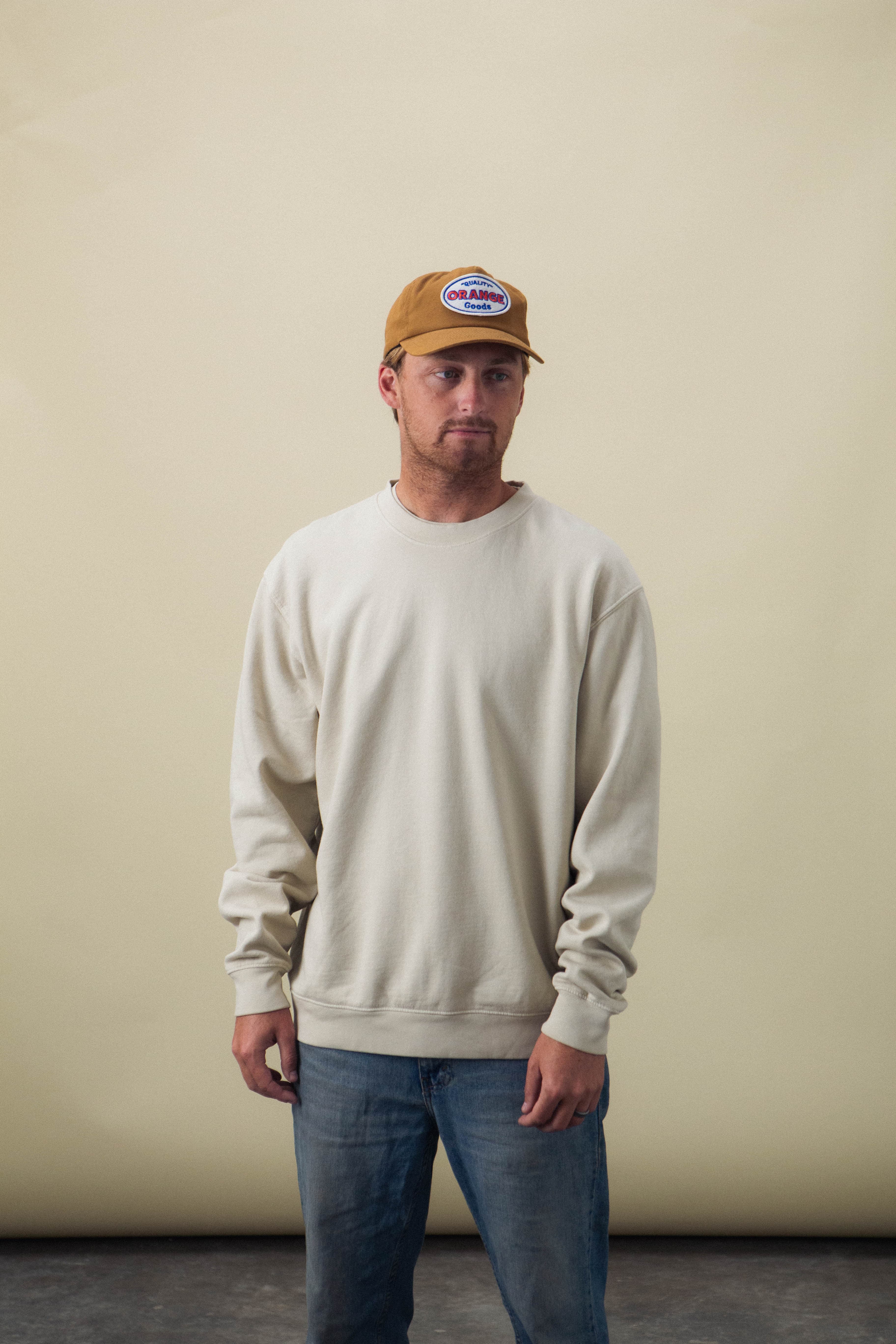
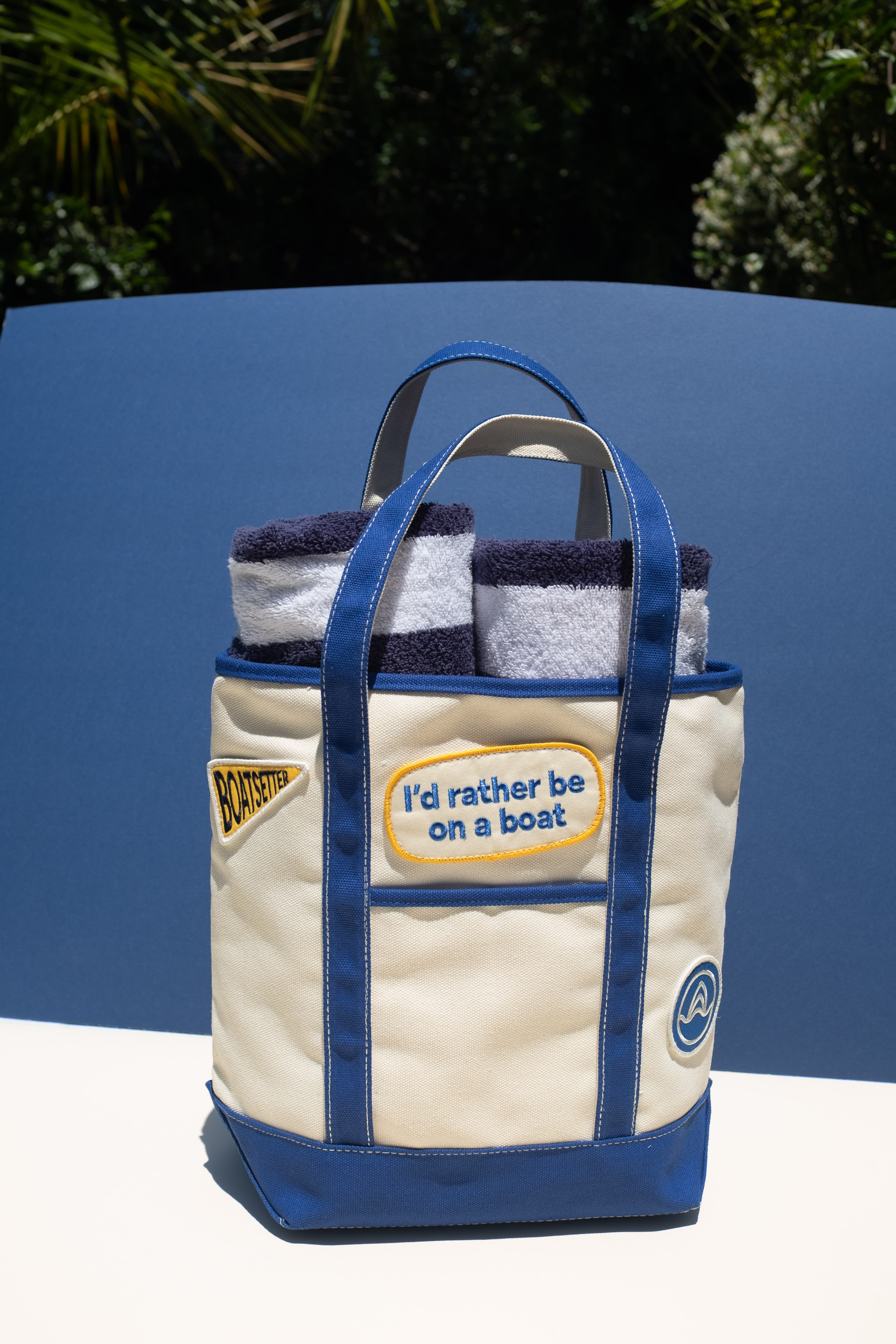
Many brands create a simplified merch version of their primary logo — a one or two color version, a wordmark without the full icon, or a badge version with the name inside a shape. This is not a compromise. It is good design practice. The merch version should feel like a natural extension of the brand, just optimized for the format.